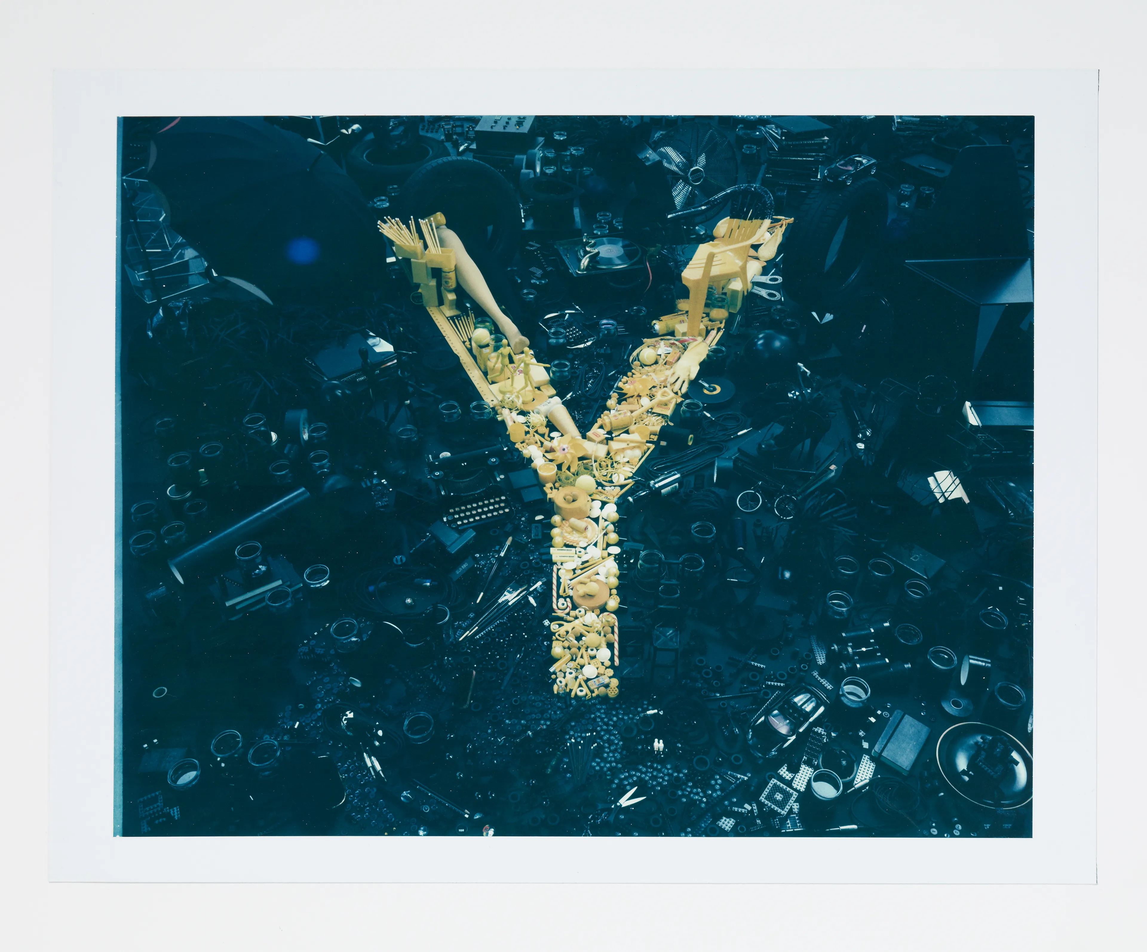
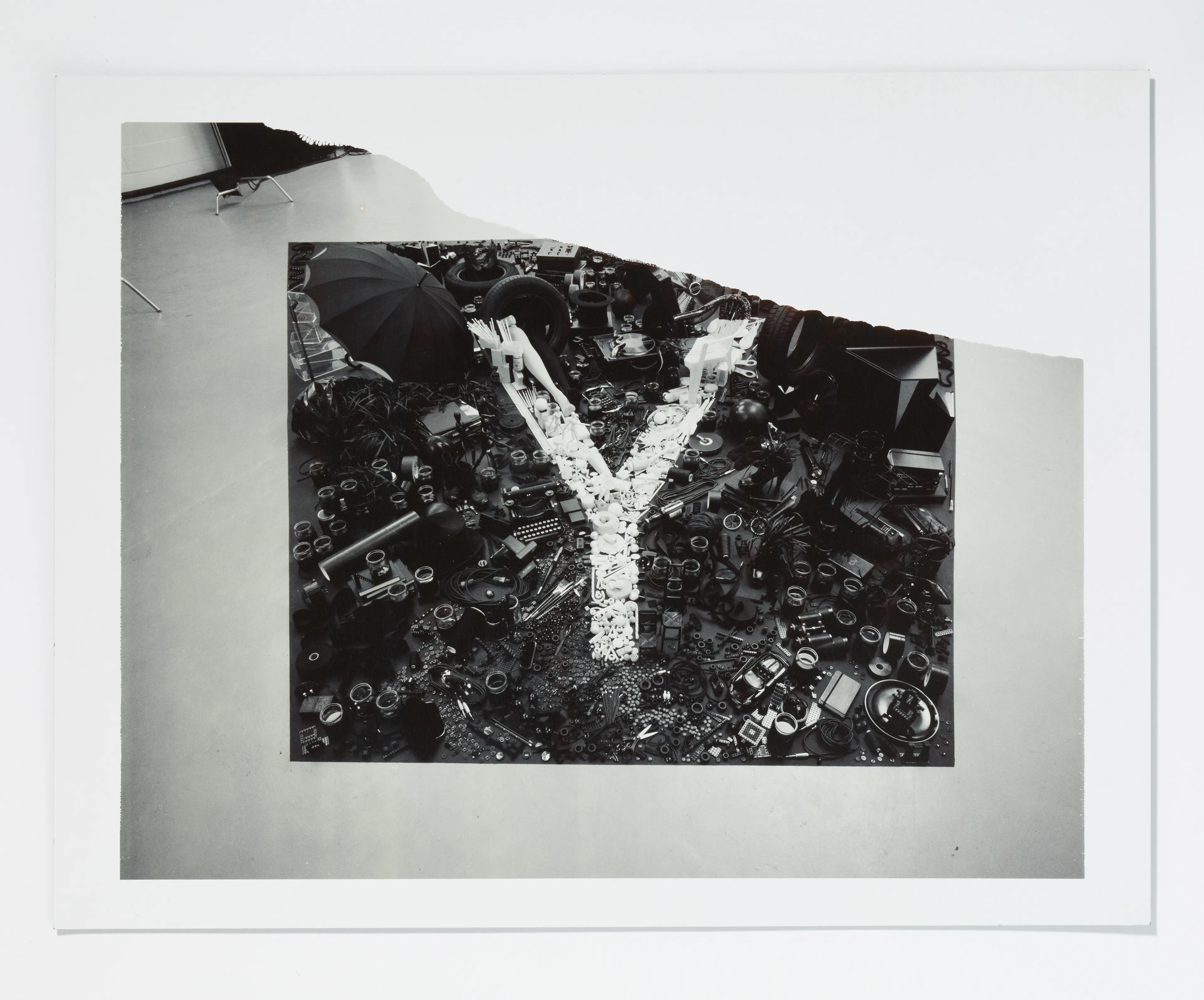
Alphabetical is an 18-year-plus personal project by the photographer and director, Dan Tobin Smith, a visual journey into his interests in art and science, history and technology.
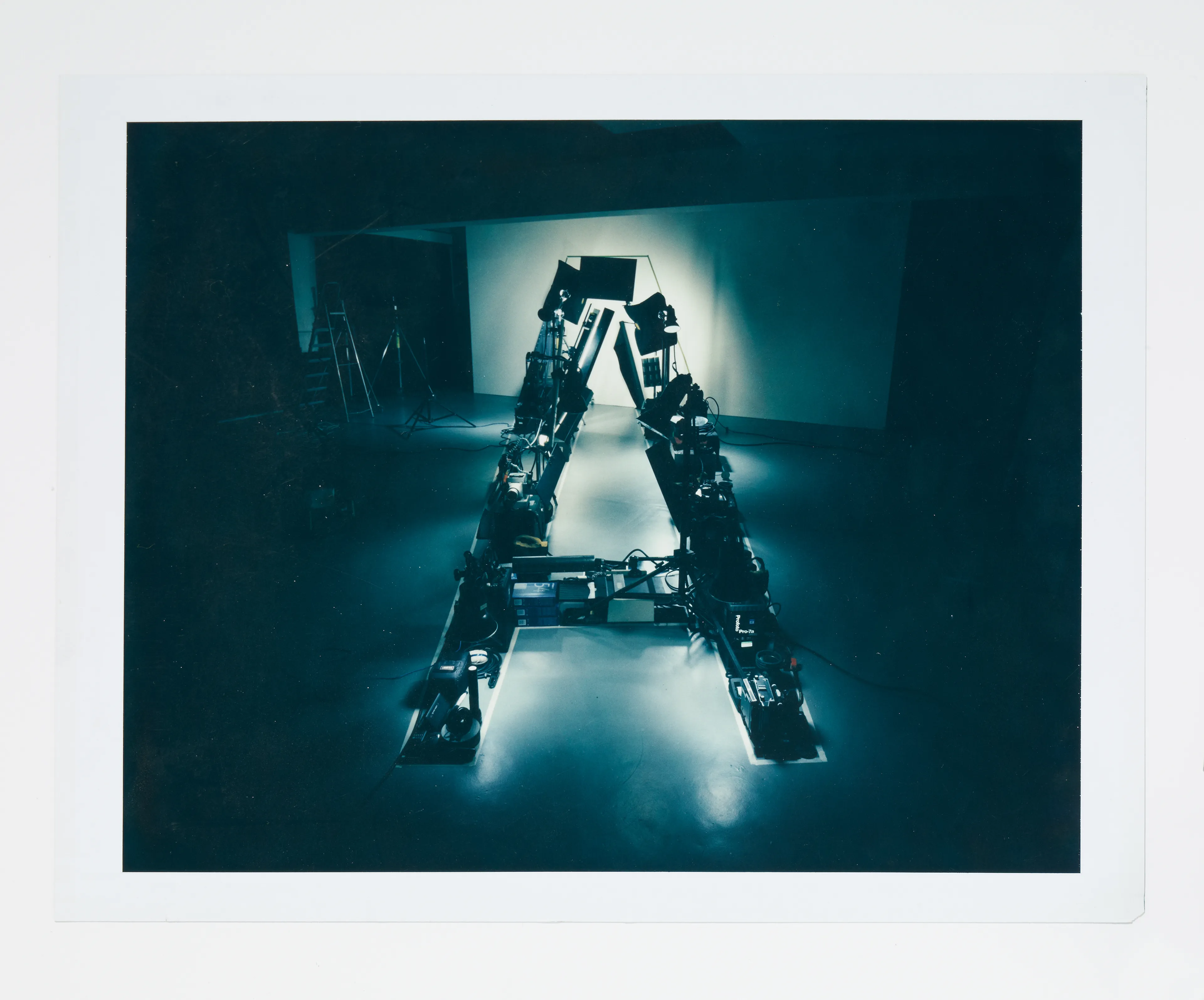
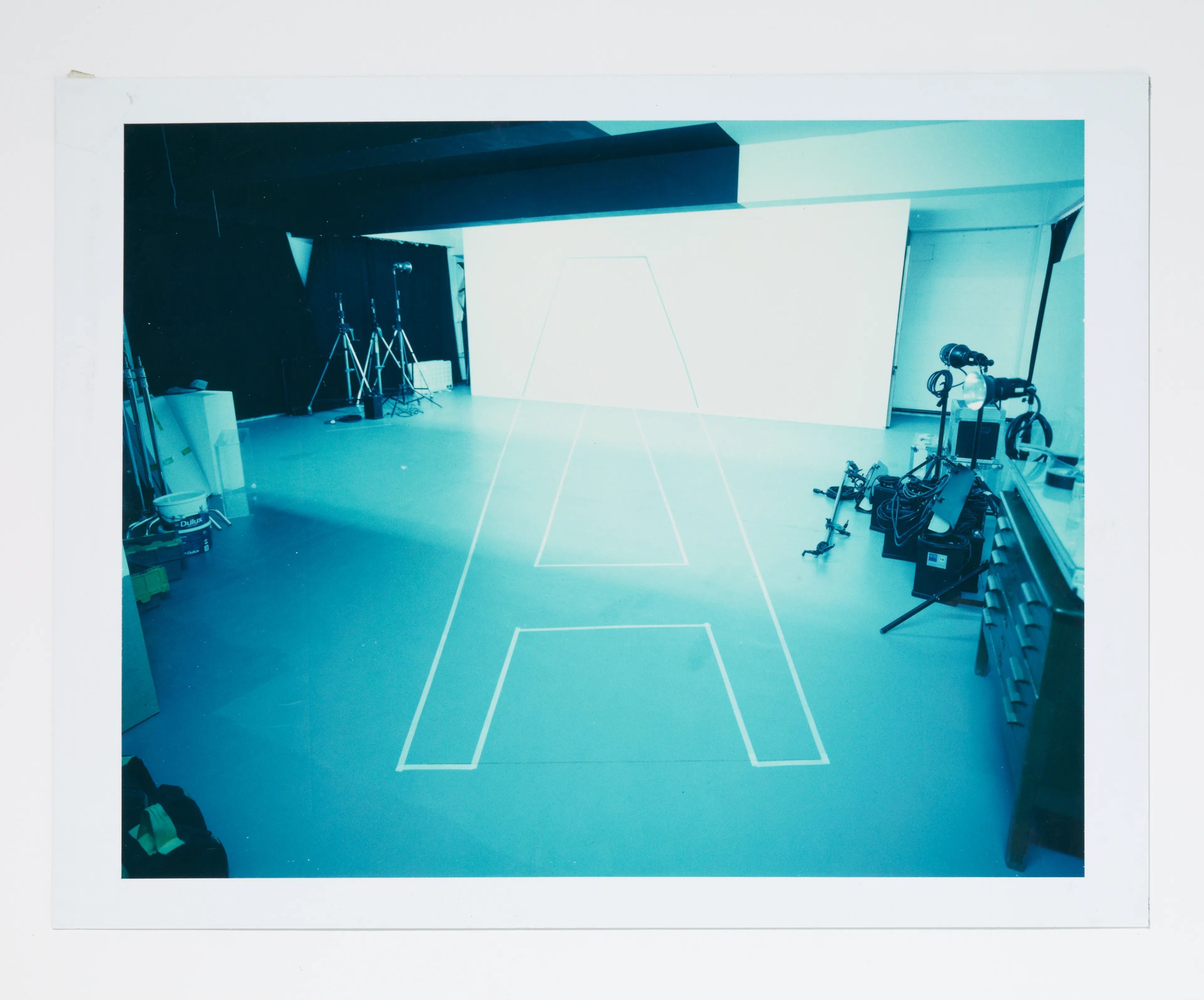
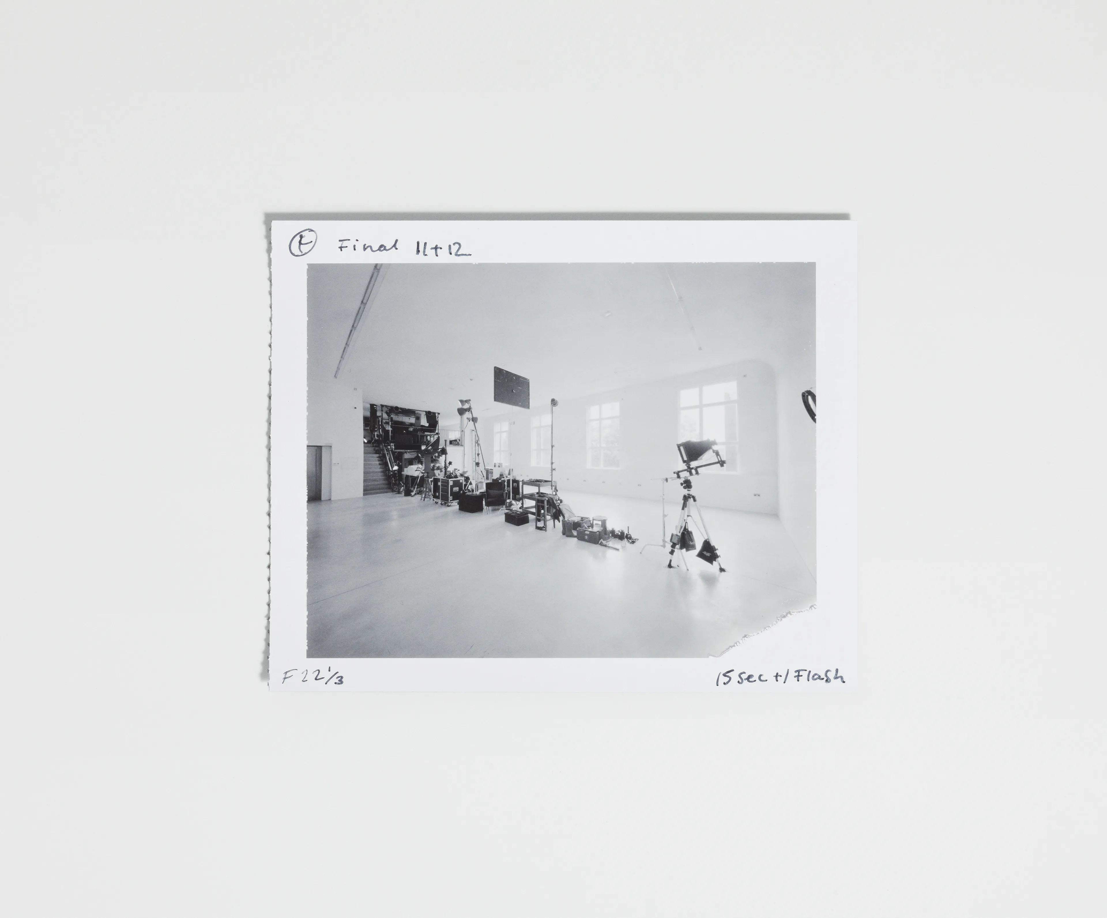
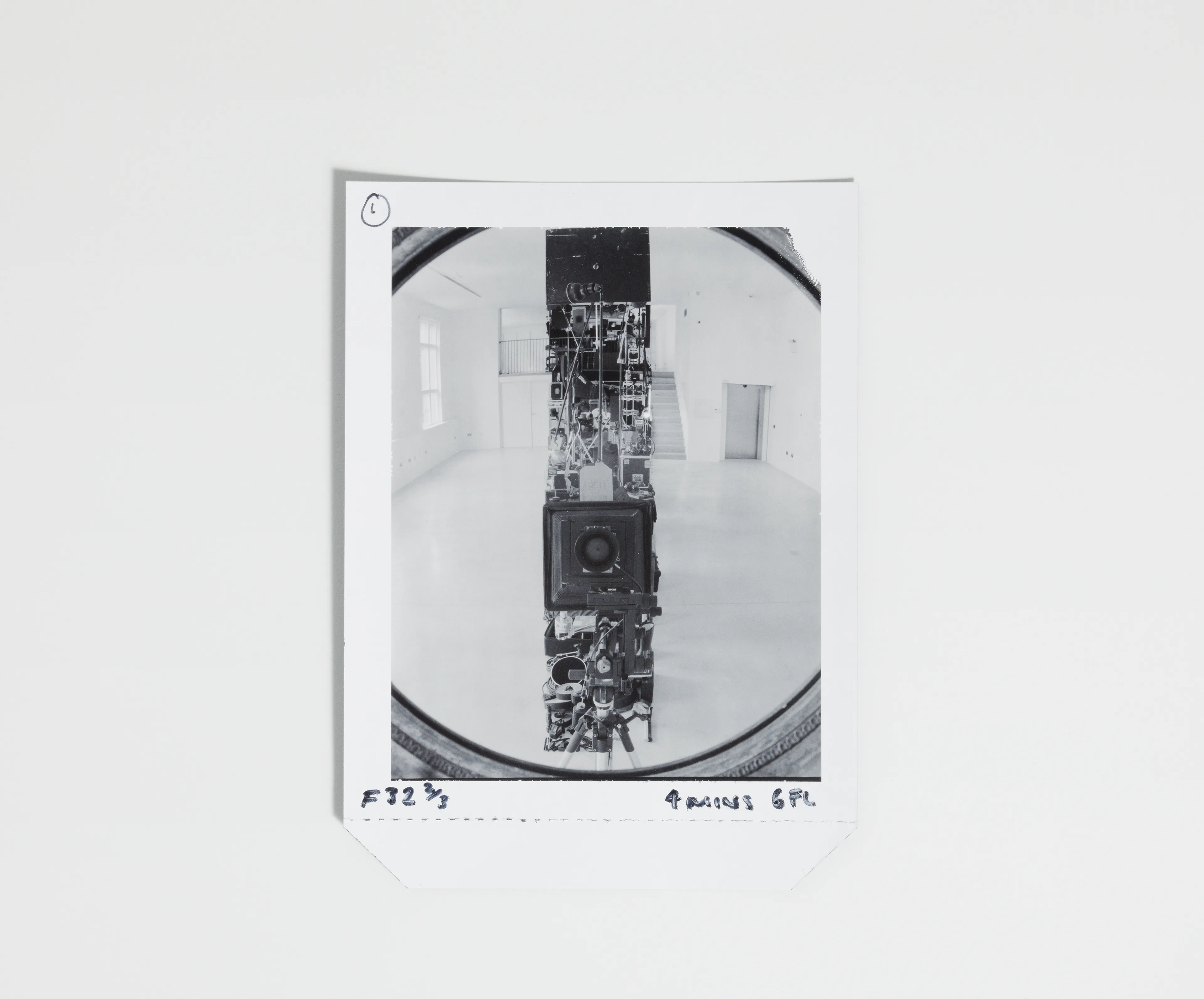
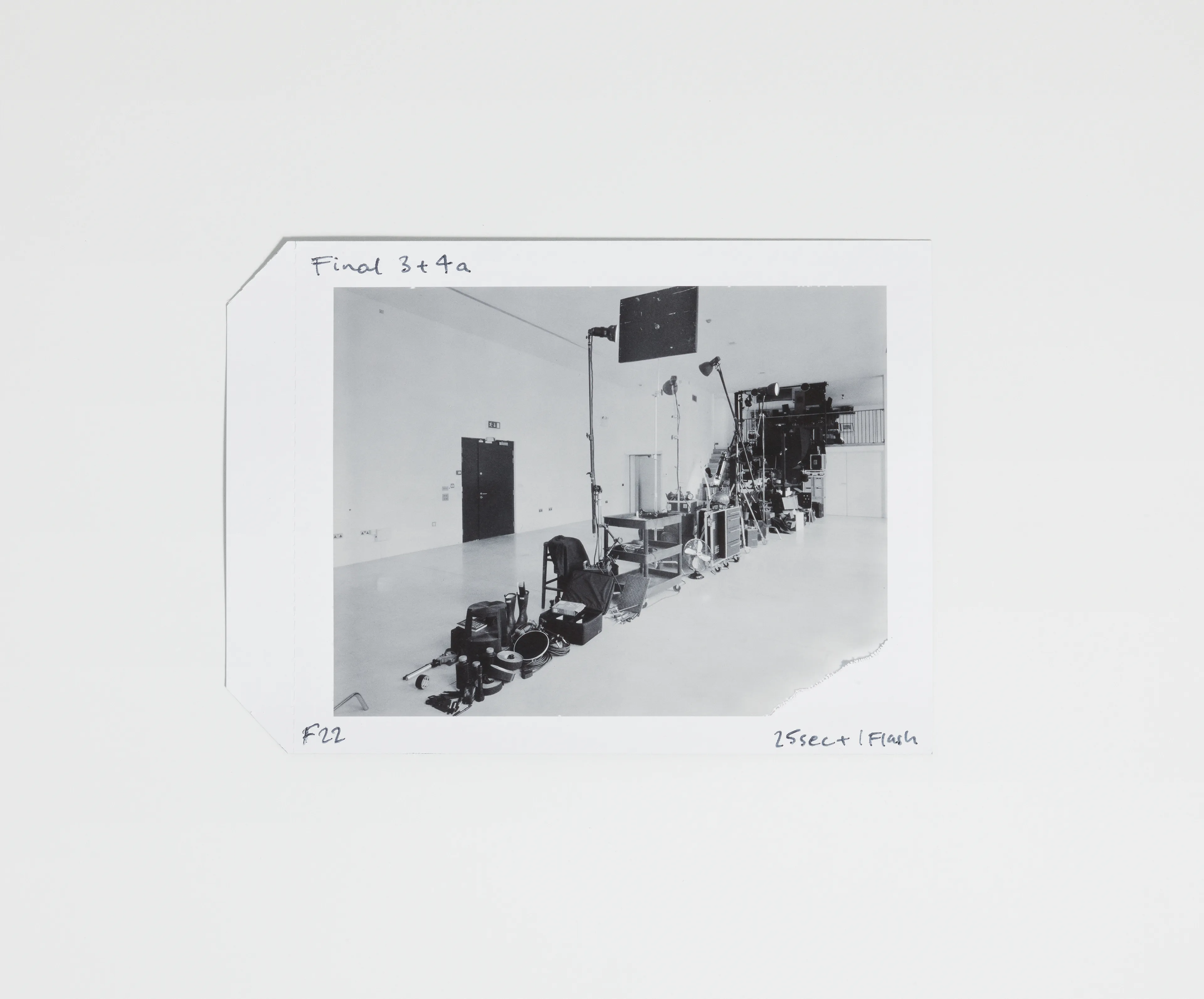
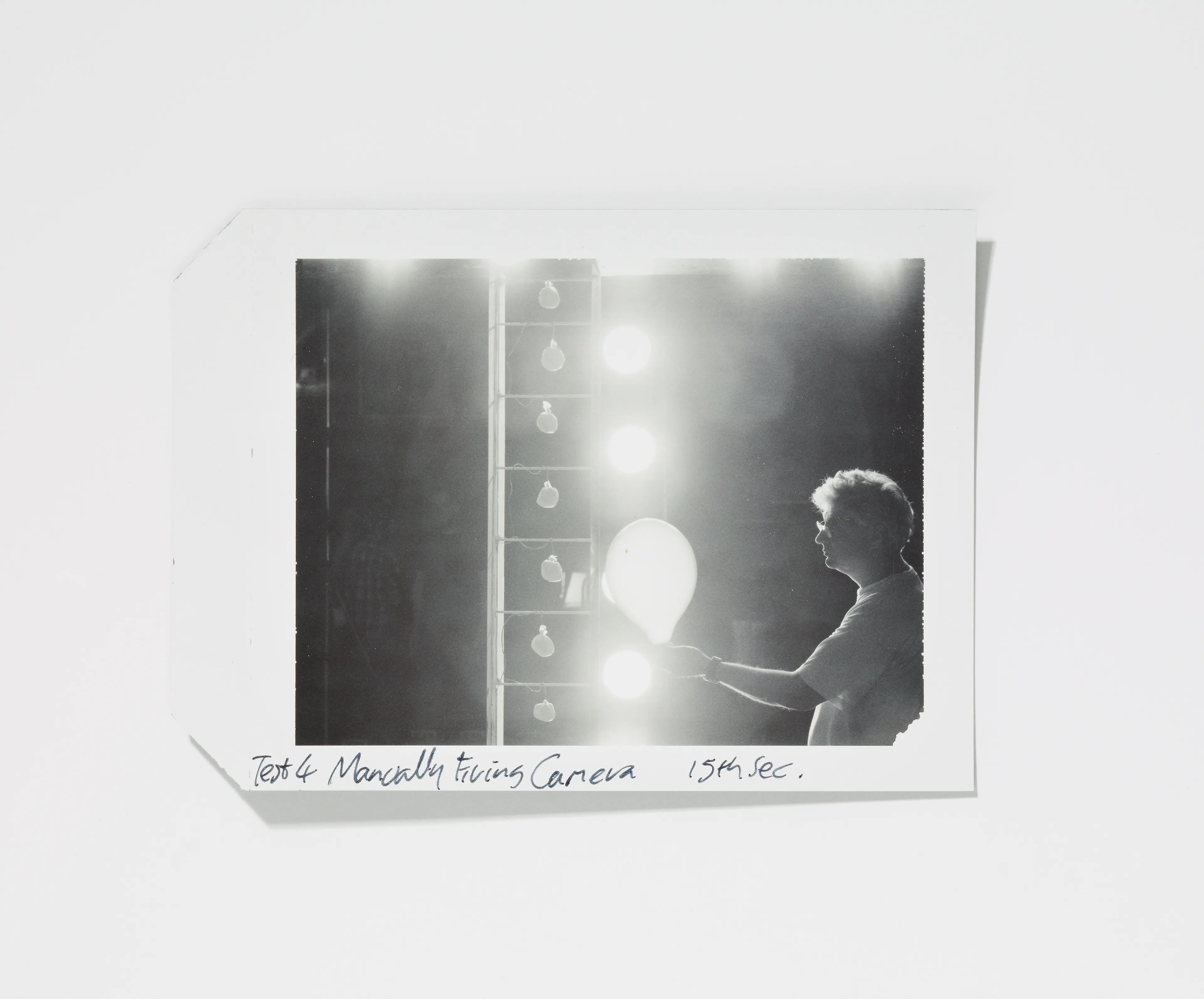
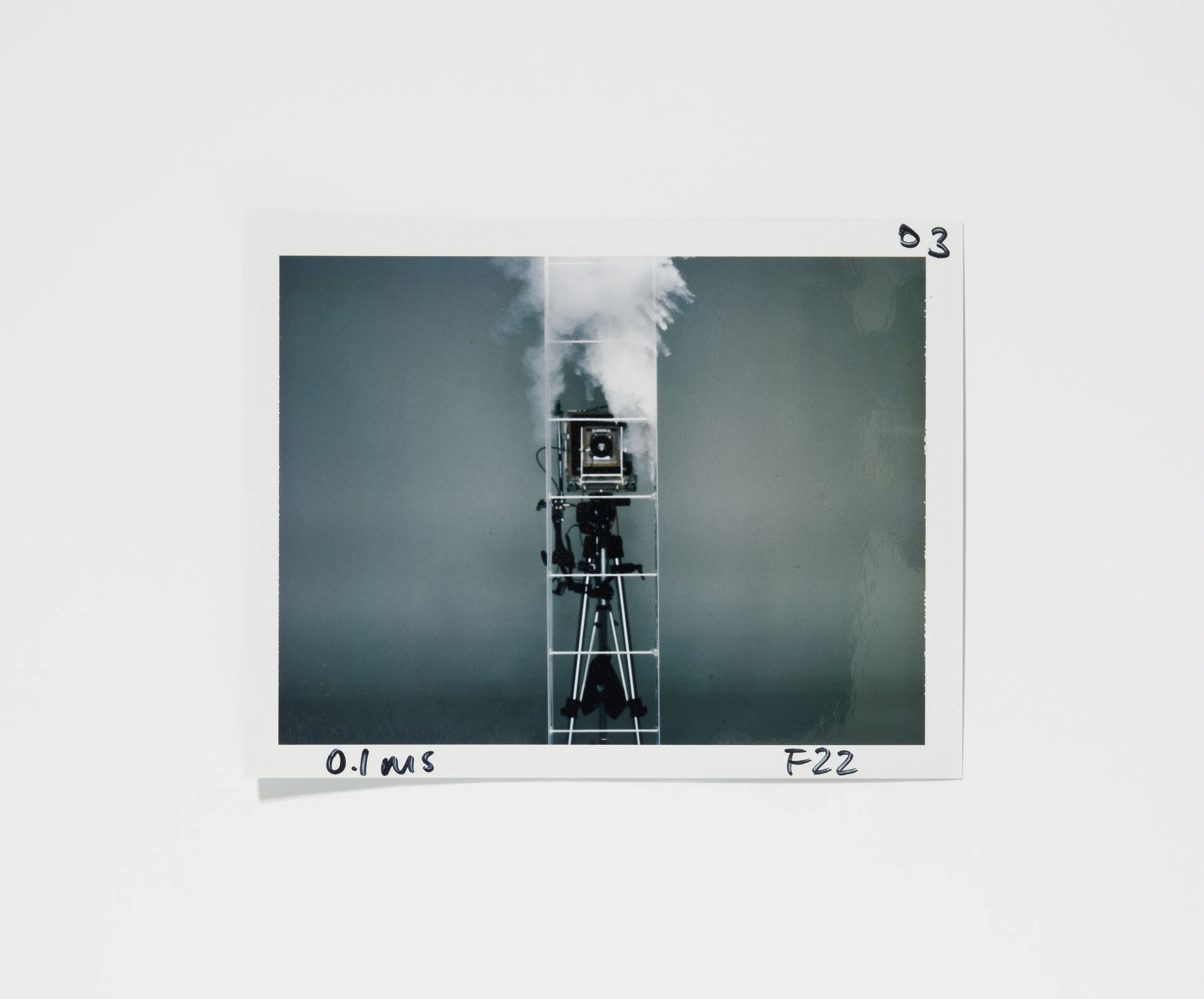
Starting with a commission from Creative Review in 2007 to create the cover for their Annual and shot over the last 18 years, the project now incorporates 20 letters, comprising of 93 images, 4 films, a host of supporting material including 10×8 inch polaroids and permanent three dimensional pieces.
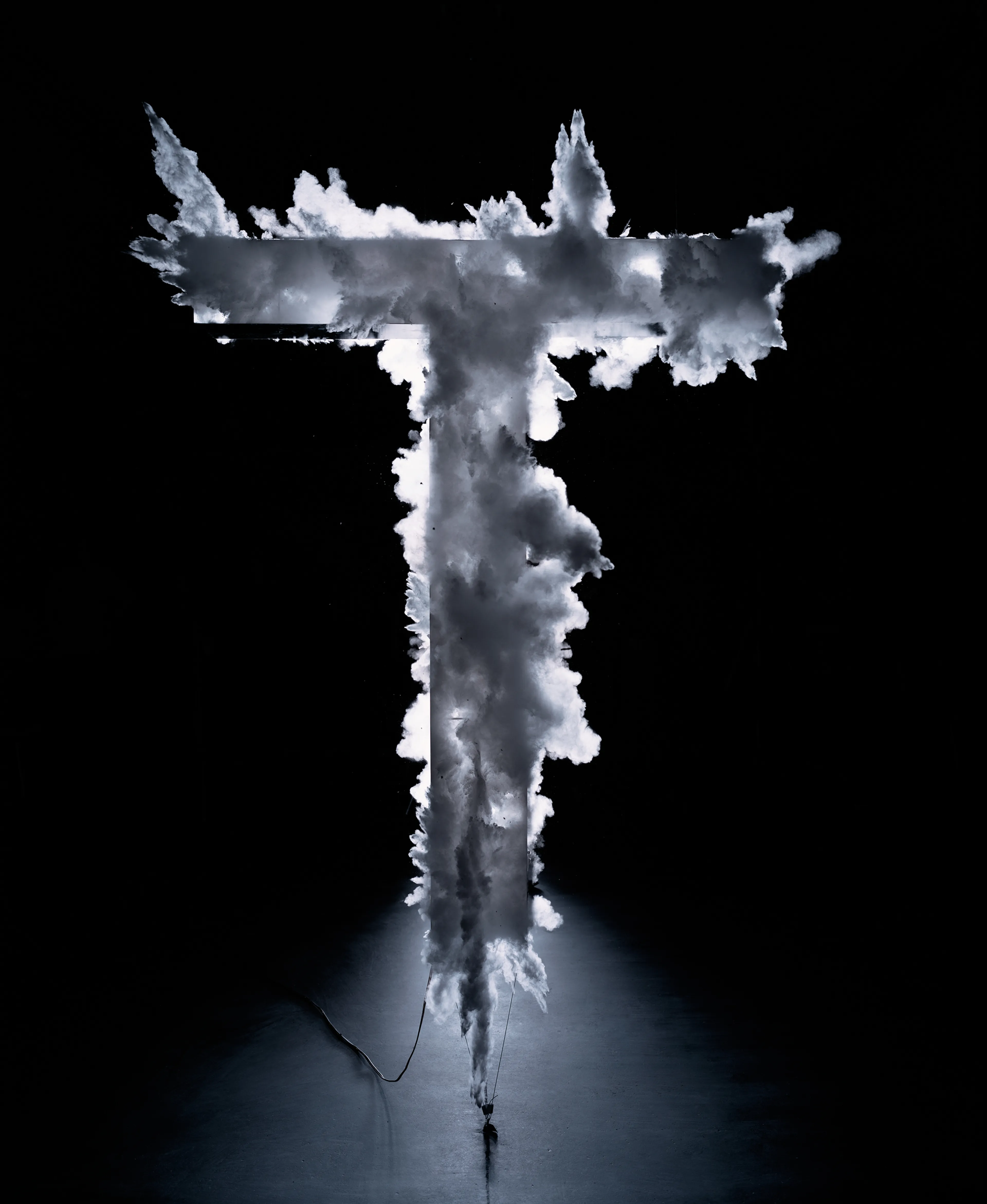
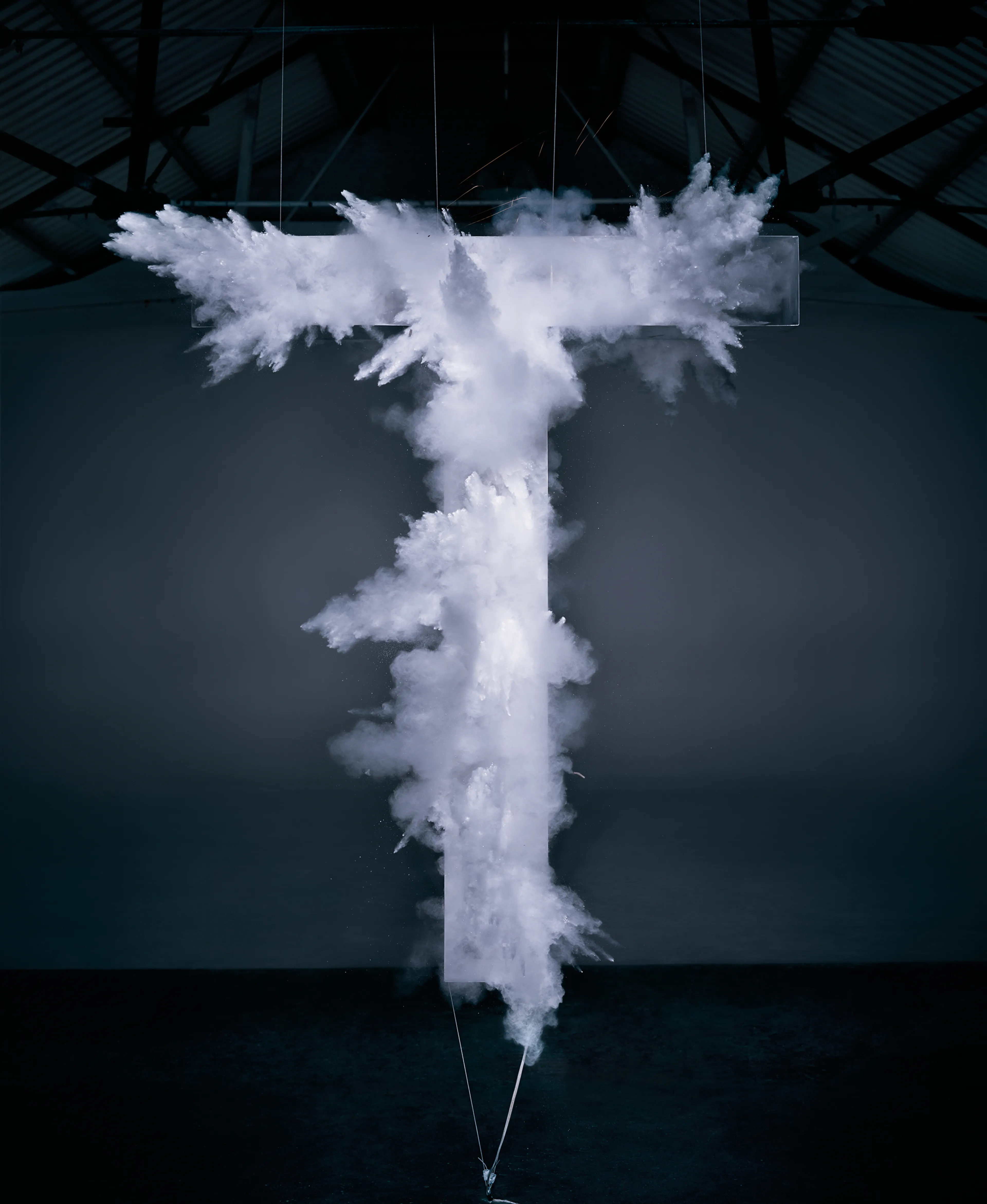
Each letter is different and incorporates a distinct visual idea — some primarily conceived for film, others as sculpture, but always executed as a photograph. Uniformity comes in the font: every letter is built as upper-case Helvetica. This choice is arresting and architectural in its simplicity, serving as both an ironic contrast to the complex constructions and the perfect conduit for them. All built in-camera and shot on 10×8 analogue film, the works utilise a broad range of materials, from flowers to smashed glass, and suspended scissors to chairs.
The project relies on anamorphosis, or distorted projection, to create the letterforms. This technique can be traced back to the Renaissance following Filippo Brunelleschi’s 15th-century experiments, which established the system for linear perspective. Once developed, the technique for depicting life-like perspective was widely used in painting, with notable examples including Leonardo da Vinci’s The Last Supper and Raphael’s The School of Athens. Hans Holbein’s The Ambassadors (1533) famously used anamorphosis to hide a human skull within a distorted image, making it visible only from an oblique angle or through a refracting hollow glass tube.
One of the earliest applications of the technique in photography appeared in 1913 with The Human U.S. Shield, which featured 30,000 officers and men of Camp Custer arranged to form an enormous national shield. From the 1970s onward, the method was adapted in subtler ways within still life and commercial advertising photography to refine composition and emphasise pertinent objects.
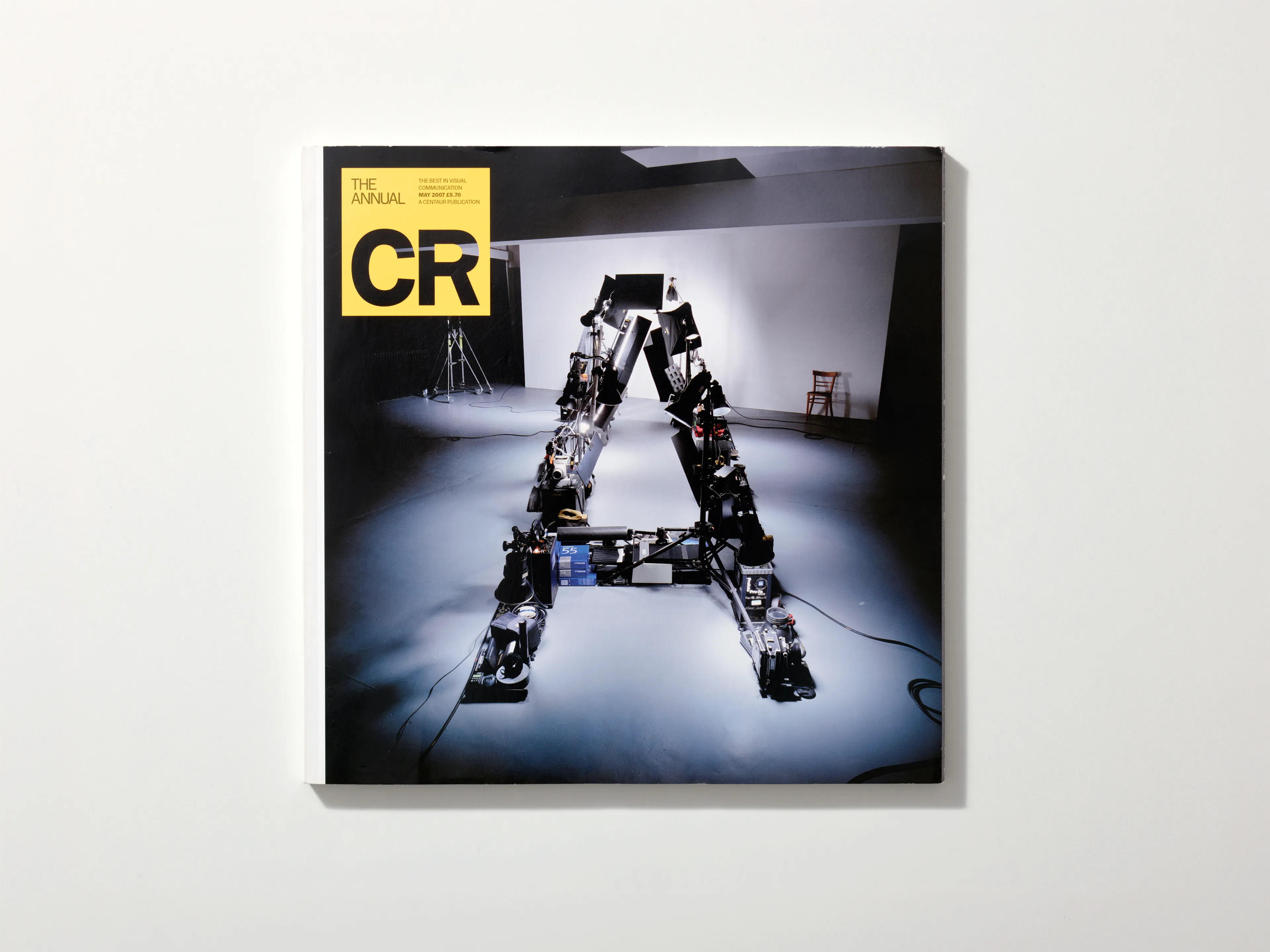
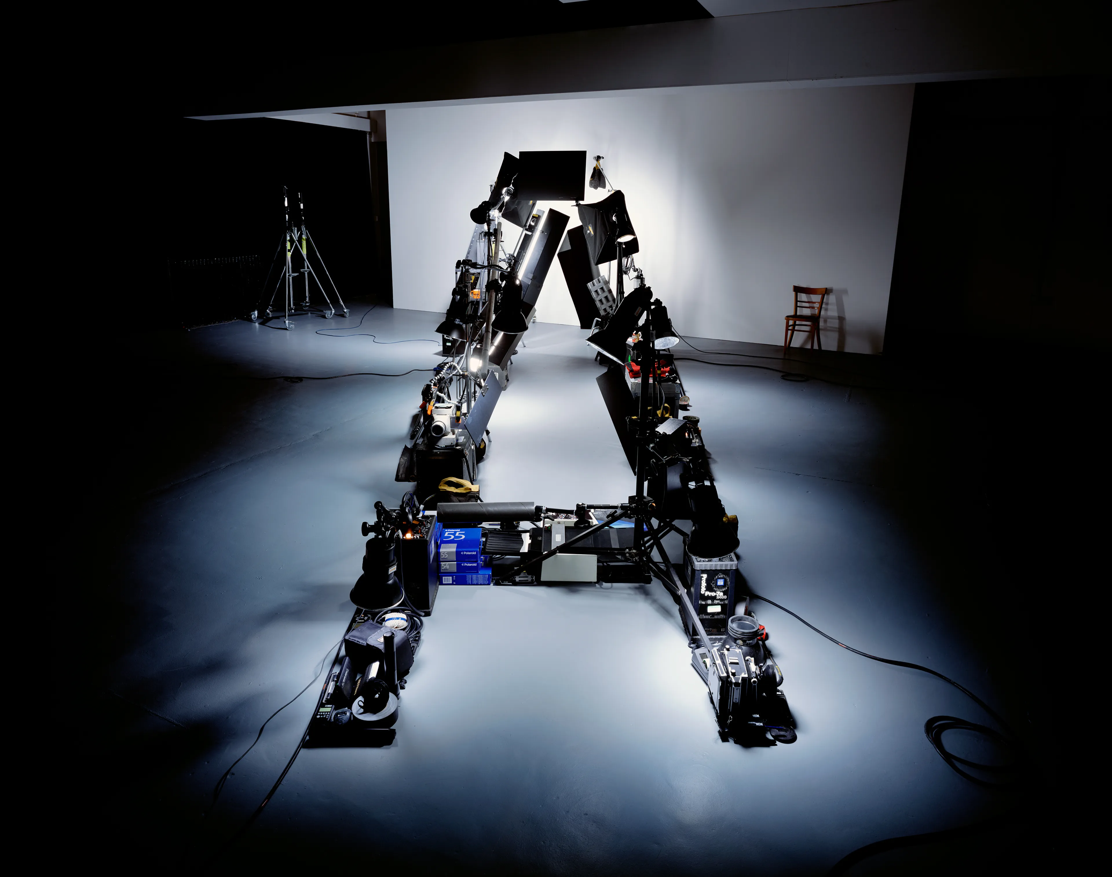
LETTER A
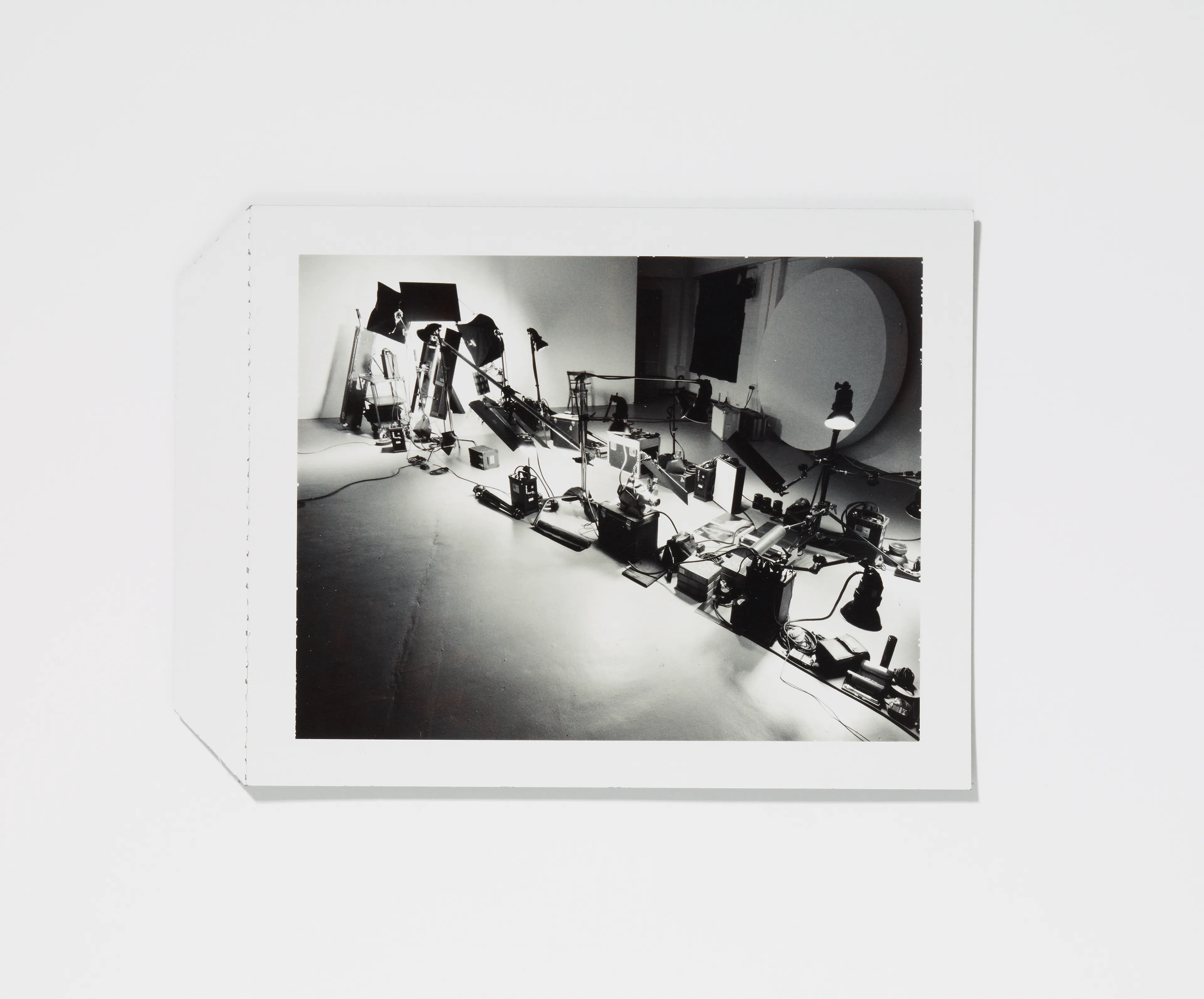
Annual / Anamorphosis, various objects arranged, 2007
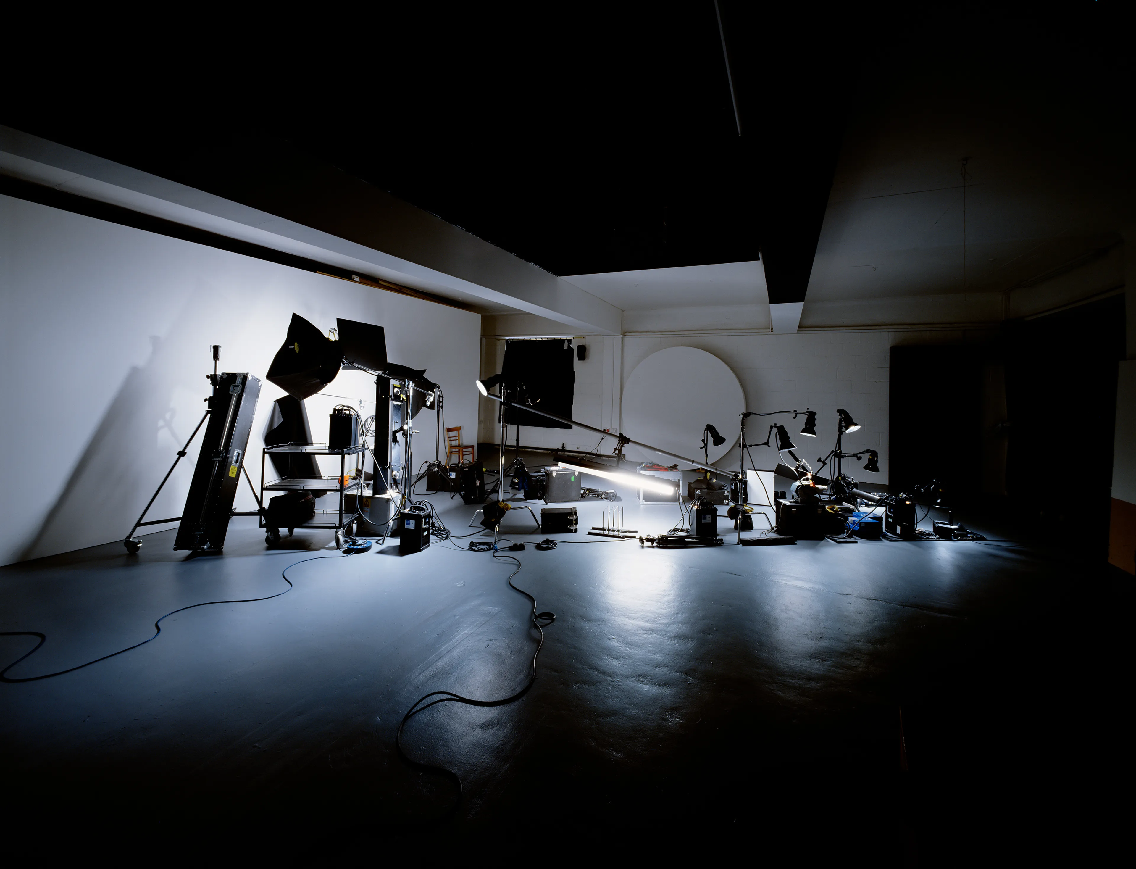
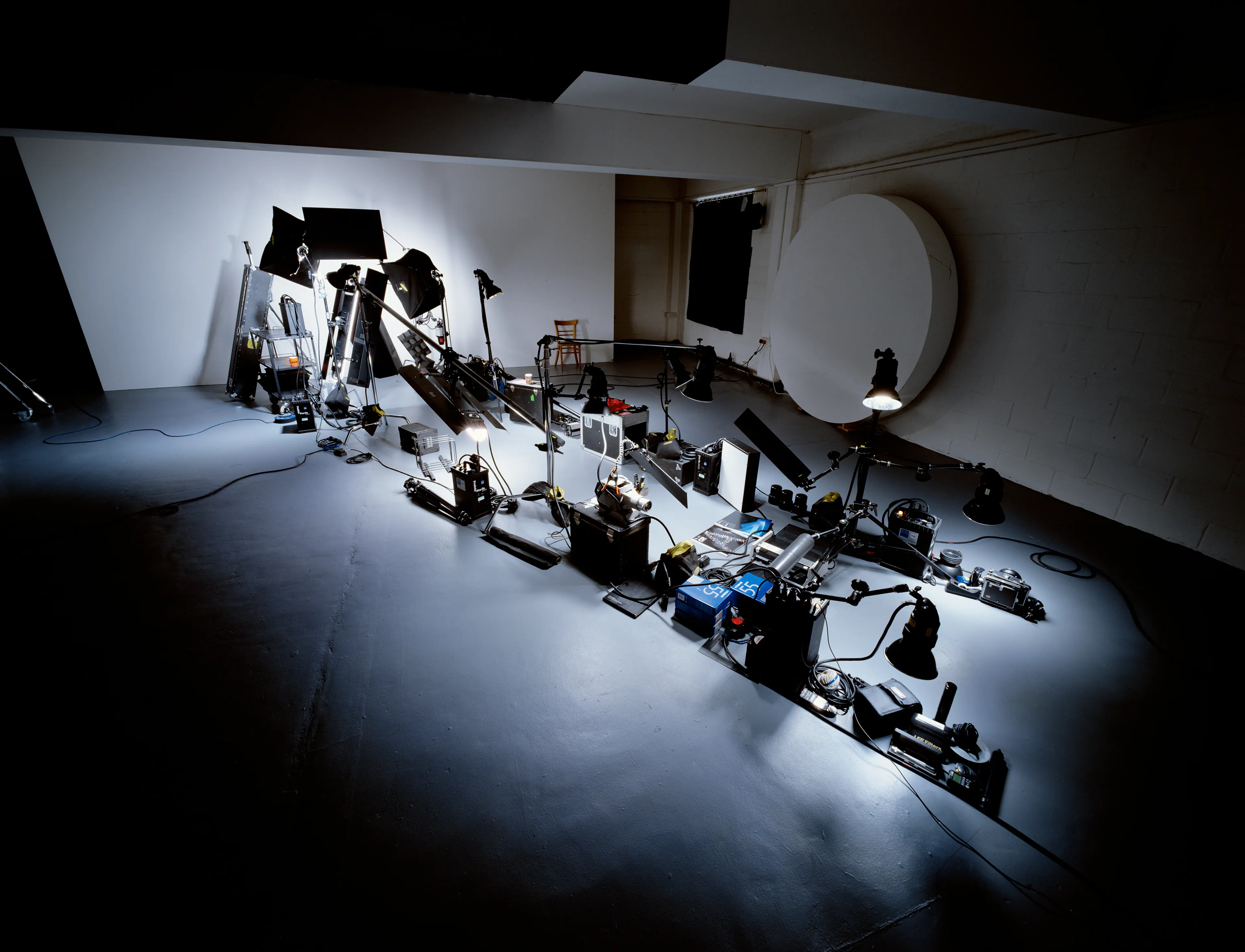
The entire project started with this commission from Creative Review to create the cover for their Annual in 2007. The brief was to create a letter form of an A that talks to the craft involved in the creative industries, namely photography.
I used equipment and various items used in my practice to make work, further using the lighting within the shot, normally hidden from view but now used in creating the silhouette and outline of the letter form. This was one of the first times I made use of anamorphosis in photography. I first shot the project on 5 × 4 on smaller scale, then grew it for the cover.
LETTER B
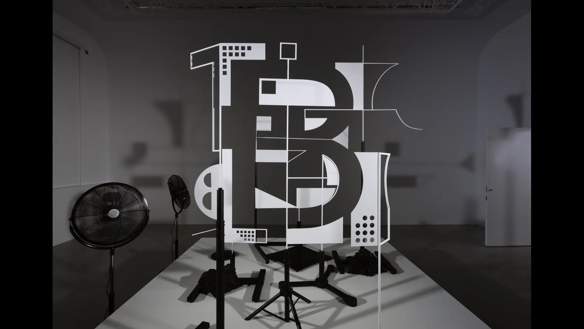
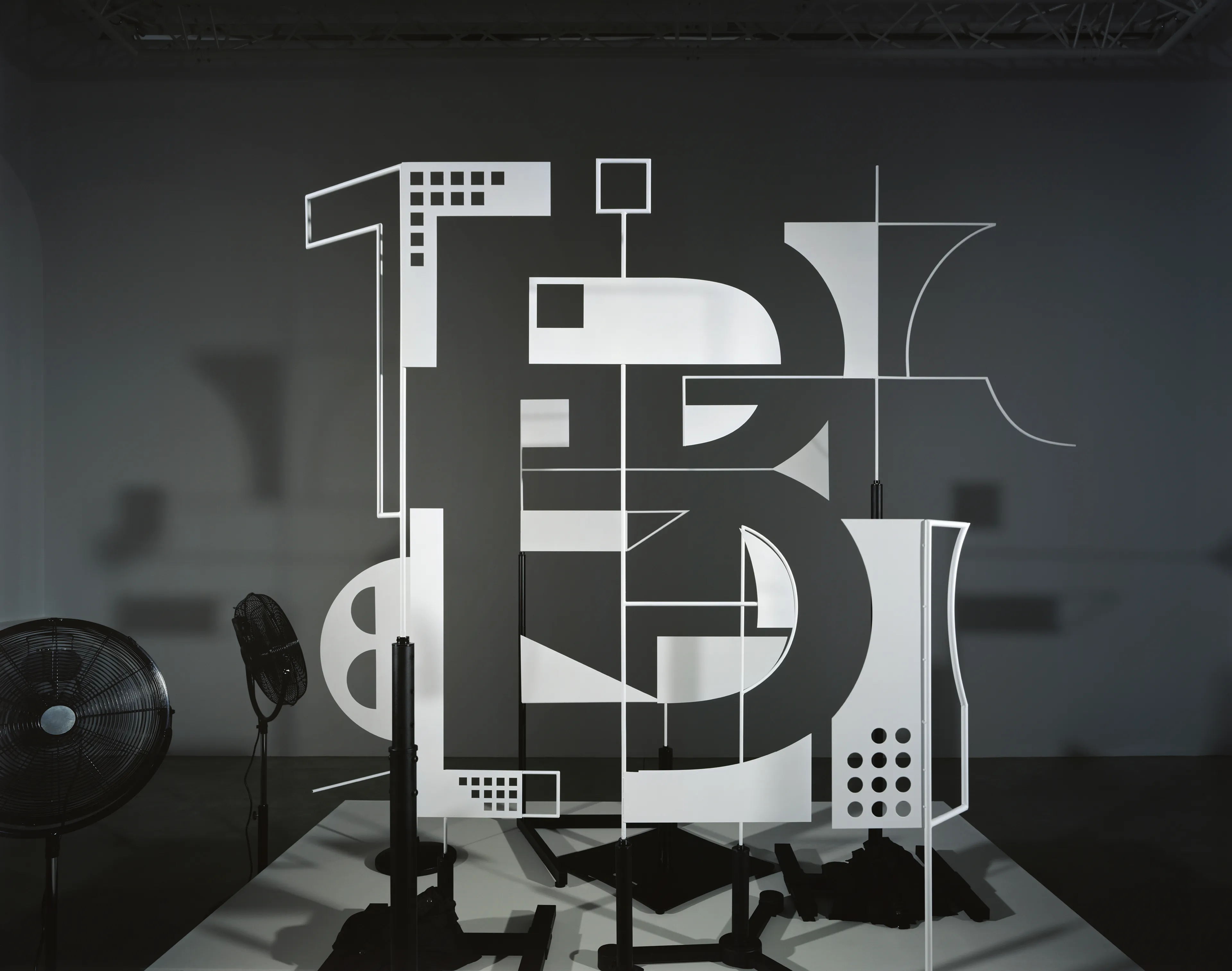
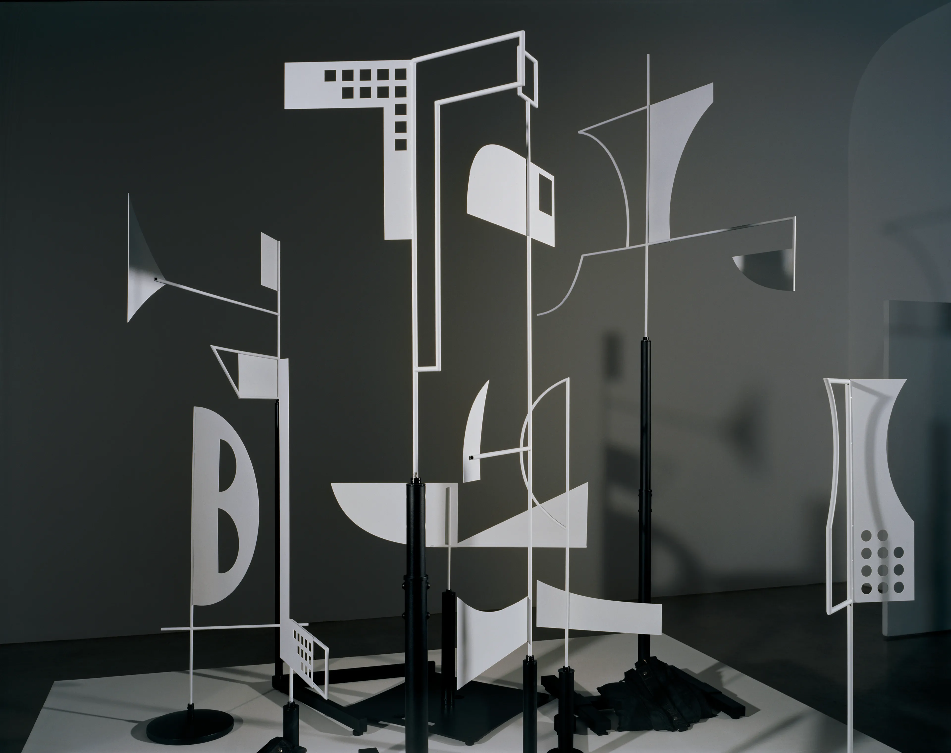
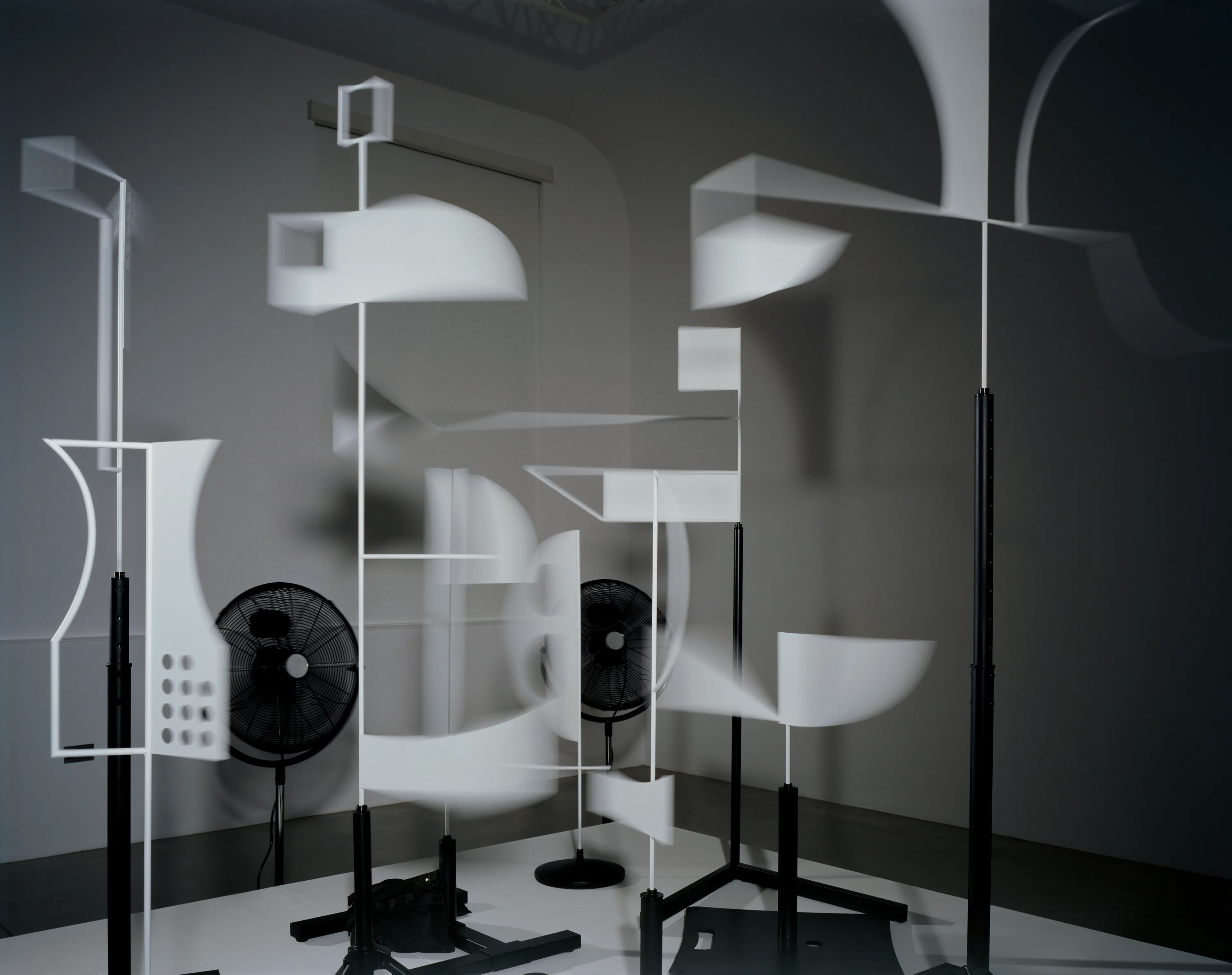
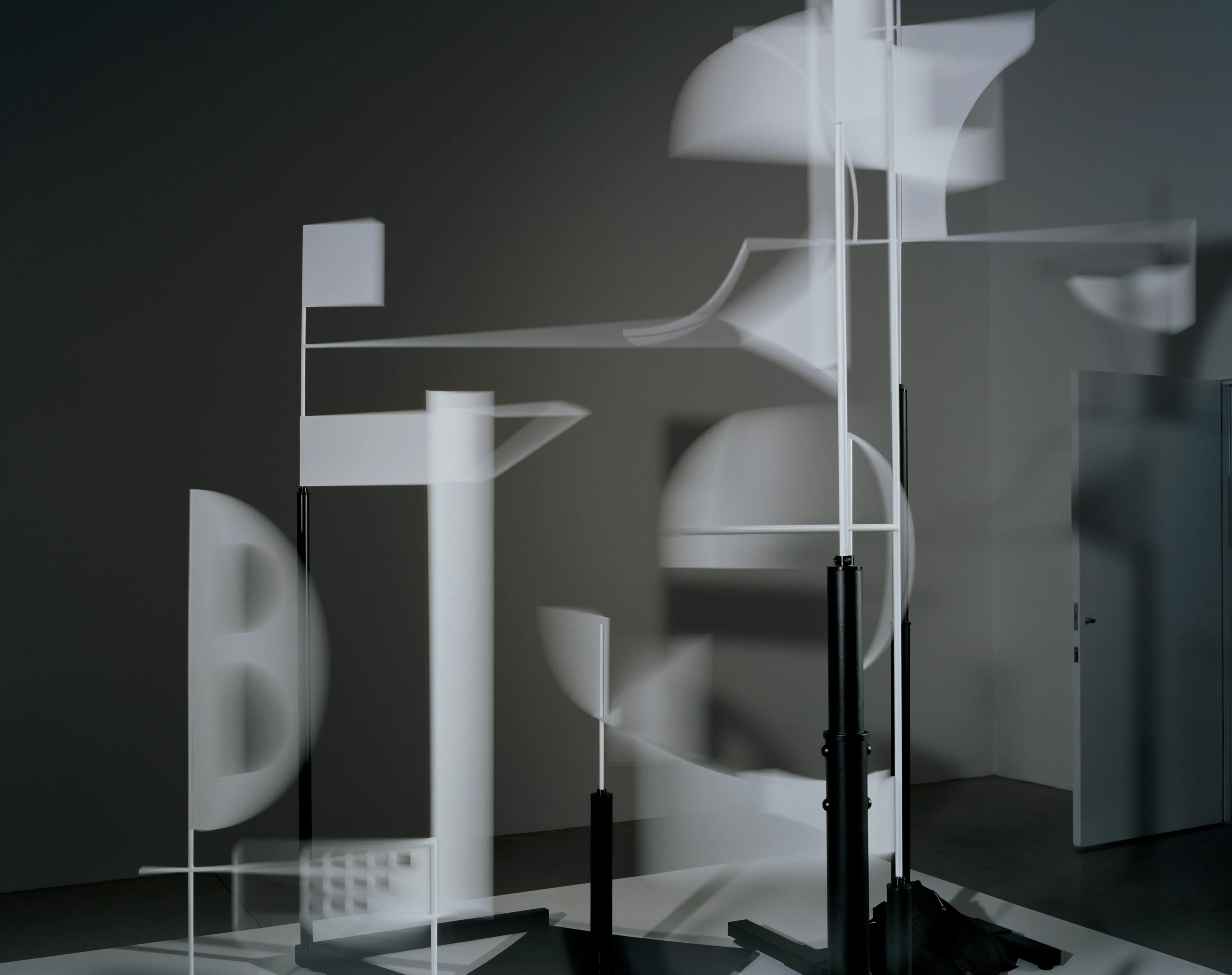
Bruno, electrical fans, metal flags, various stands, 2024
The 22nd letter of the alphabet to be completed so far, Letter B is a kinetic installation devised for film using wind to move seemingly random shaped metal flags that have the potential to create the letter form. Inspired by Bruno Munari’s useless machines, the installation makes reference to that work by having a hidden system of engineering to orchestrate an impossible ballet of metal flags, seemingly blown into perfect formation for a fleeting moment.
The secret is that I always start from engineering, not from art. Many people start with an idea that they want to realize at all costs. That’s not my method. If you start with the engineering, you know how far you can go. An industry has specific technologies and techniques, so you try and make something different with what you have to work with […]; this is the essence of creativity.
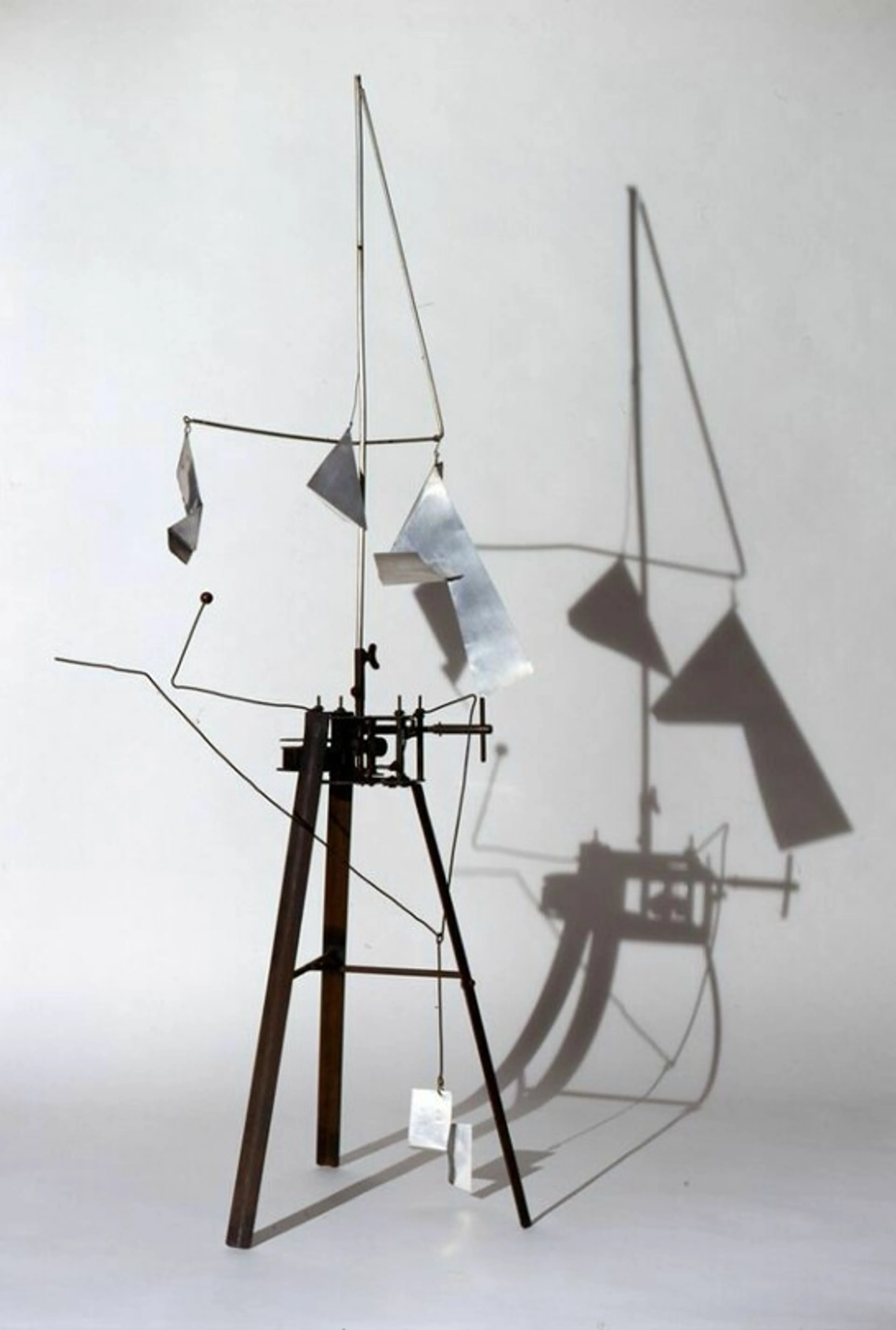
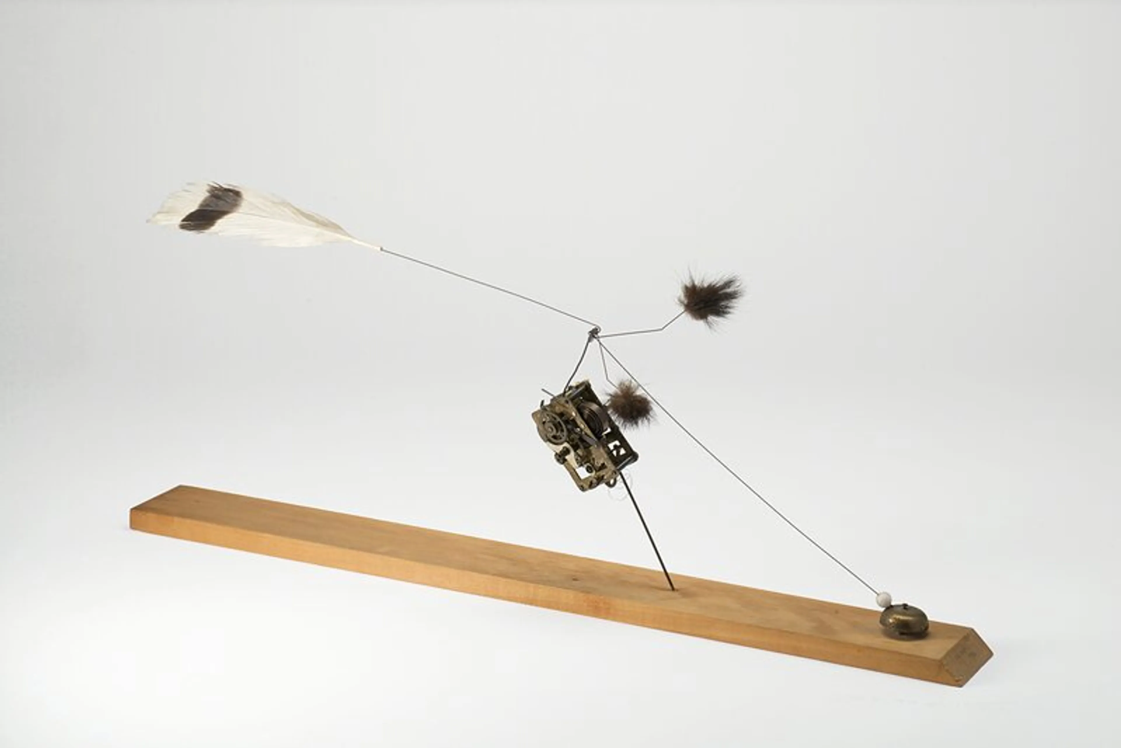
[1] Bruno Munari, Arrhythmic Carousel, 1953 [2] Bruno Munari, Macchina aritmica, 1986
LETTER C
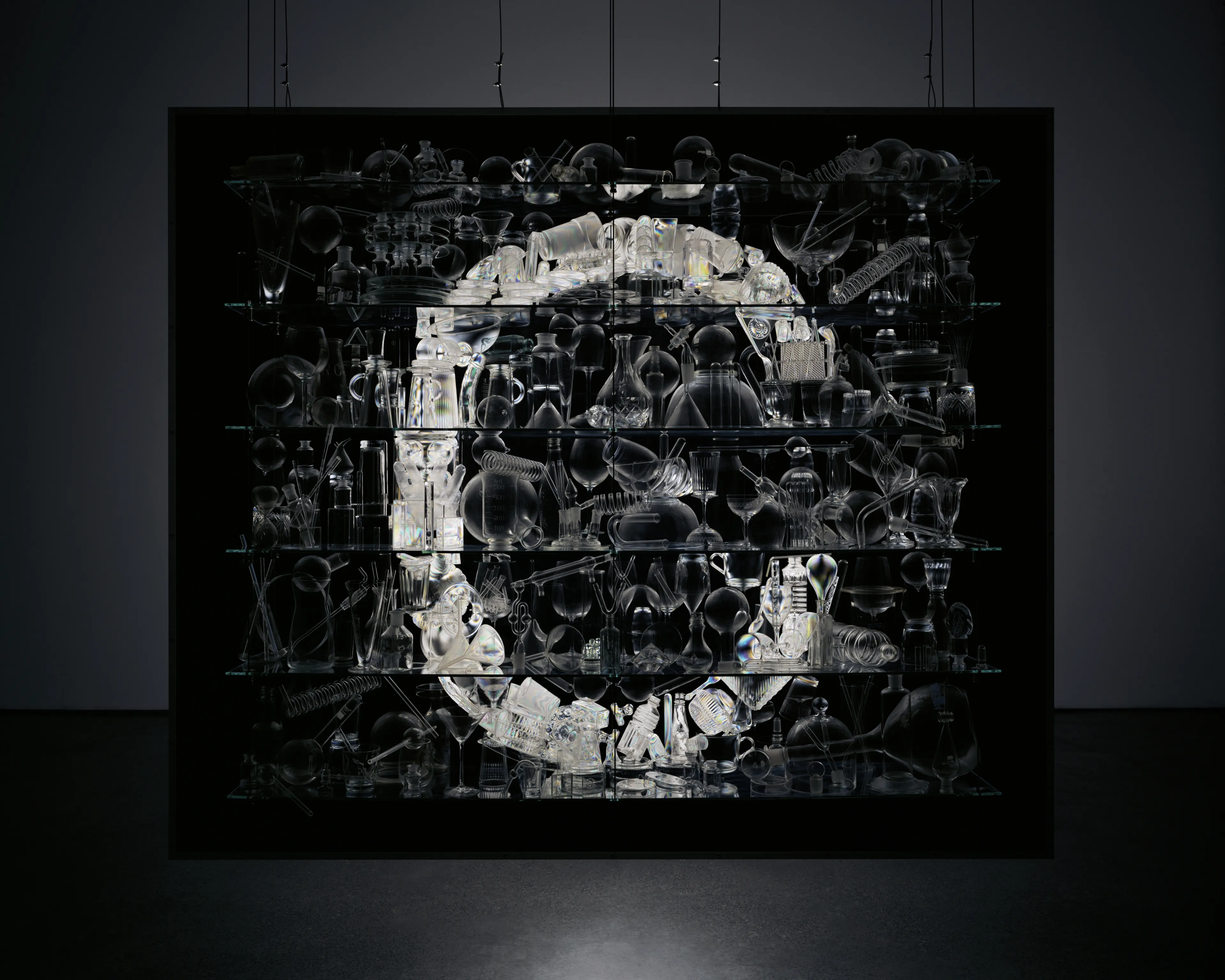
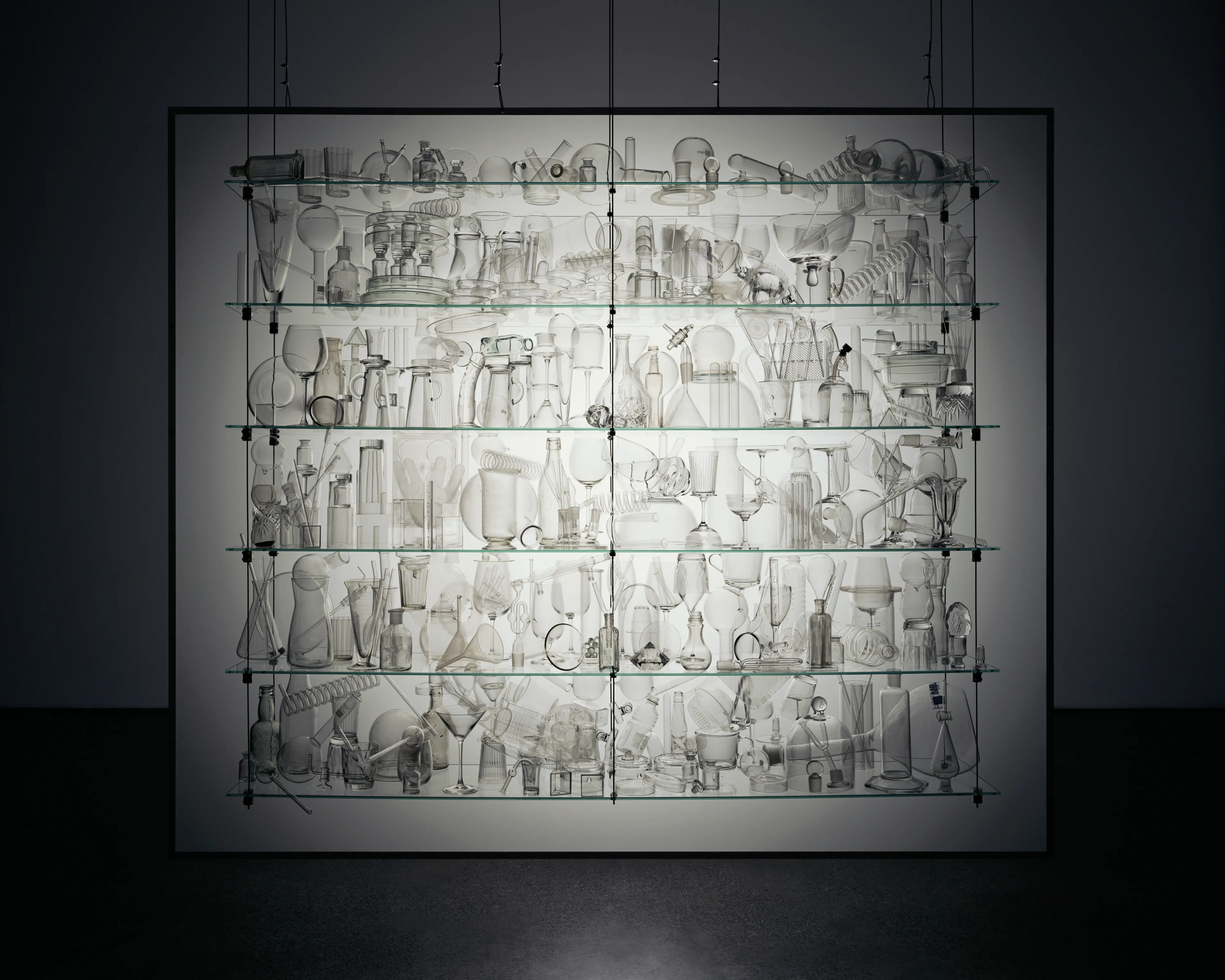
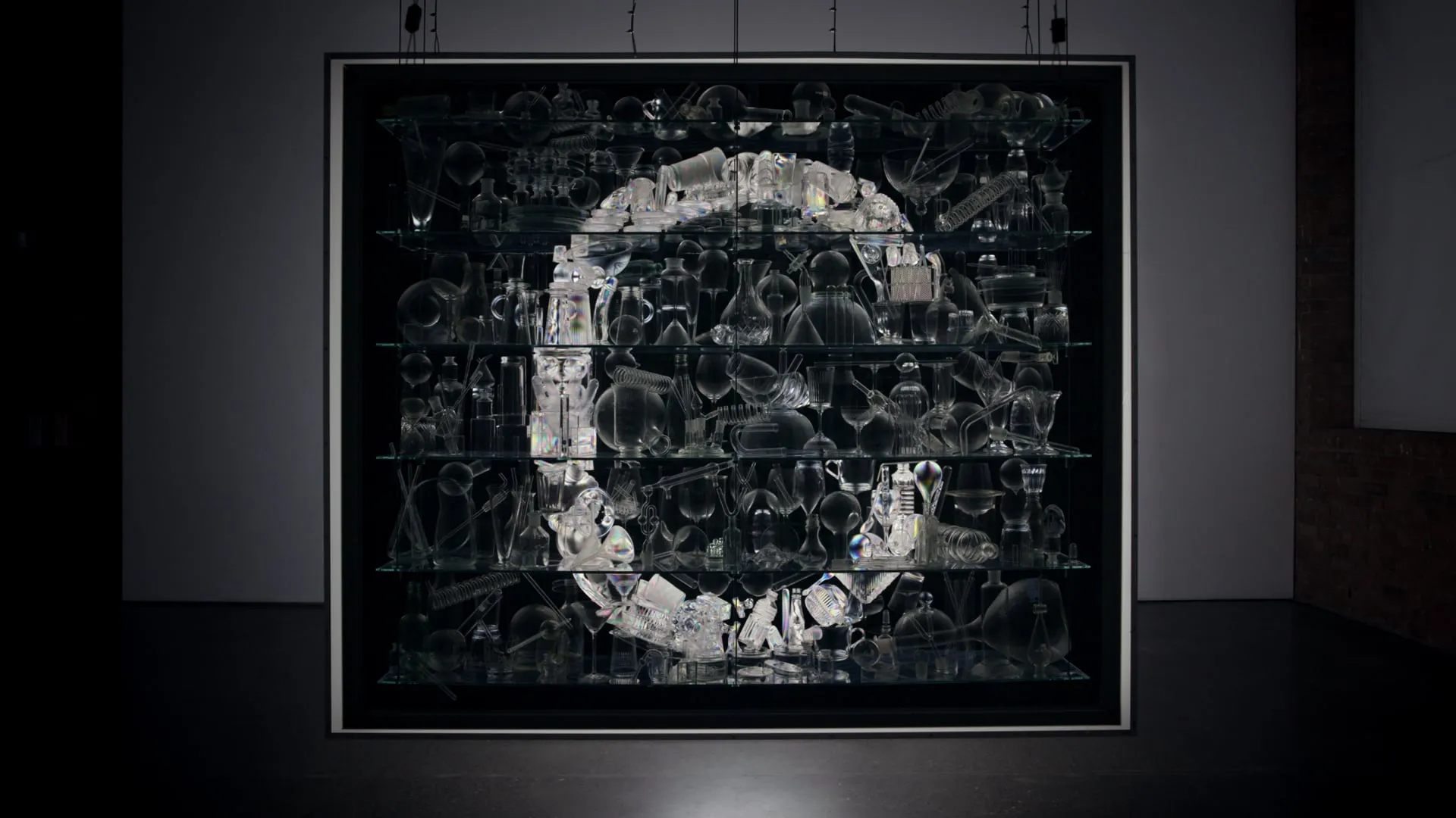
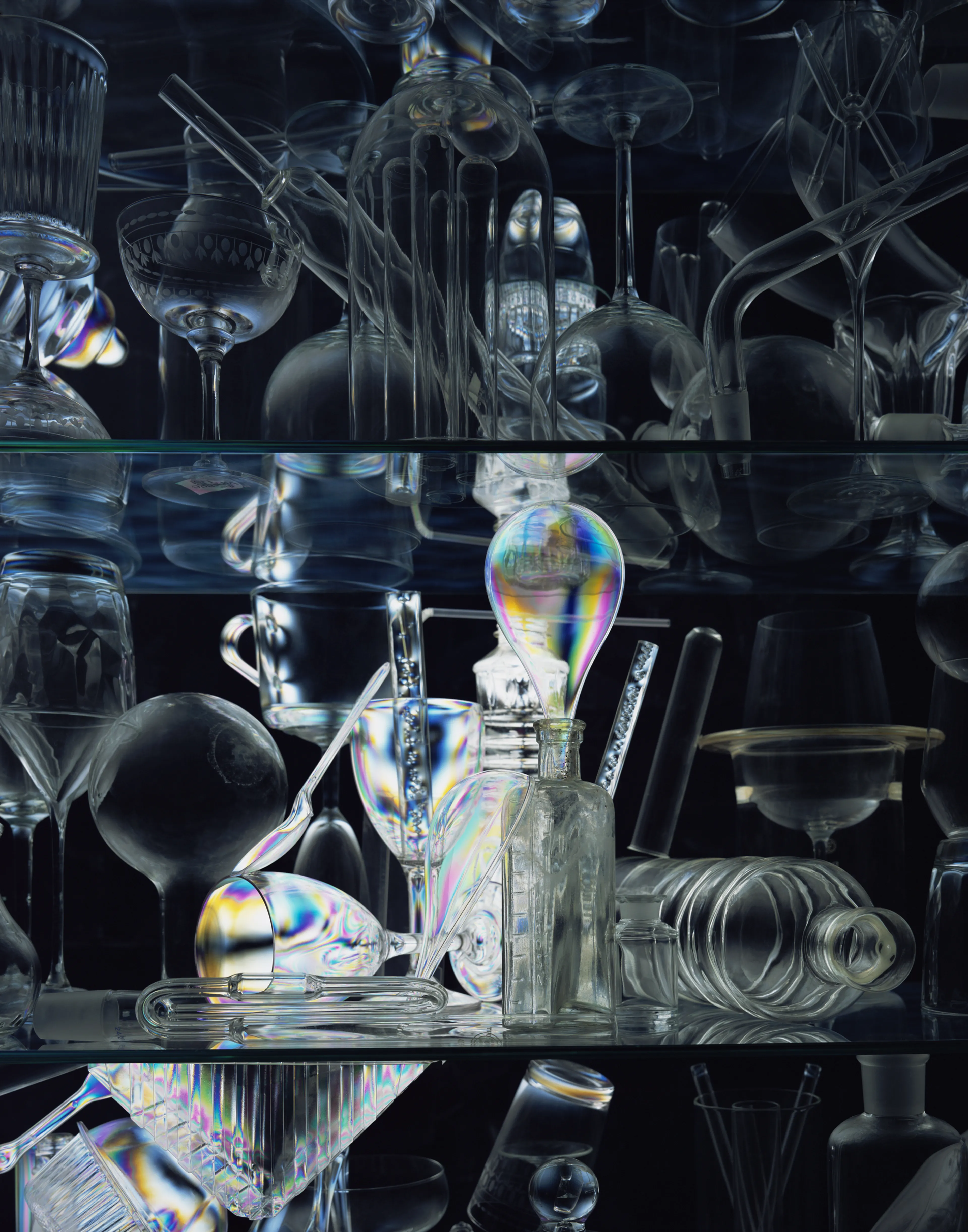
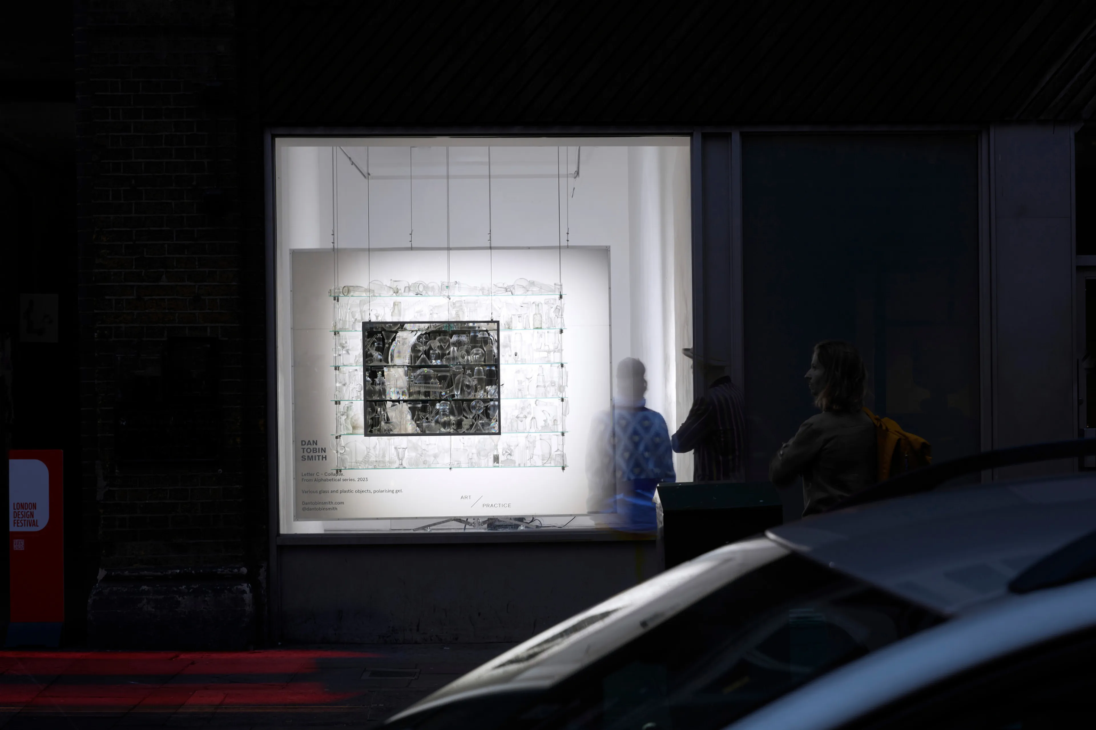
Crossed, Various glass and plastic objects, polarising gel, 2023
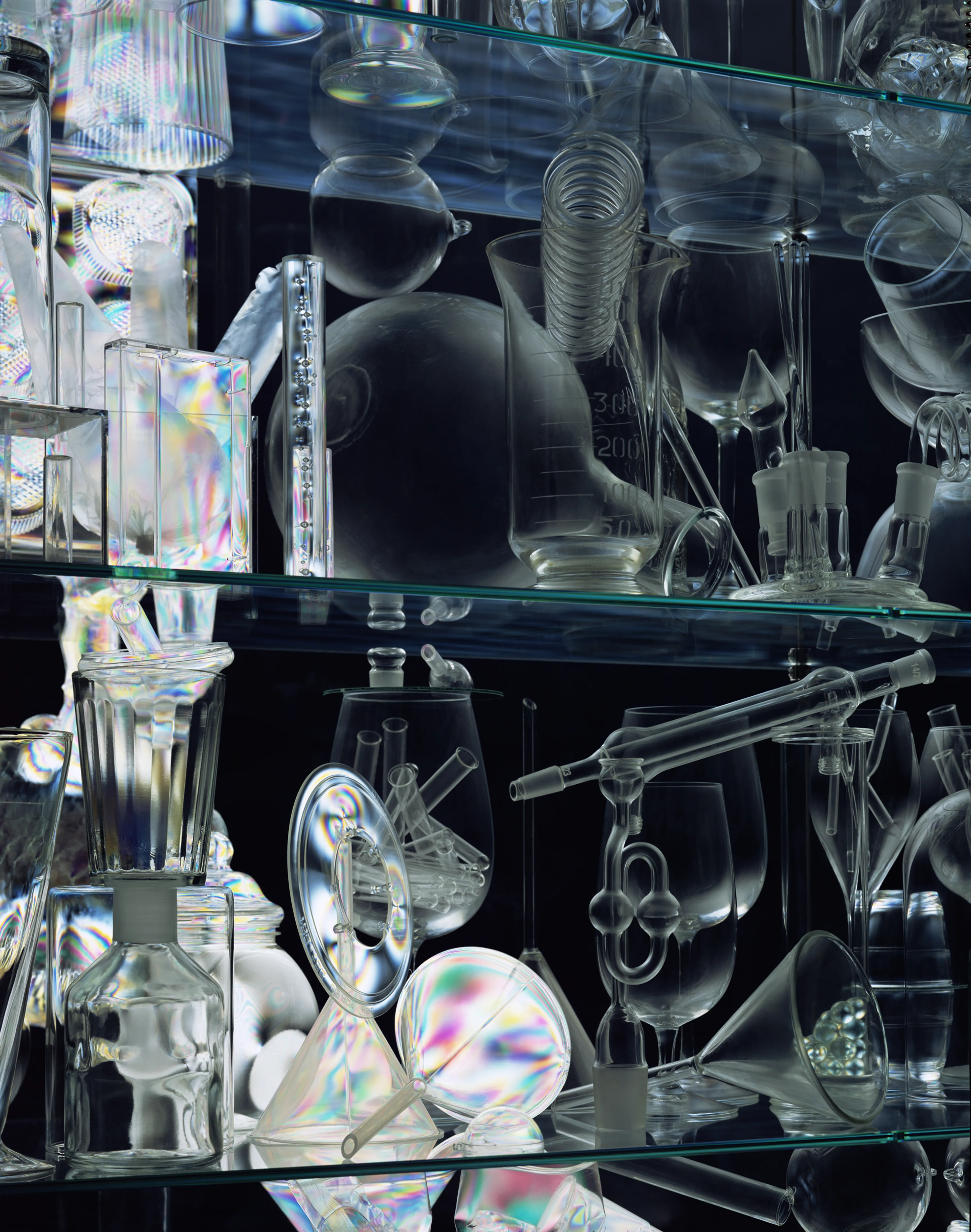
Inspired by the Bell inequality test, Dirac’s three polarisers experiment and the hidden nature of materials and perception, the sculpture exploits the strange phenomenon of polarisation and material. The typographical form, concealed in plain sight, is then revealed by the materials’ previously unseen characteristics.
The title refers to Crossed Polarisation, the effect of blocking all light when two polarisers are held 90 degrees to one another, the plastic material, appearing the same as the glass under normal conditions, then shifts the polarisation again, making it distinct from the glass.
The installation was rebuilt for London Design week, the effect taking place as you passed the window of the Art Practice Gallery, Shoreditch, September 2024
Classical physics could explain the world but got some of the details wrong; quantum physics gets all the details right but can’t explain the world.
Letter D
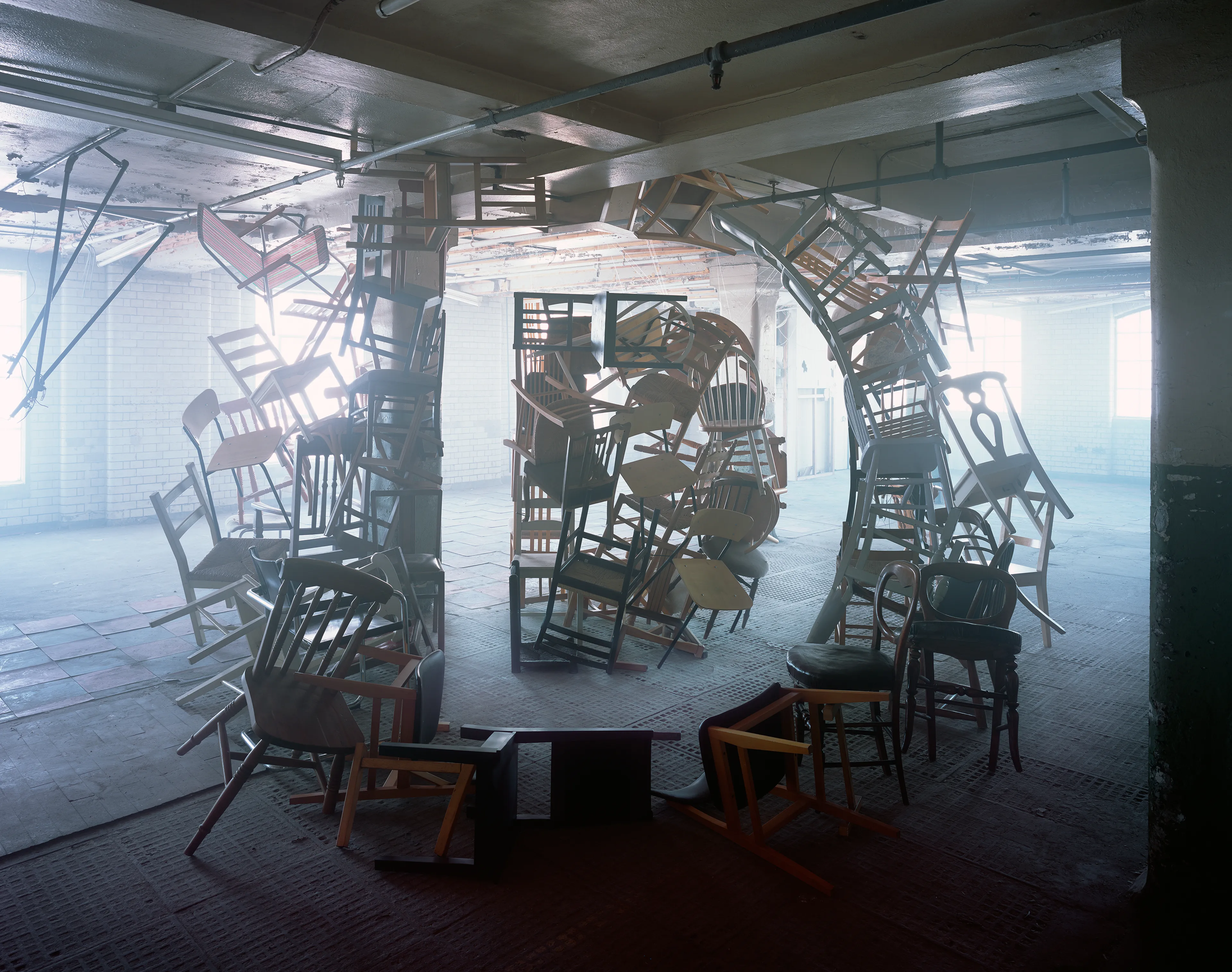
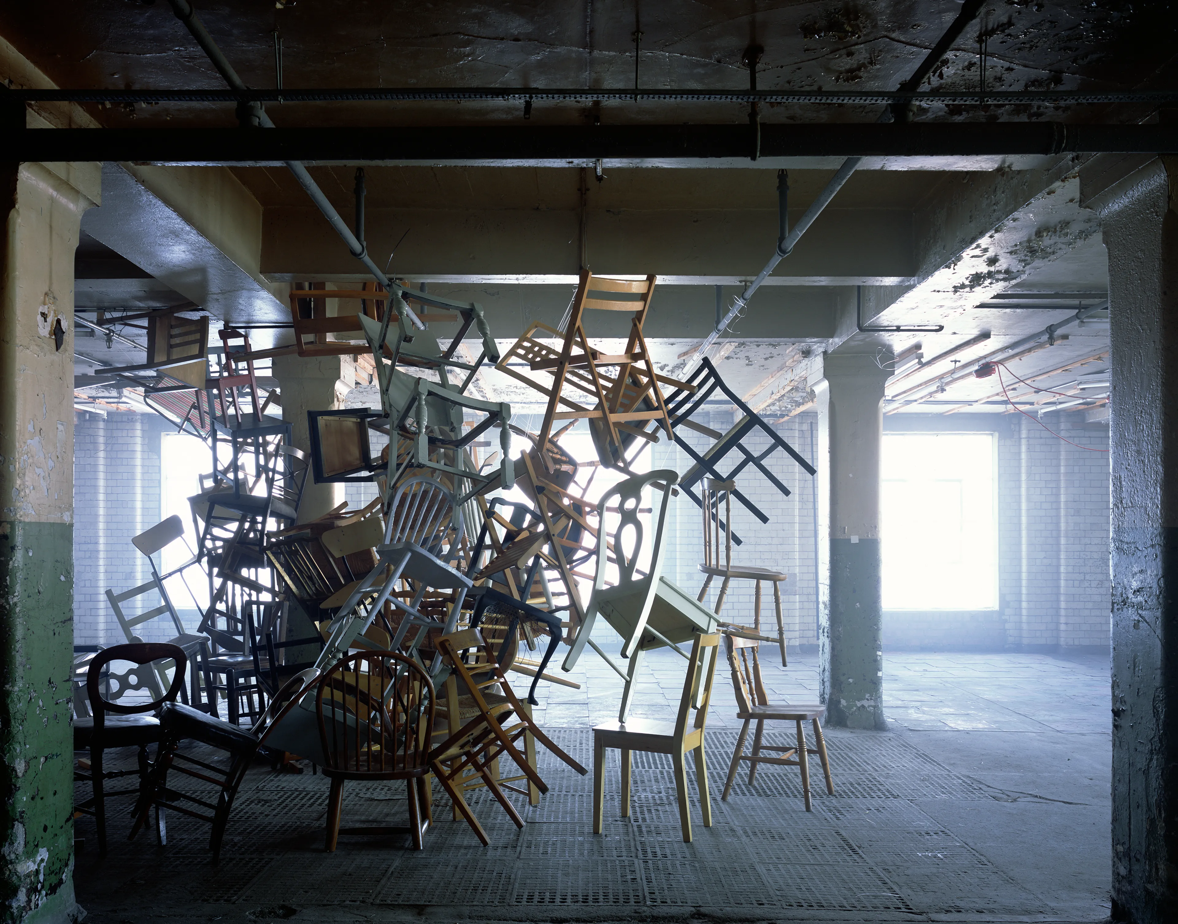
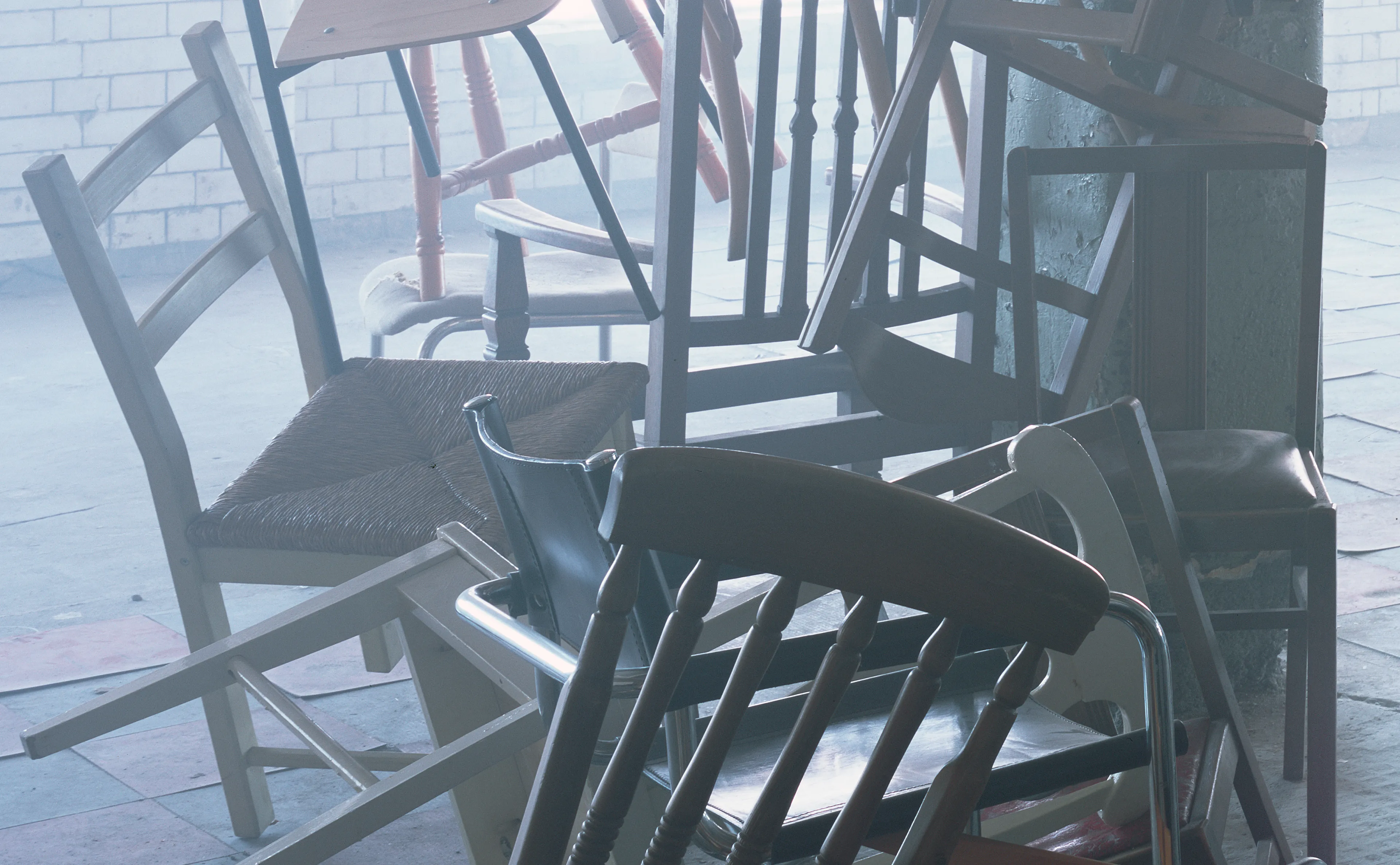
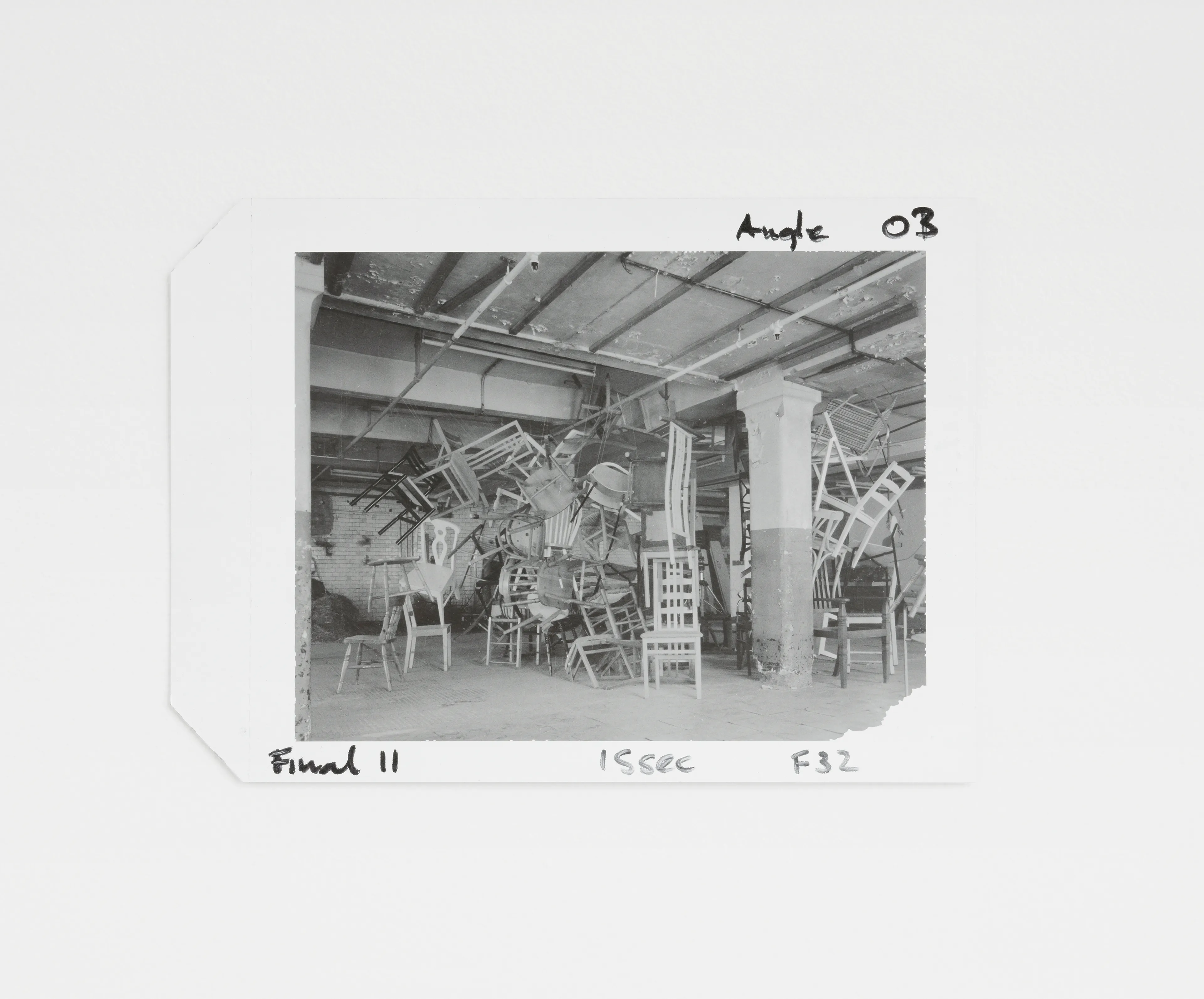
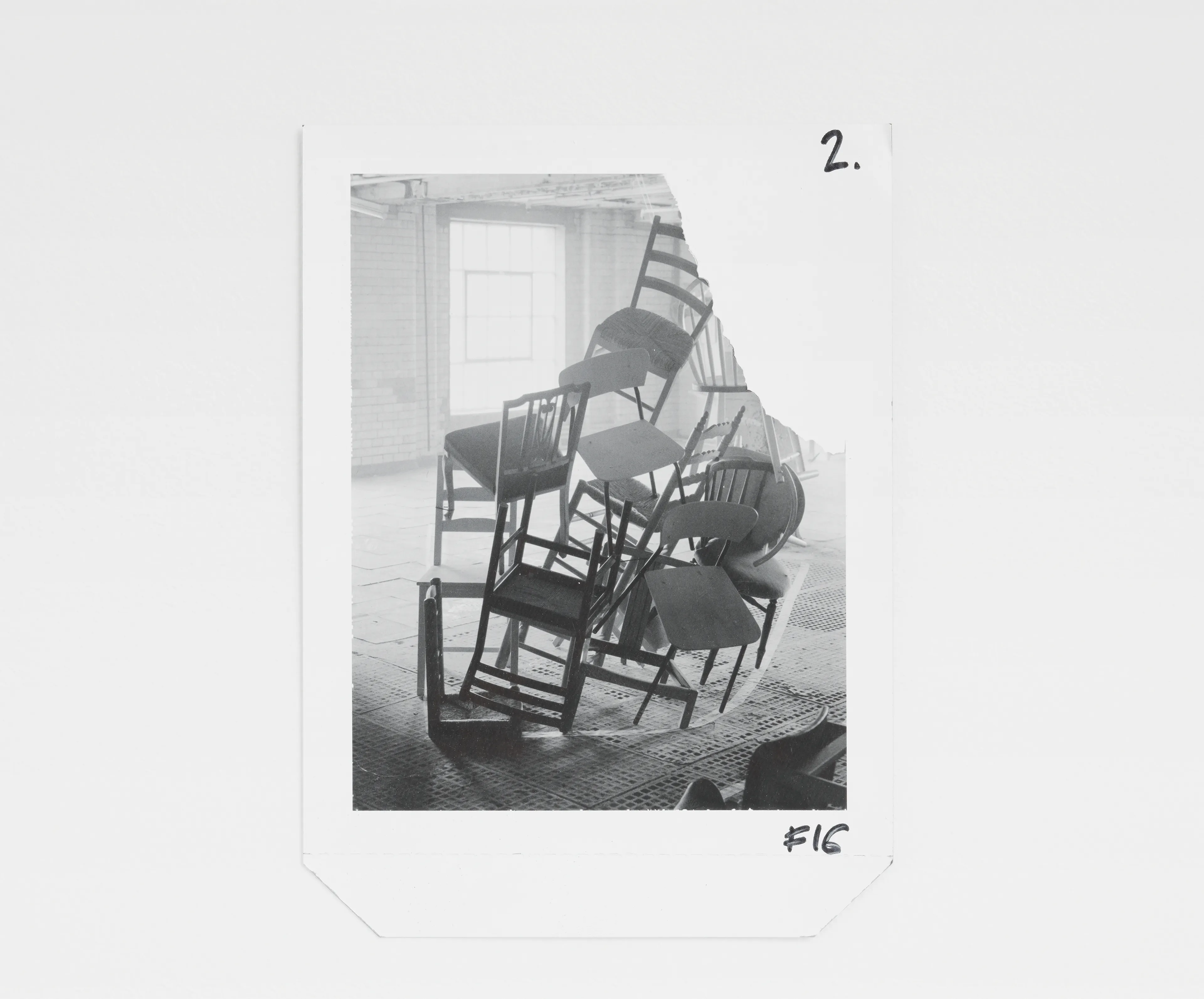
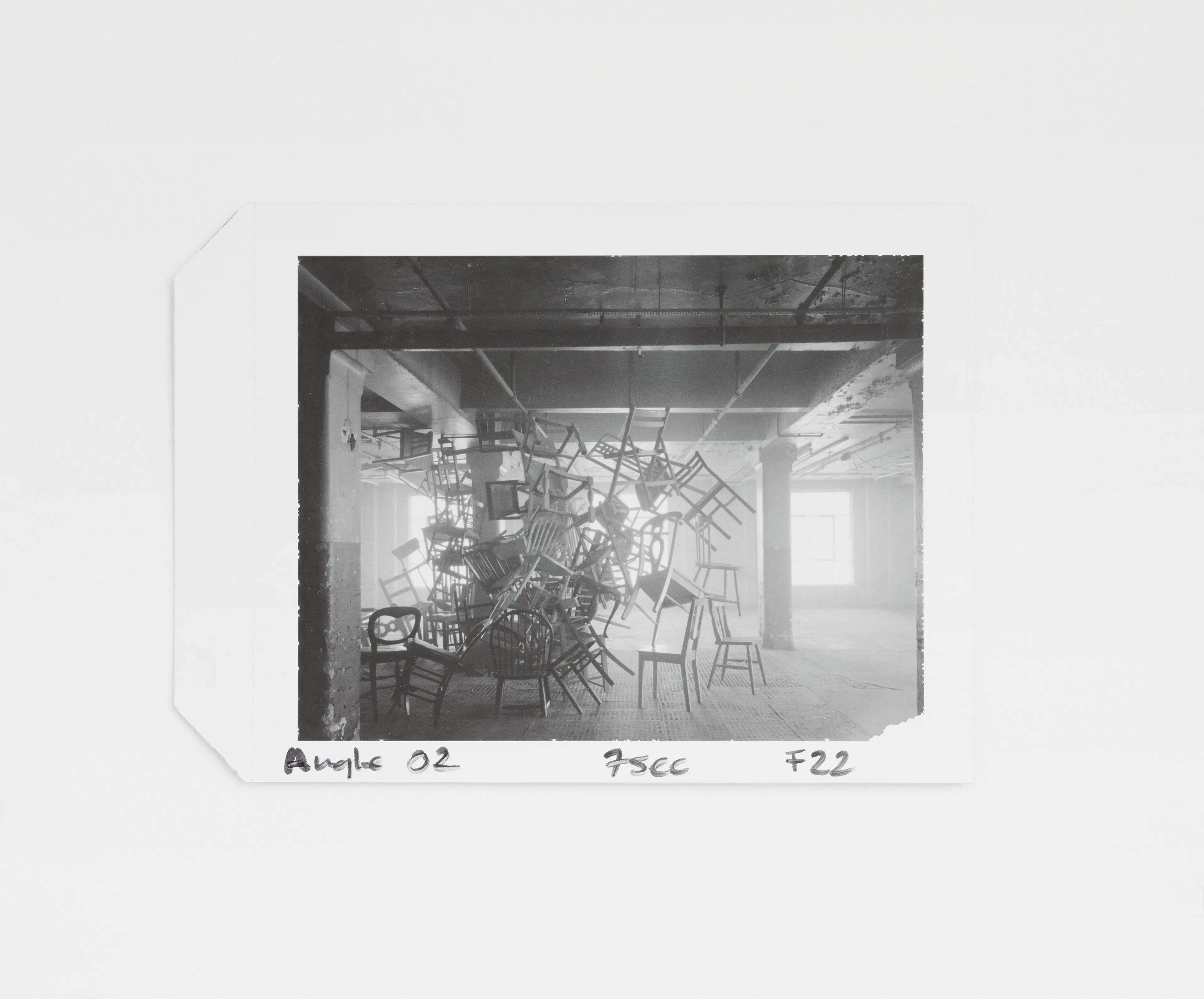
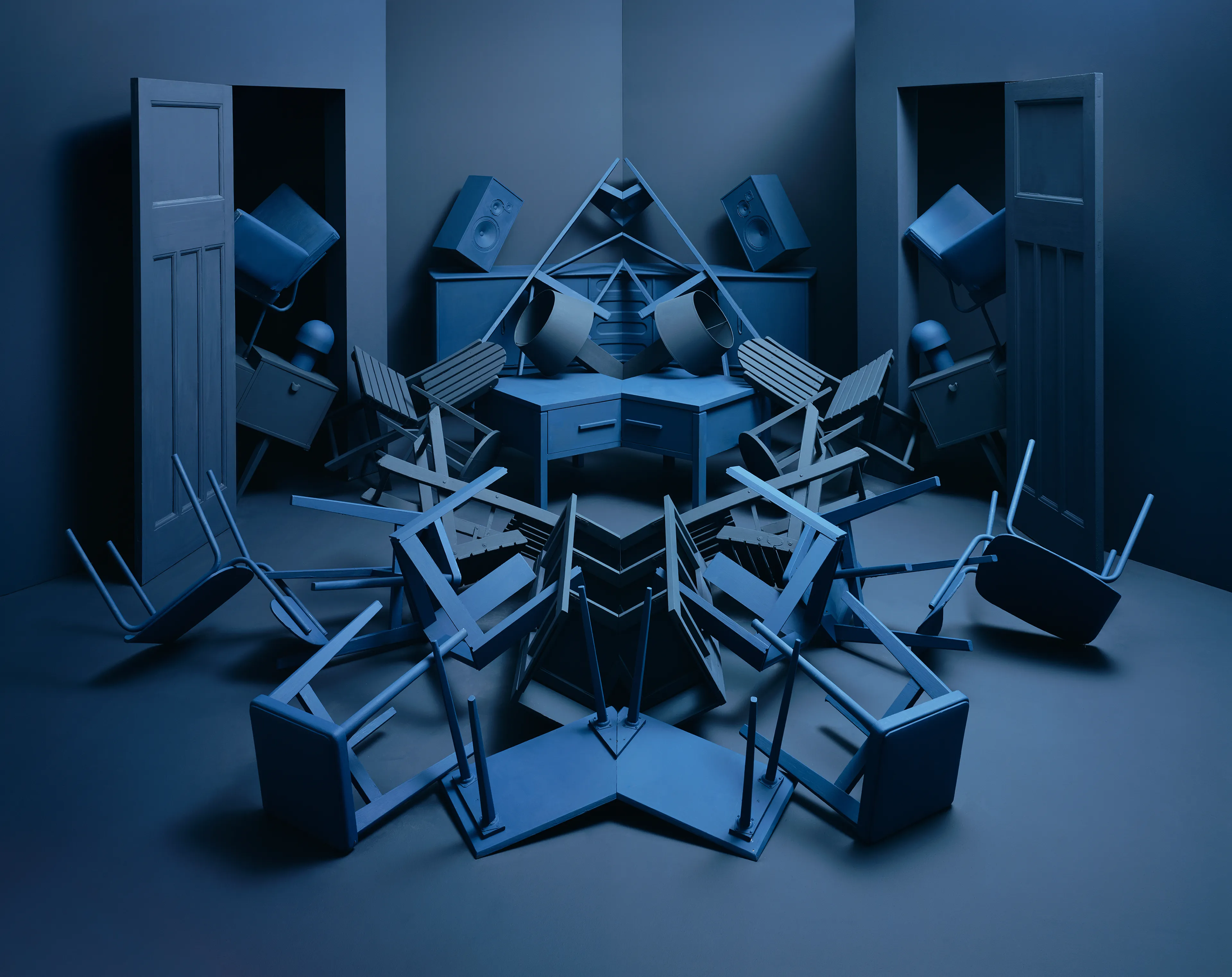
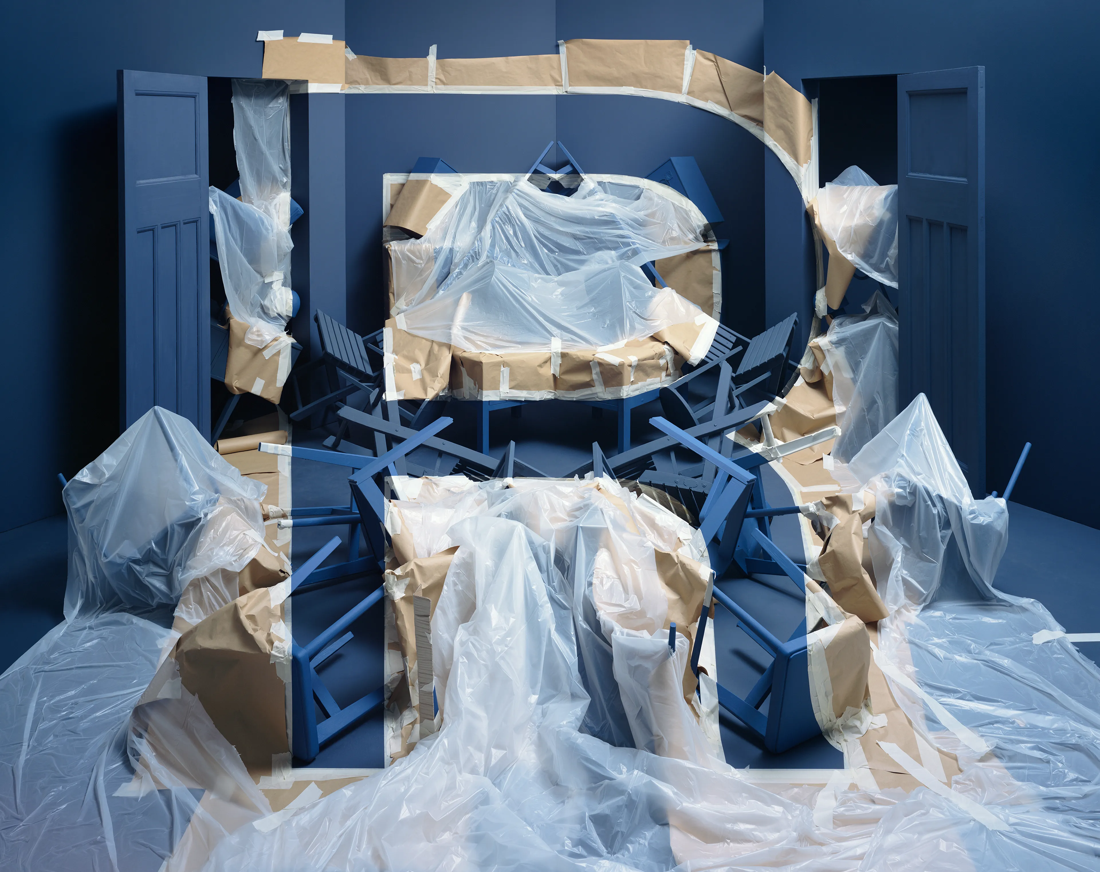
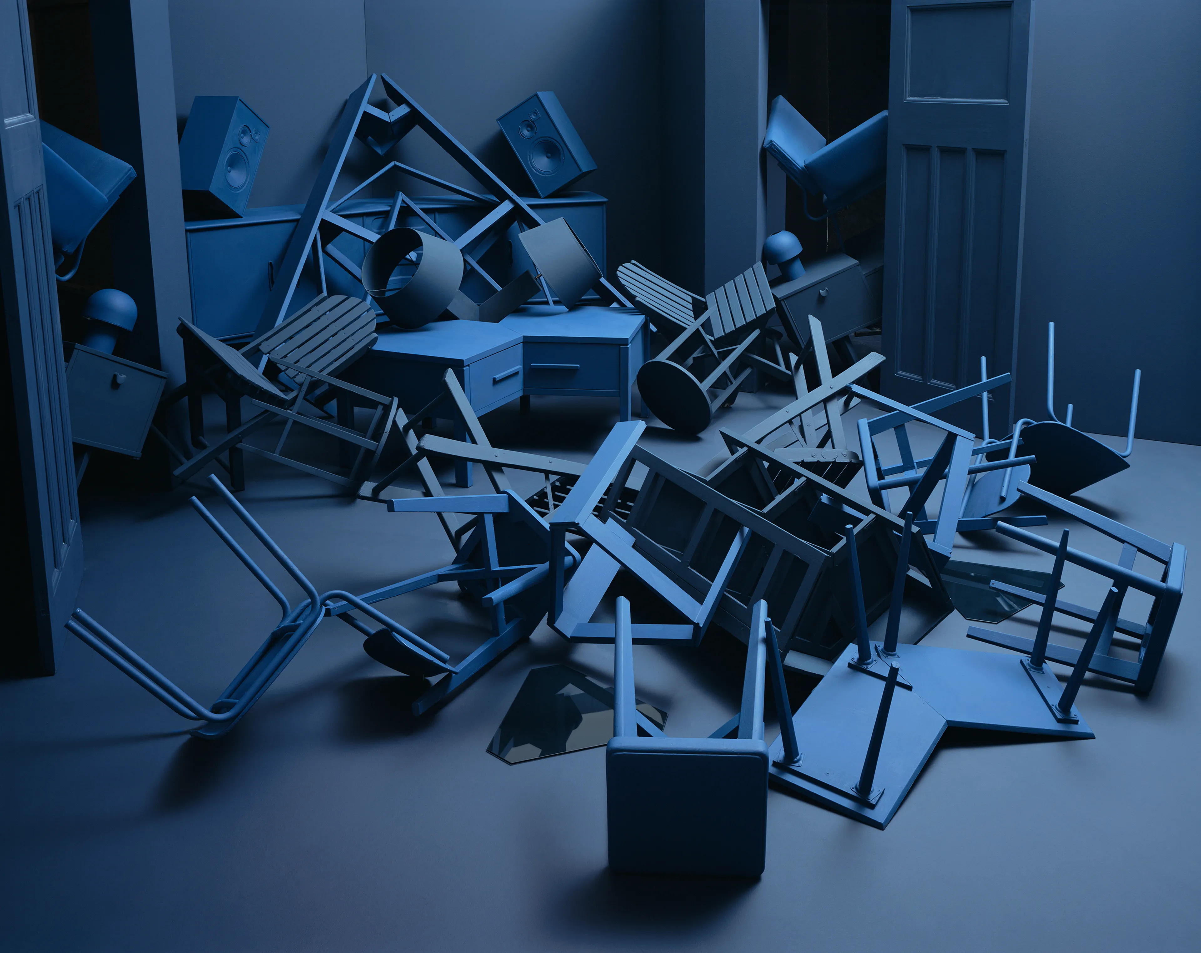
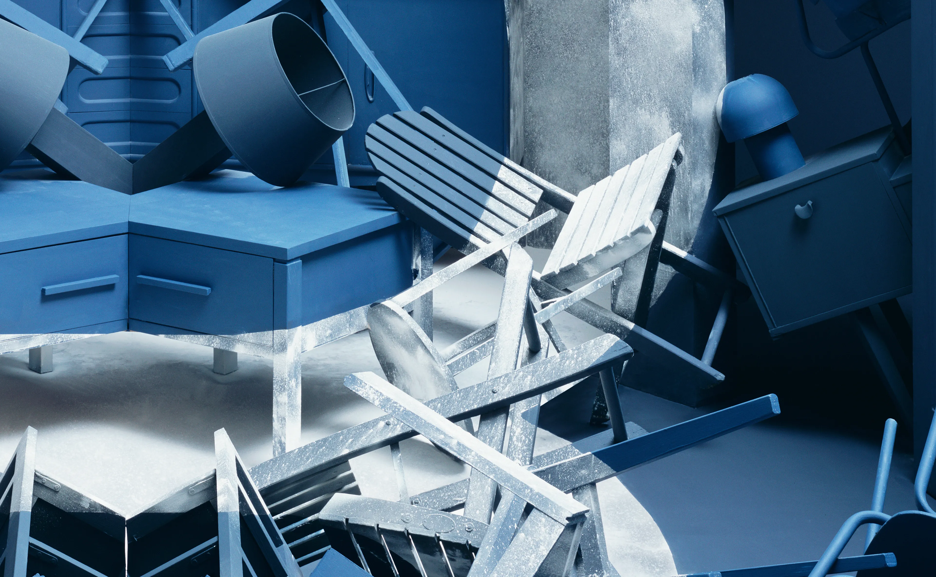
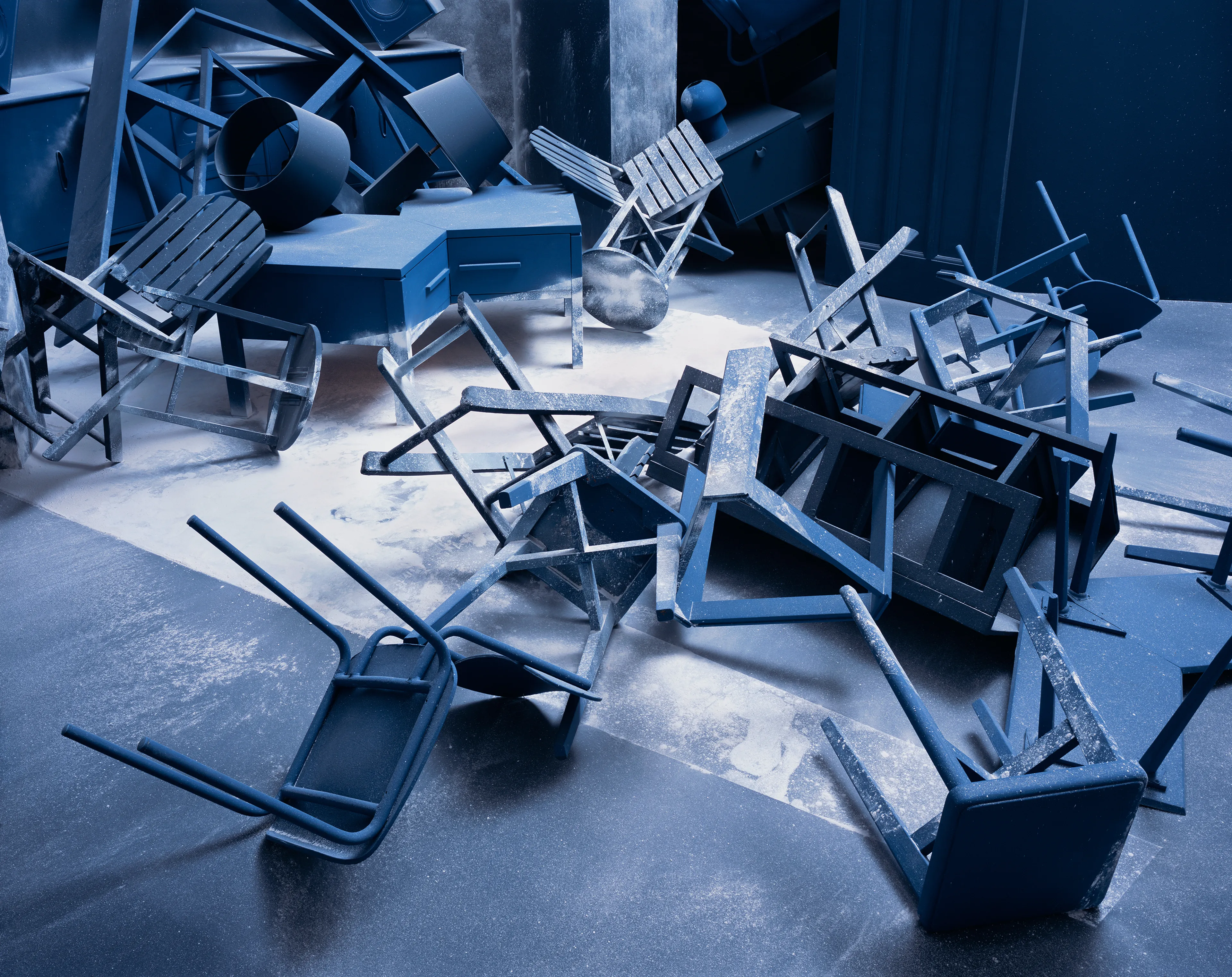
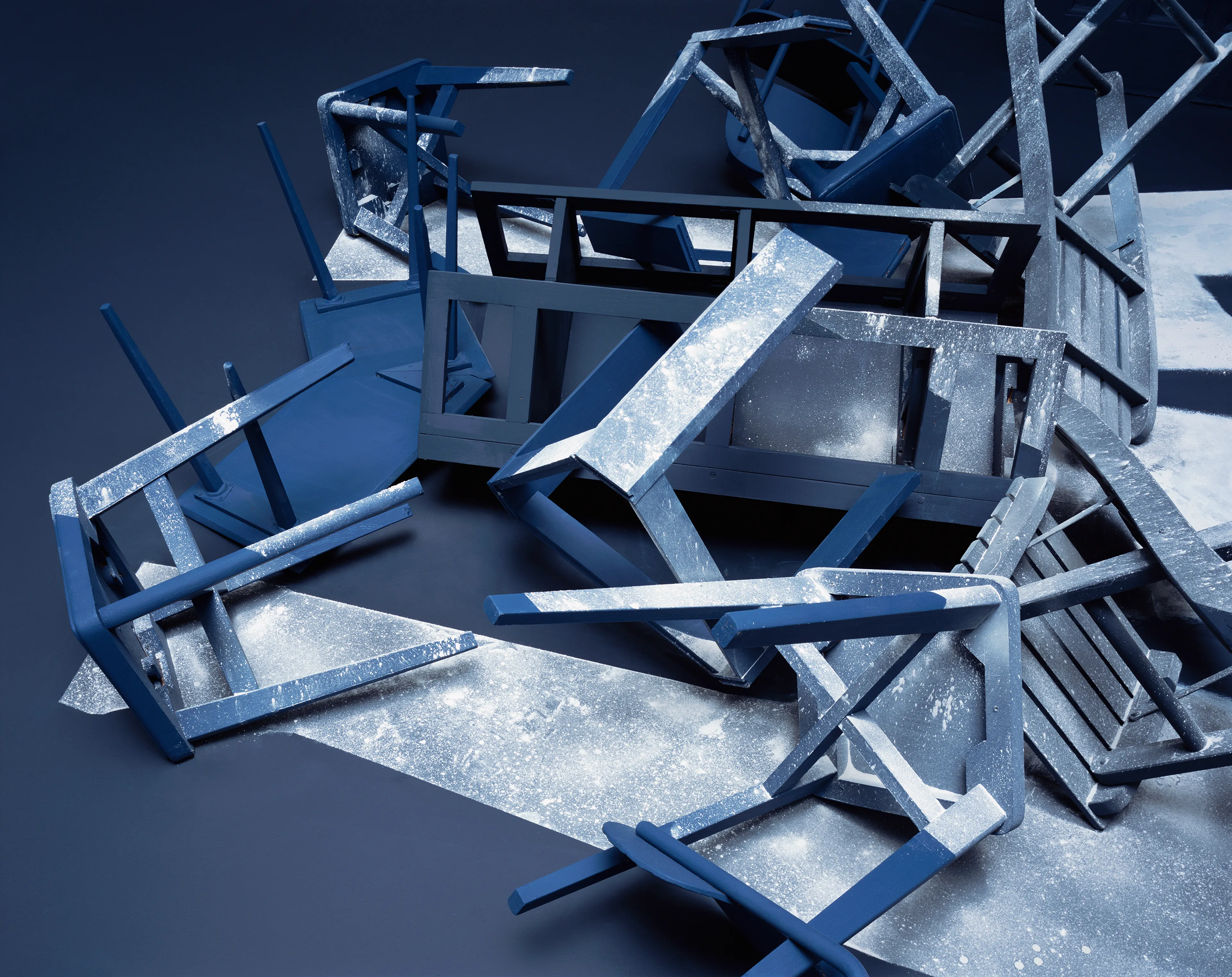
Design, Various Chairs, 2012
Made with frequent collaborator, set designer Nicola Yeoman. Constructed in an empty warehouse in Bermondsey in 2012. The two warehouse adjoined Nicola’s studio and was only accessible through a hidden doorway that attached the two buildings.
Chairs were used because they are ubiquitous and have a sculptural quality when used in repetition. Easily discarded even though still functional and very useful, they represent forced obsolescence culture, where perfectly good objects are replaced because of fashion or design trends. The warehouse, forgotten and decaying, provides the backdrop.
The title of ‘Design’ relates to the concept of Designed or Planned Obsolescence, where objects are built to be replaced, either through the intended structural failure, or by ever outdated trends and the relentless pursuit of novelty, exploited commercially for increased profit.
Brooks Stevens, an industrial designer, invented the term “planned obsolescence” in 1954, defining it as instilling in the buyer “the desire to own something a little newer, a little better, a little sooner than is necessary” although blamed for the increasing throwaway culture, some believe it was a nuanced comment on the ephemeral and creative nature of a designers work, where the need to create on an individual level, results in undoubtedly increasing commercial output. The Onion published article in 2014 “Report Confirms No Need To Make New Chairs For Time Being”.
Letter E
Entropy, various objects, 2007
Having long been interested in the Second Law of Thermodynamics and the concept of entropy, the project describes this concept visually. By using anamorphosis to create order from disorder, the images talk to the human condition of trying to control the increasing disorder in the world by classifying and organising.
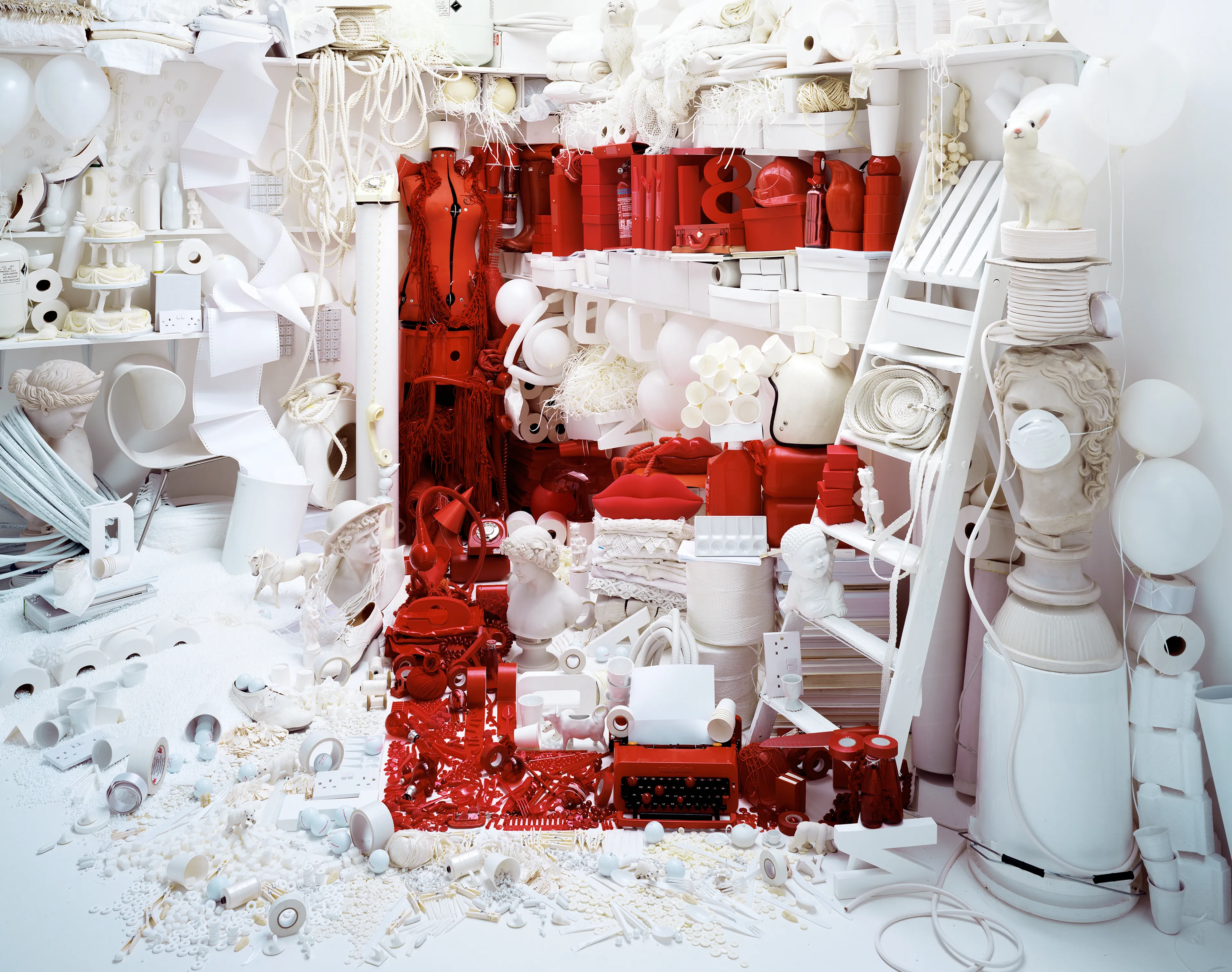
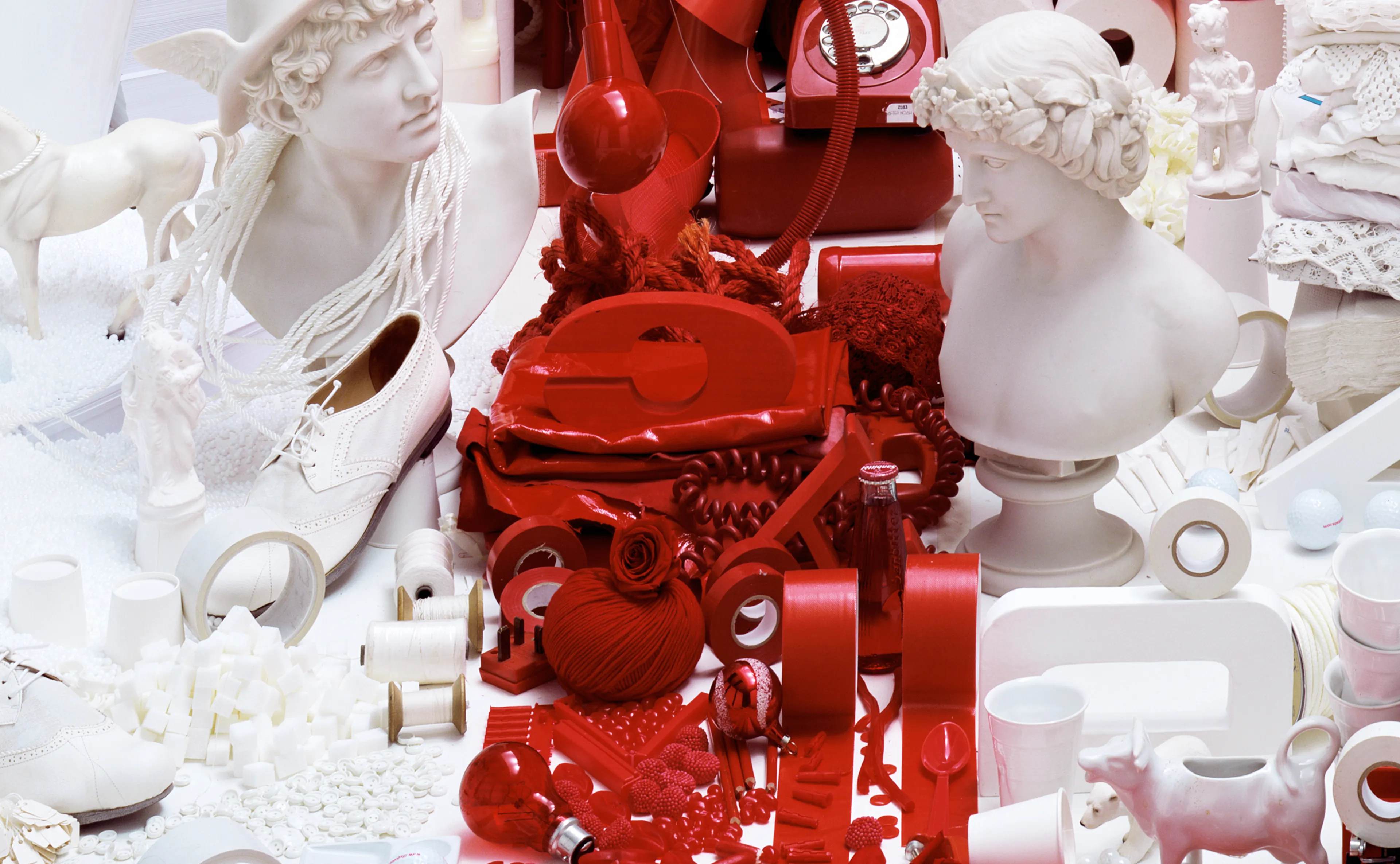
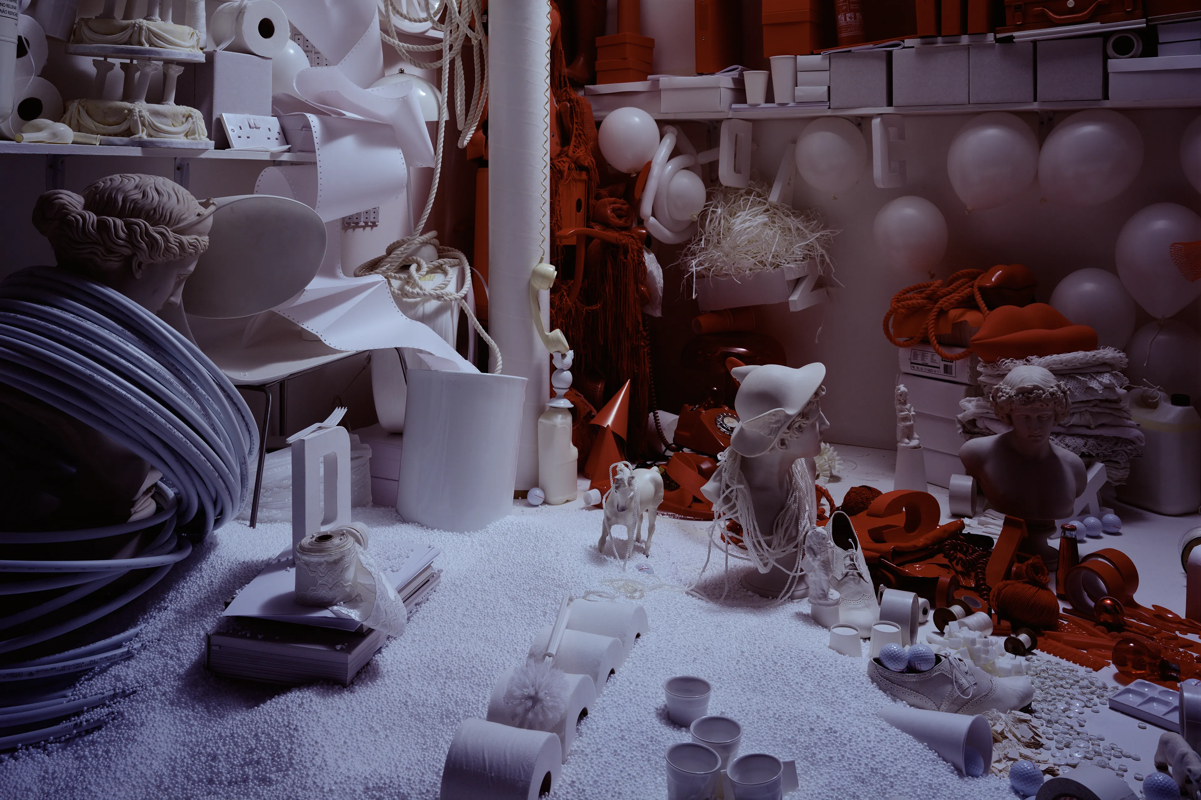
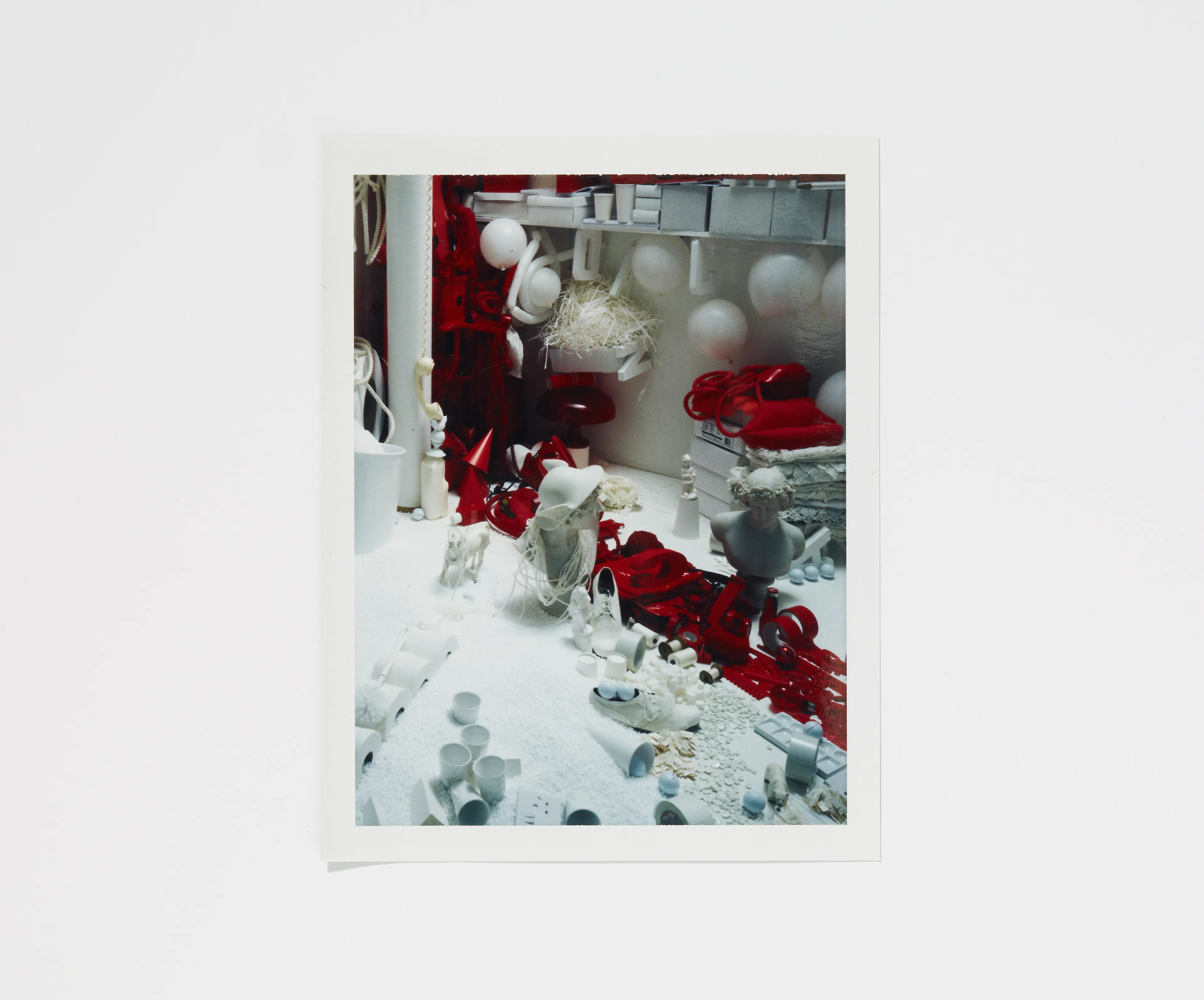
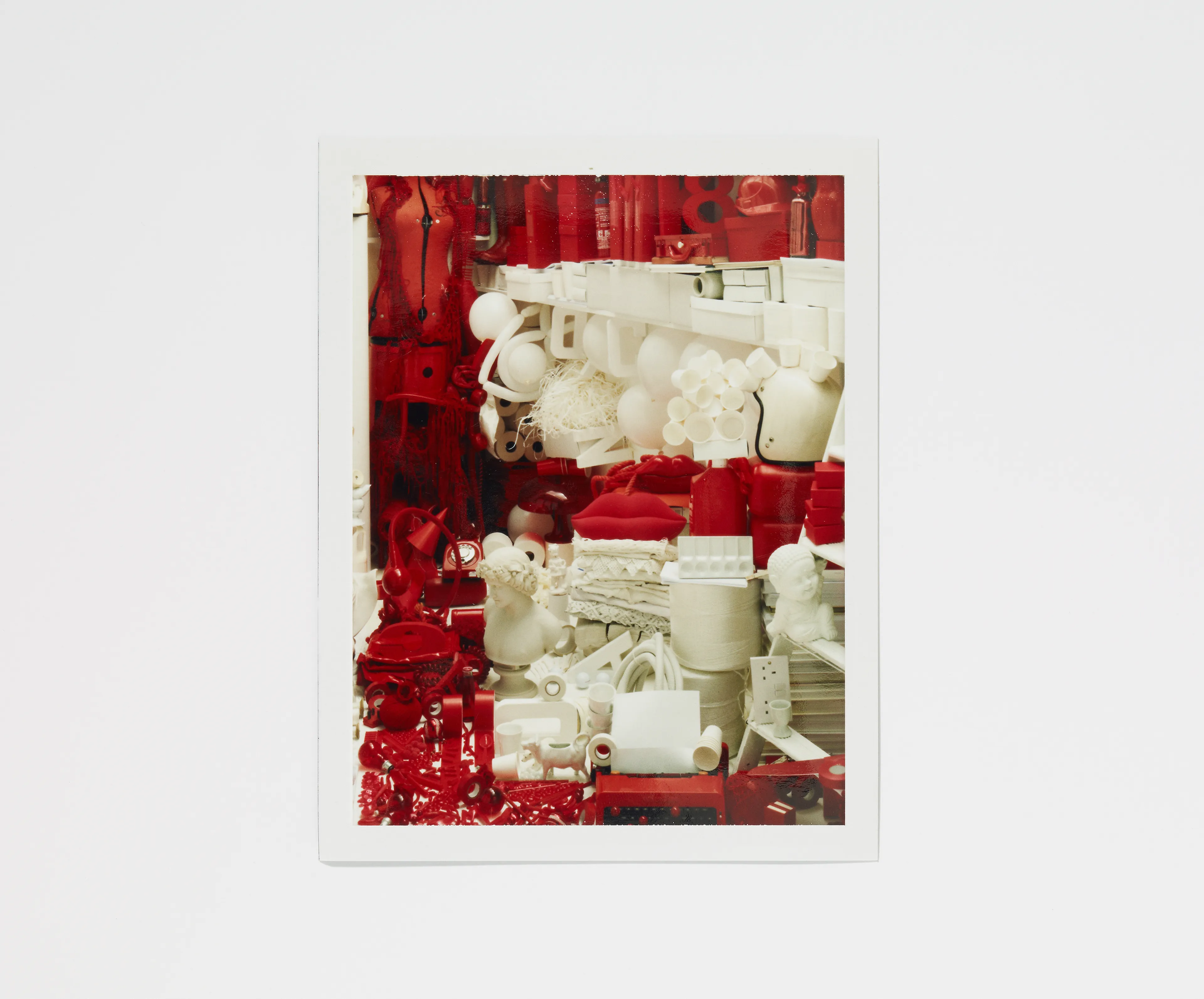
The letter E Image then went on to inform the design of Jay-Z’s Blueprint 3 album cover, commissioned in 2008 by Roc Nation. Both projects made with Set Designer Nicola Yeoman. The Blueprint 3 set was rebuilt for The Book of Hov, a tribute to Jay-Z, exhibited in Brooklyn Public Library in 2023.
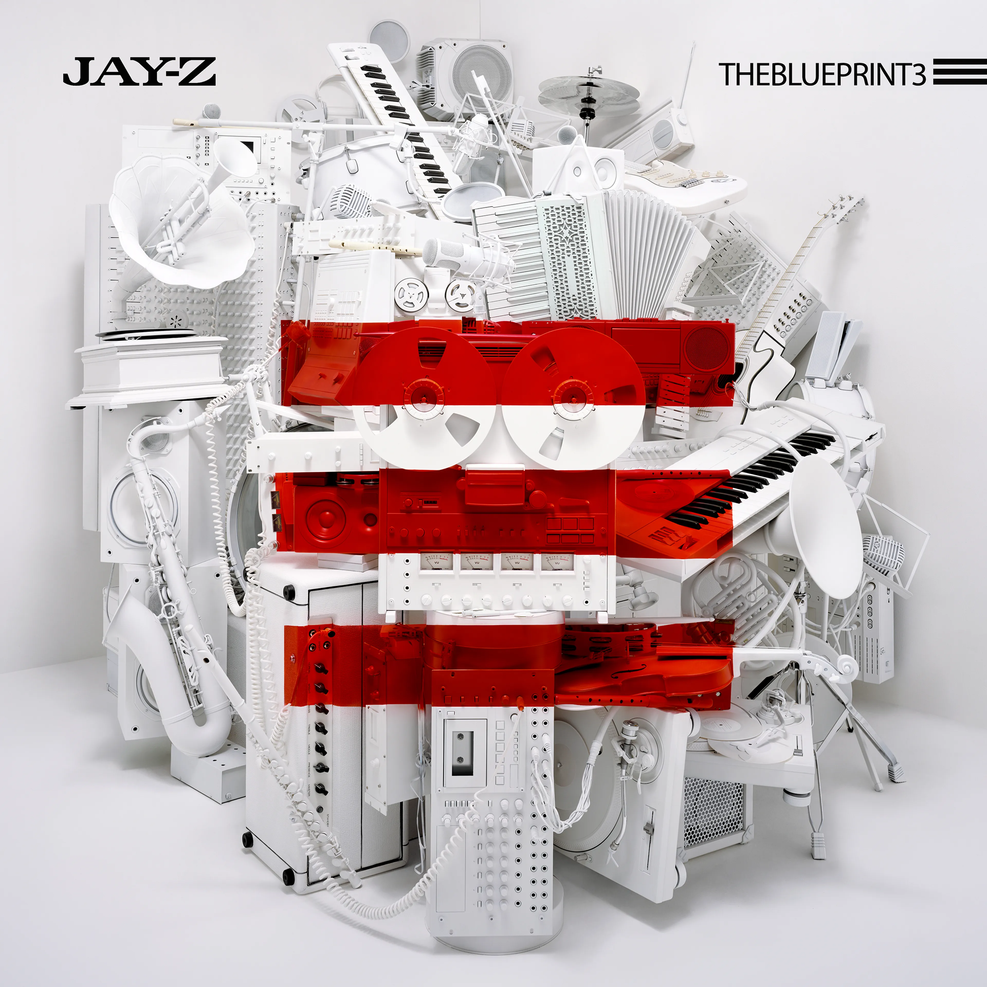
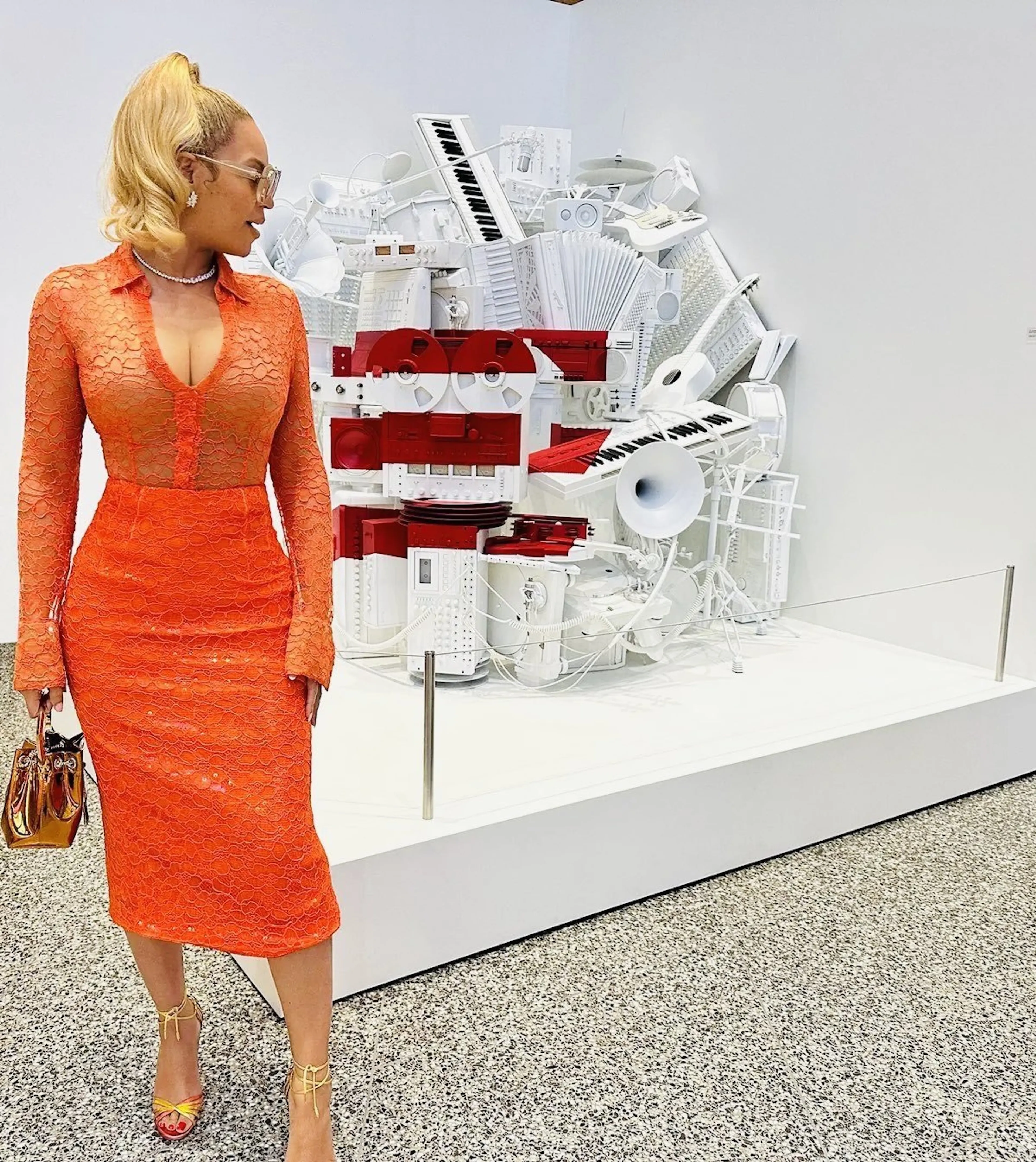
[1] Jay-Z, The Blueprint 3 album cover [2] Beyonce attends The Book of Hov exhibition at the Brooklyn Public Library, 2023
Letter F
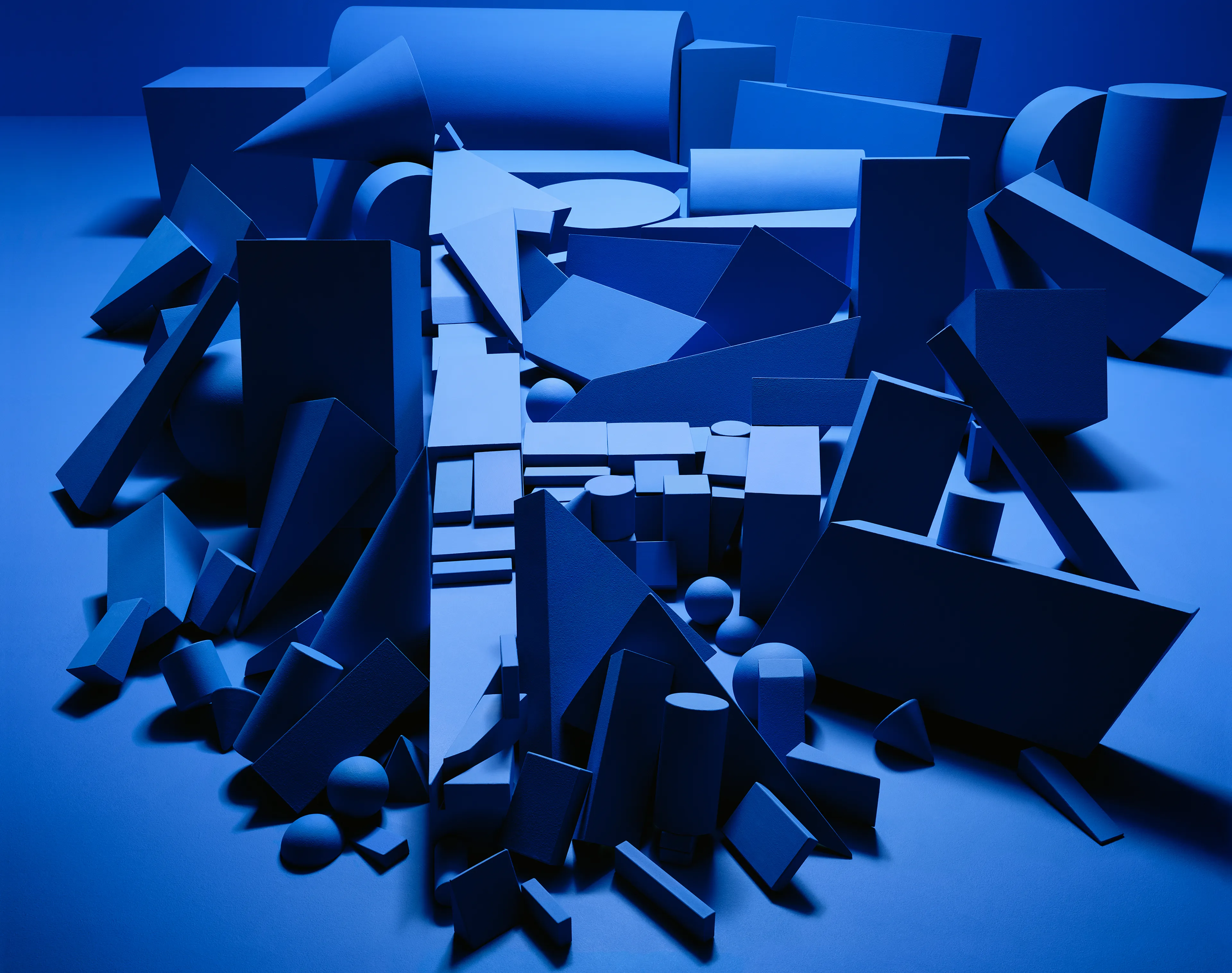
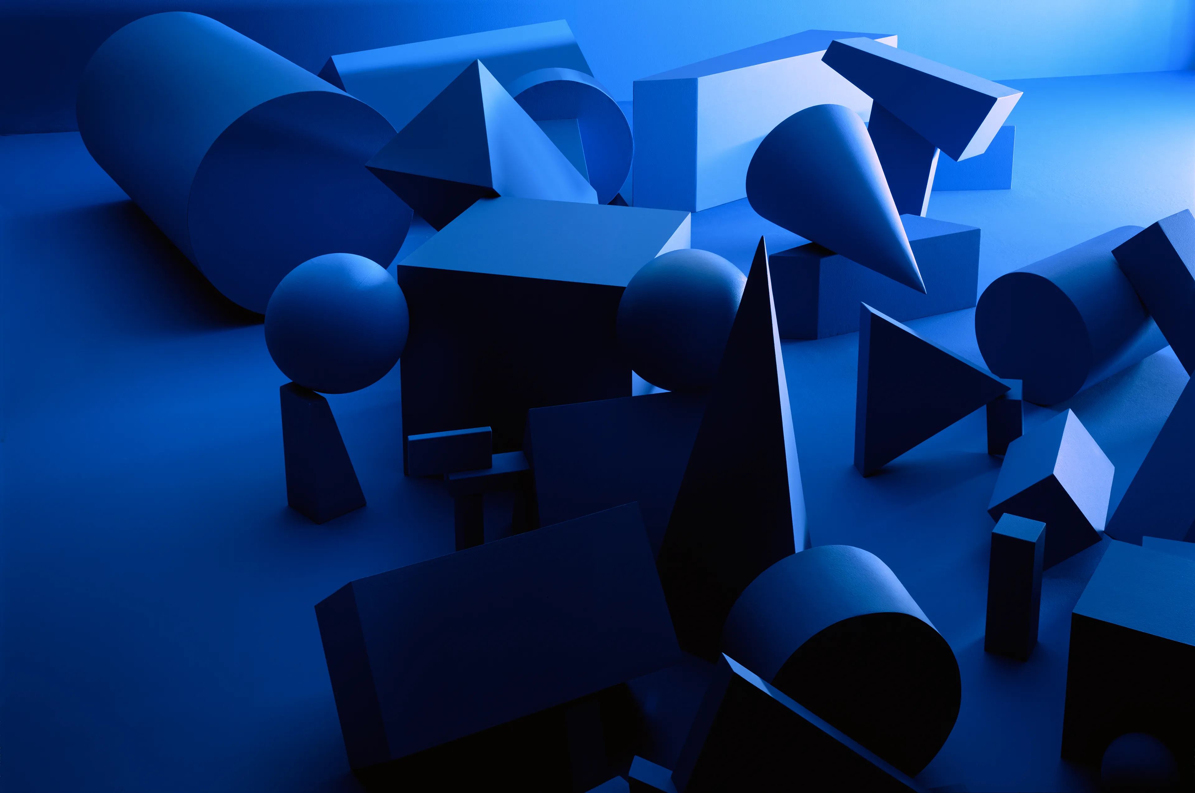
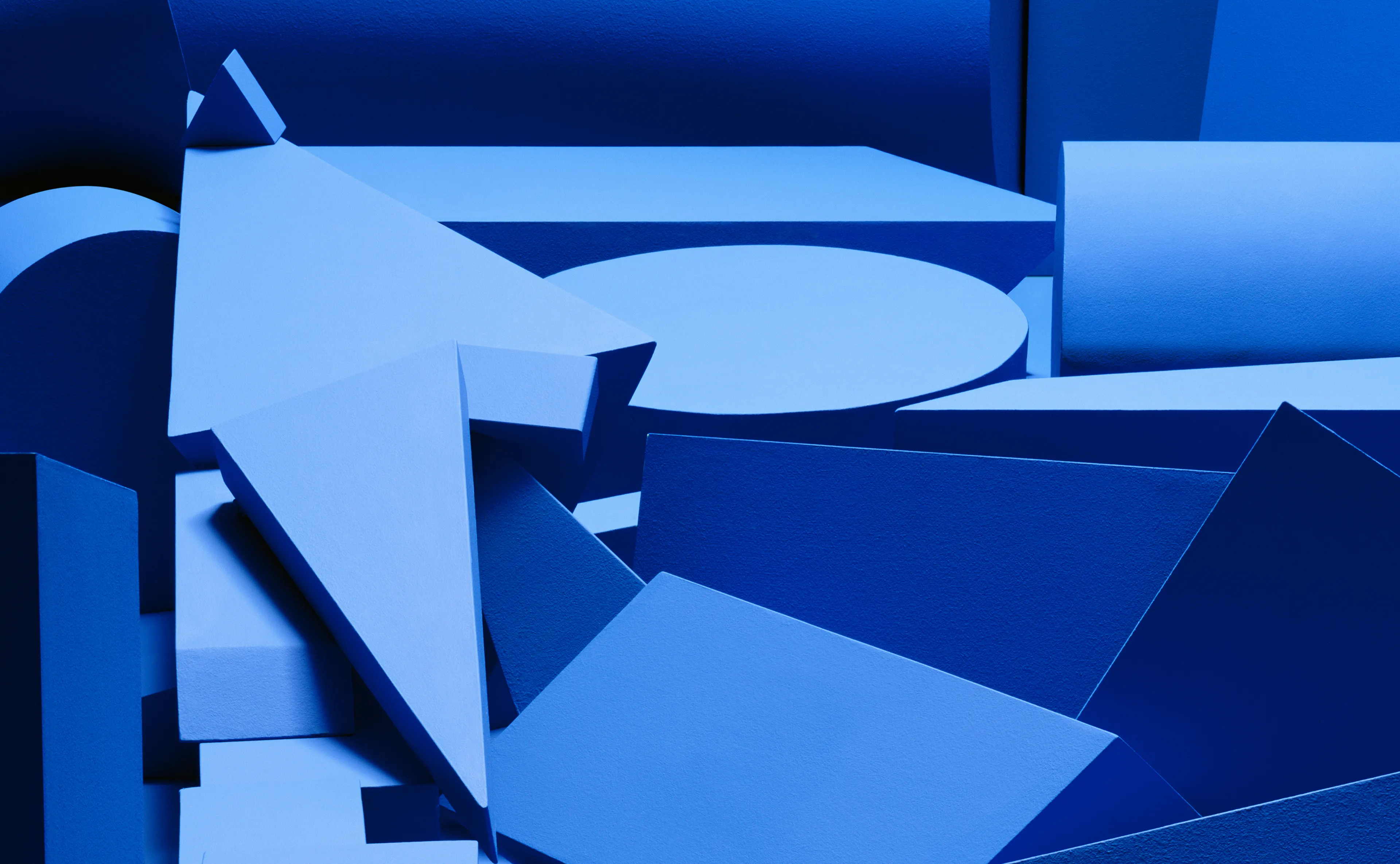
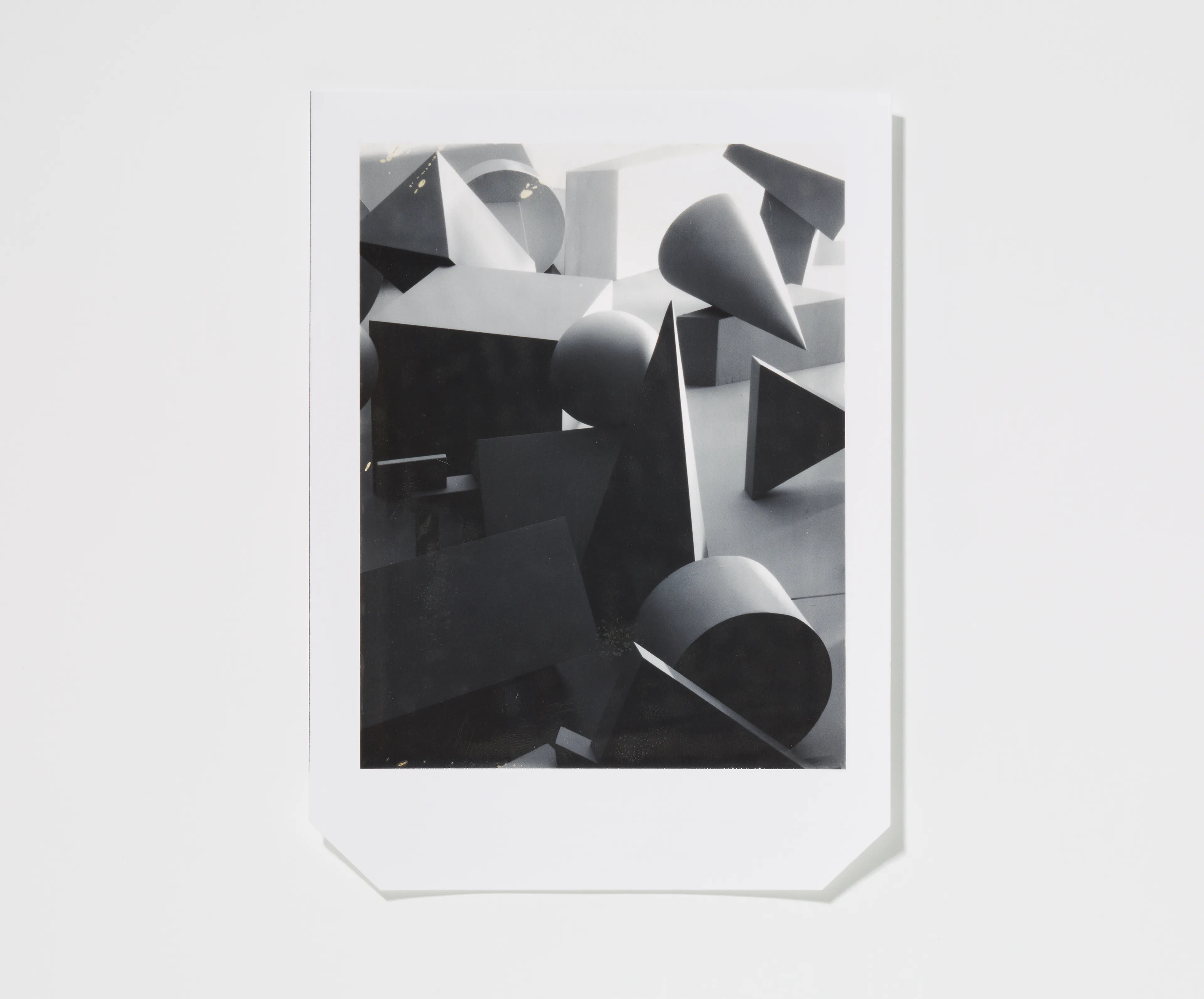
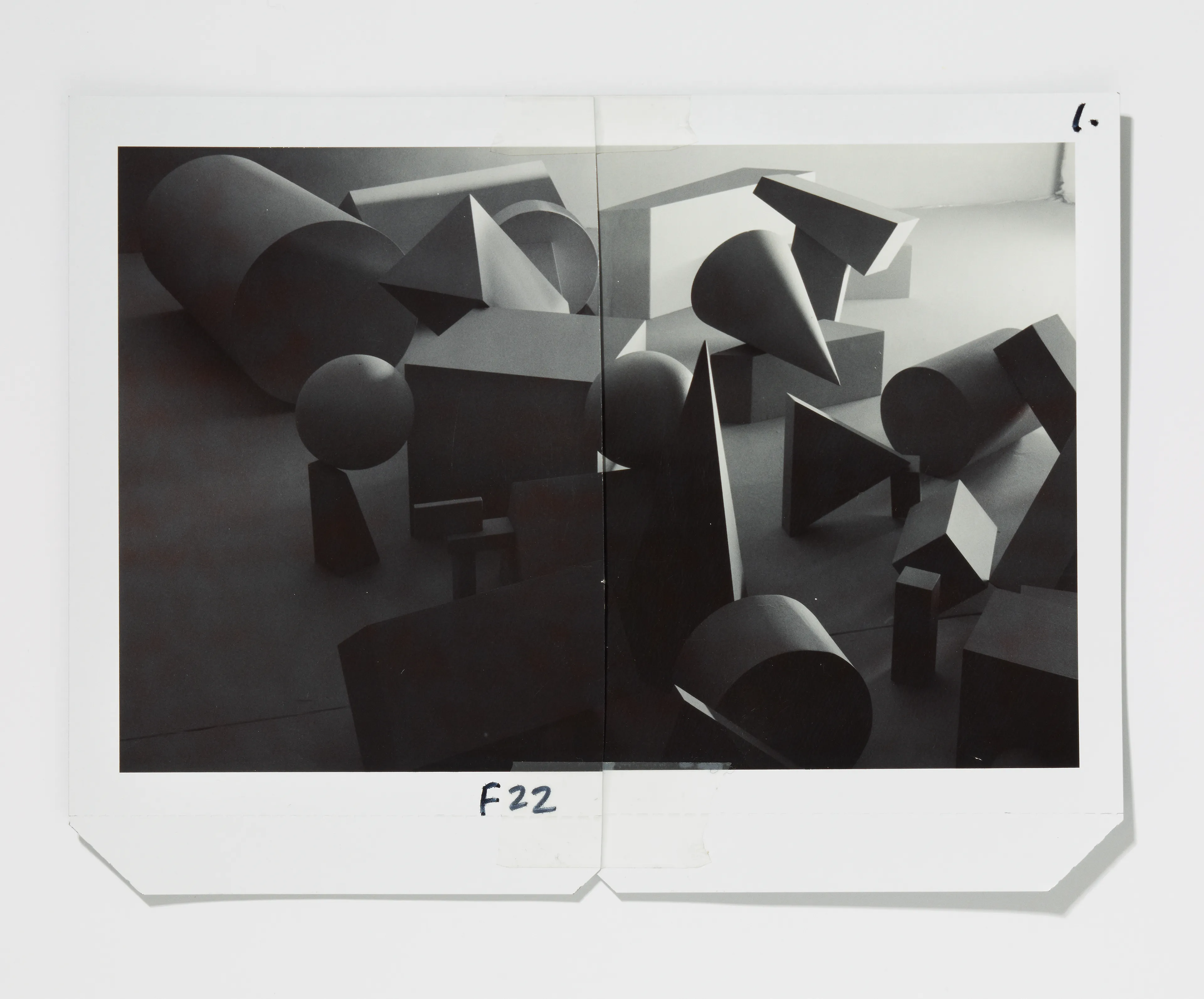
Fields / Fresnel, various painted wooden shapes, 2010
Letter F makes use of the mixed polarisation of light to create the letterform from a single material and finish. Even though the material is very matt, the subtle characteristics of material creates the letterform.
LETTER G
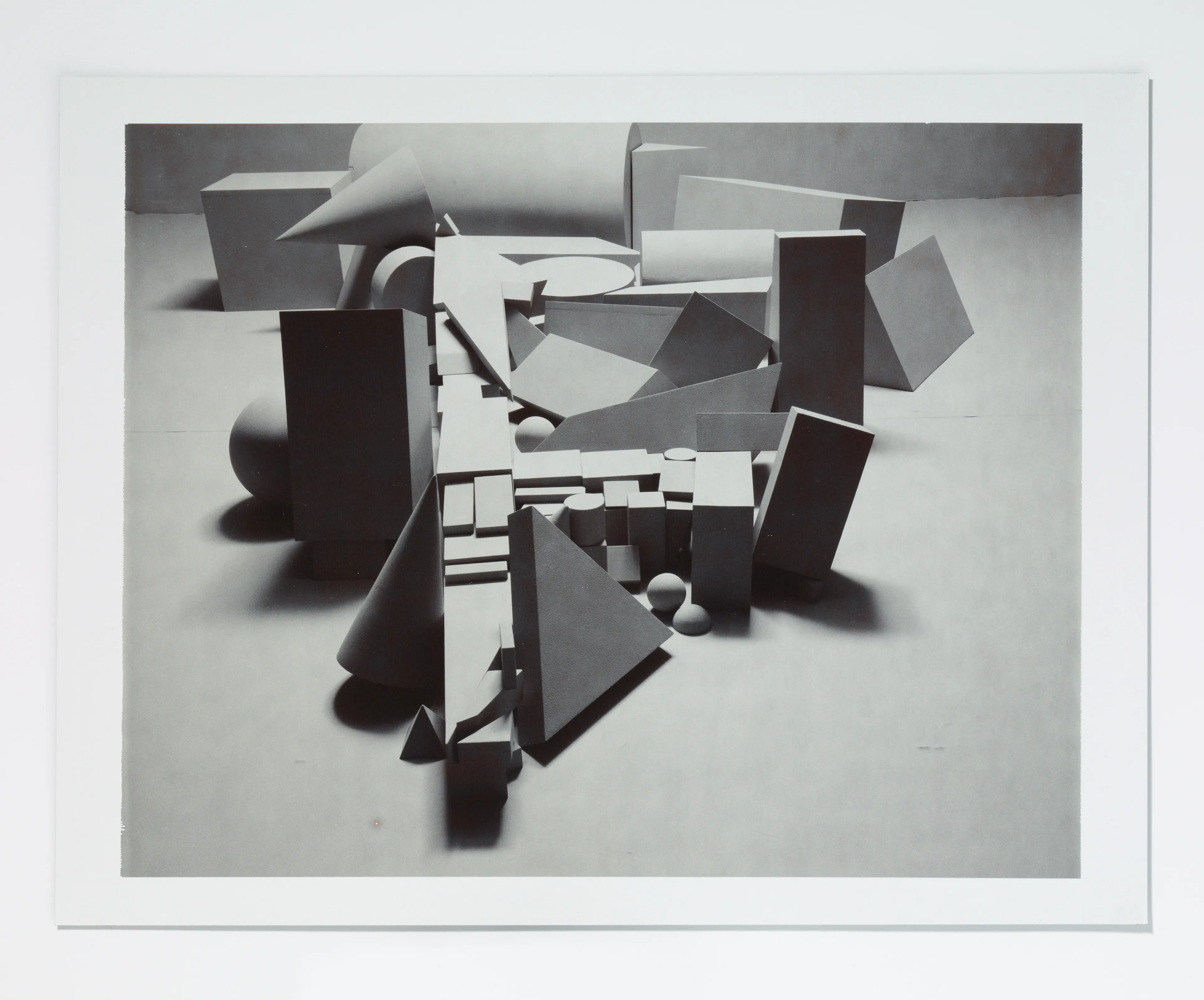
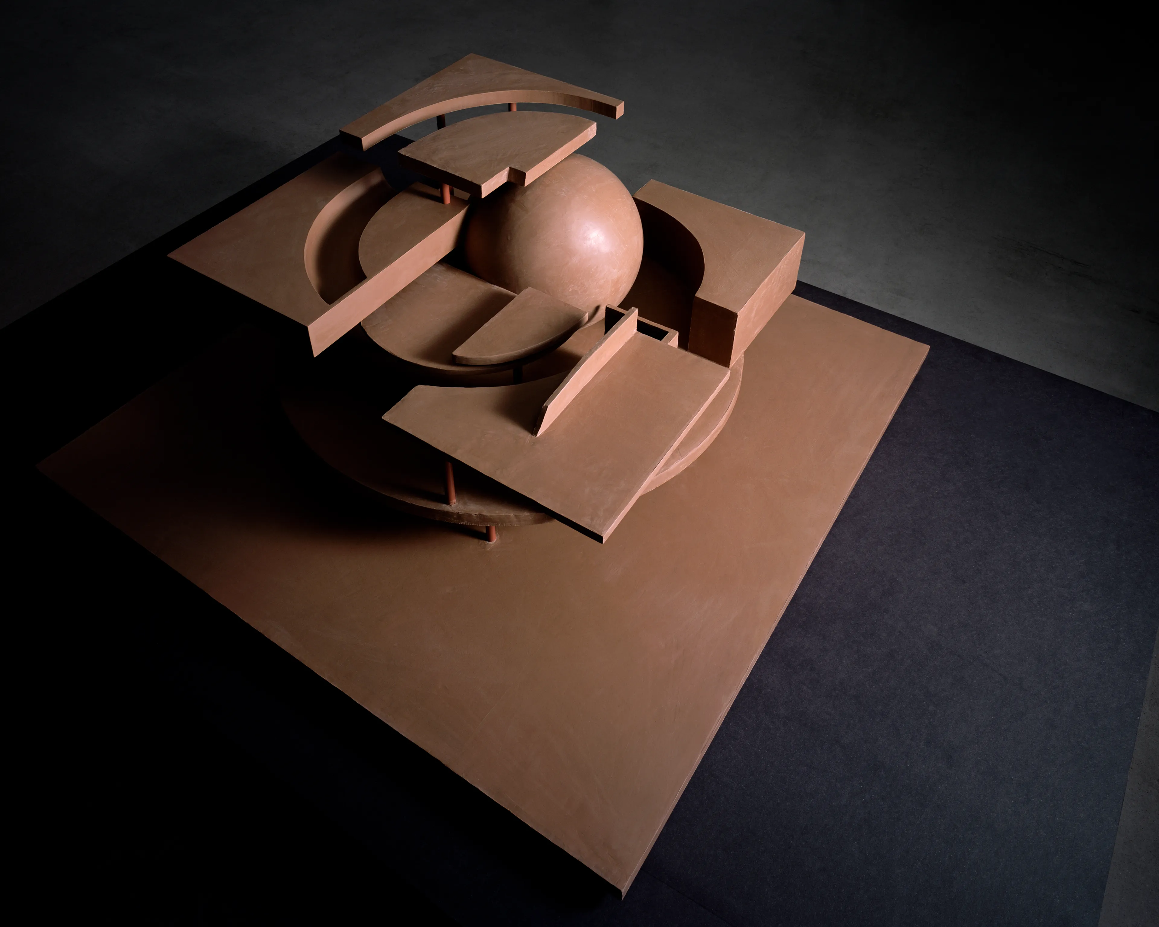
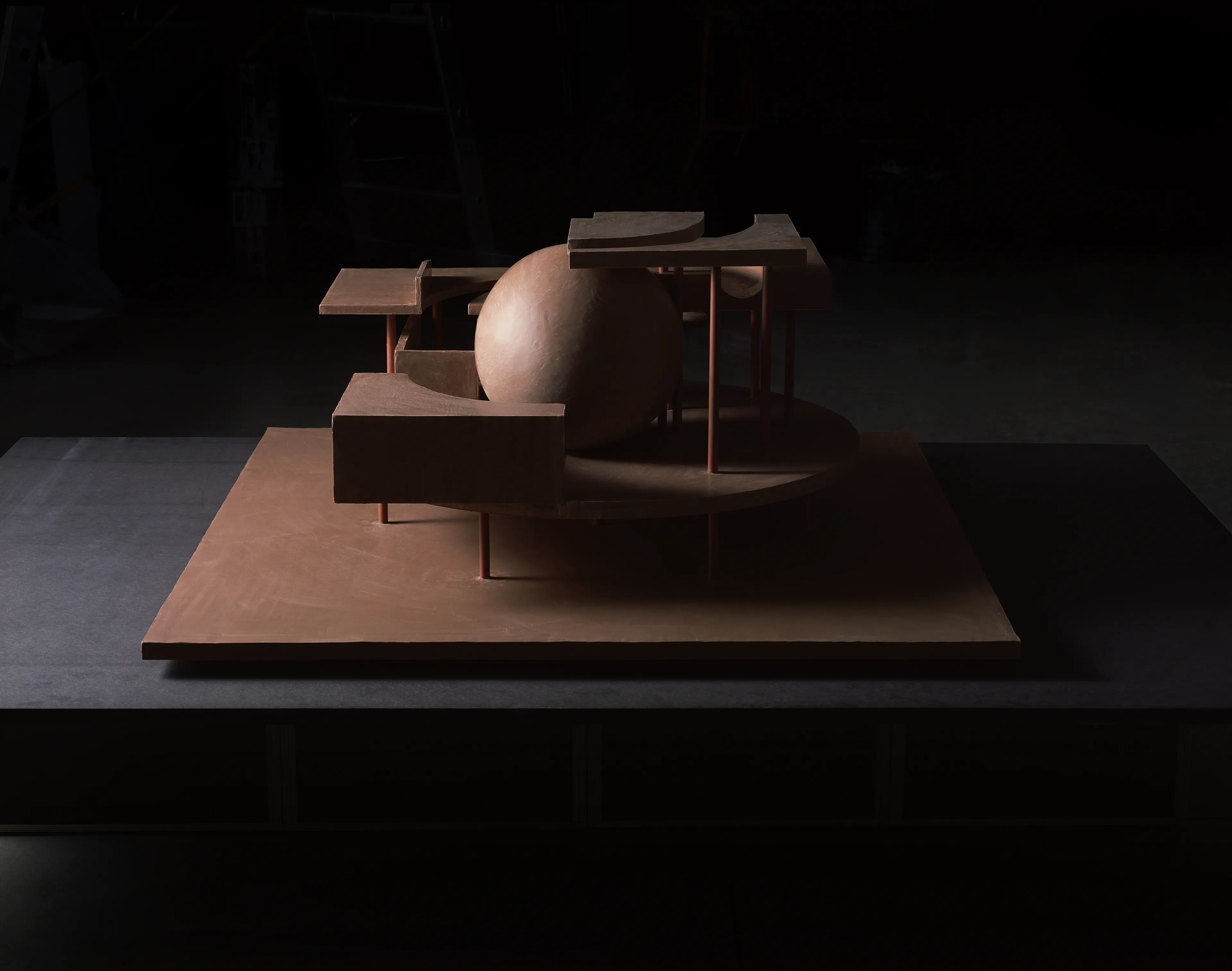
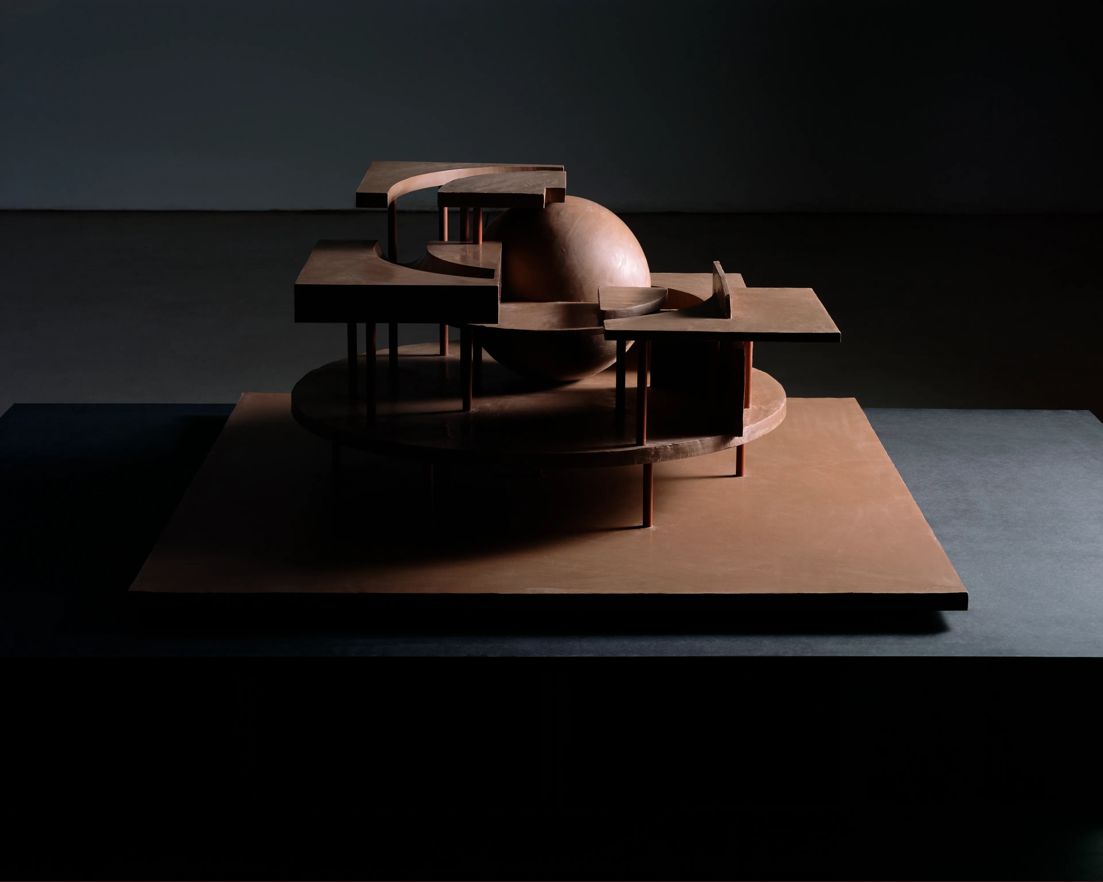
The Ghost in the Geometry, clay, wood, 2016
Letter G pays homage to the architectural influence of Étienne-Louis Boullée’s “Cenotaph to Newton” (1784) and Carlo Scarpa’s Tomba Brion. The letterform is broken apart in 3 dimensions from the two dimensional typography. These forms were extruded into architectural forms and rendered in clay.
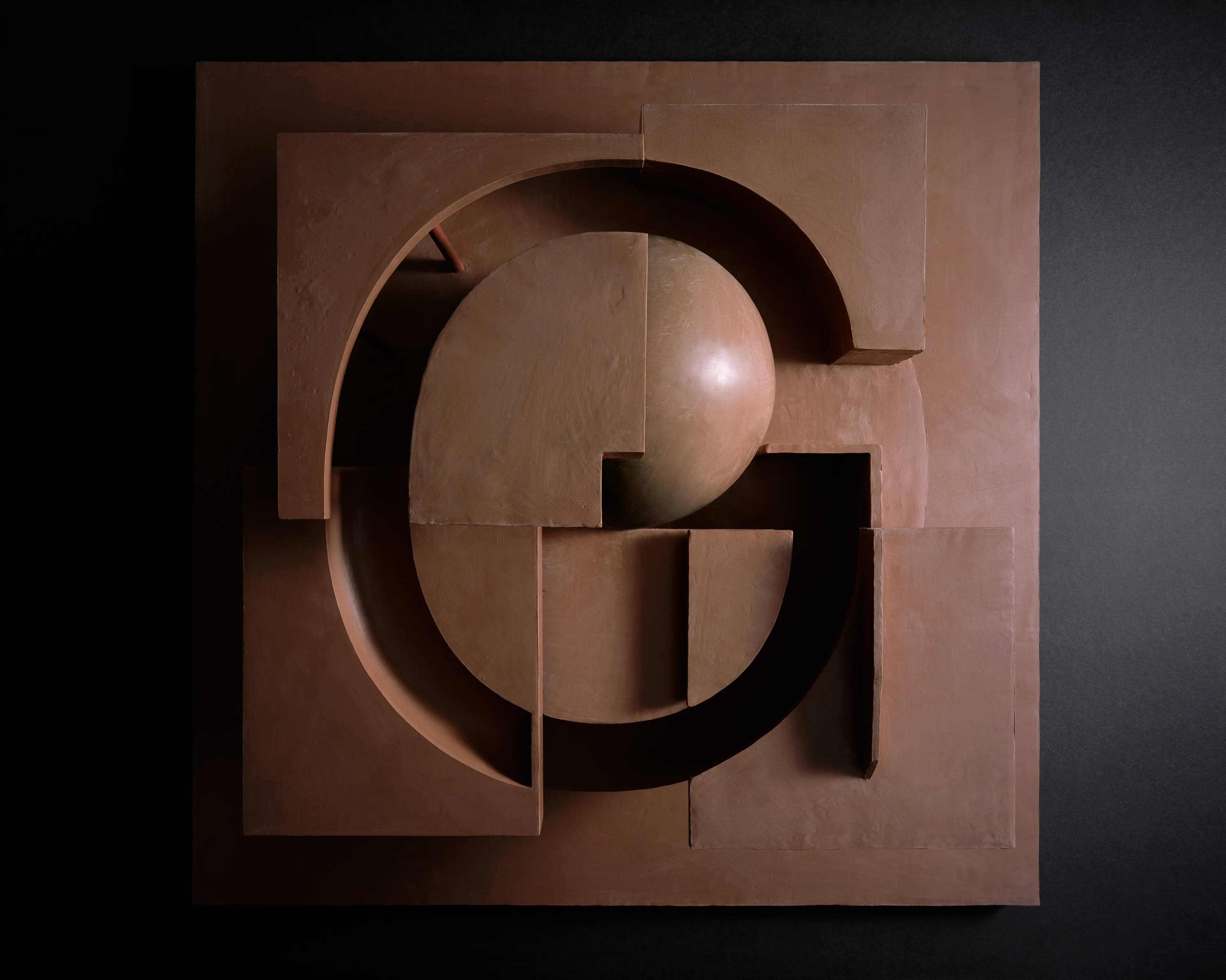
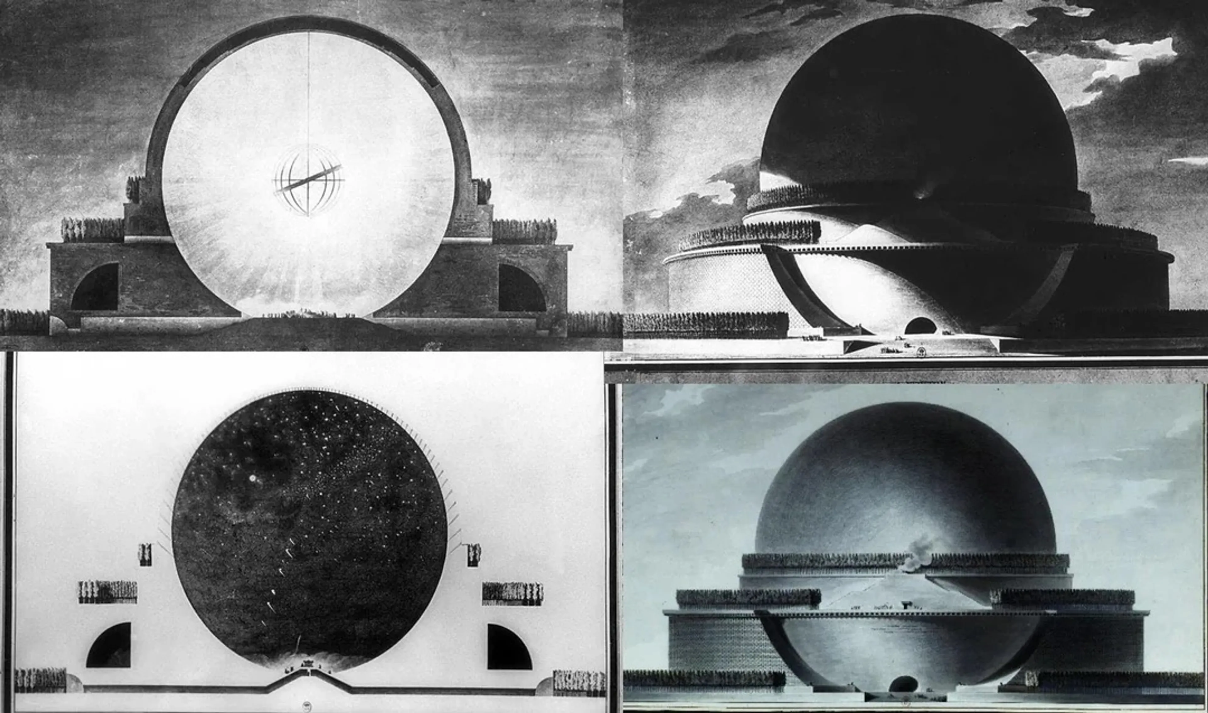
Étienne-Louis Boullée’s “Cenotaph to Newton”, 1784
Clay was extensively used as a material for ancient and the earliest known architectural models. Clay was also used for ’Soul Houses’, model’s of houses often found in tombs from the Middle Kingdom of Egypt period, 2000 to 1700 BC
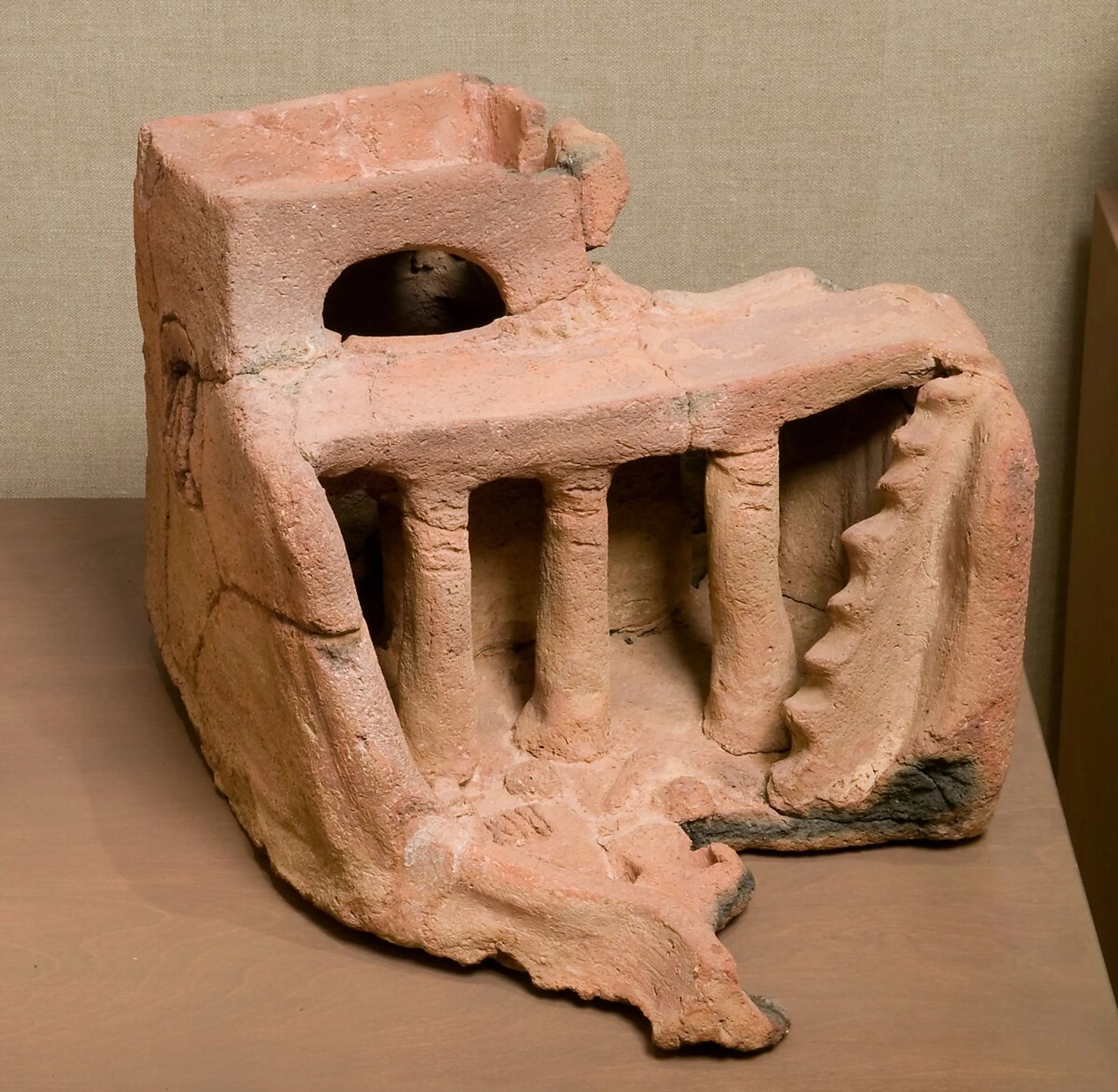
Soul House, Middle Kingdom of Egypt period, 2000 to 1700 BC
The letterform is defined by the absence of form, which creates the typography.
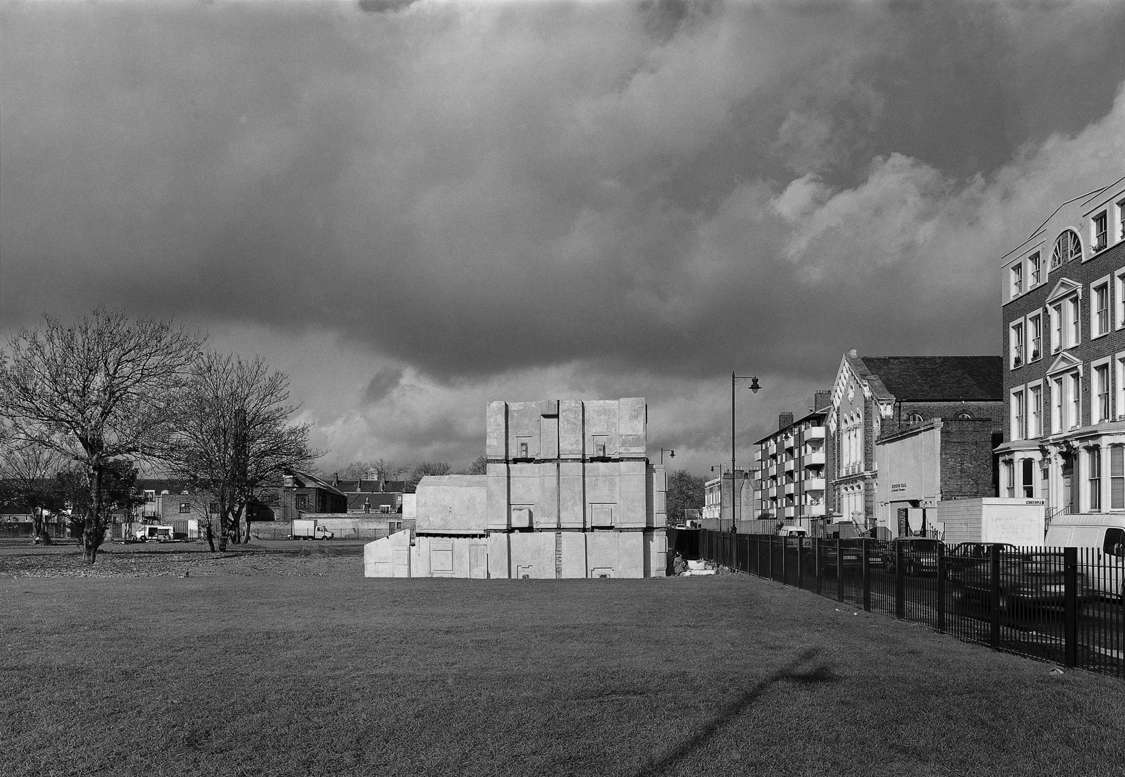
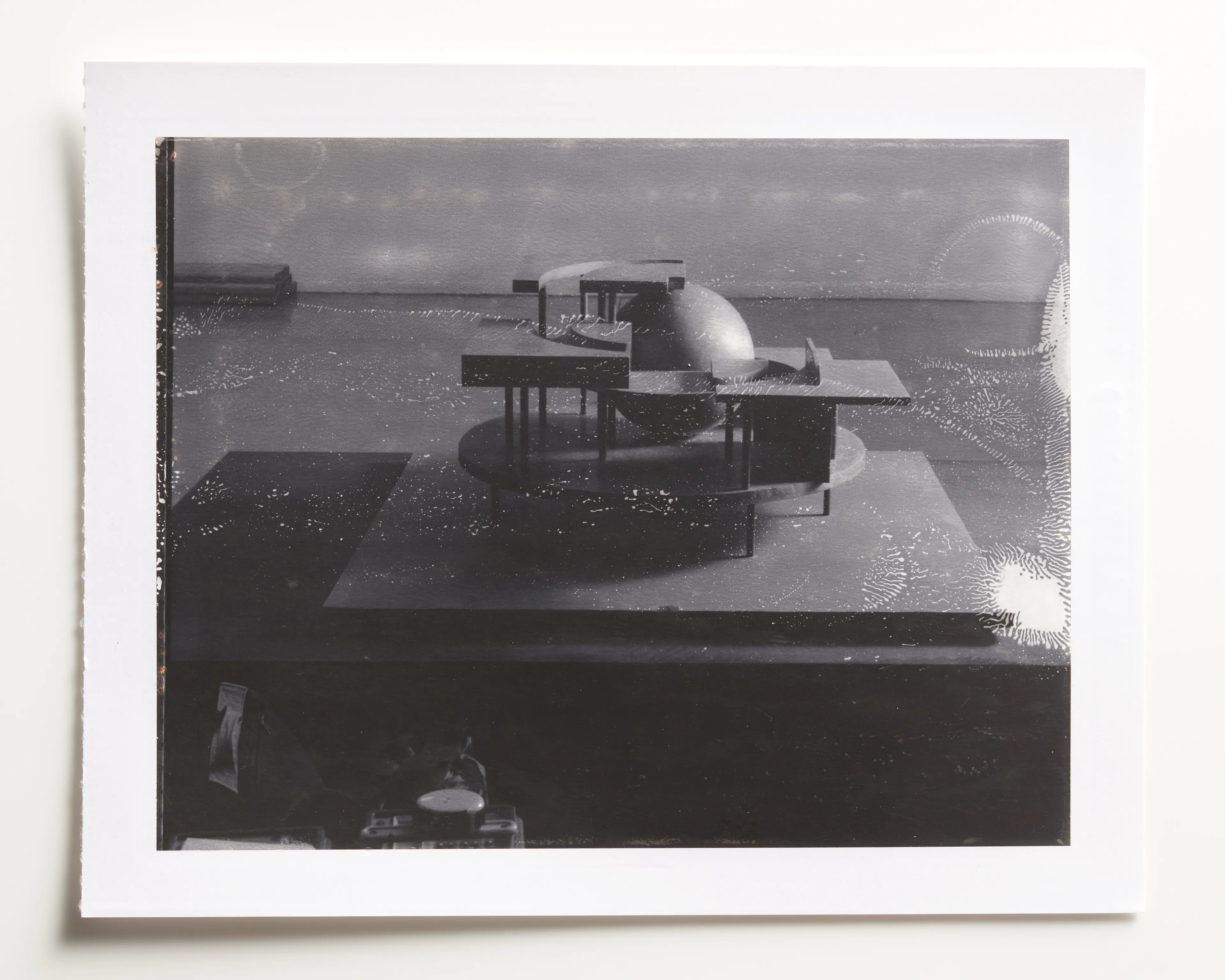
[1] Rachel Whiteread, House, 1993 [2] Letter G side view Polaroid
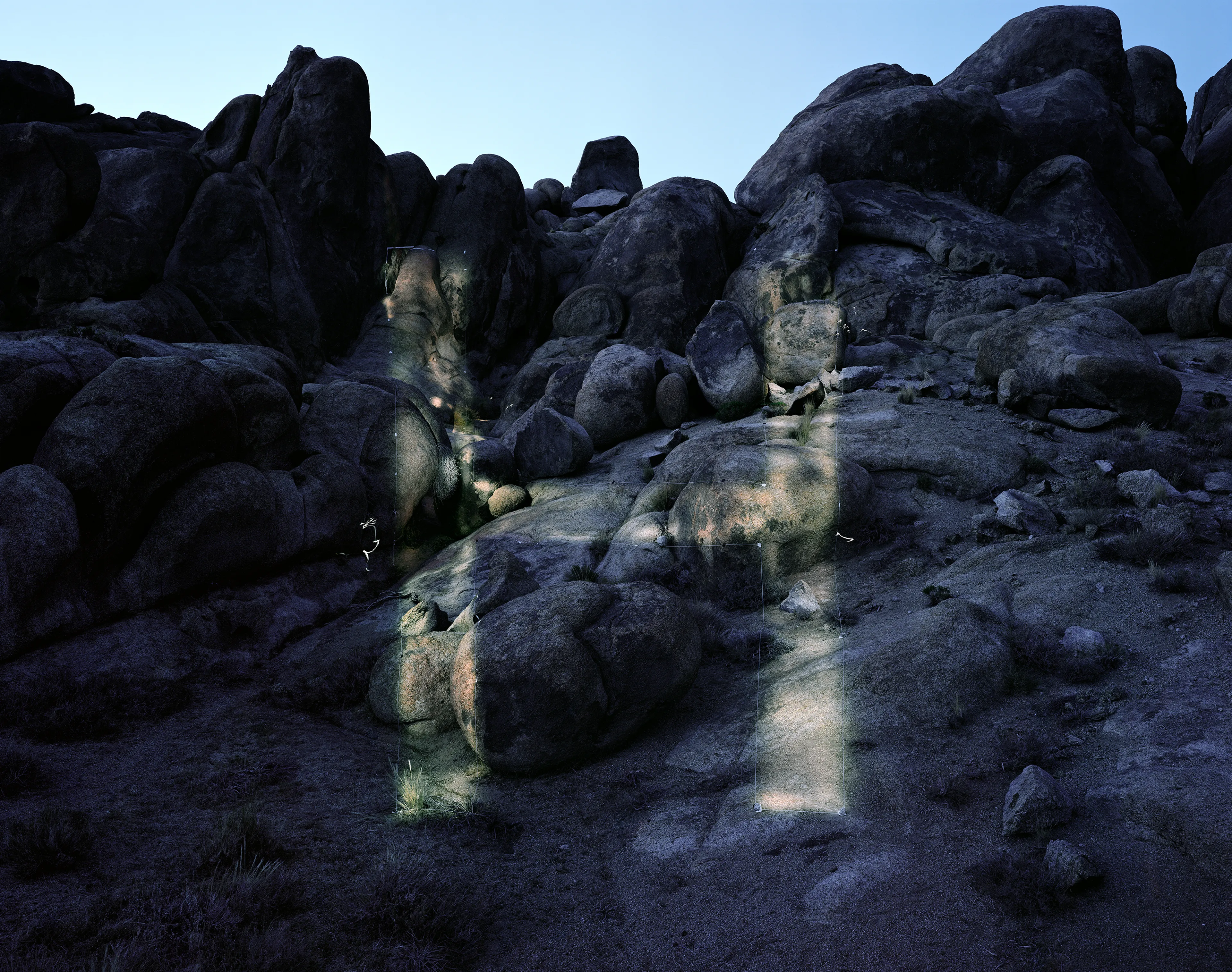
LETTER H
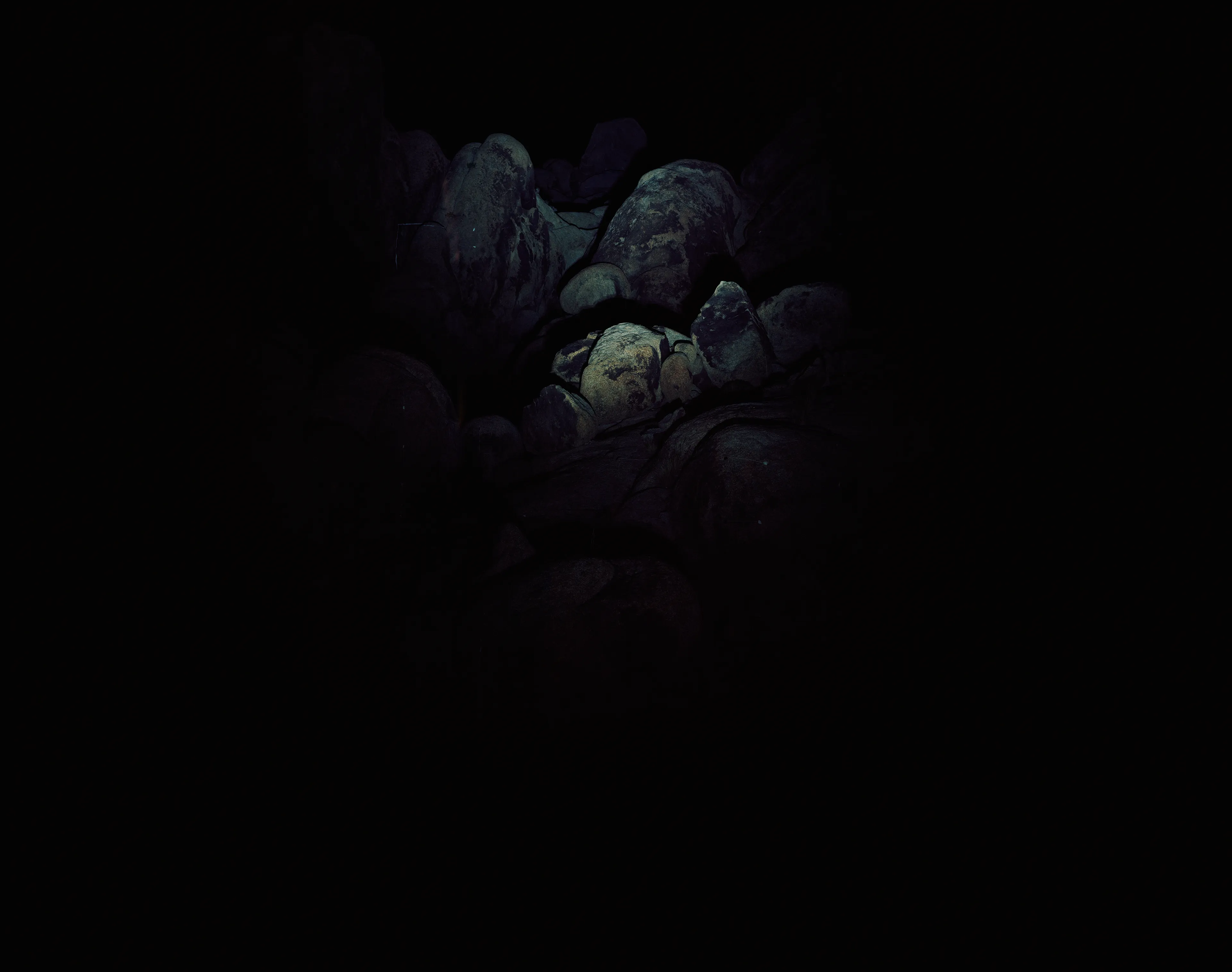
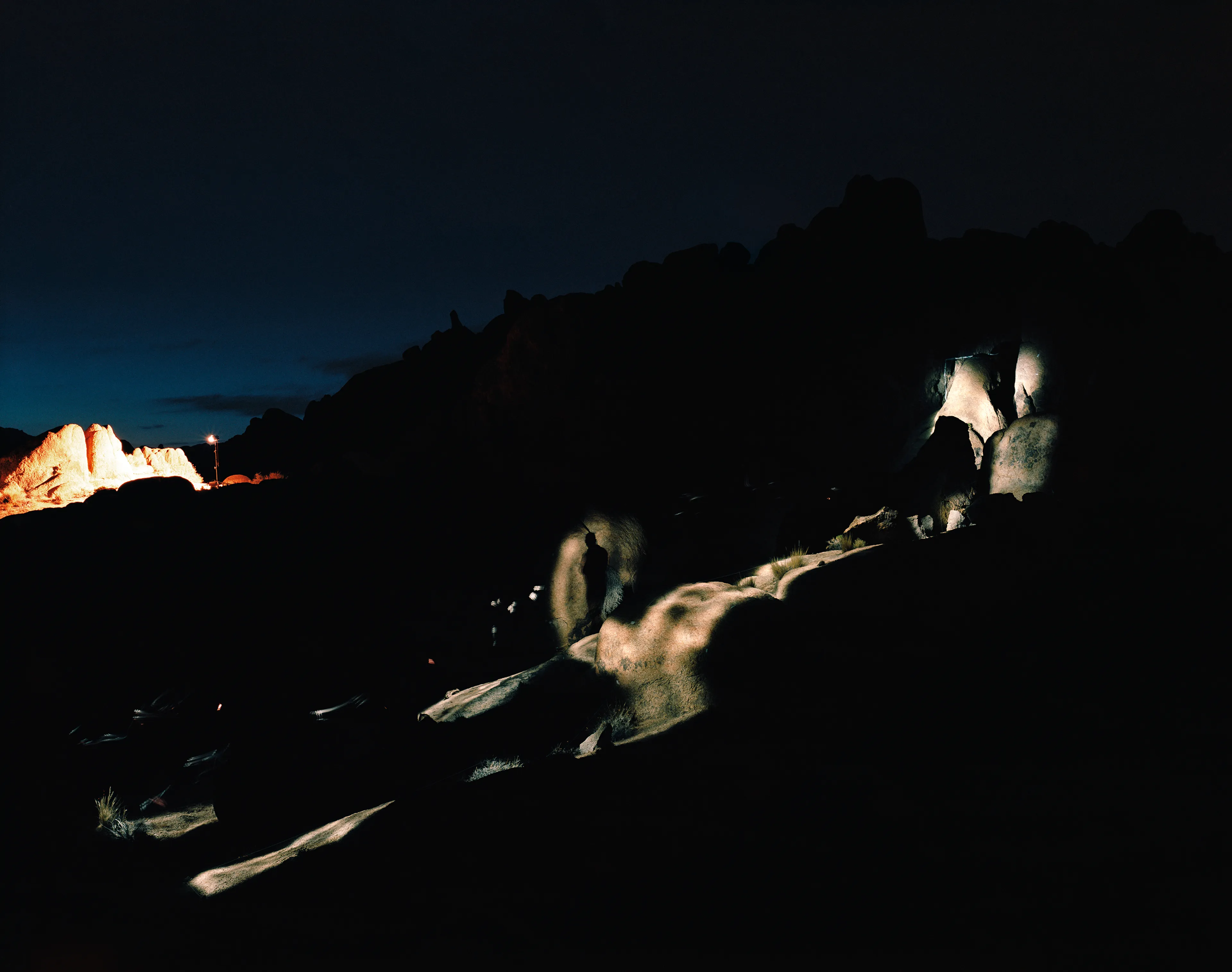
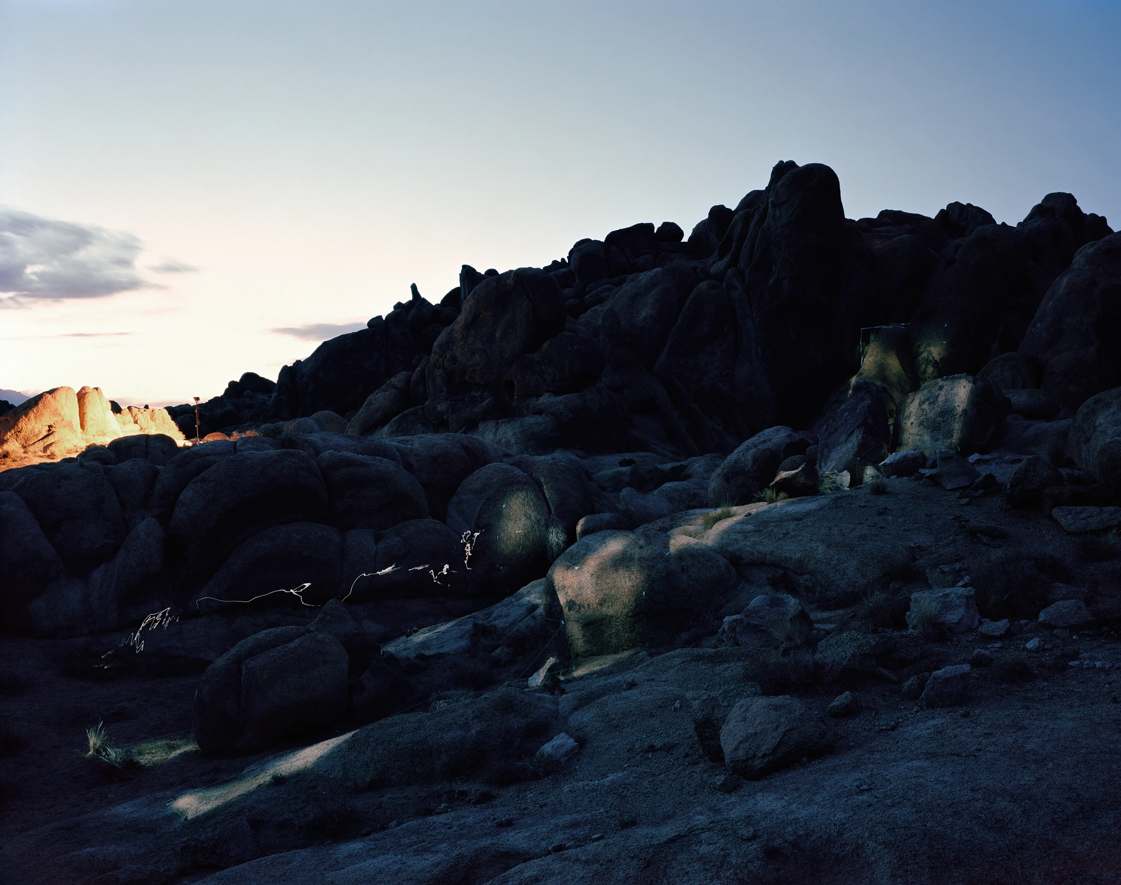
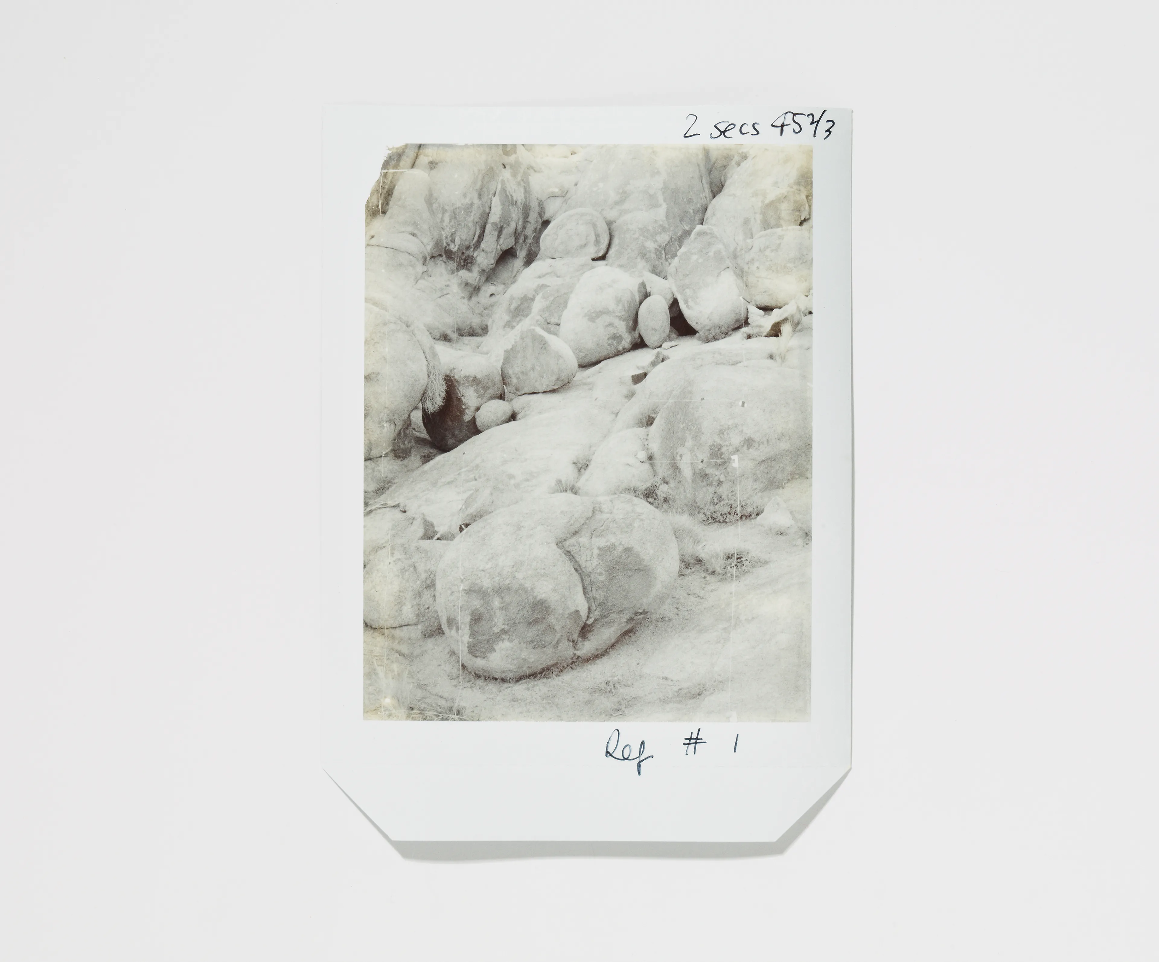
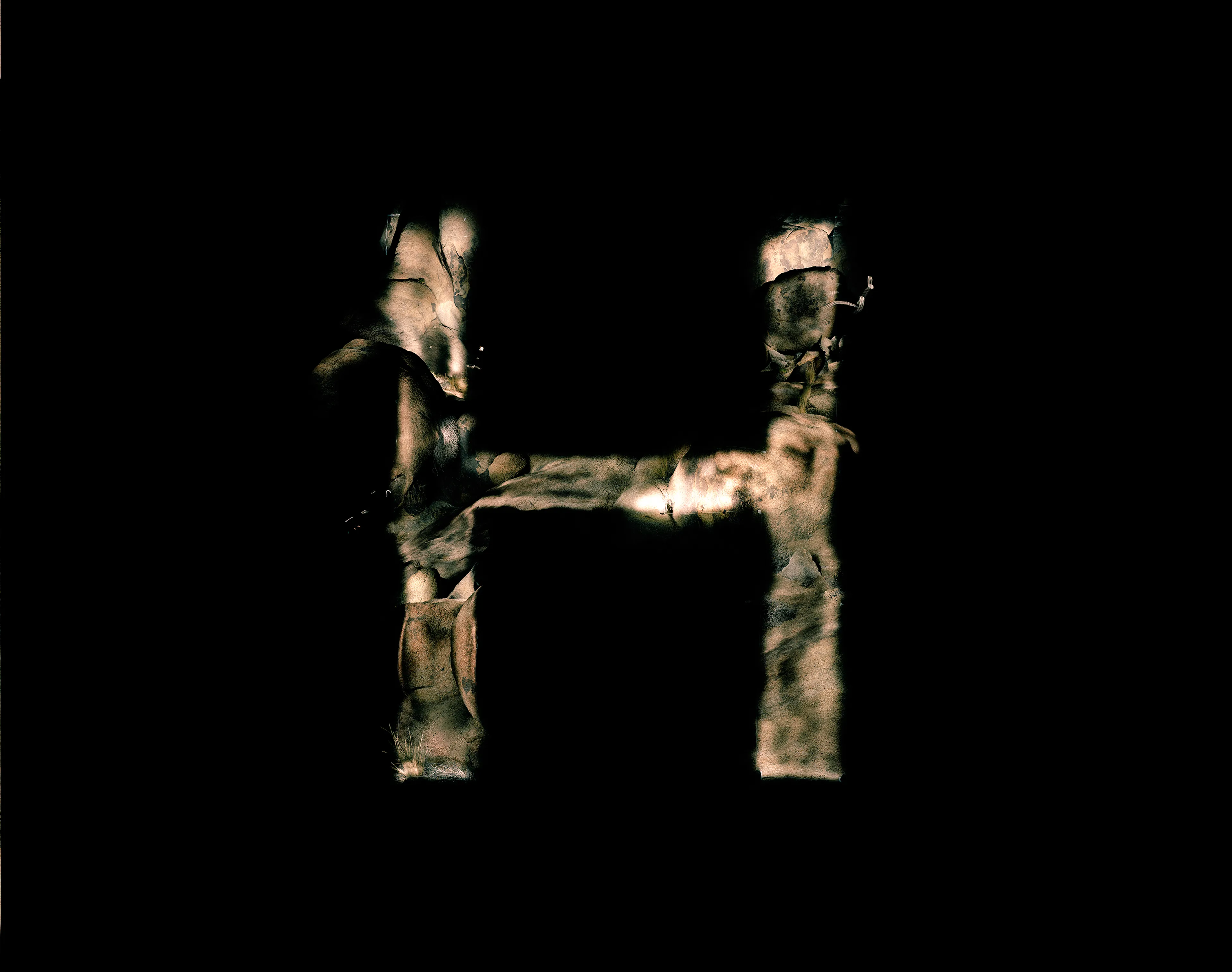
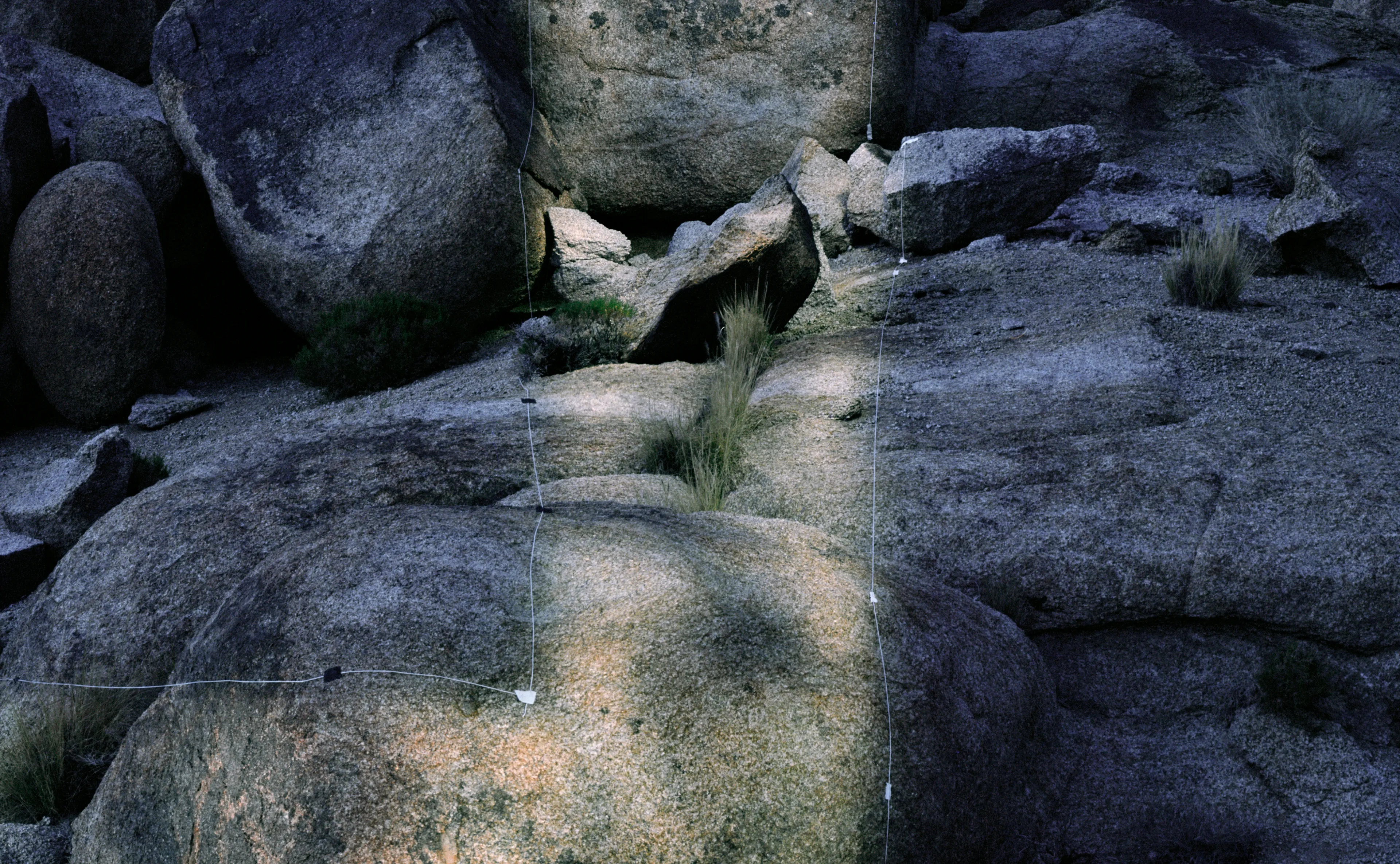
Hills, 2010
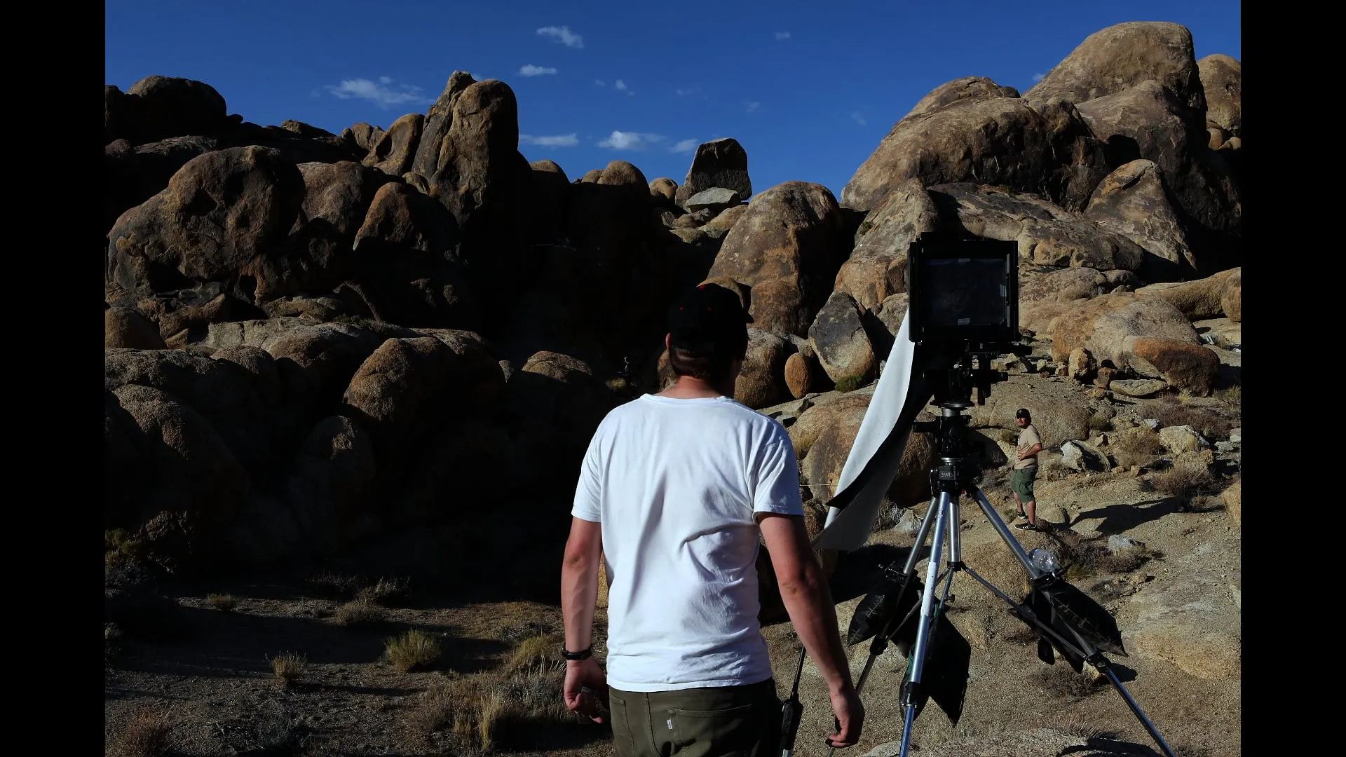
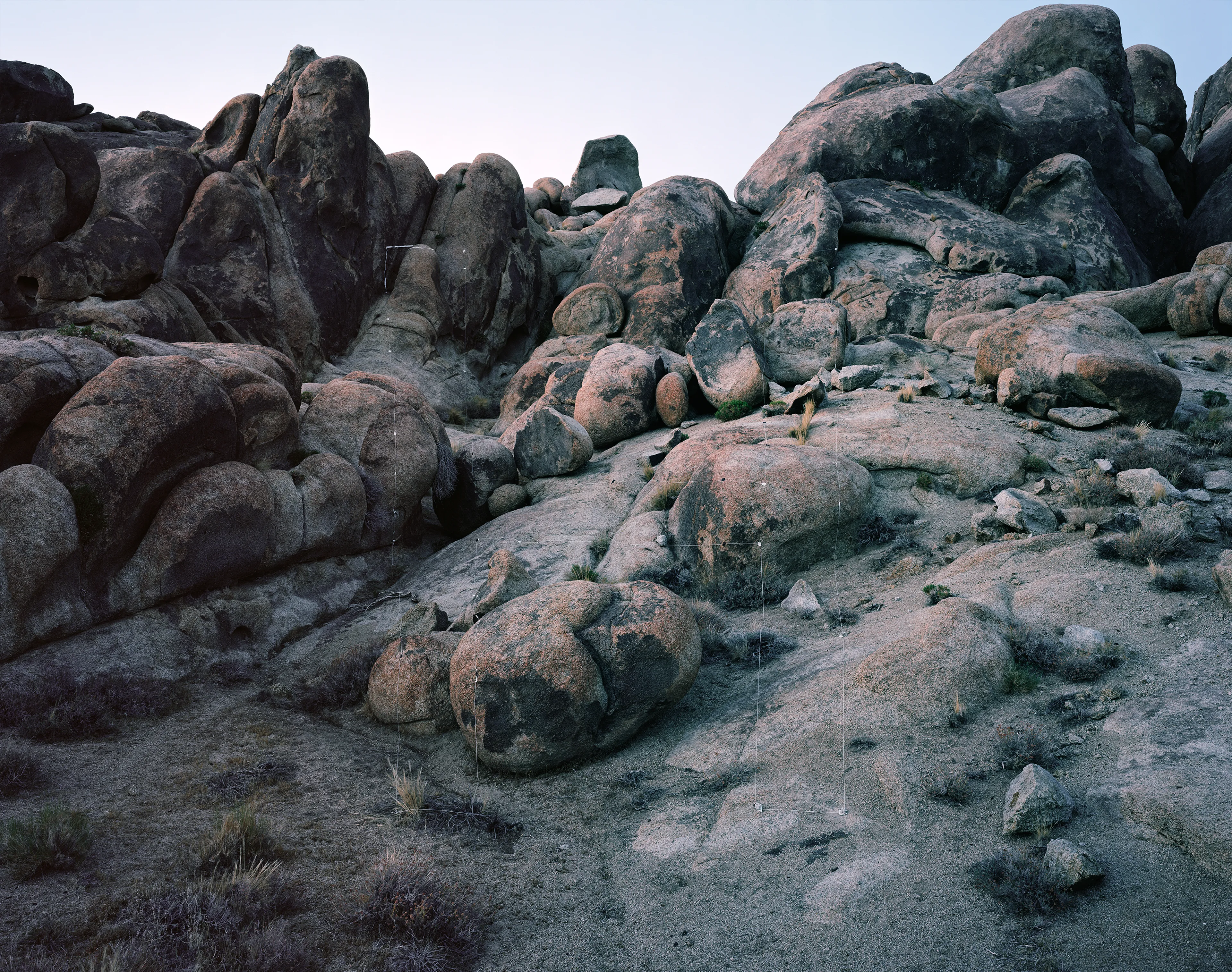
Shot in the Alabama Hills in California. The letterform uses the strange natural rock formations to create depth and height allowing the light painting to work at varied distances from the cameras point of view.
Letter I
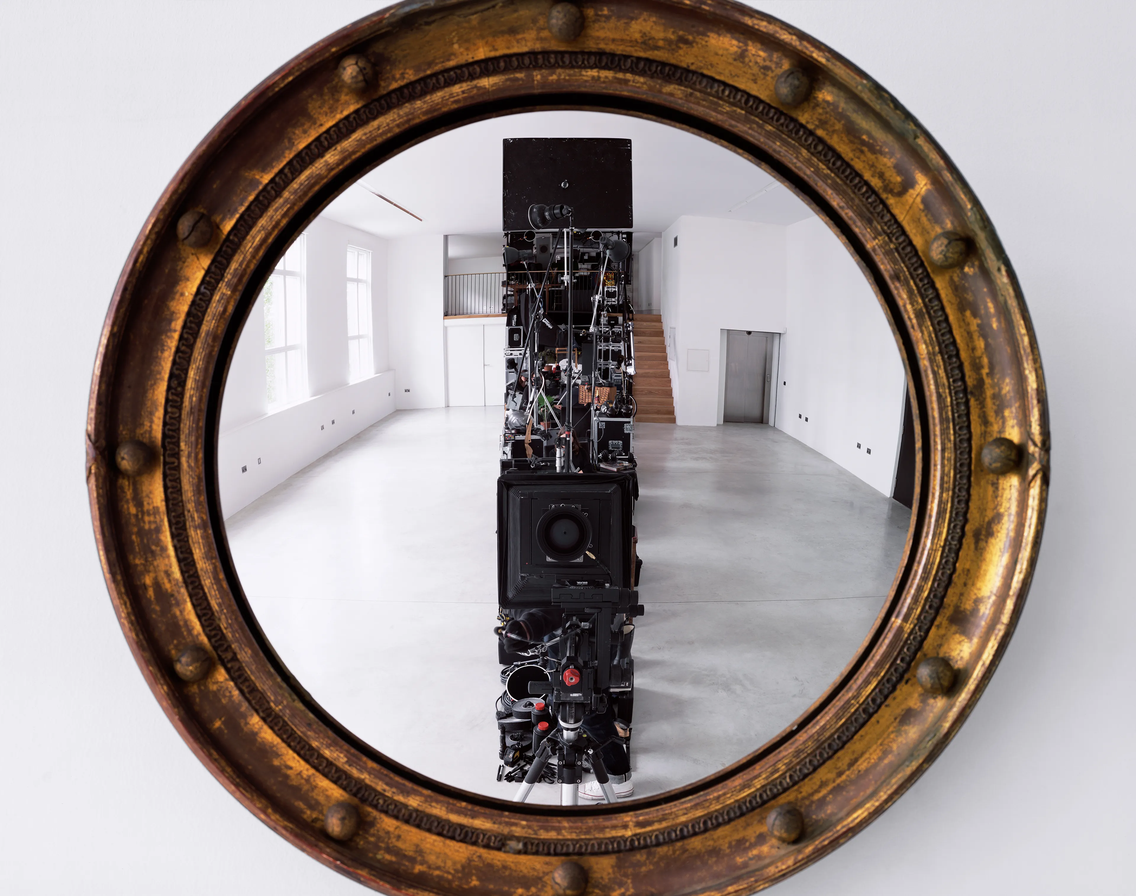
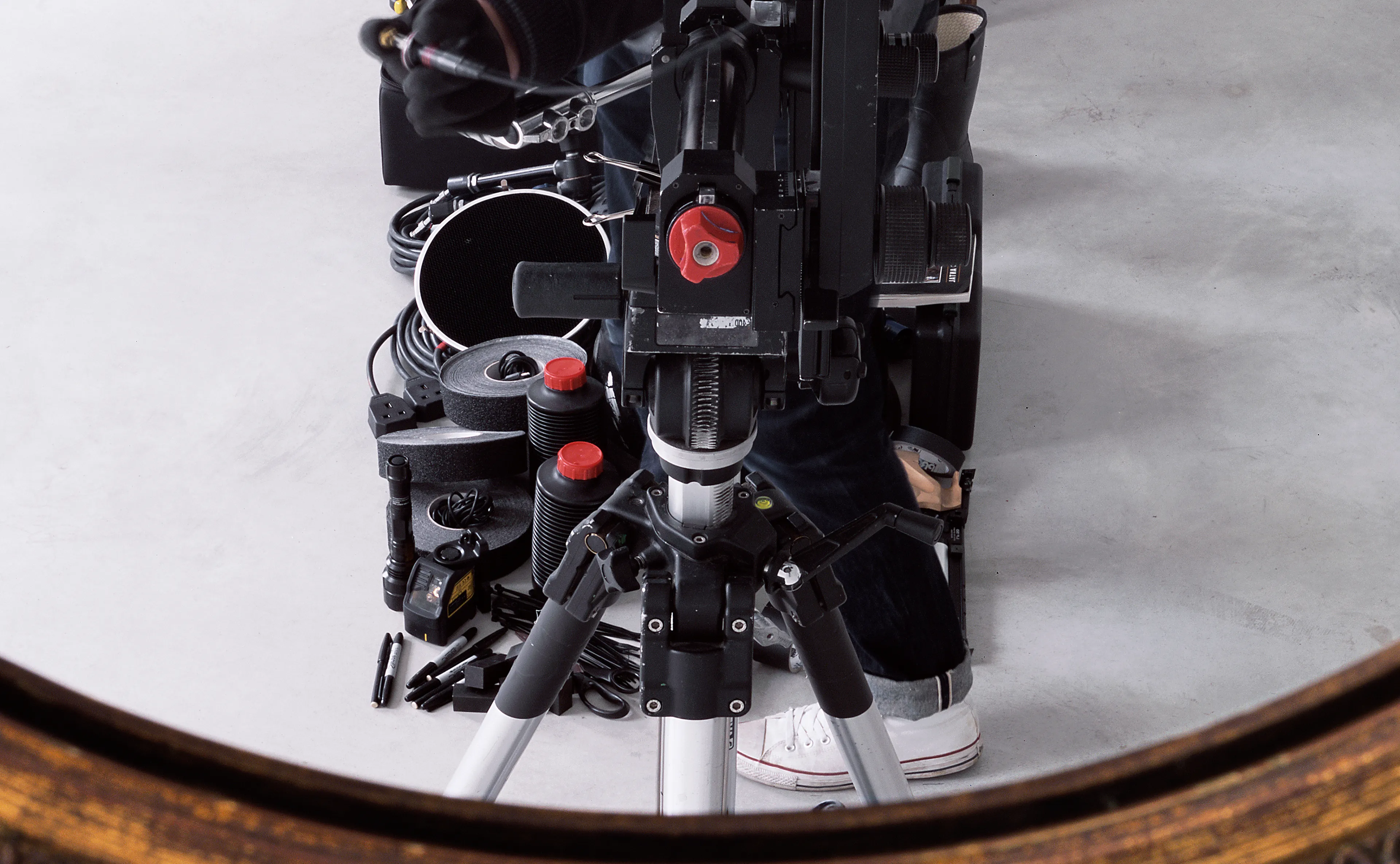
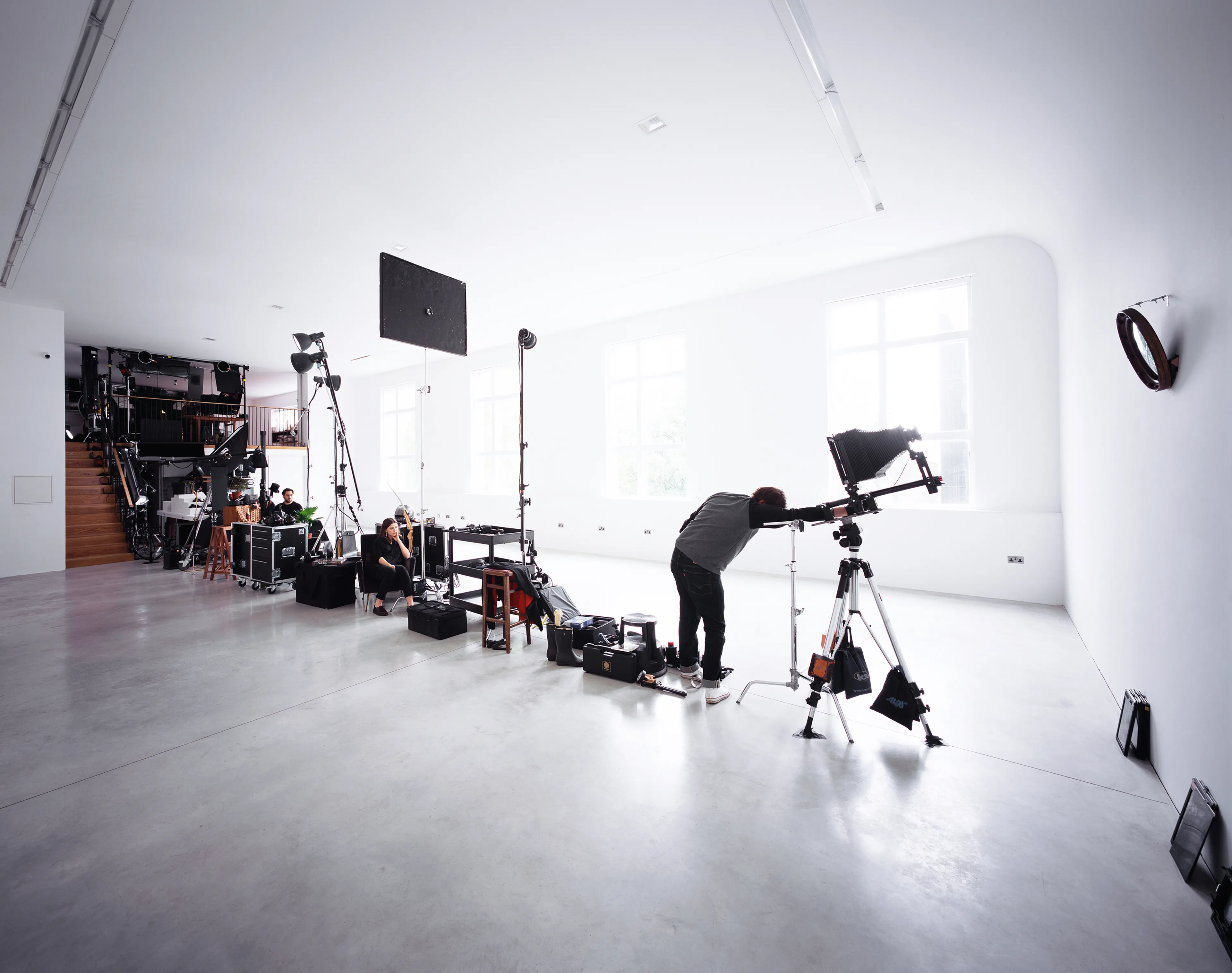
Self-portrait, various objects from the studio, 2015
Convex Mirrors, first originating in Roman times because of the difficulty in creating flat glass surfaces, have been used in art for centuries. The earliest and most famous example being Jan Van Eyck’s The Marriage Giovanni Arnolfini.
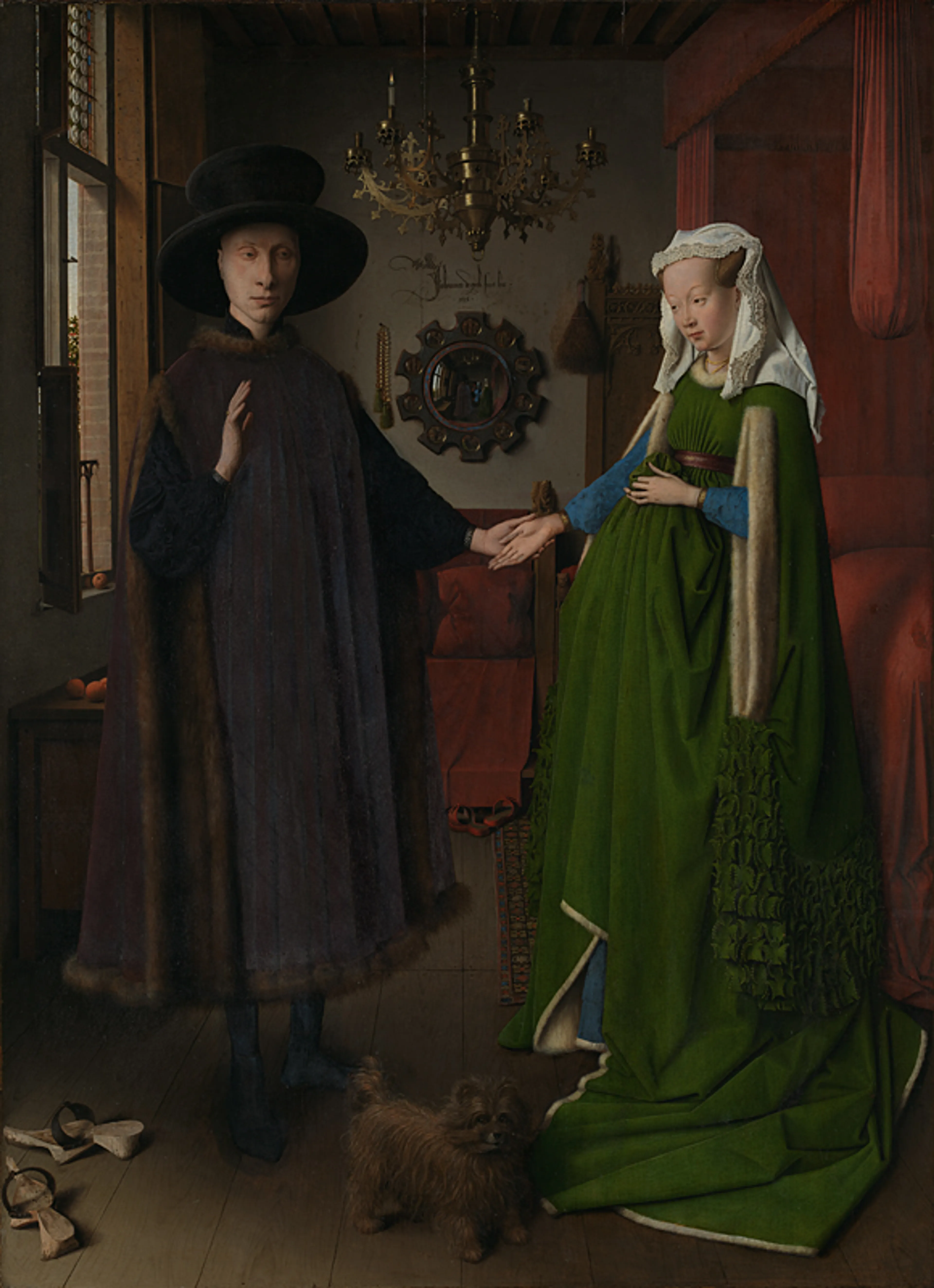
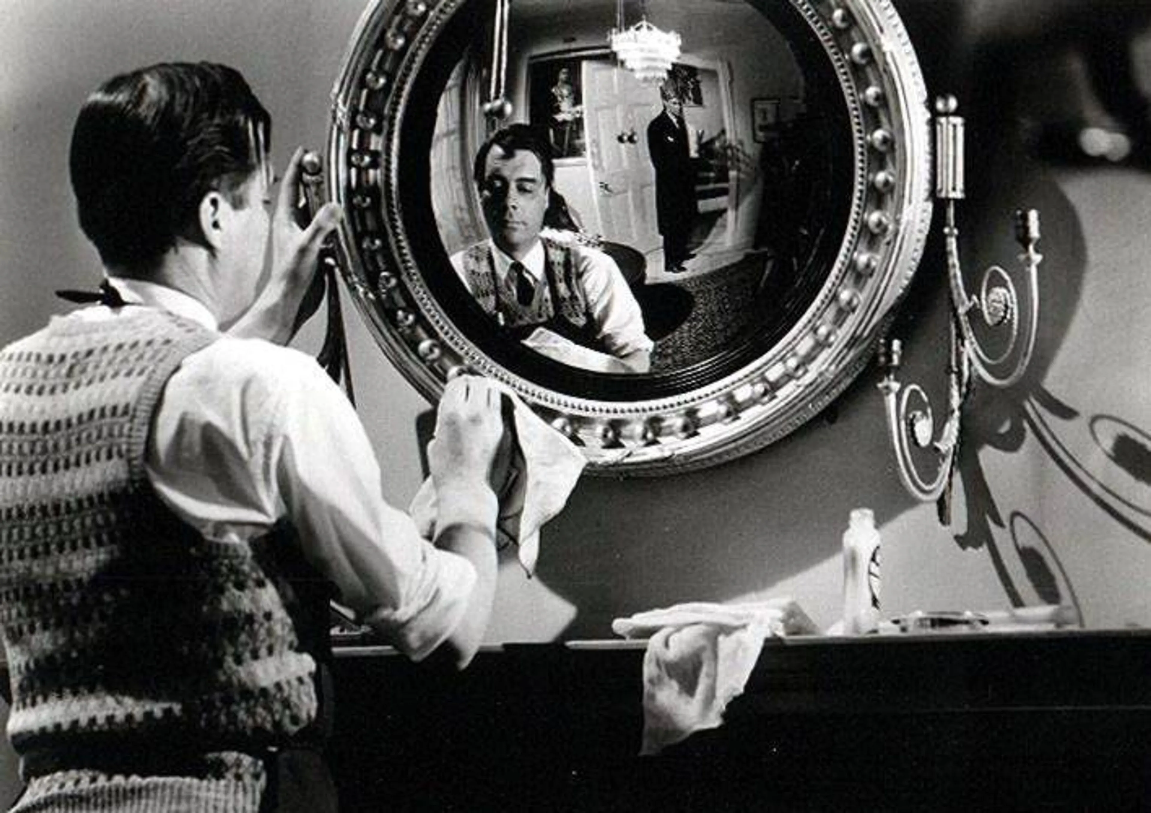
[1] Jan Van Eyck, The Arnolfini Portrait, 1434 [2] Dirk Bogarde in The Servant, 1963
548 years later in Ridley Scotts Blade Runner, we see the lead character Deckard scanning and looking through a photograph, being able to search in and around a room, he finds a spherical mirror sitting atop a dresser in the image, is able to move into it and uses it it explore the rooms further. The formation of the letterform is made up of the contents of my studio, including me and two assistants, hidden within the scene.
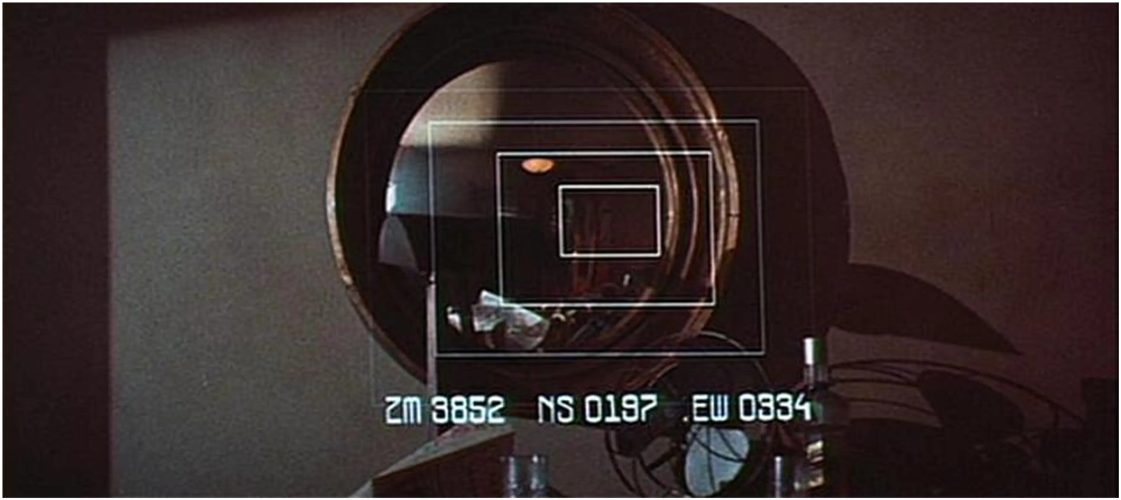
Blade Runner, 1982
Letter K
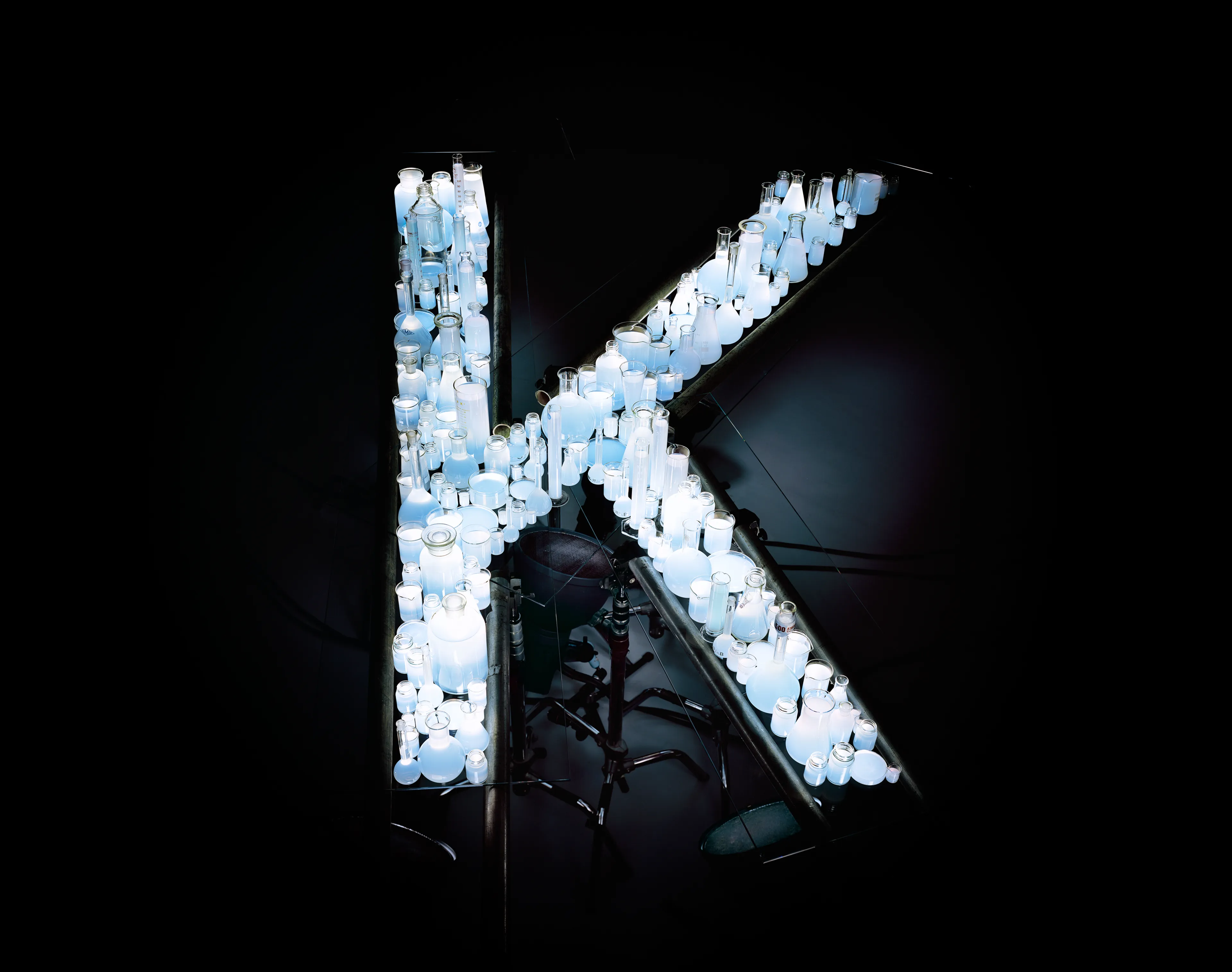
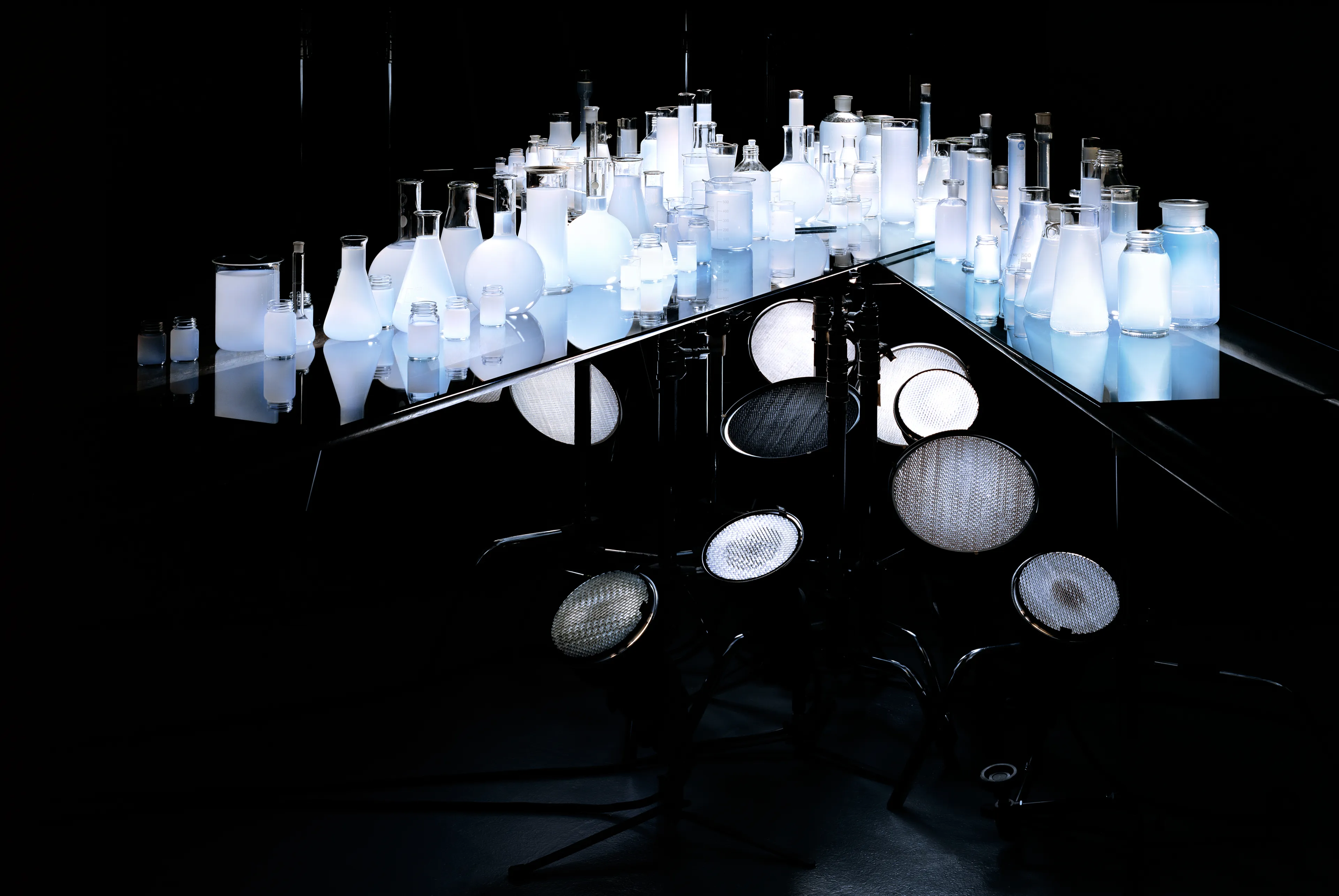
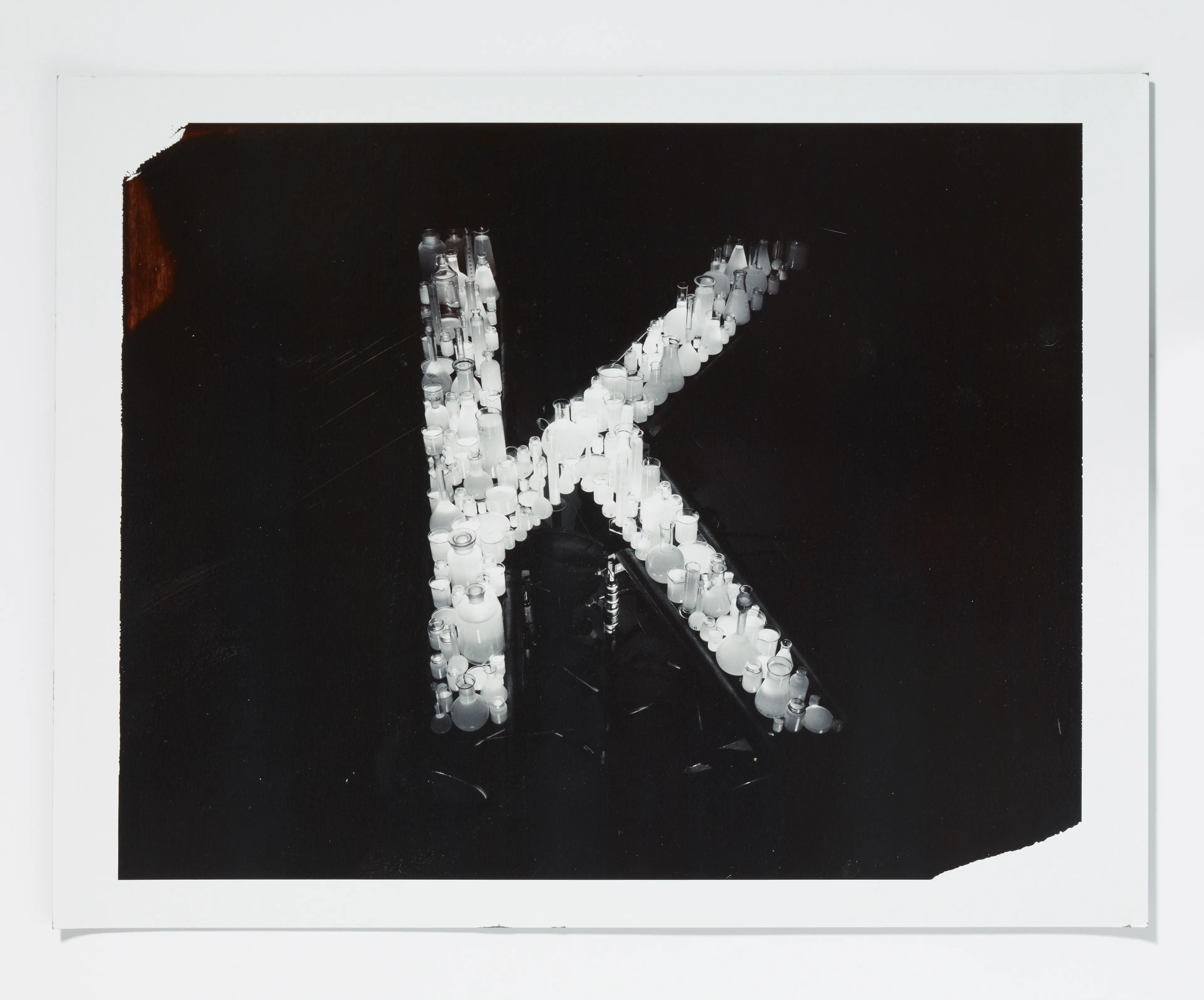
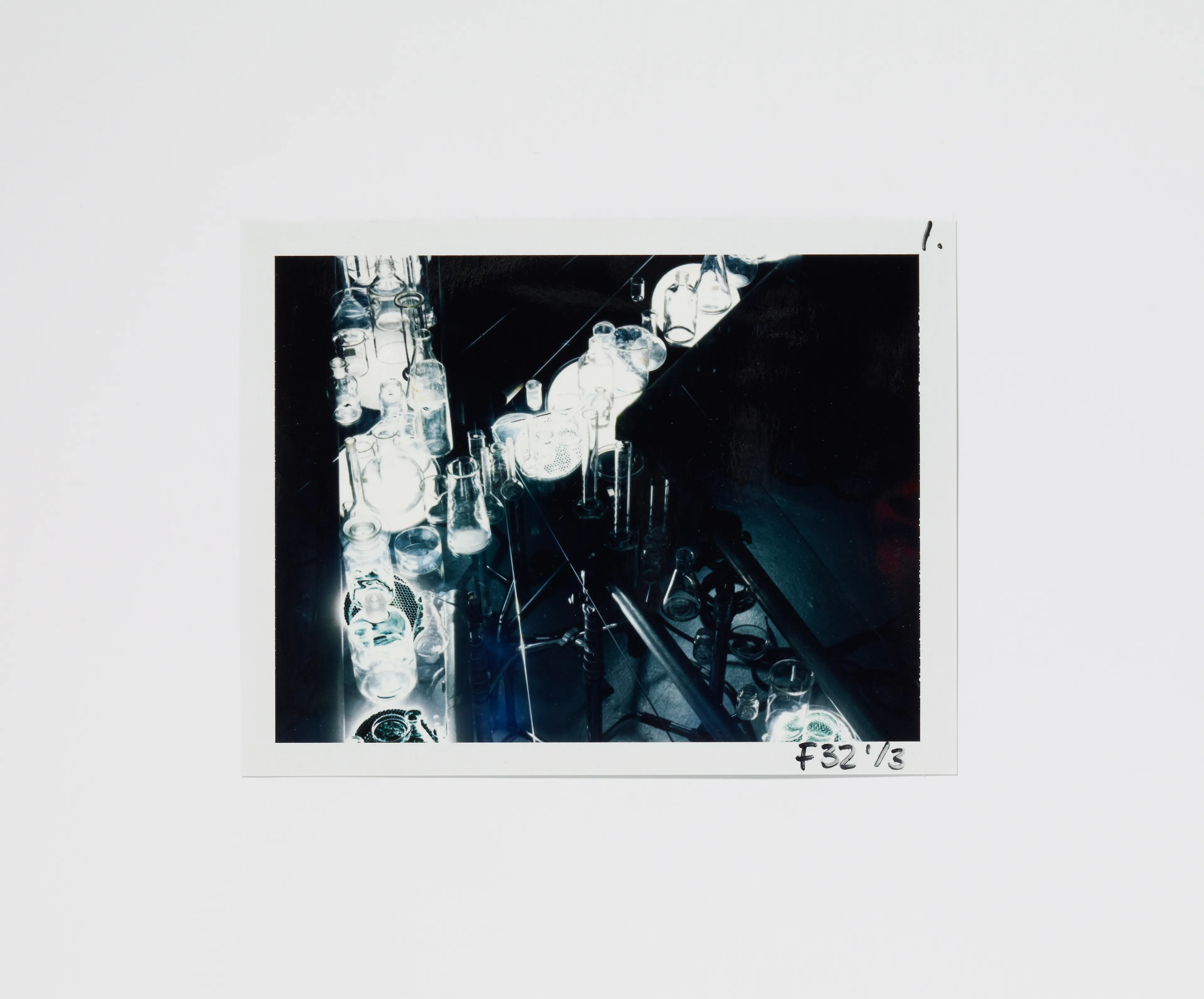
Kolbern, various vessels, milk, water, 2010

Letter N
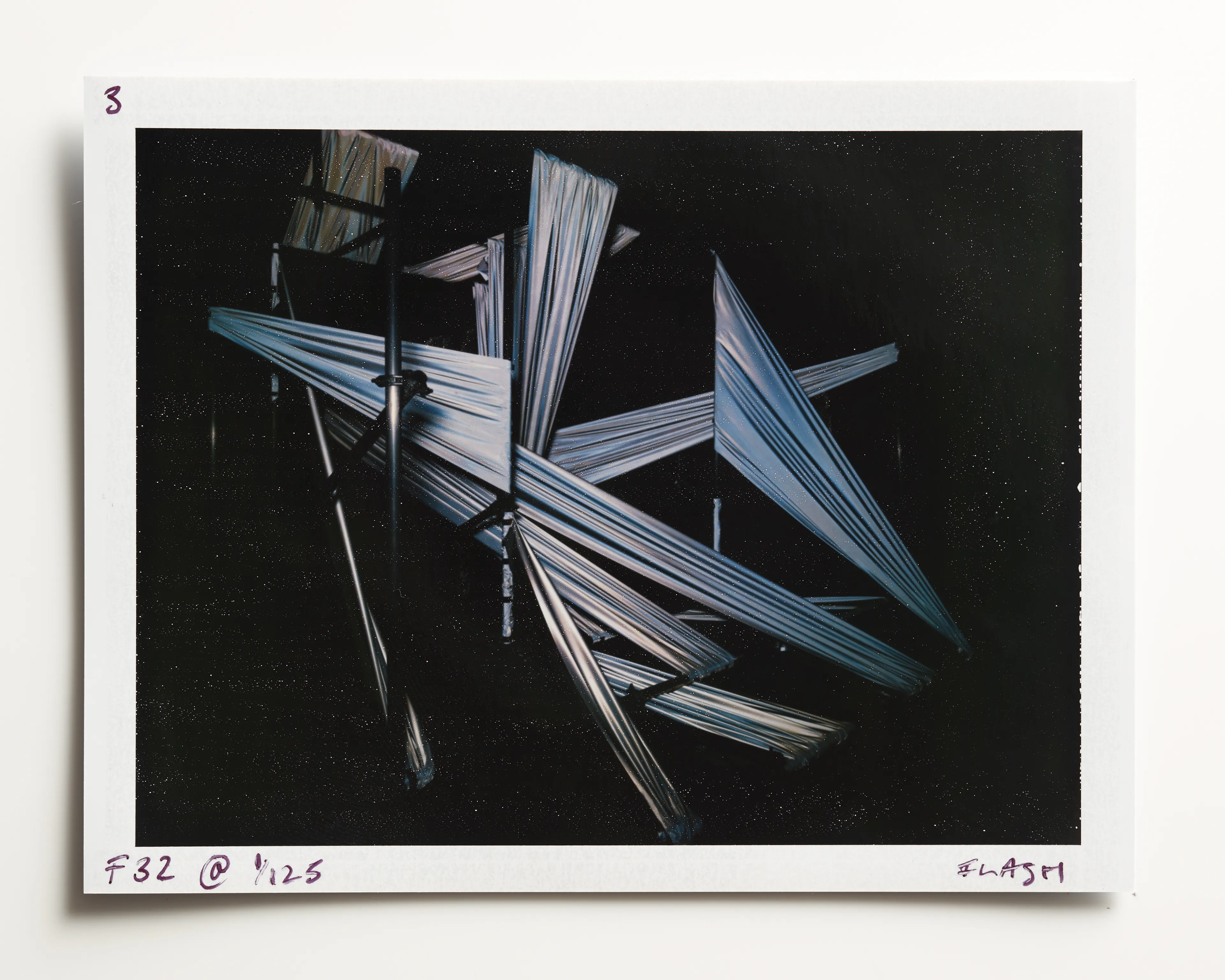
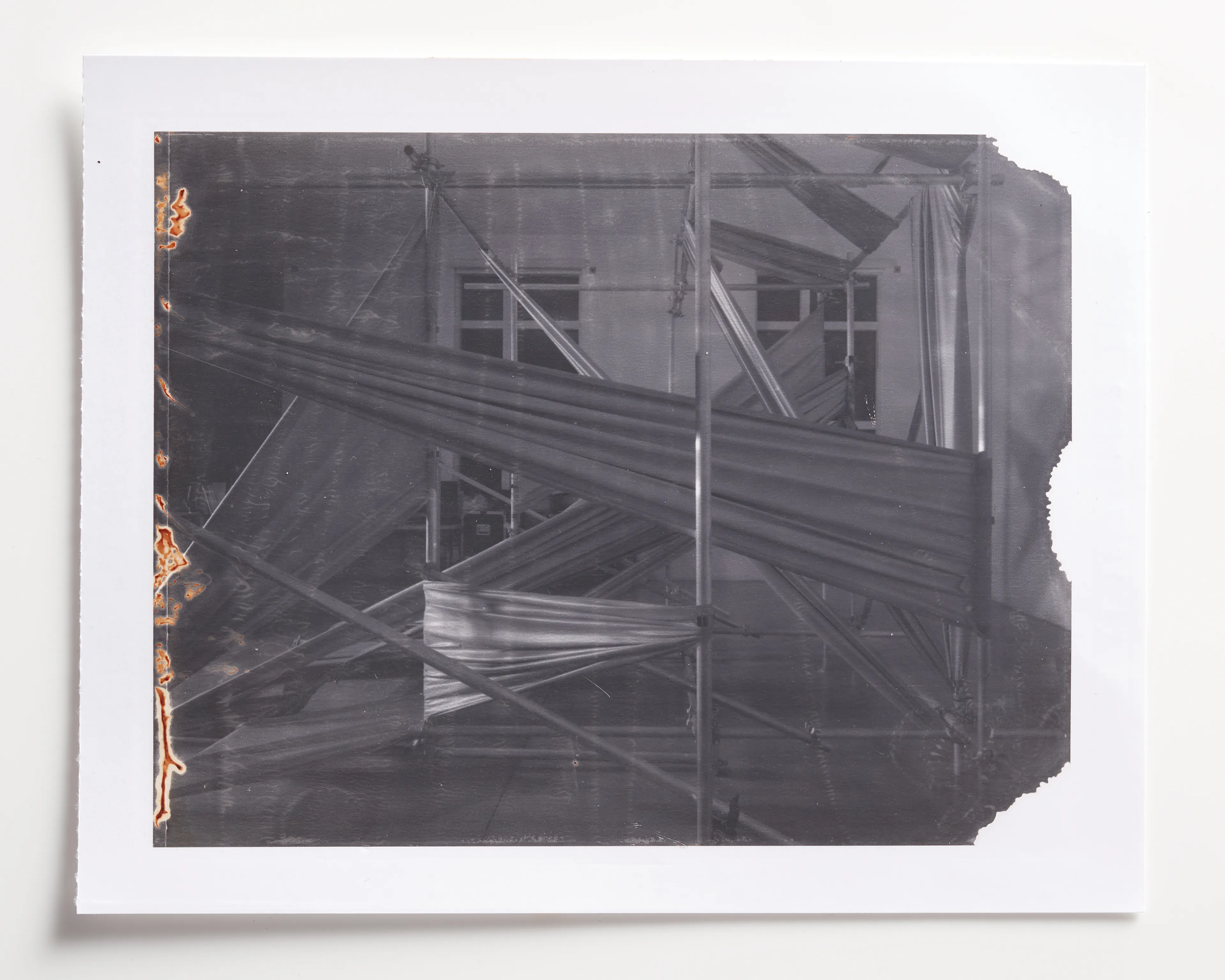
Negentropy, Scaffolding Tubes, 3M material, 2019
The project makes use of Scotchlite Material, a type of retroreflective sheeting. Invented in the 1930’s for use in road markings to increase safety.
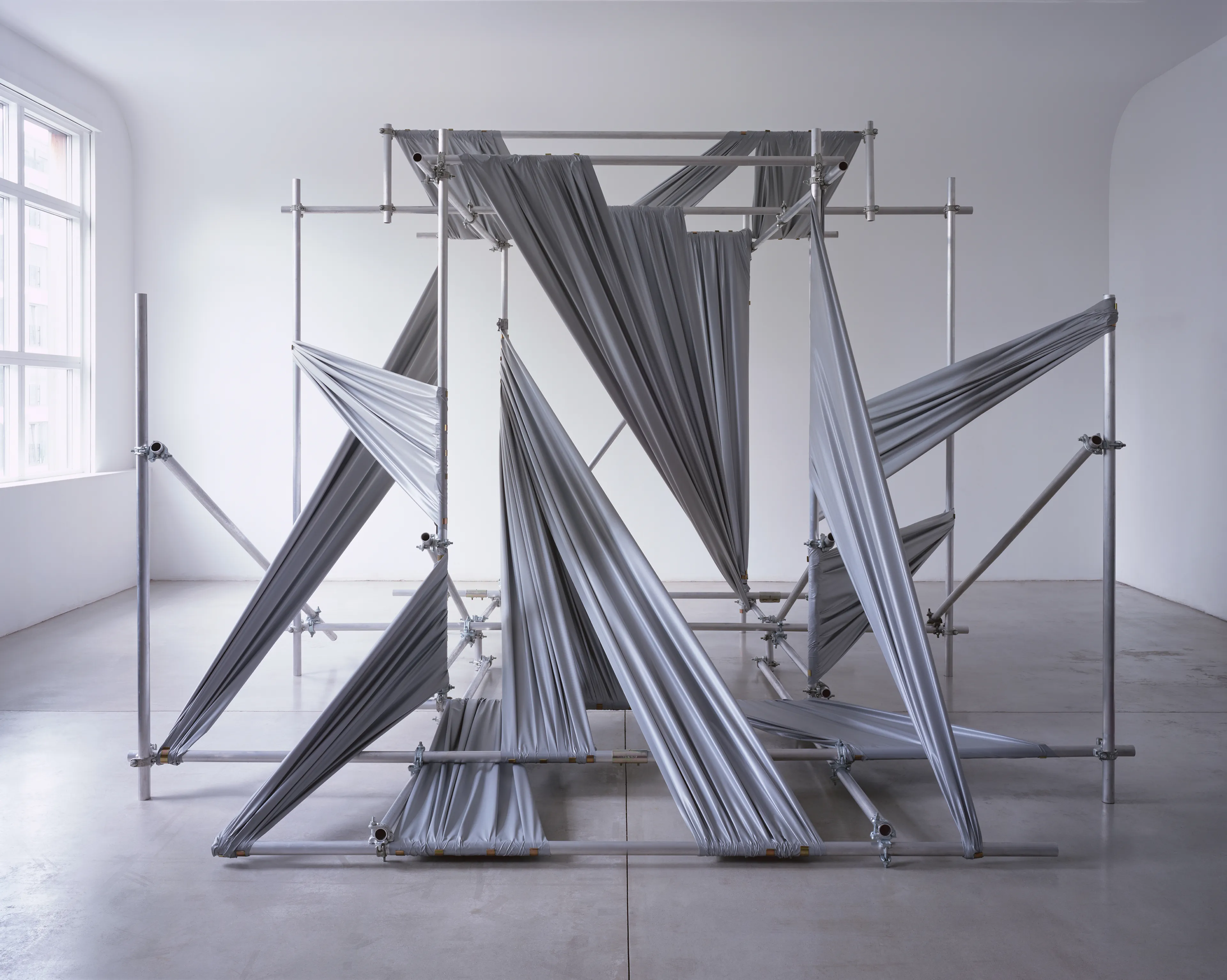
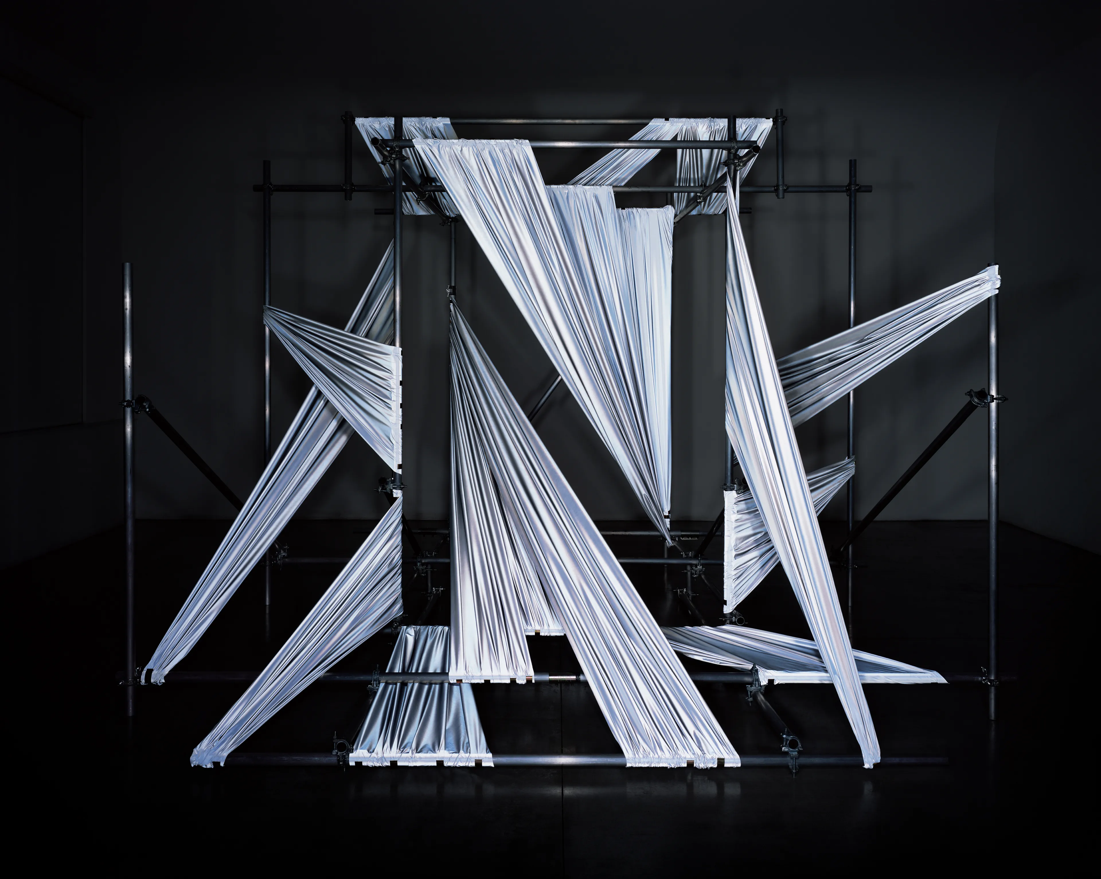
This material uses thousands of microscopic glass beads encapsulated in plastic to reflect light back directly from the direction it’s originating. The light reflected back is 100 times the strength of the light projected making giving it many uses, including within photography and film, specifically in front projection. This was most famously used by Stanley Kubrick in 2001, A Space Odyessy . Kubrick needed to use 10×8 inch transparencies of the background scene to make sure there was no degradation in image and even had a special projector built specifically for that purpose. 3 still camera units spent months in southwest Africa photographing the landscapes for the “Dawn of Man” prologue.
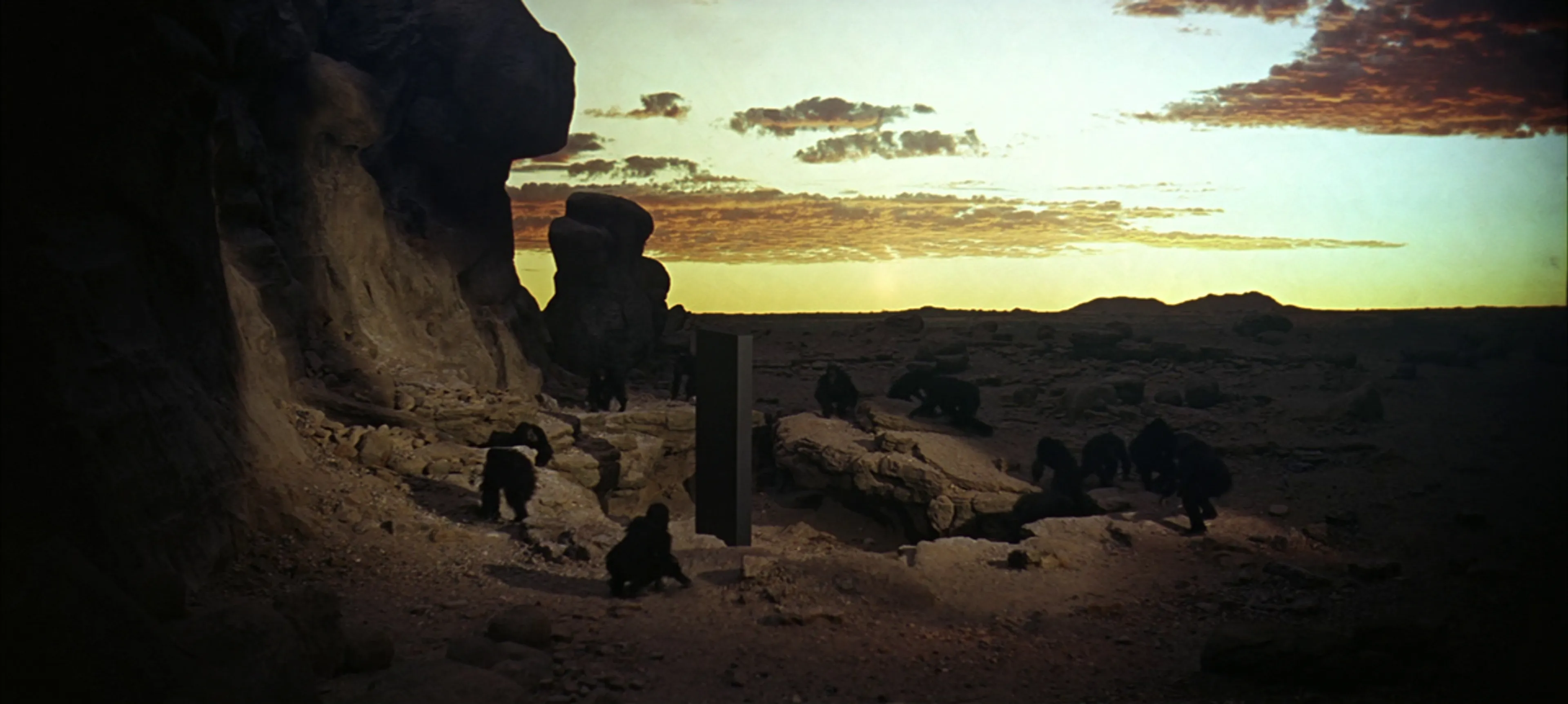
3M Scotchlite in use for the 'Dawn of Man' sequence in Stanley Kubrick's 2001, A Space Odyssey
The term Negentropy derives from the term entropy, the opposite of entropy. The 3M material acts in a unique way, rather than dispersing the light and increasing entropy into he surrounding environment, it reflects it directly back to its source
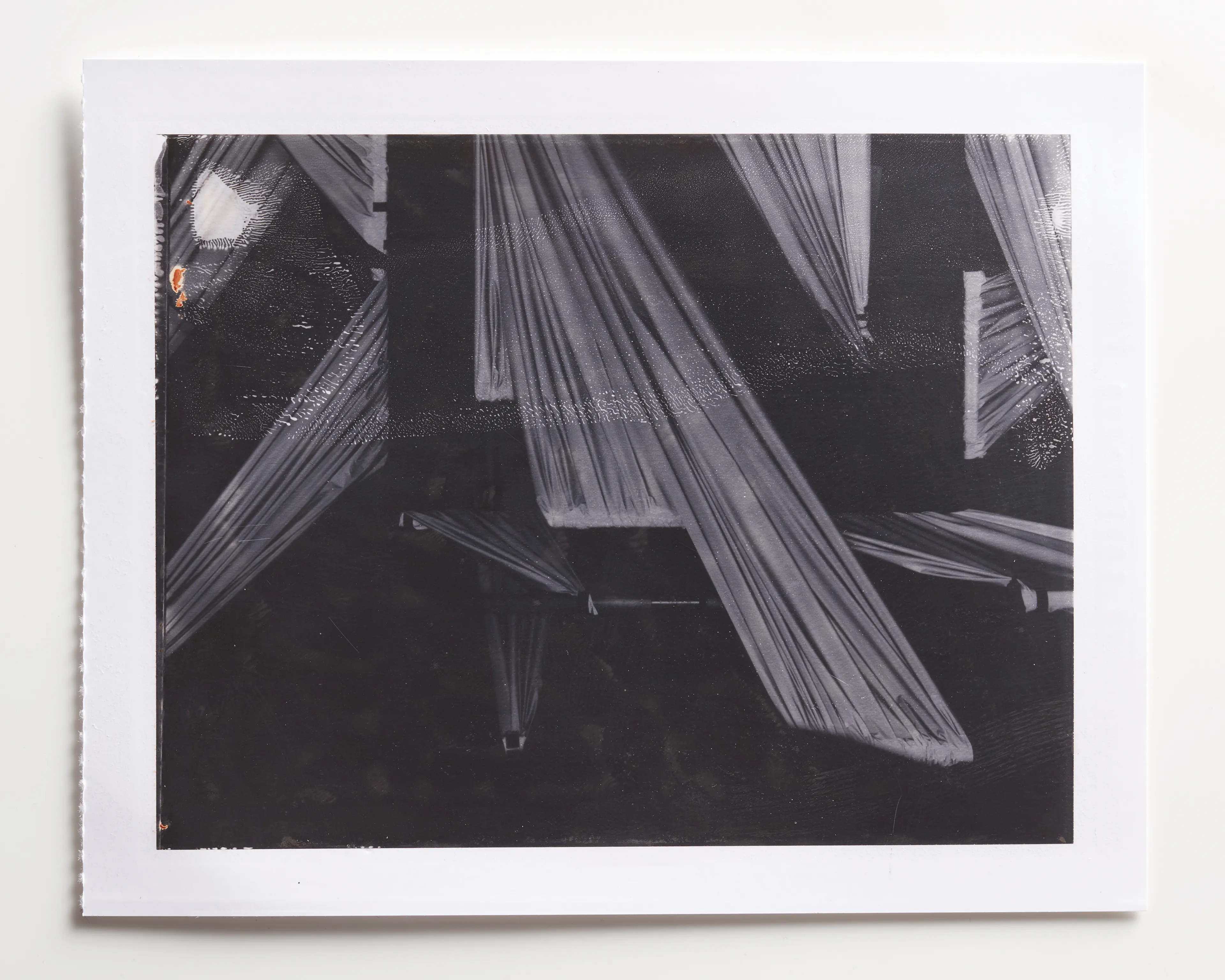
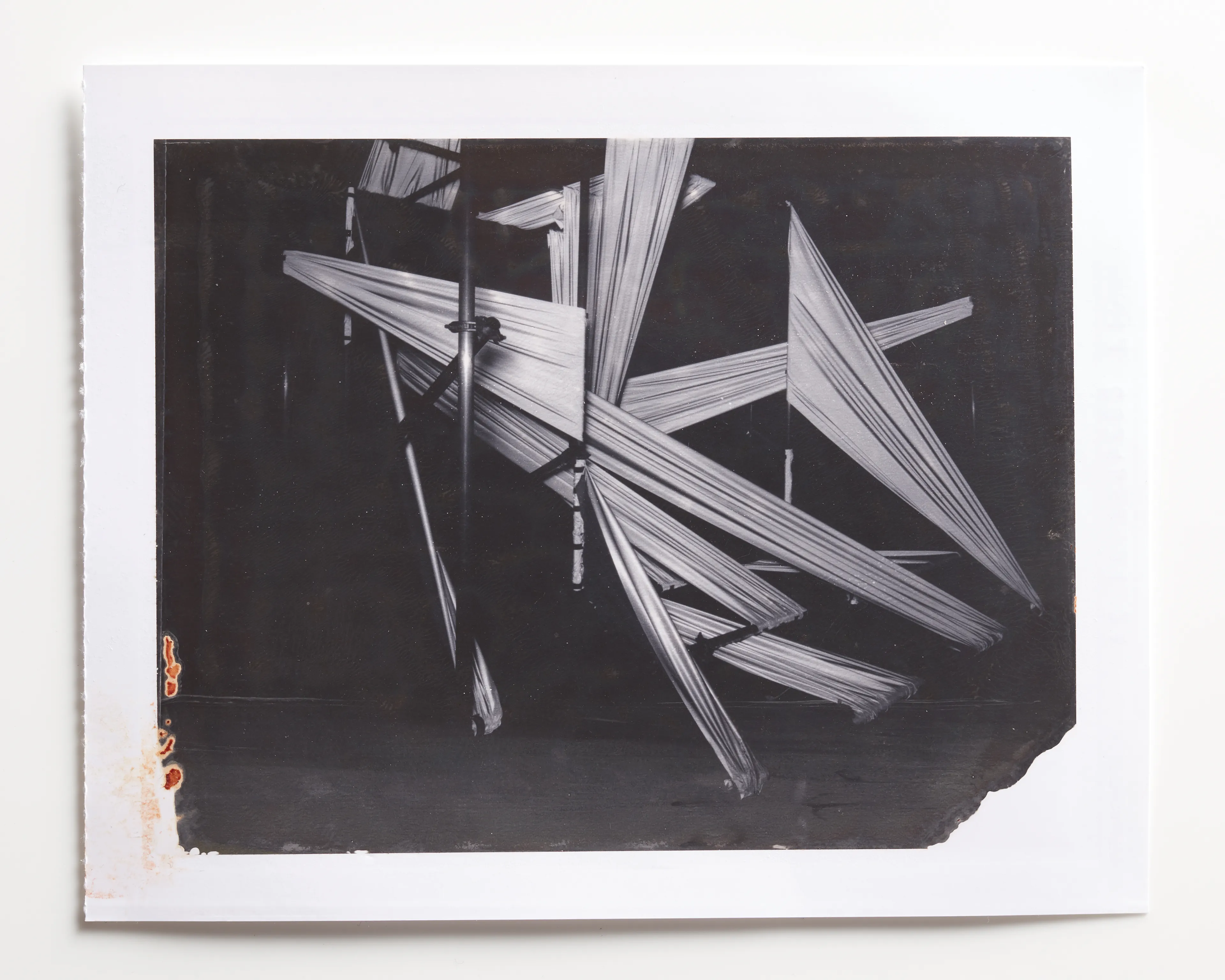
Letter P
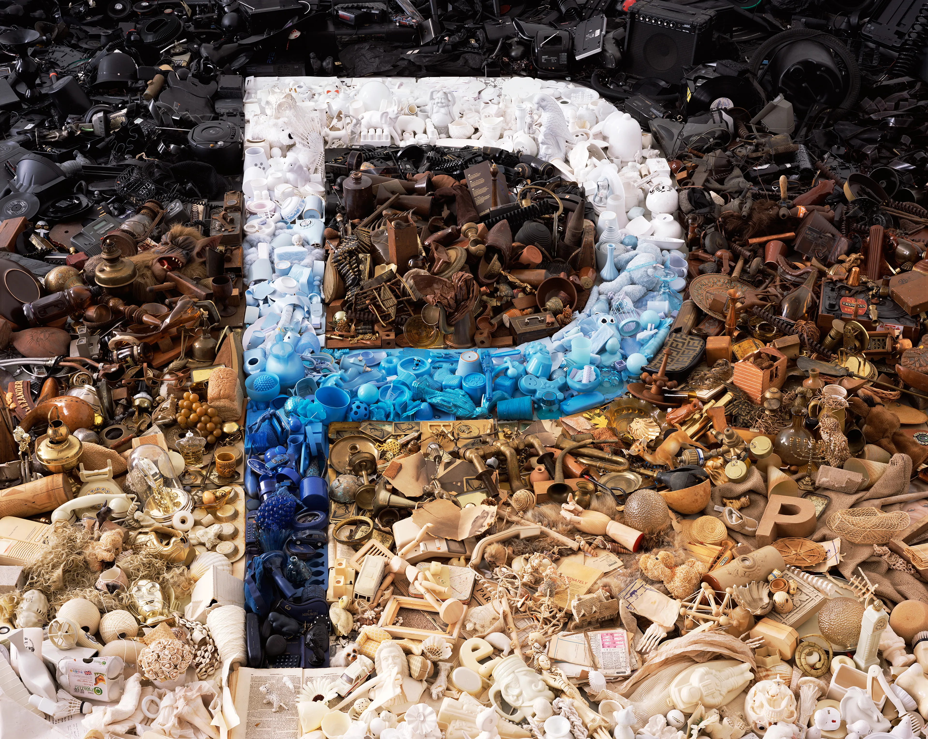
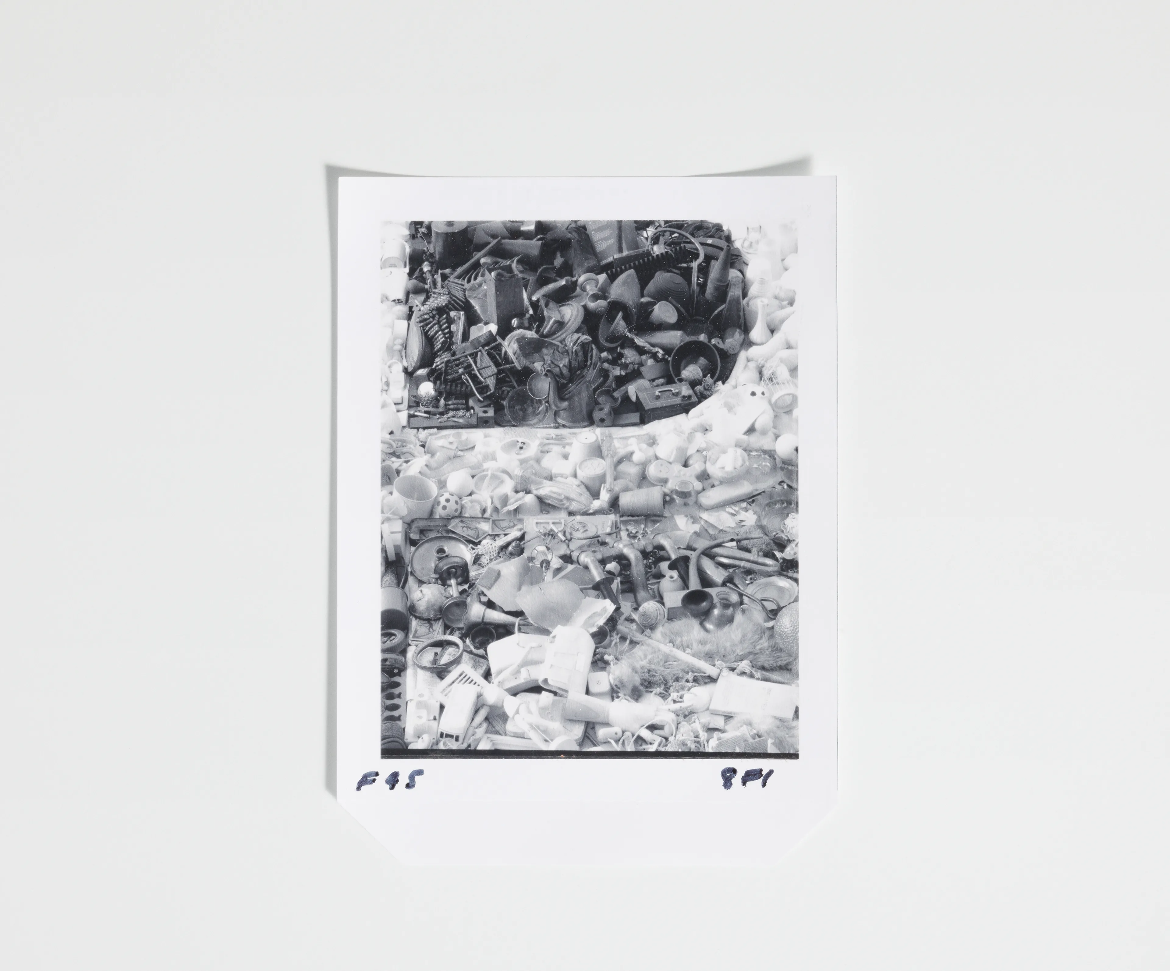
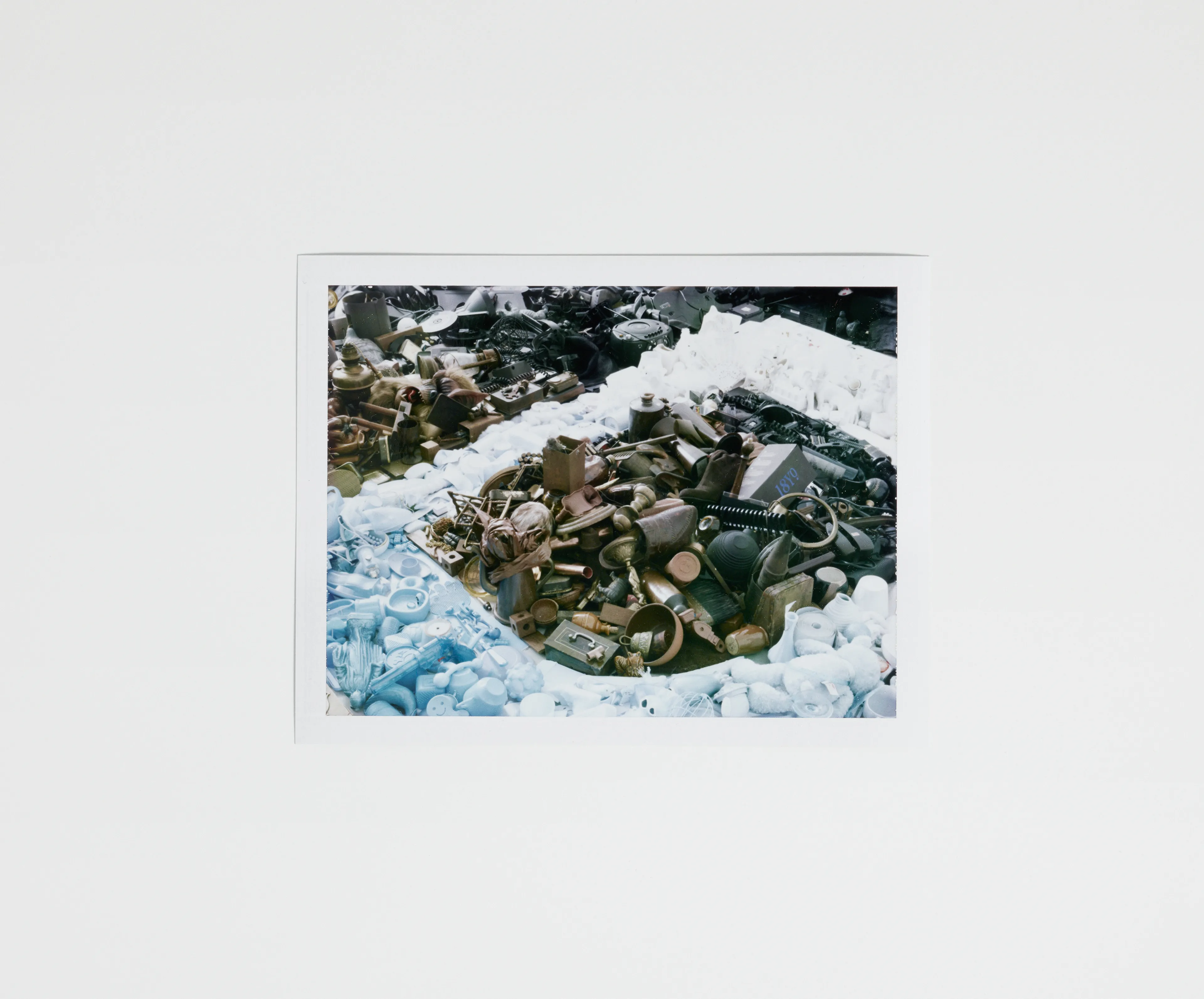
Phillip, various found objects, 2014
I created this piece whilst I was working on a print series and installation during London Design week in 2014 called ‘The First Law of Kipple’. The project was inspired by Phillip K Dick’s concept of Kipple, a word Dick invented, describing a kind of domestic entropy, like clutter, but it also has a psychological aspect because of the way waste or clutter affects you.
No one can win against kipple, he said, except temporarily and maybe in one spot
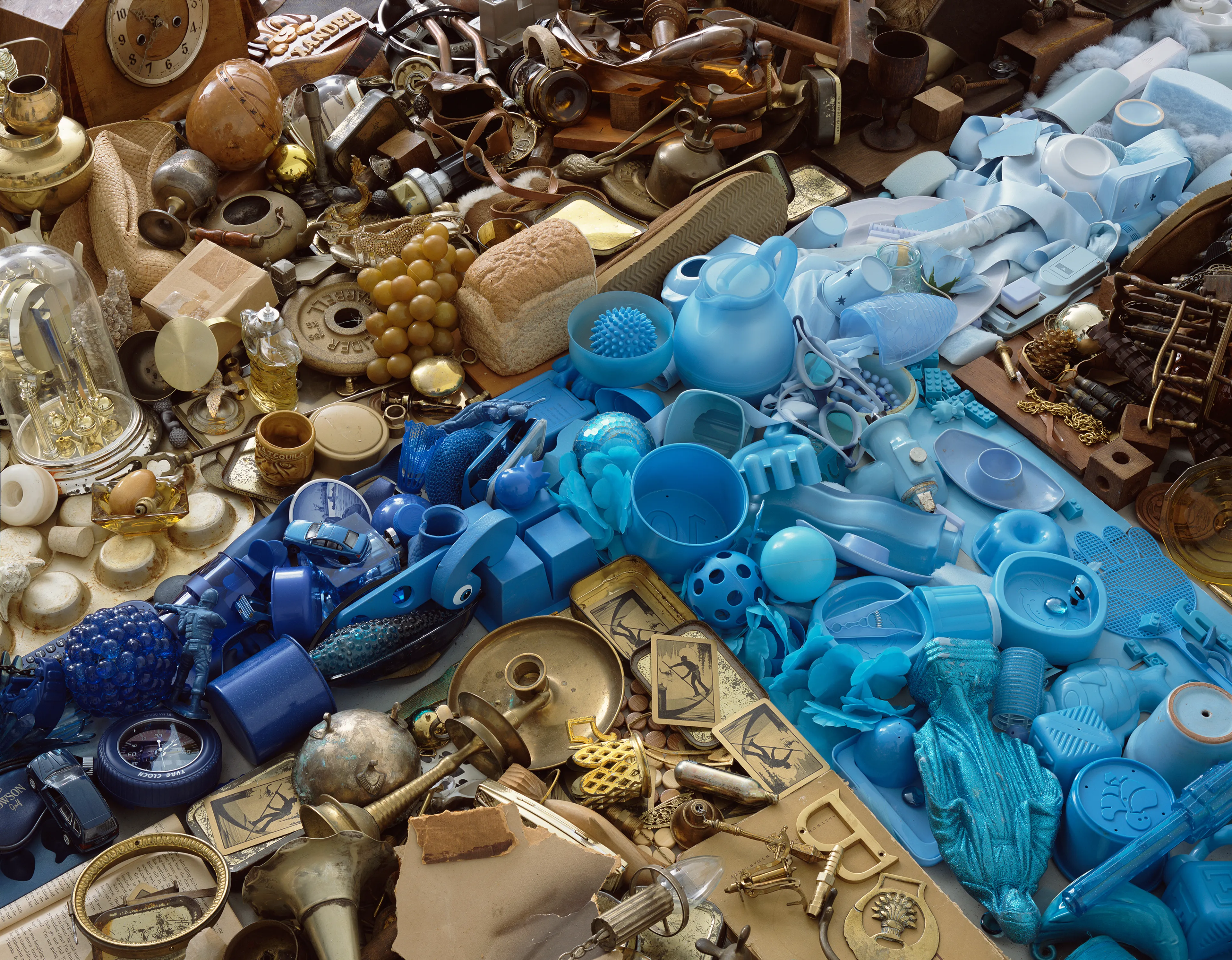
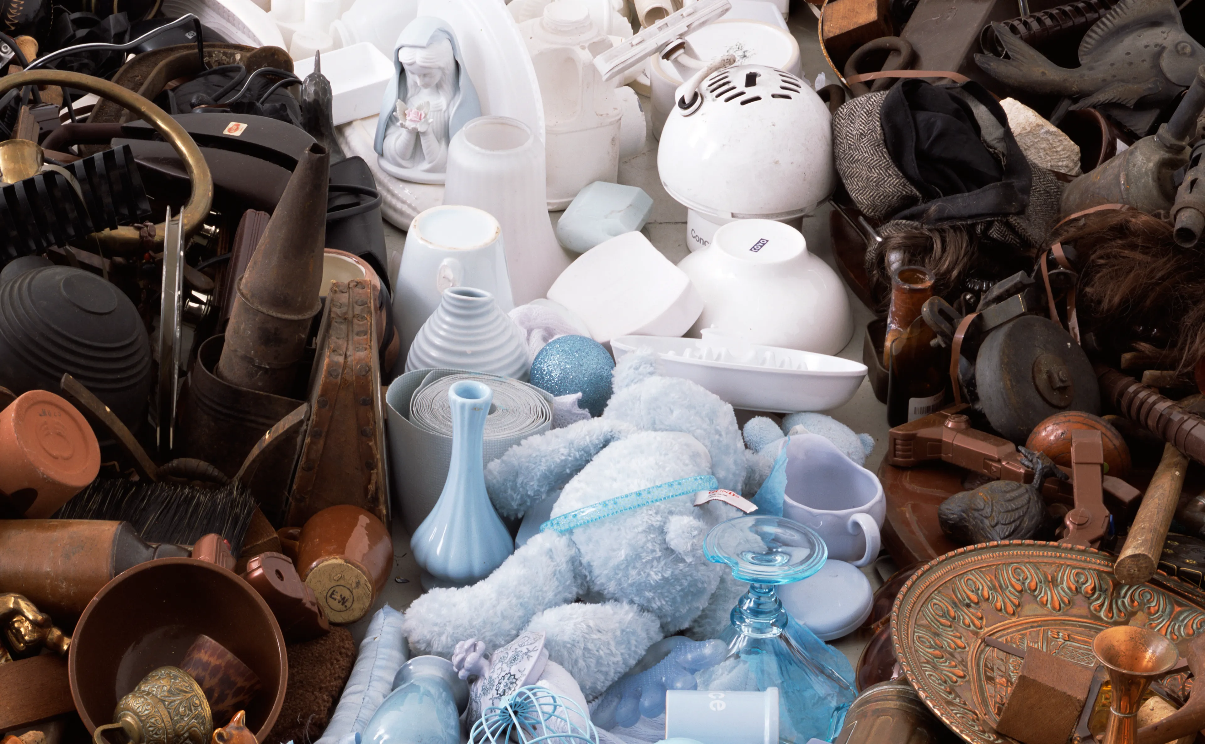
Kipple is useless objects, like junk mail or match folders after you use the last match or gum wrappers or yesterday’s homeopape [newspaper]. When nobody’s around, kipple reproduces itself… the entire universe is moving towards a final state of total, absolute kippleization.
Letter Q
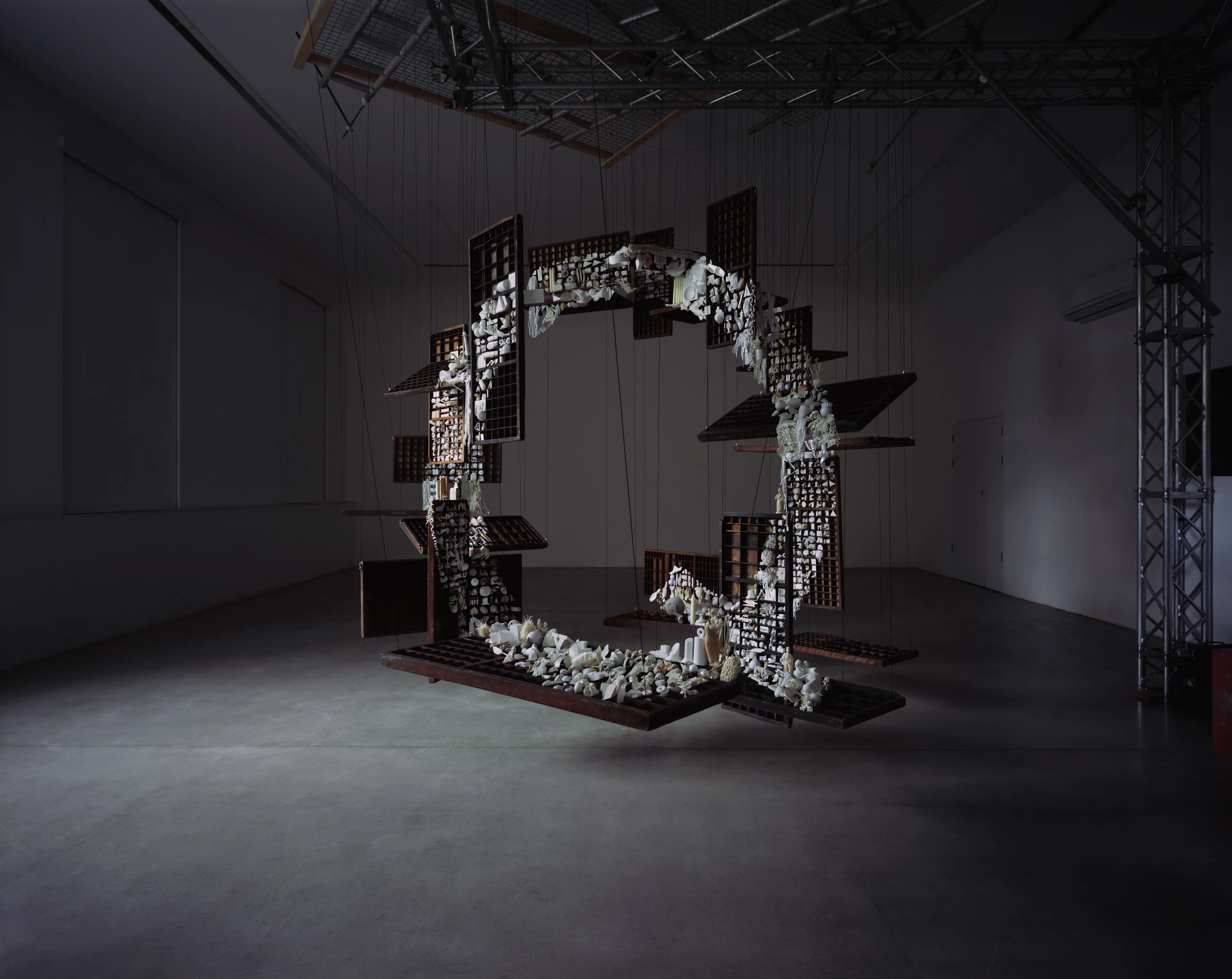
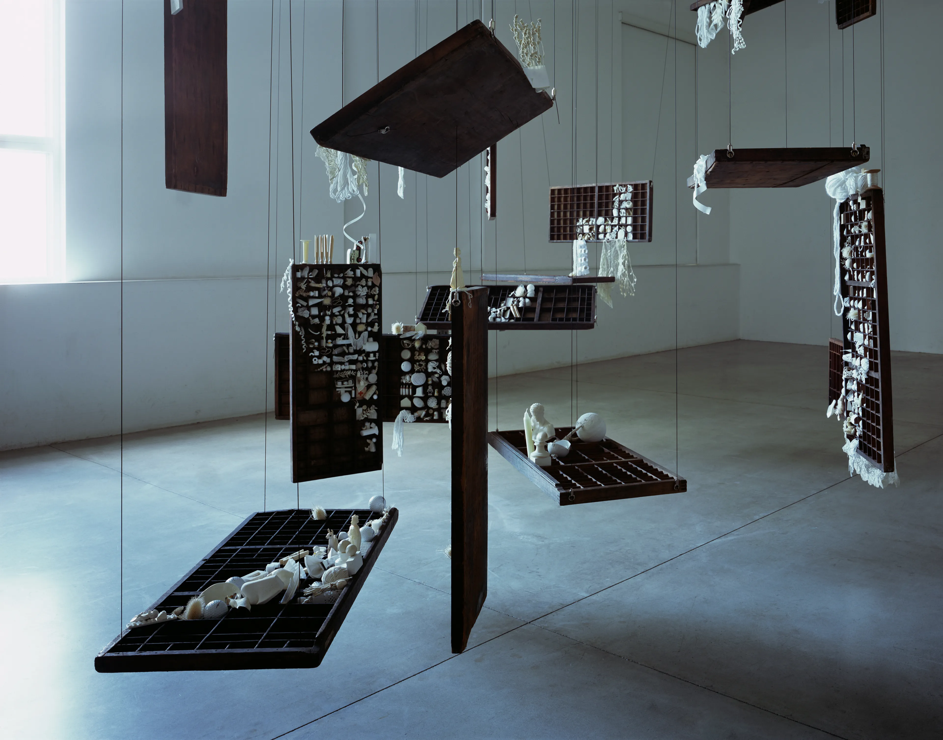
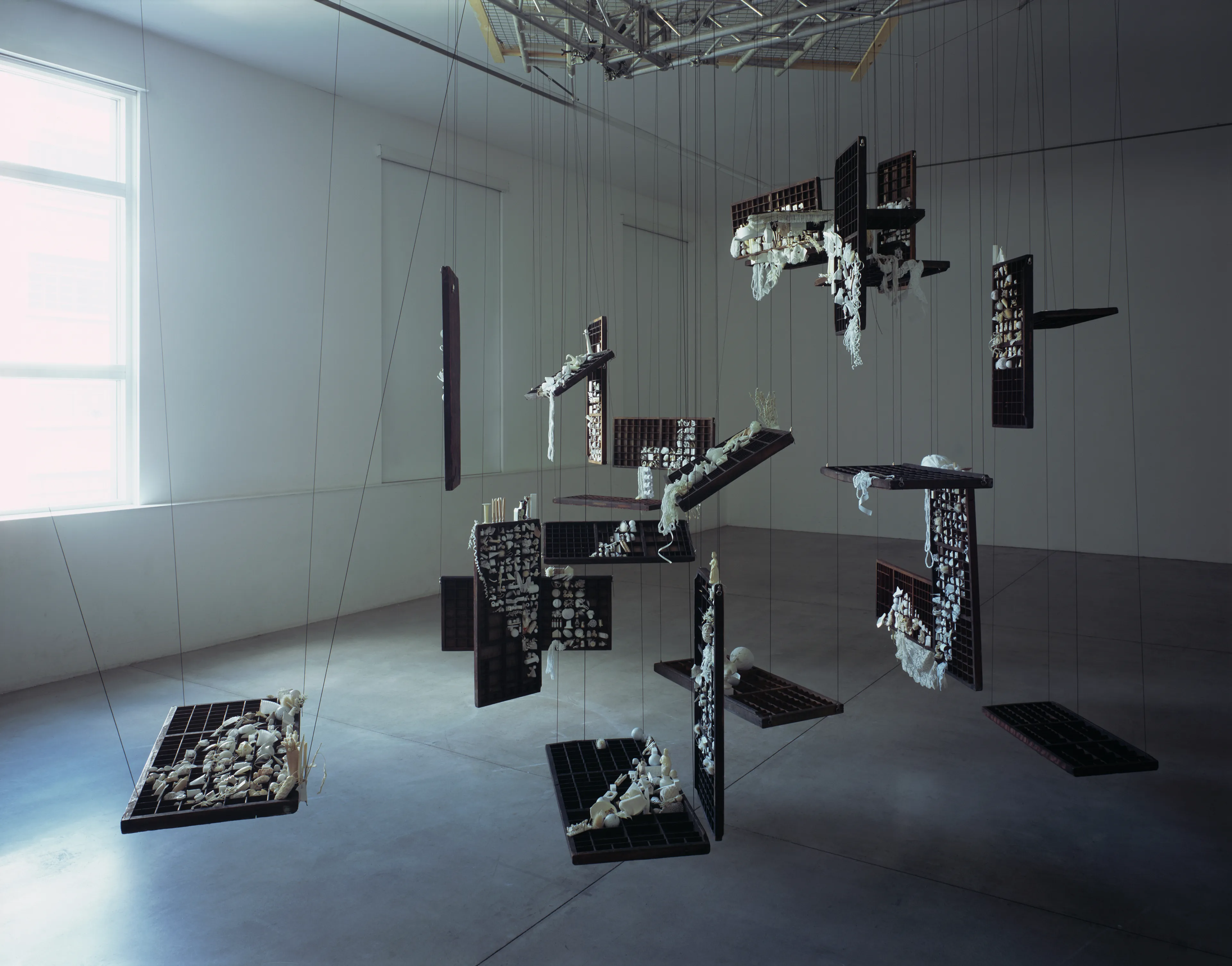
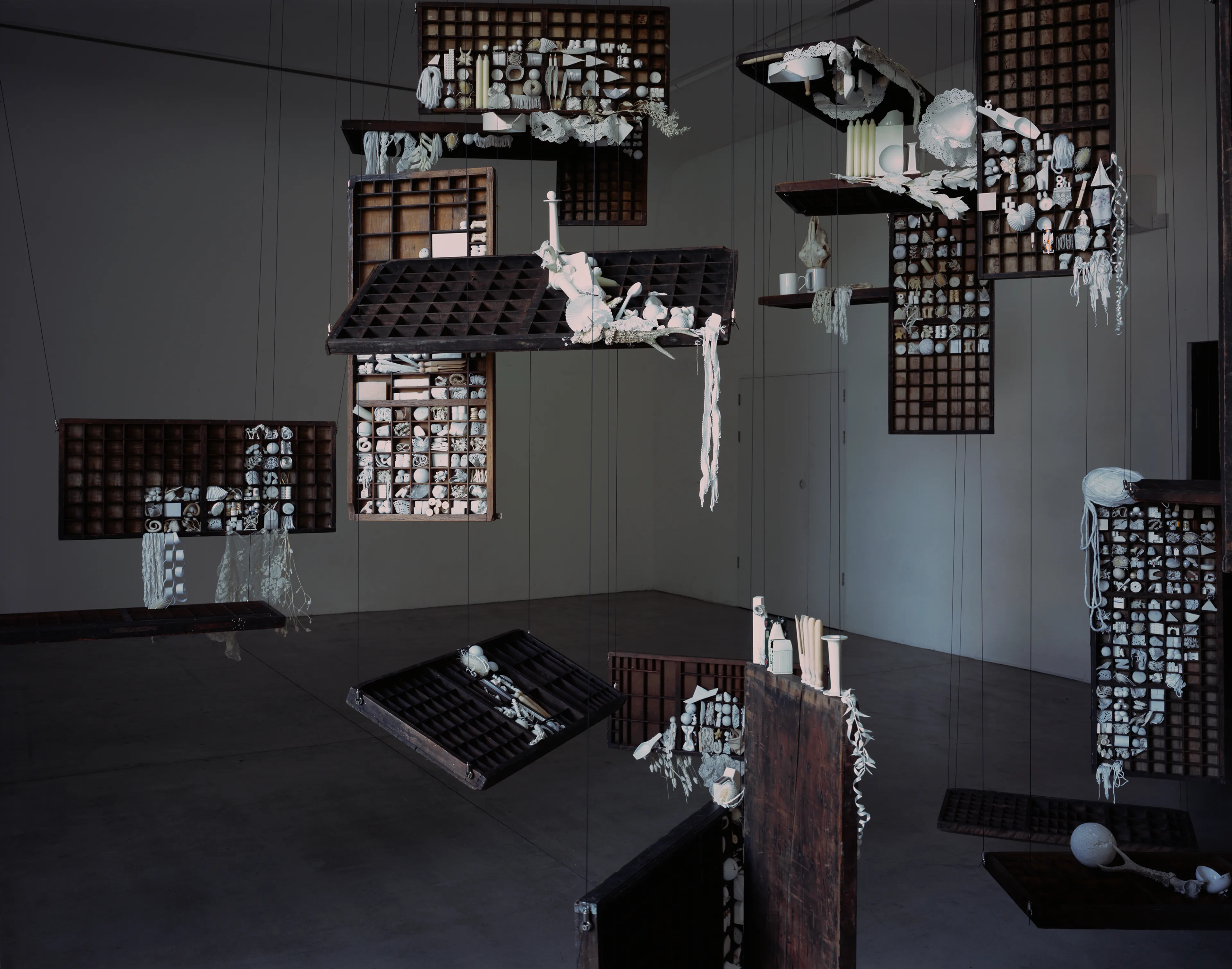
Query, 2022
lorem ipsum dolor sit amet consectetur adipiscing elit labore sed ut est qui velit aliqua est ut nulla laboris animi imperdiet consectetur vel dolor temporibus esse et mollit dolorem sint dolor placeat vel quo in esse molestias culpa qui velit id distinctio quod enim voluptas dolore mollit culpa ex vero
Letter R
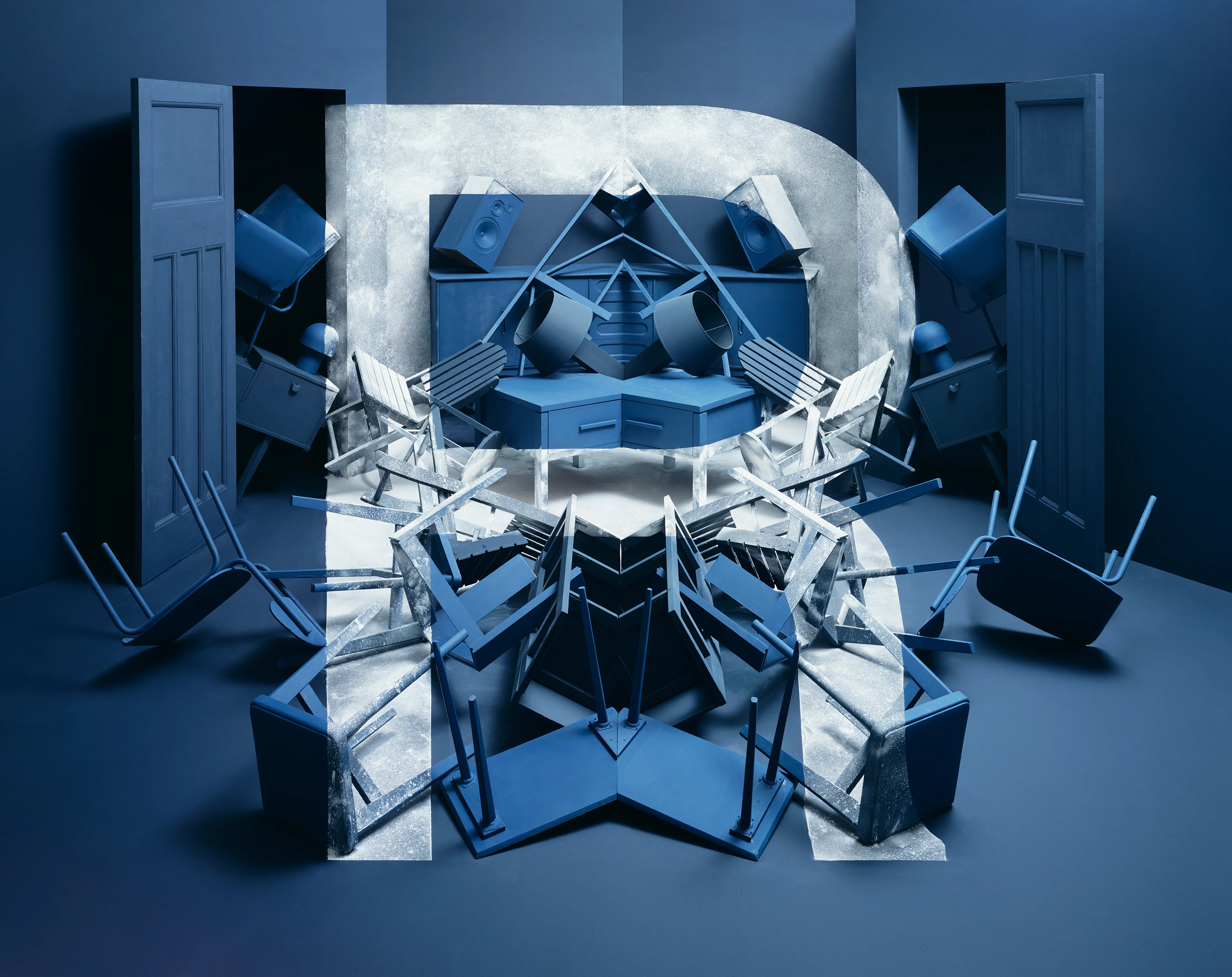
Reflection, 2018
lorem ipsum dolor sit amet consectetur adipiscing elit labore sed ut est qui velit aliqua est ut nulla laboris animi imperdiet consectetur vel dolor temporibus esse et mollit dolorem sint dolor placeat vel quo in esse molestias culpa qui velit id distinctio quod enim voluptas dolore mollit culpa ex vero
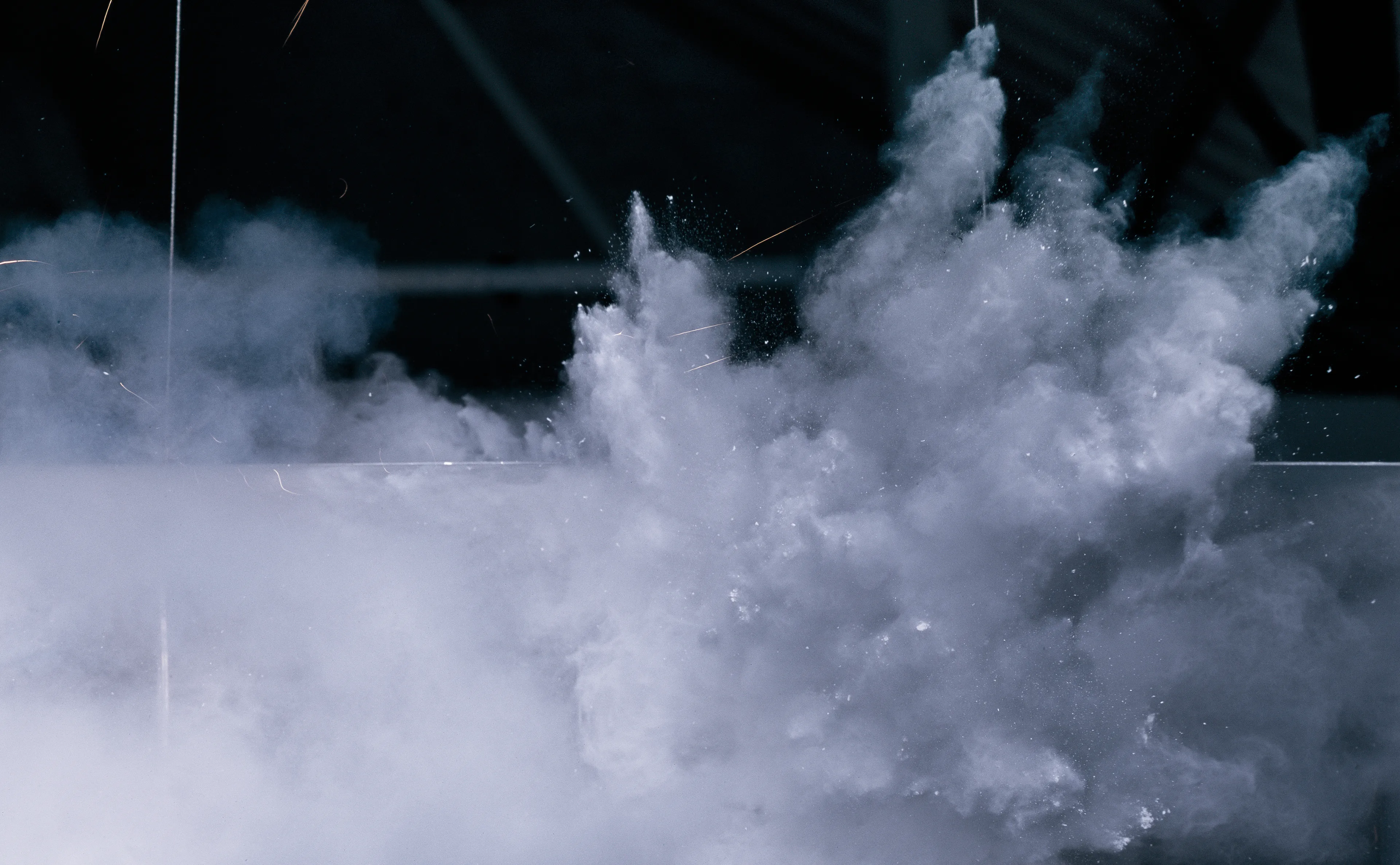
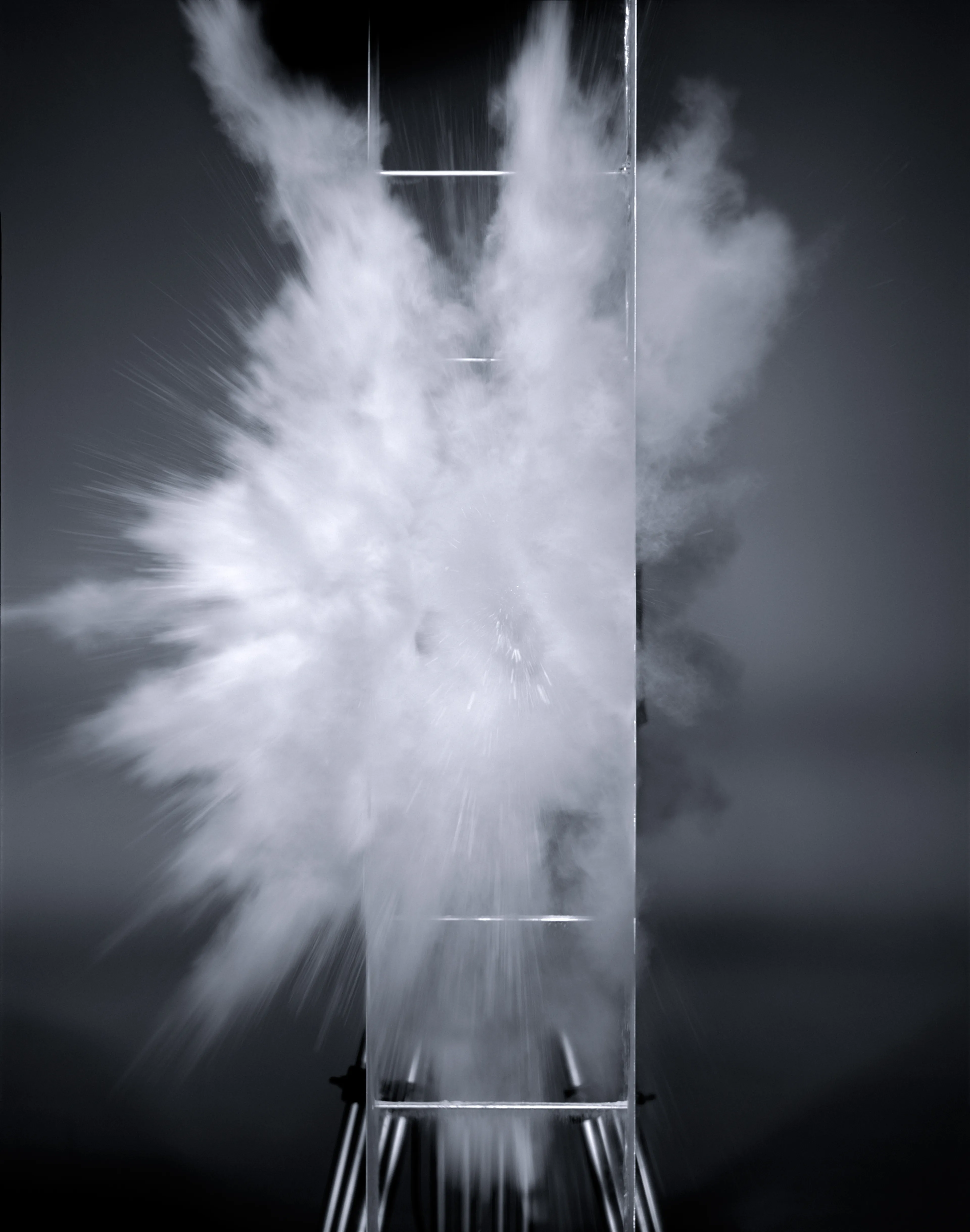
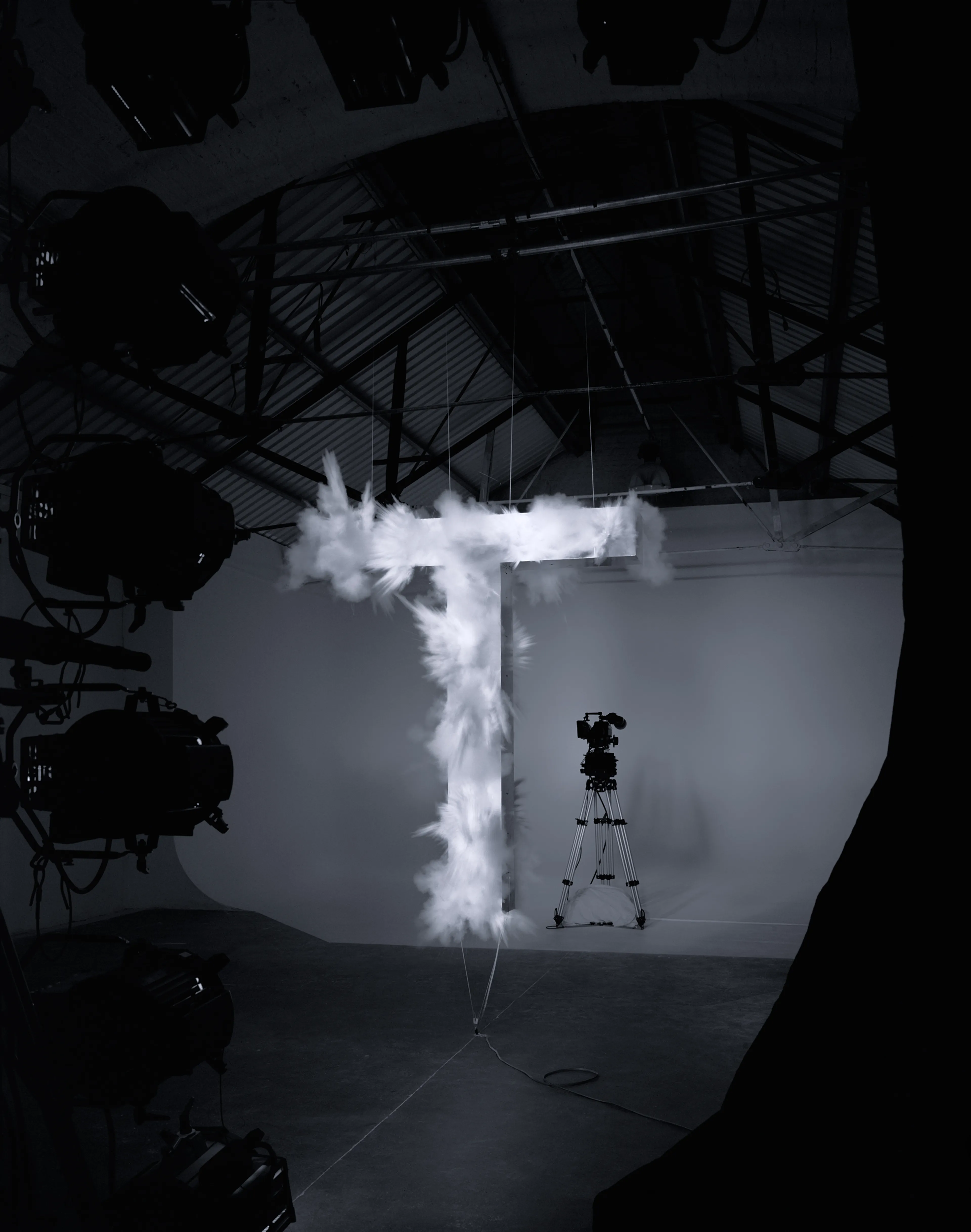
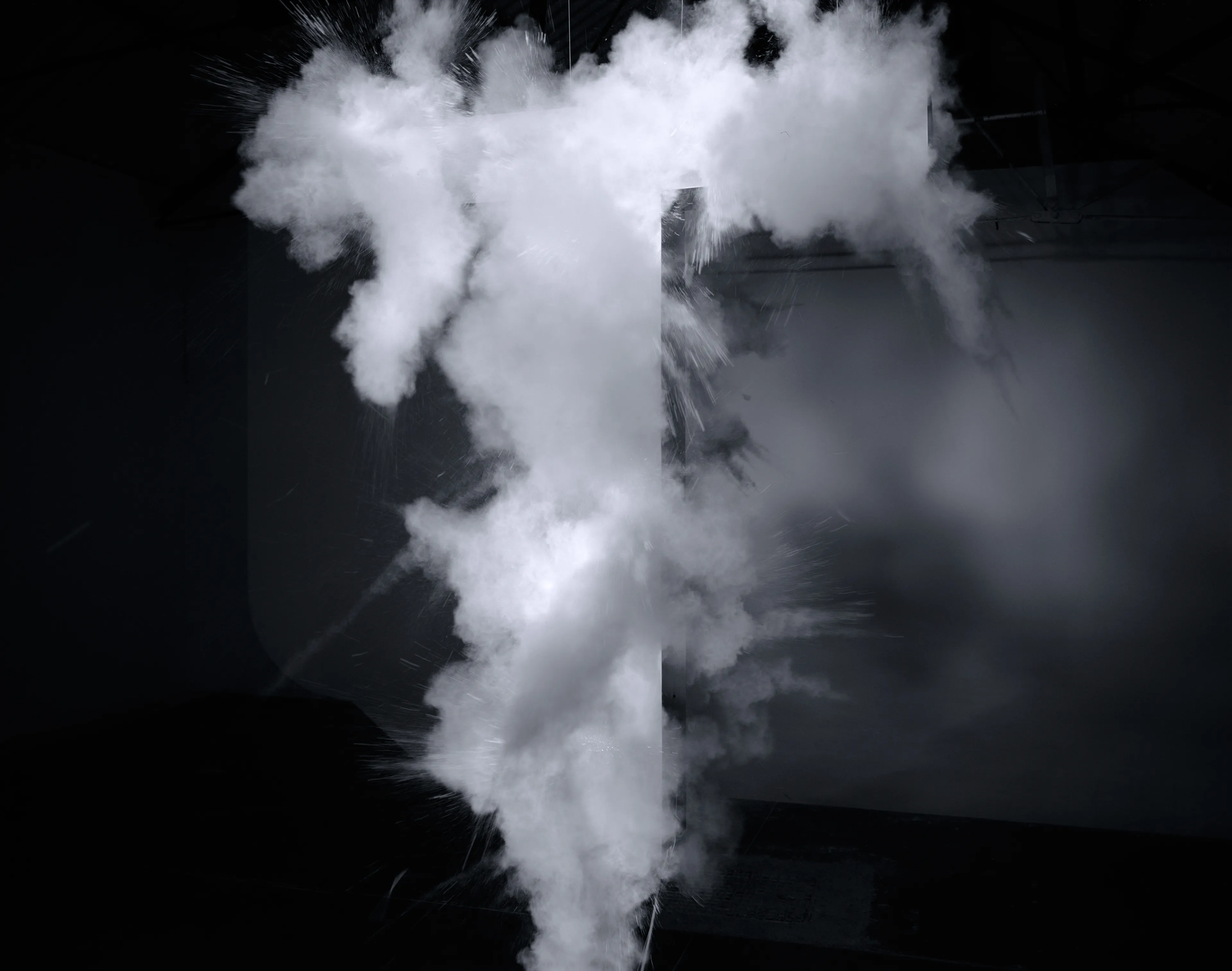
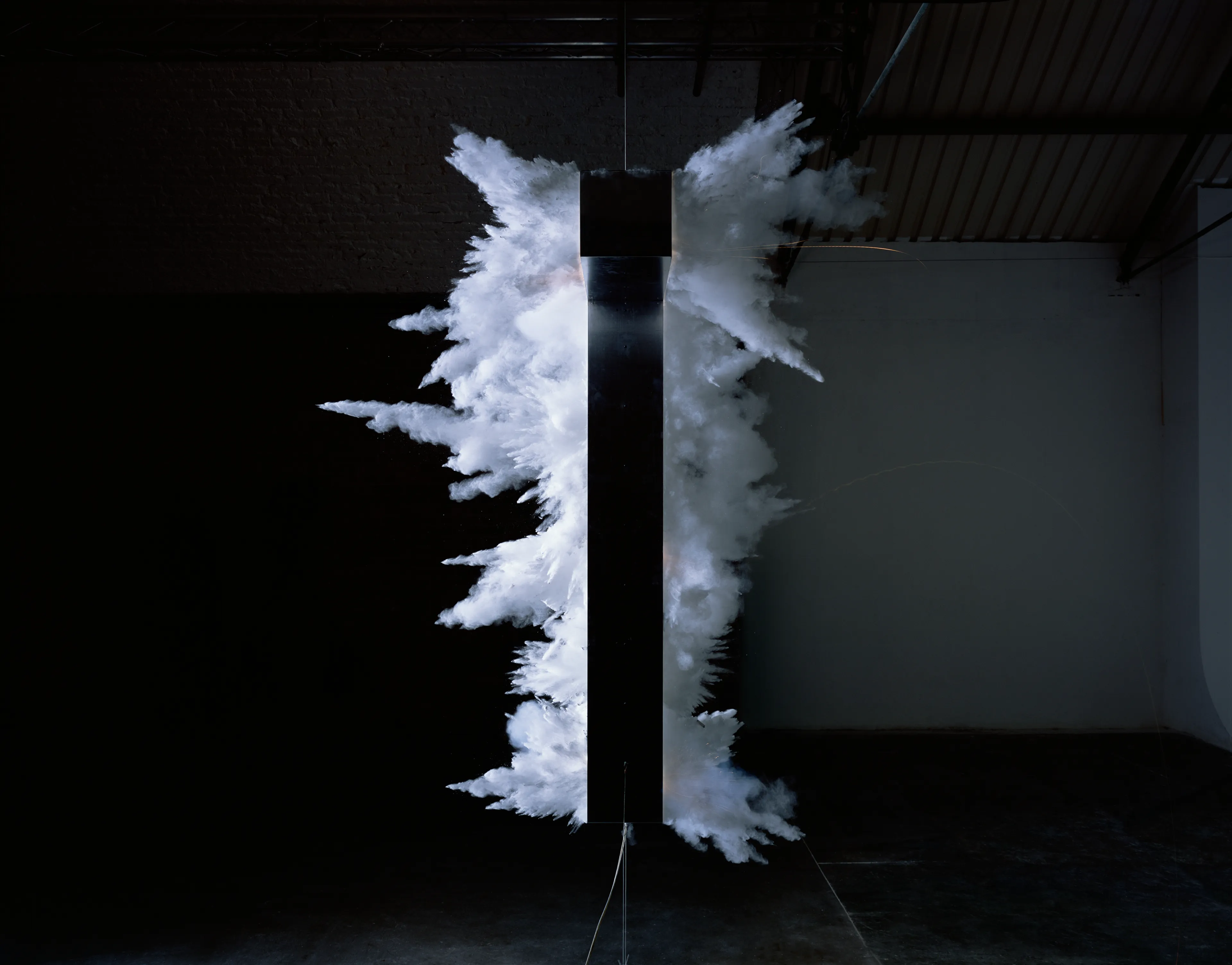
Letter T
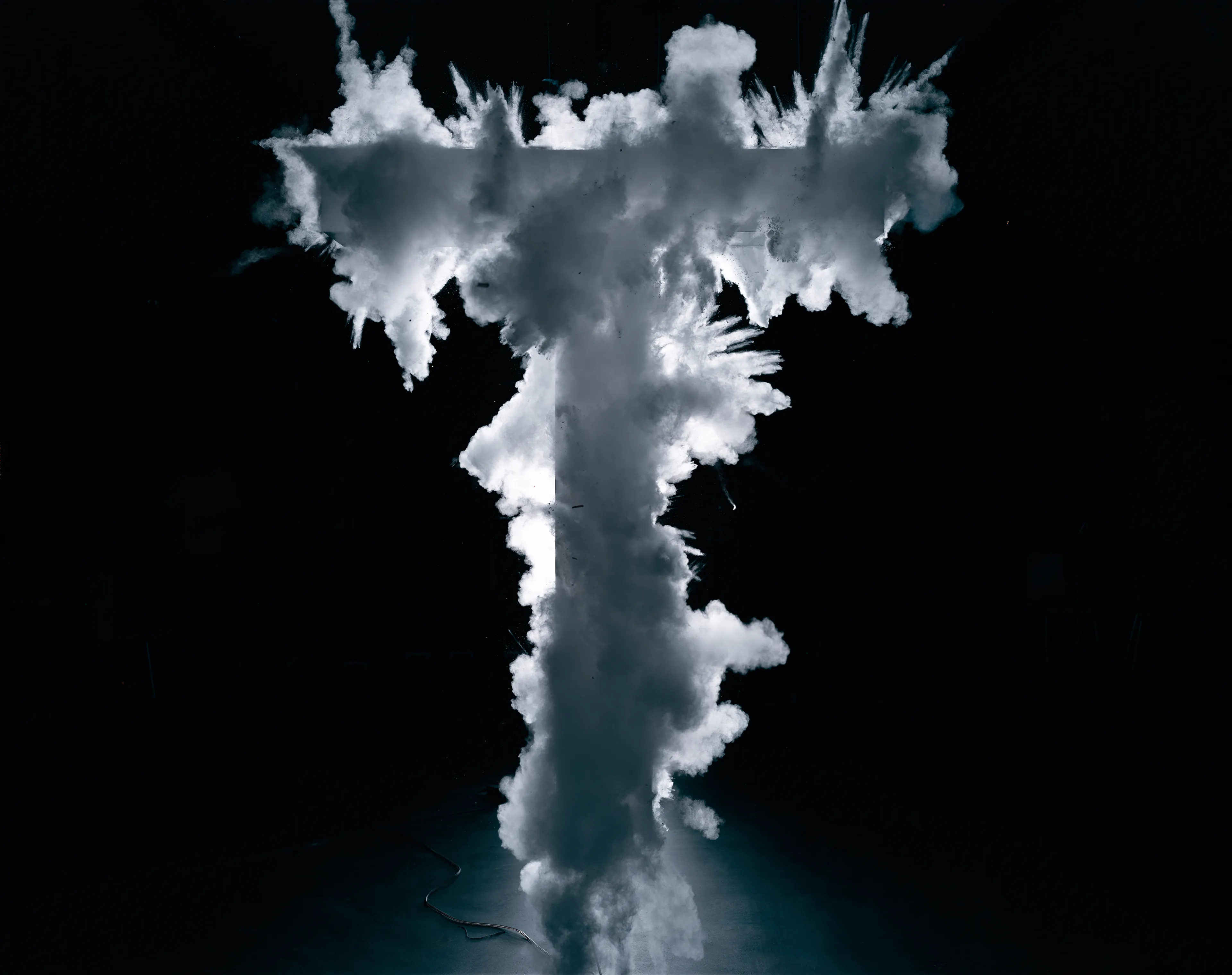
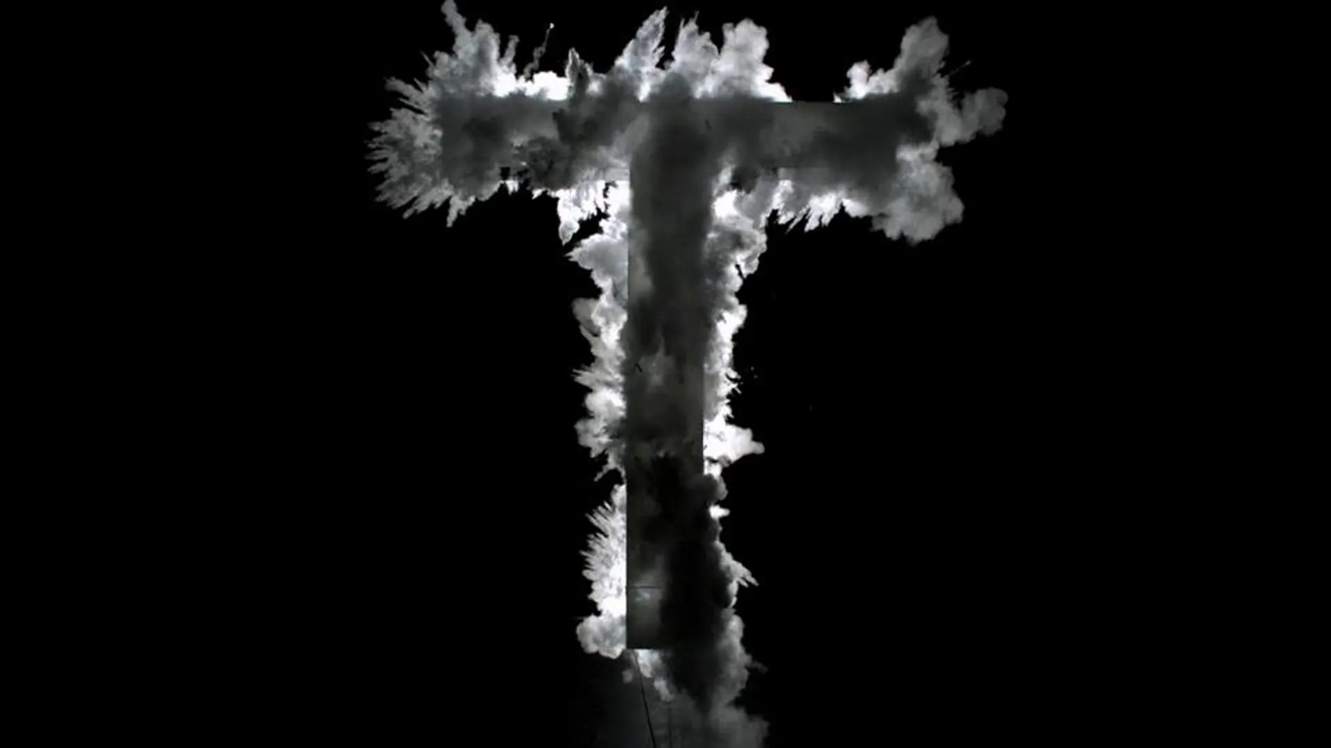
Time, 2011
lorem ipsum dolor sit amet consectetur adipiscing elit labore sed ut est qui velit aliqua est ut nulla laboris animi imperdiet consectetur vel dolor temporibus esse et mollit dolorem sint dolor placeat vel quo in esse molestias culpa qui velit id distinctio quod enim voluptas dolore mollit culpa ex vero
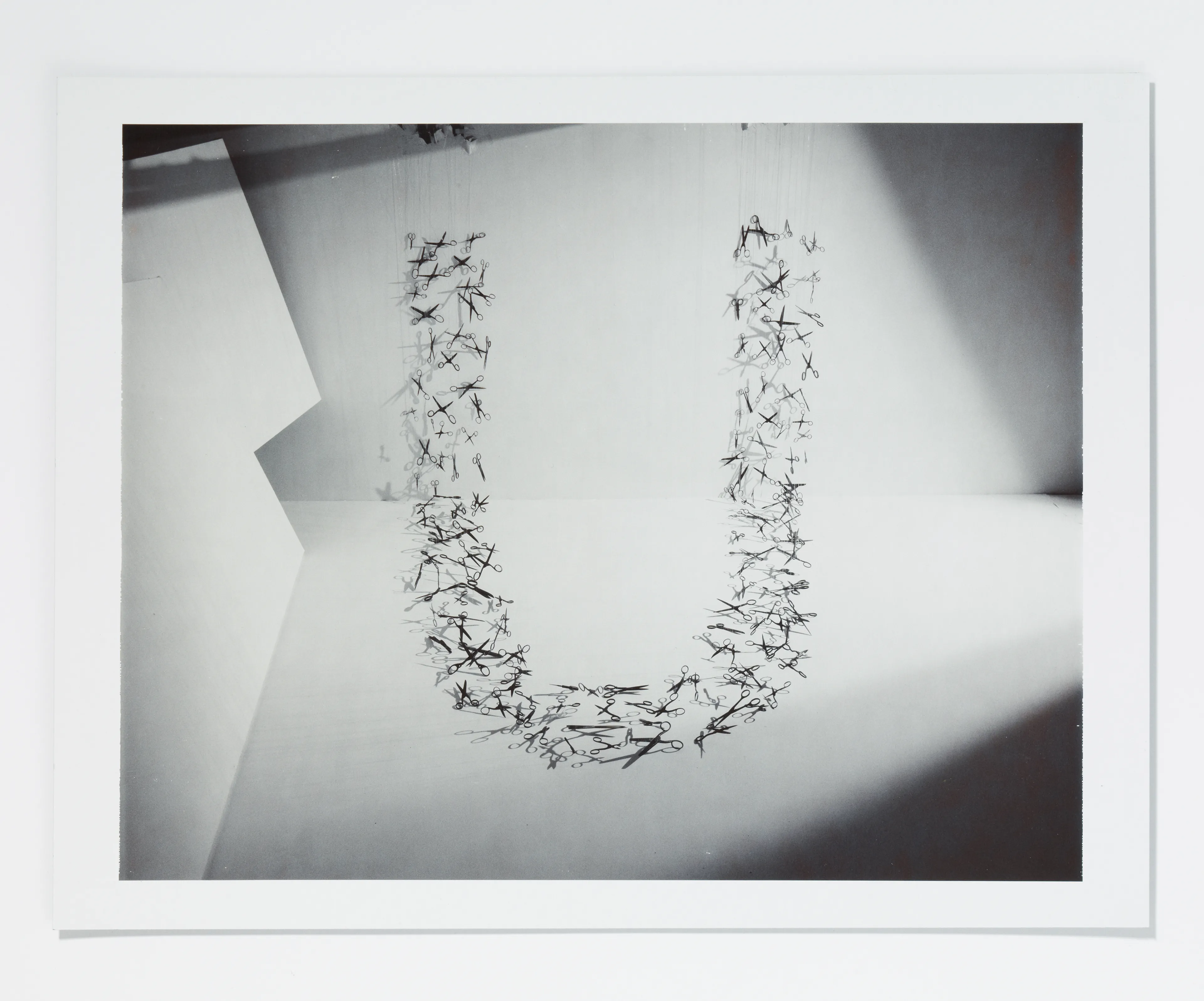
Letter U
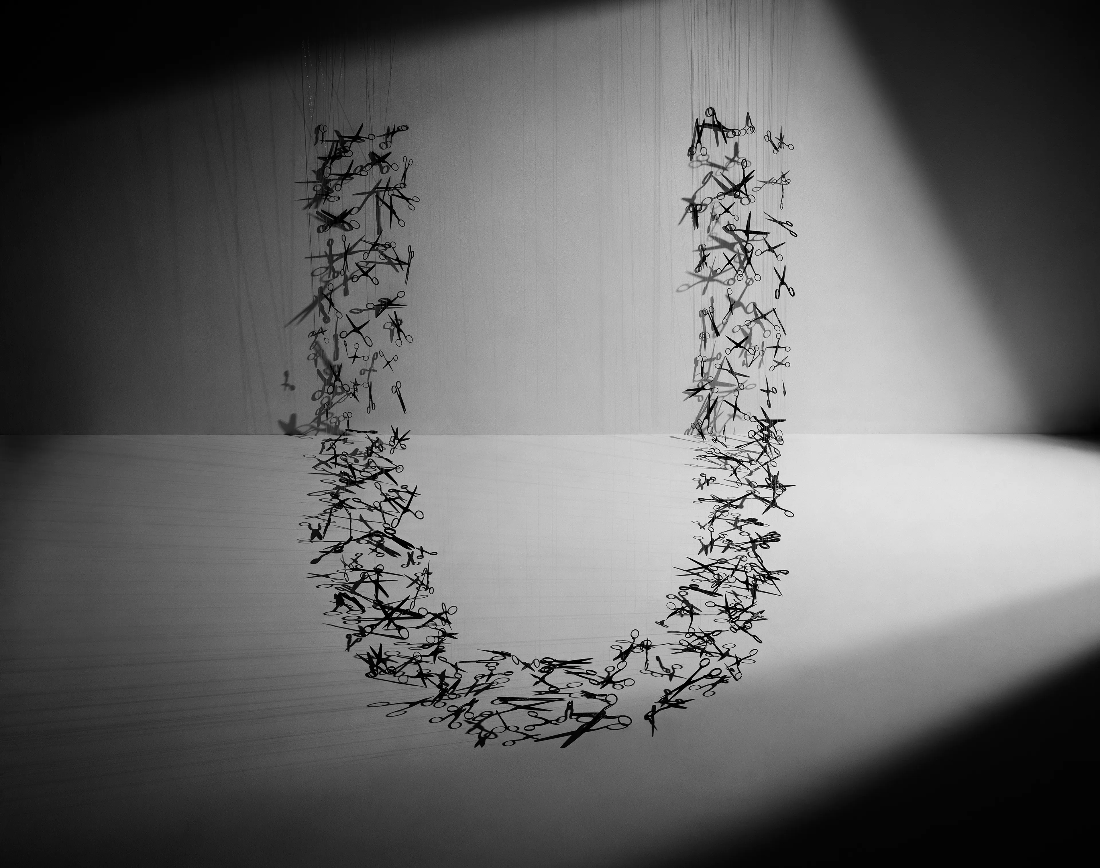
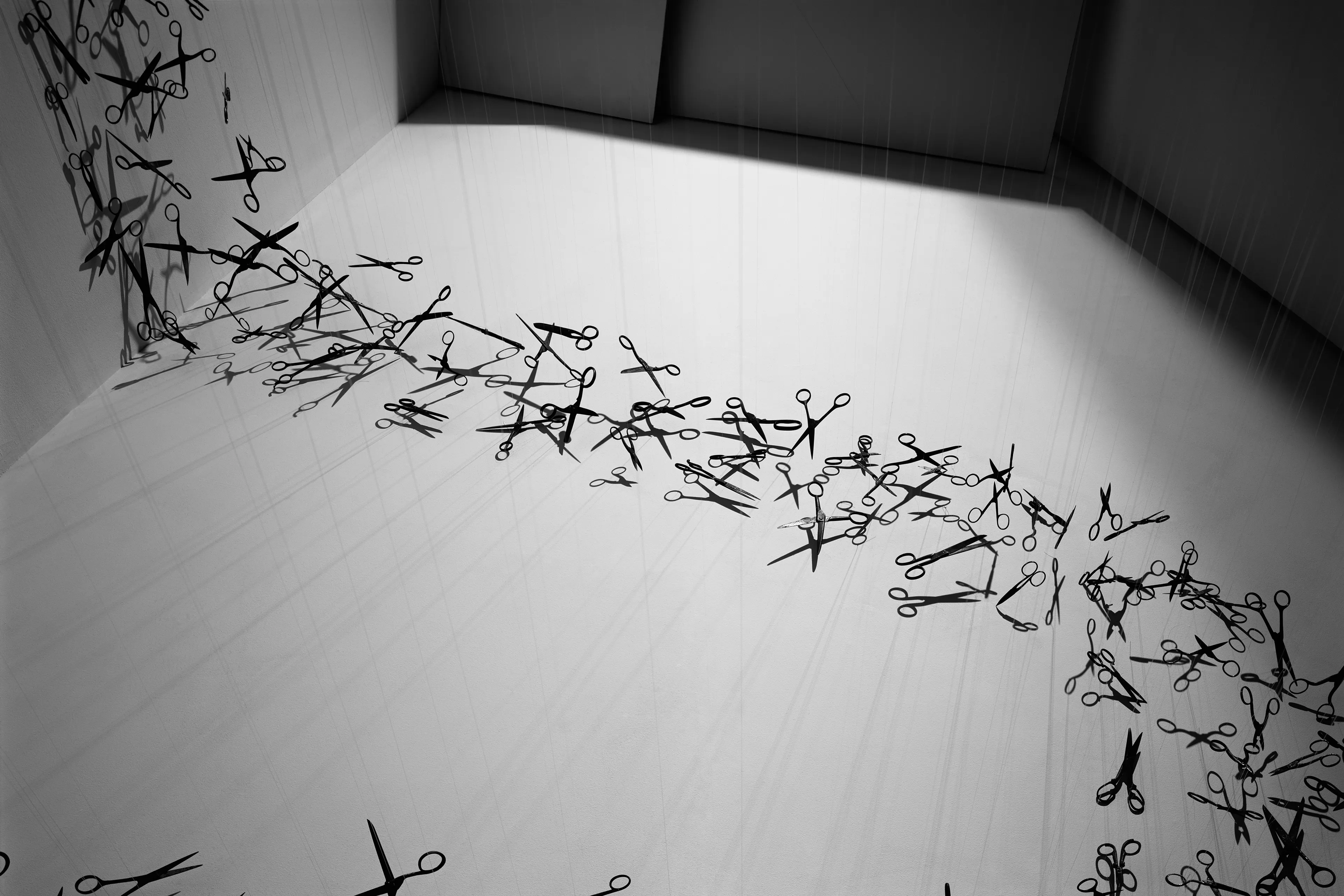
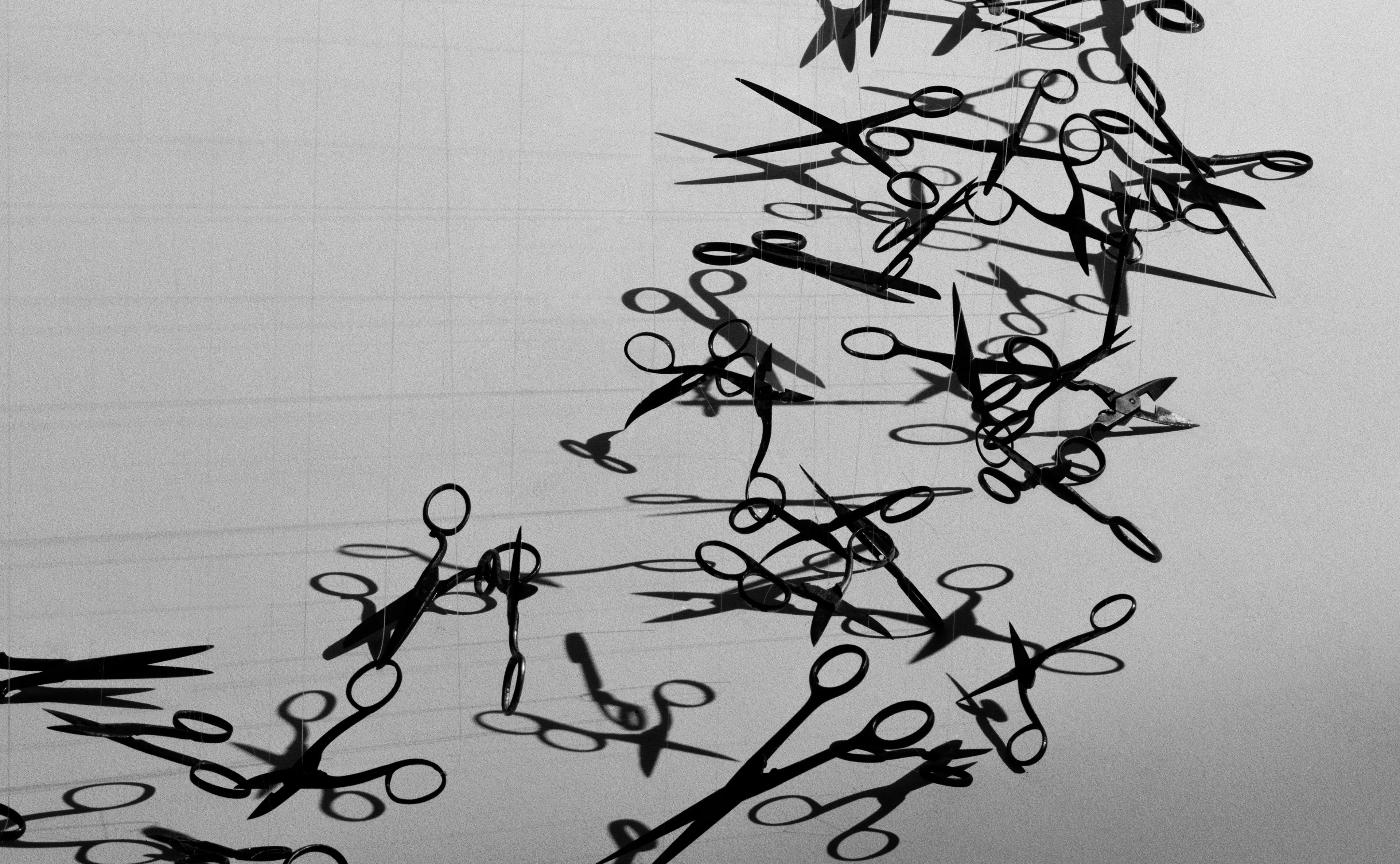
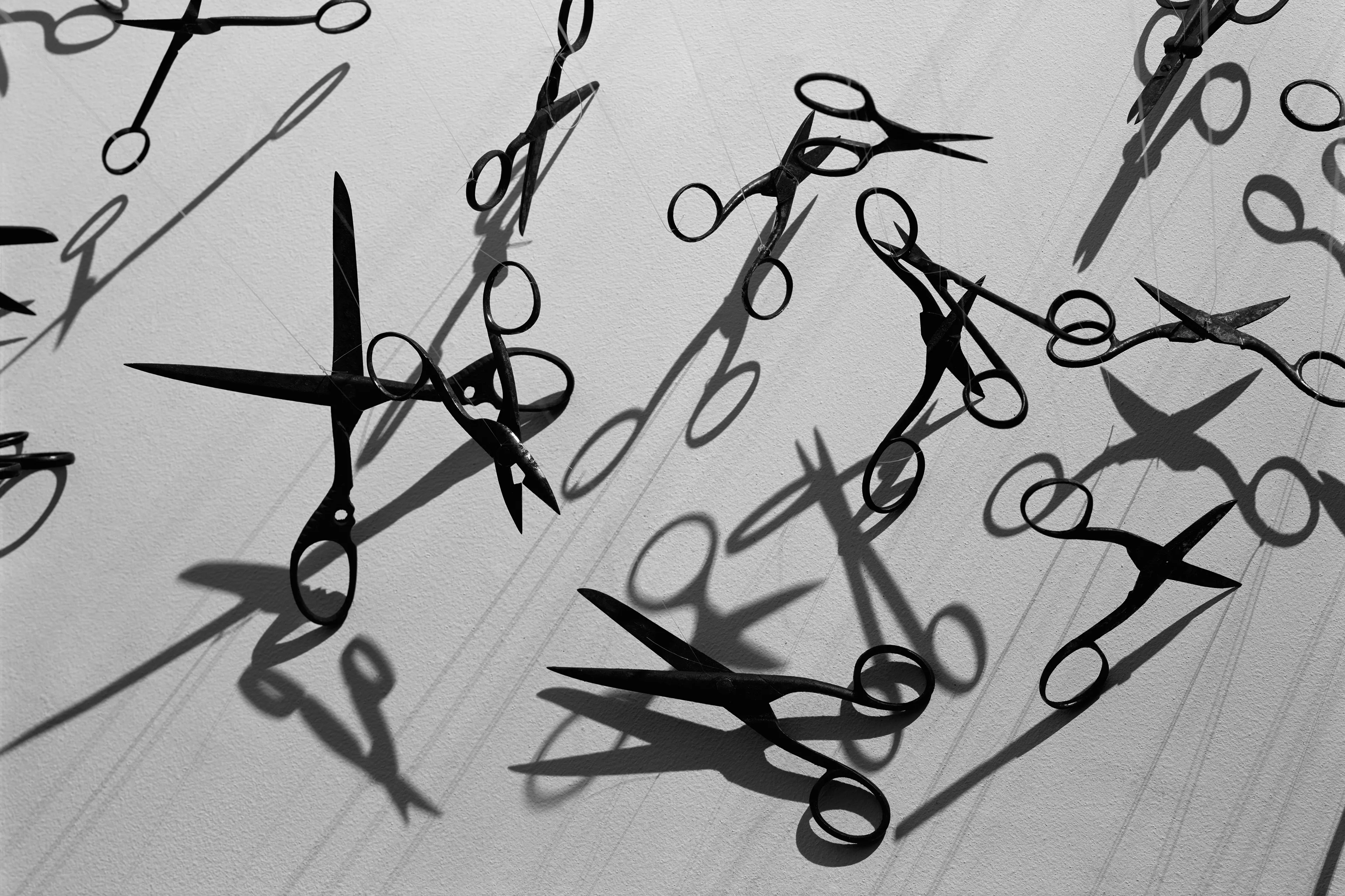
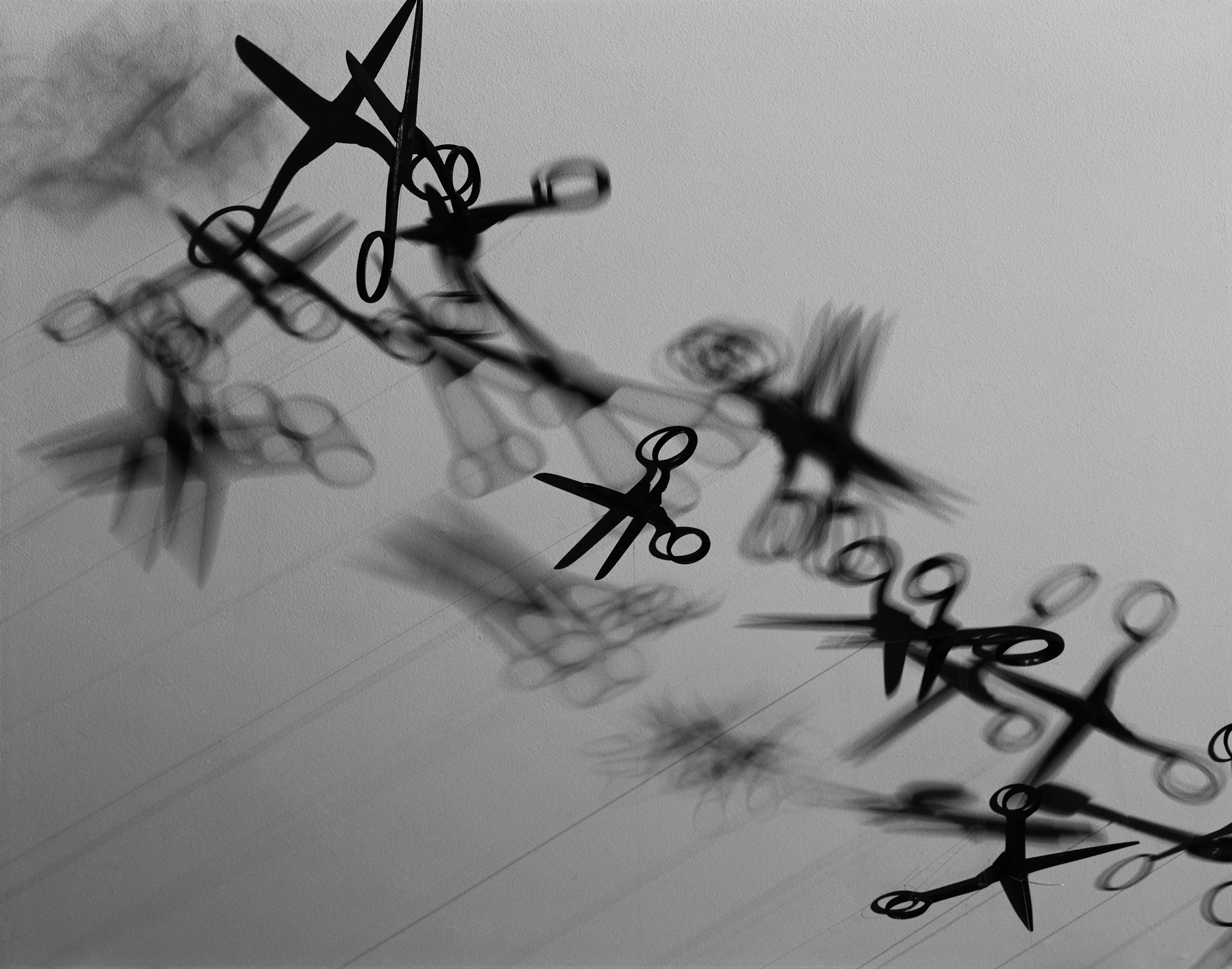
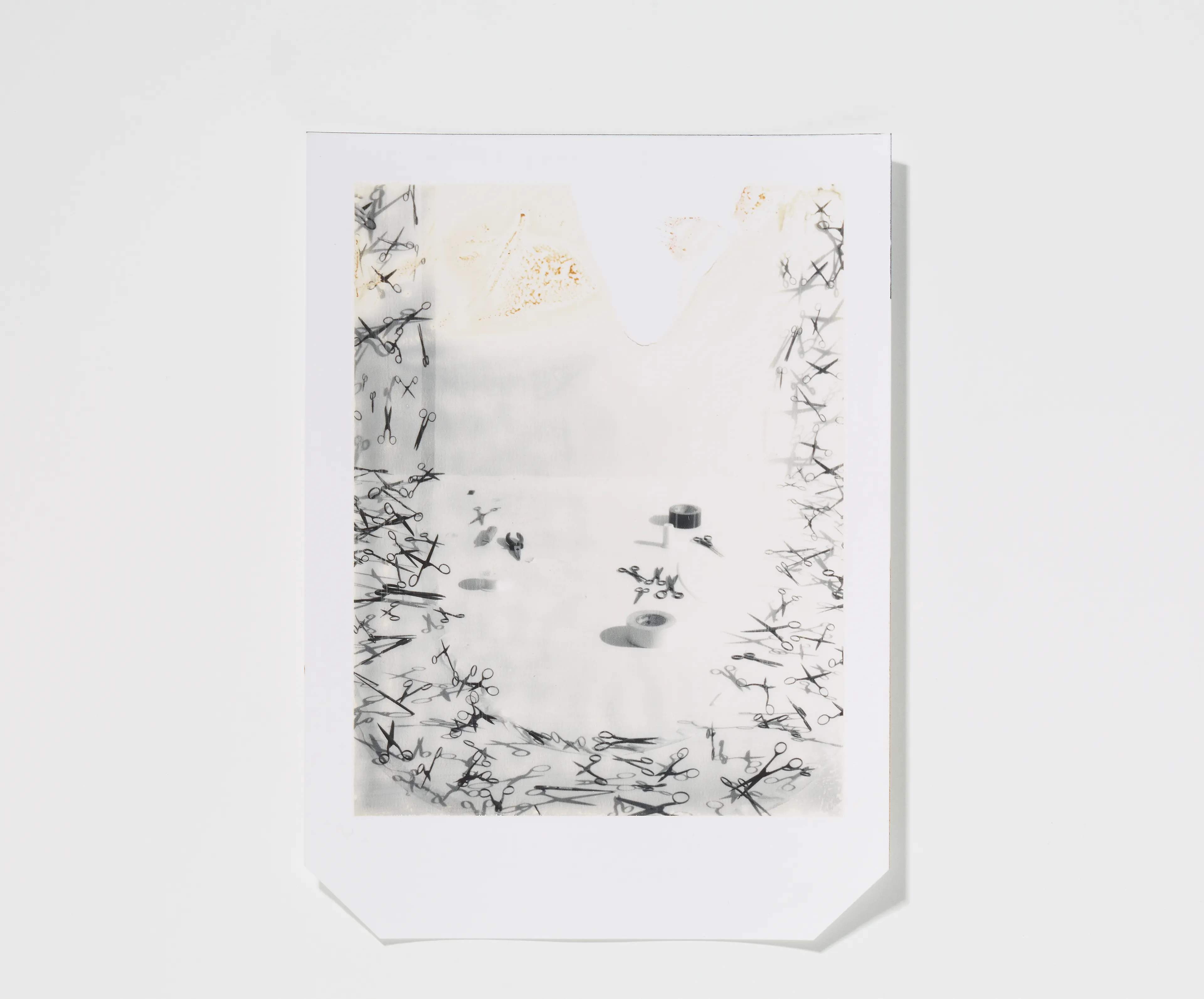
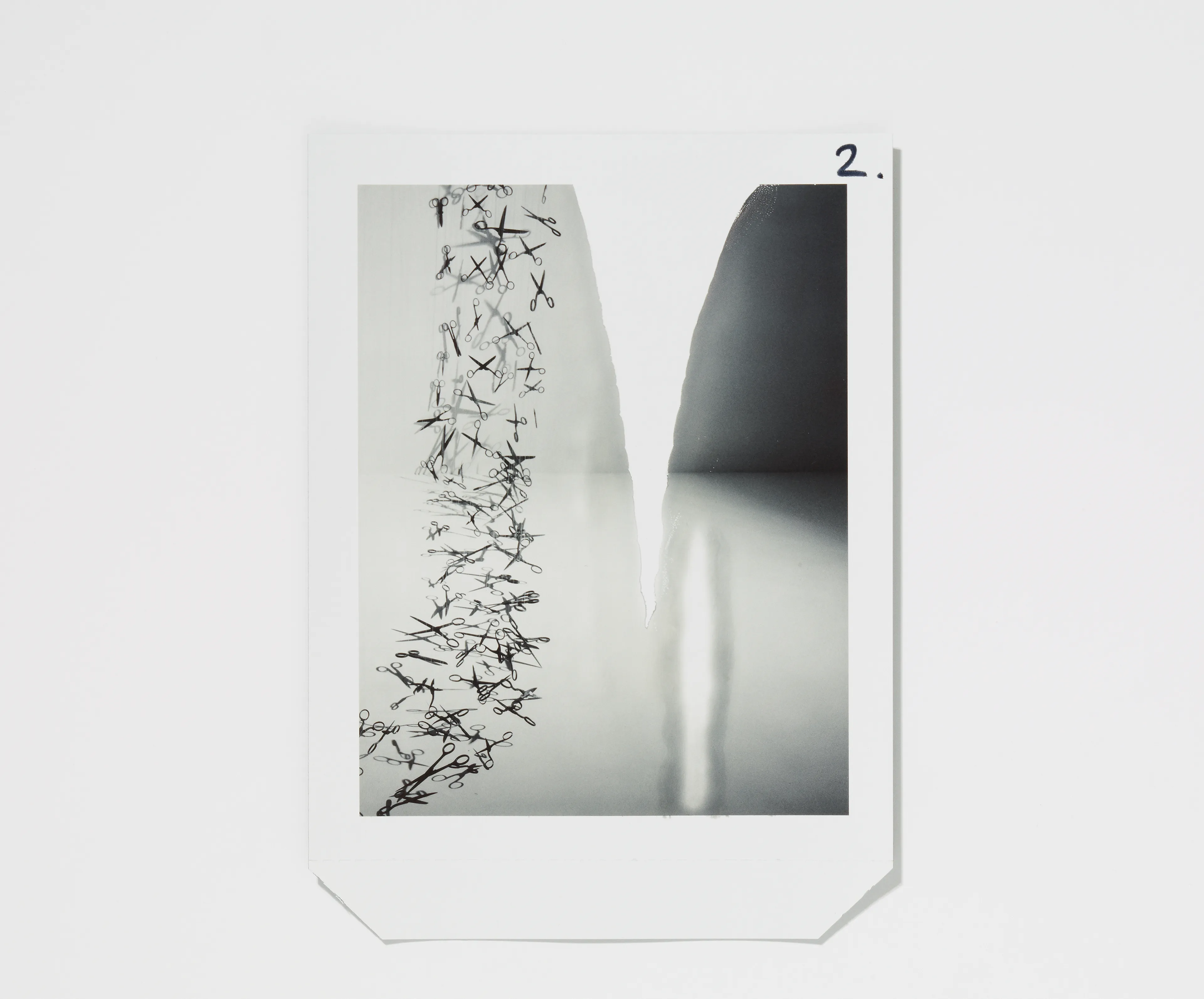
Undone, scissors, wire, 2011
lorem ipsum dolor sit amet consectetur adipiscing elit labore sed ut est qui velit aliqua est ut nulla laboris animi imperdiet consectetur vel dolor temporibus esse et mollit dolorem sint dolor placeat vel quo in esse molestias culpa qui velit id distinctio quod enim voluptas dolore mollit culpa ex vero
Letter W
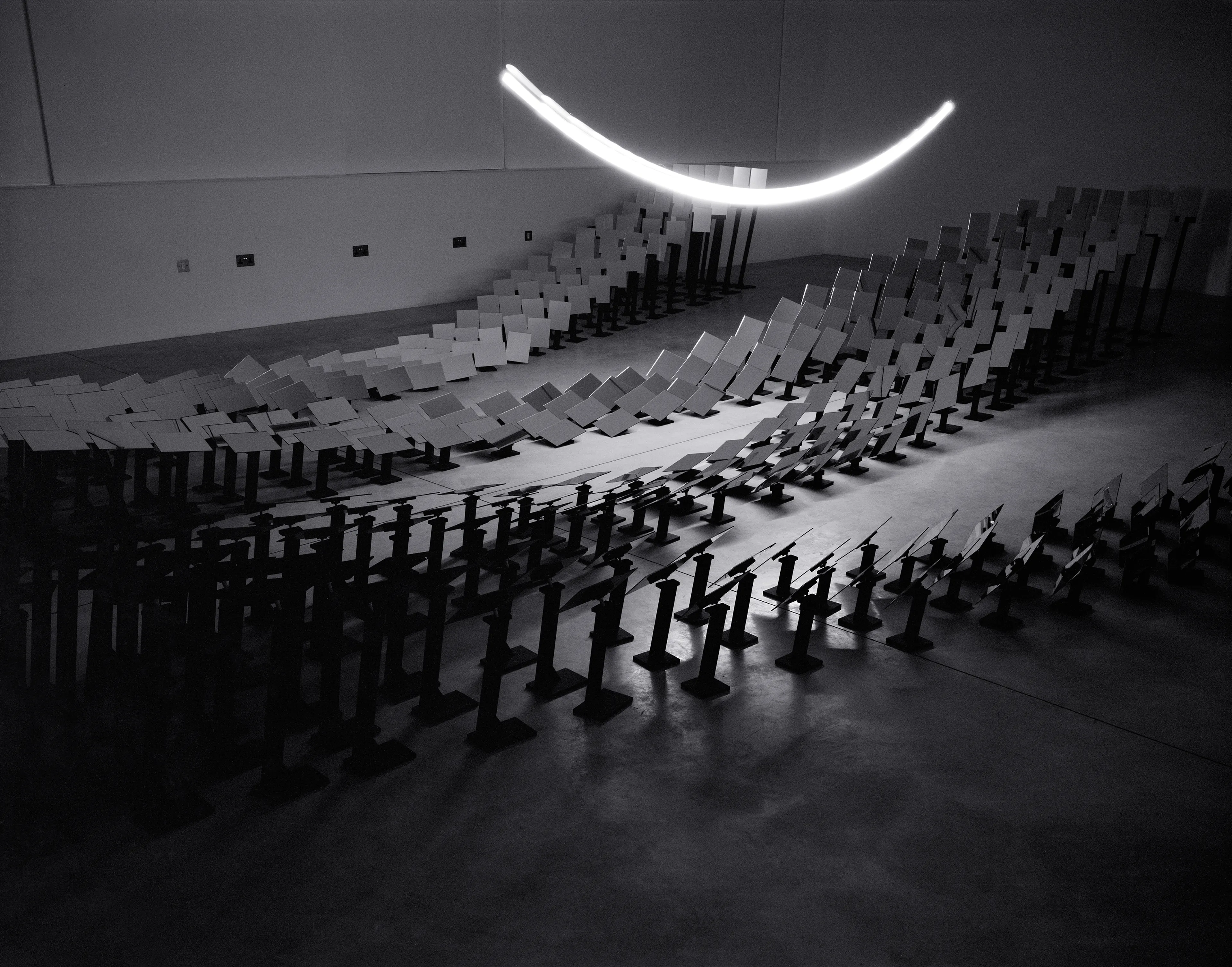
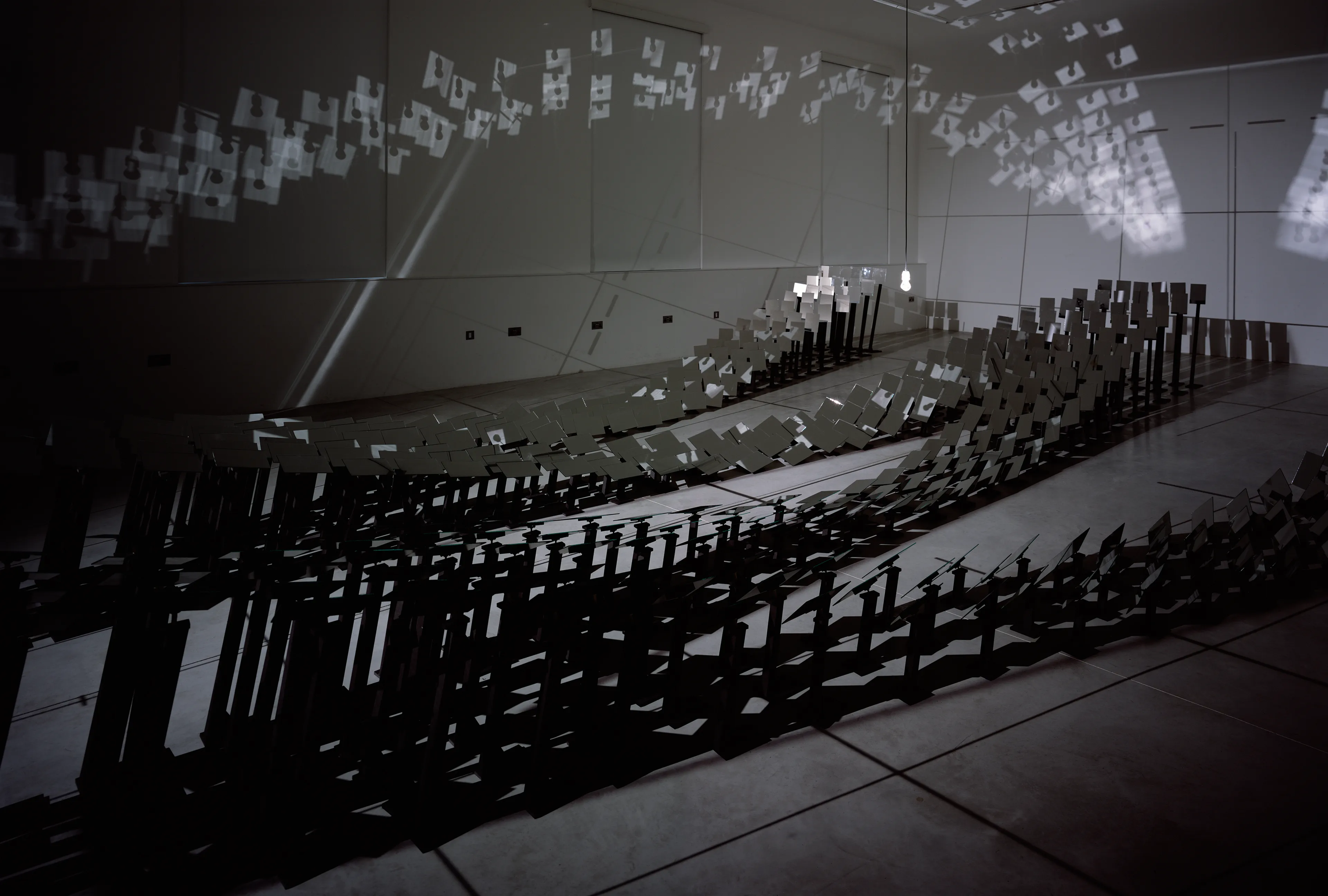
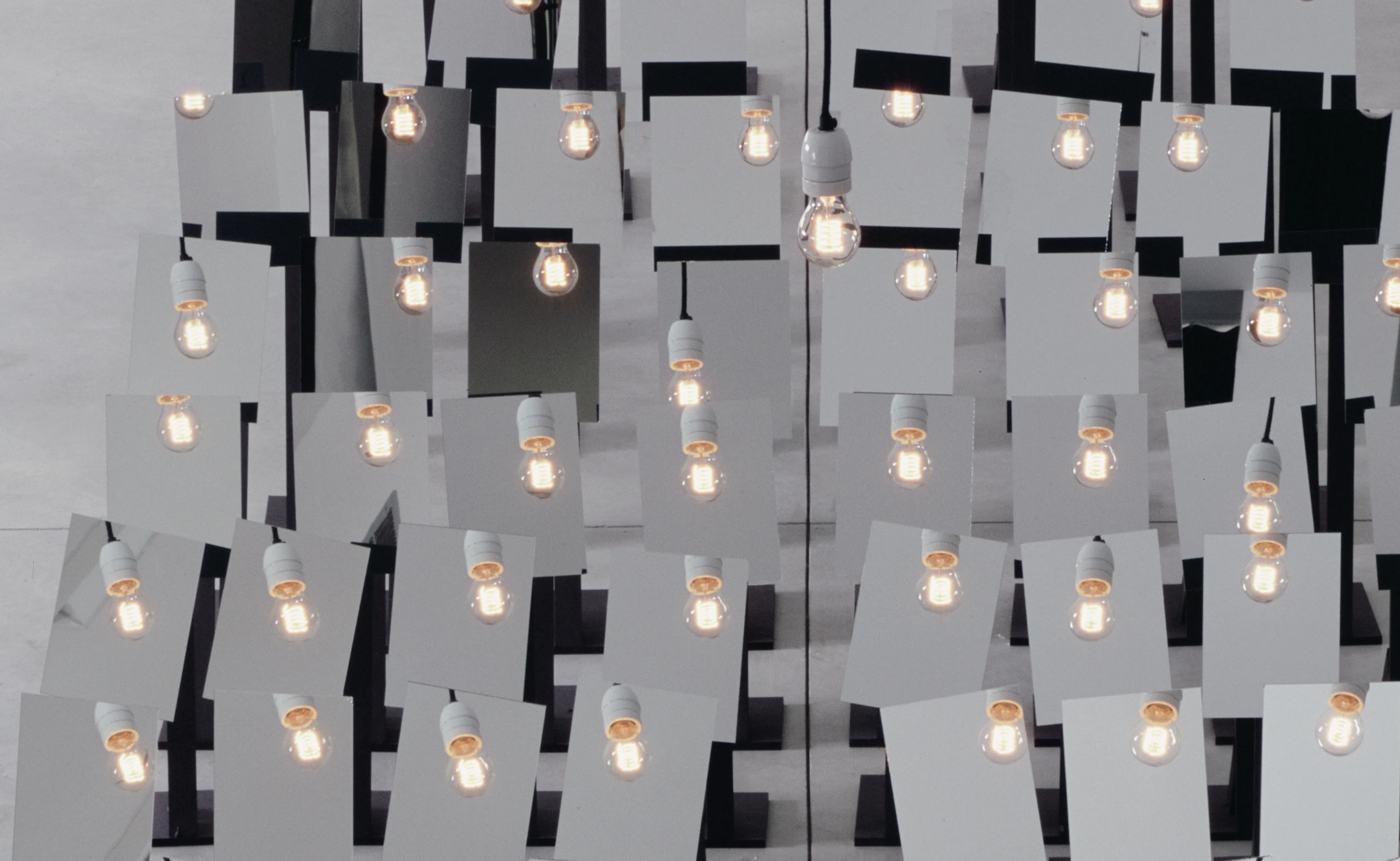
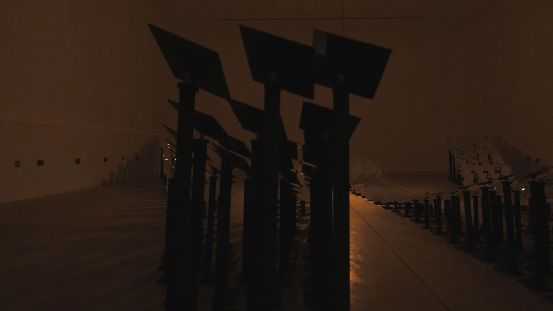
Wave Function, mirrors, stands, lightbulb, 2016
The installation features a singular lightbulb yet can create the letterform through hundreds of reflections.
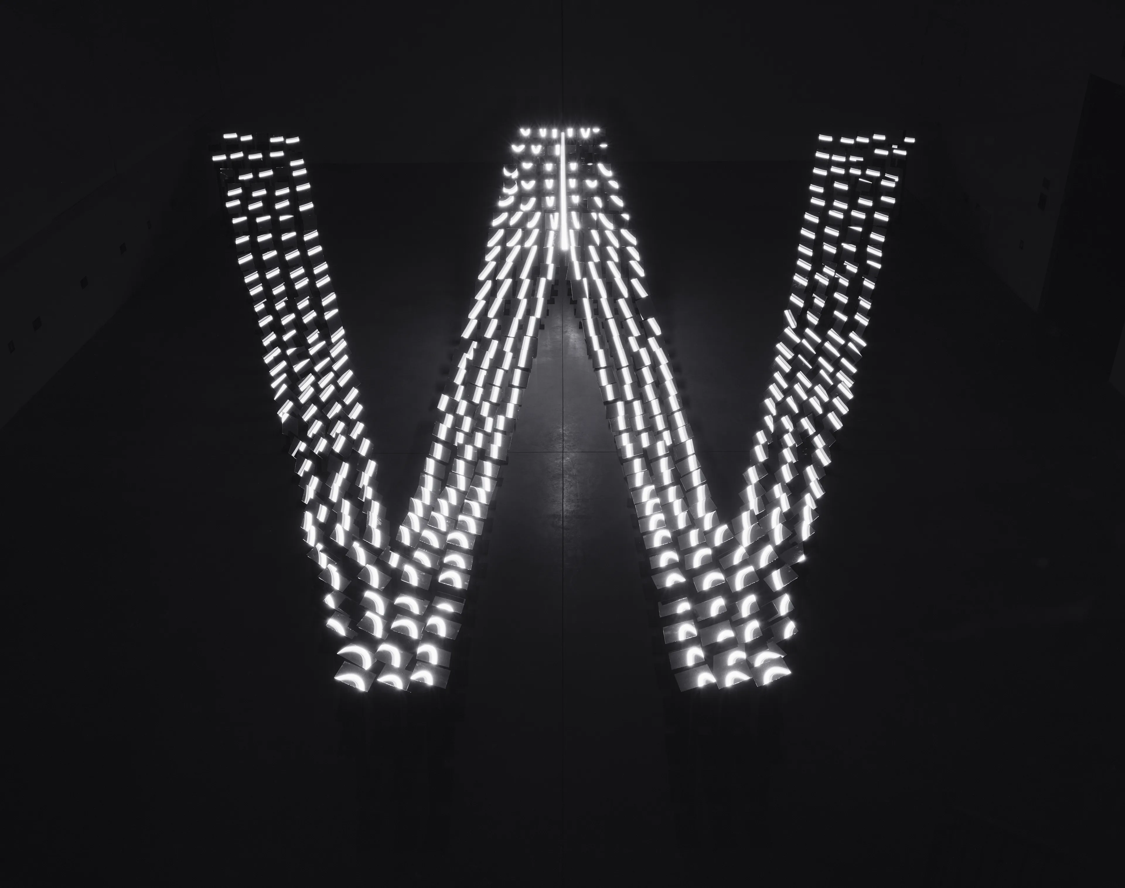
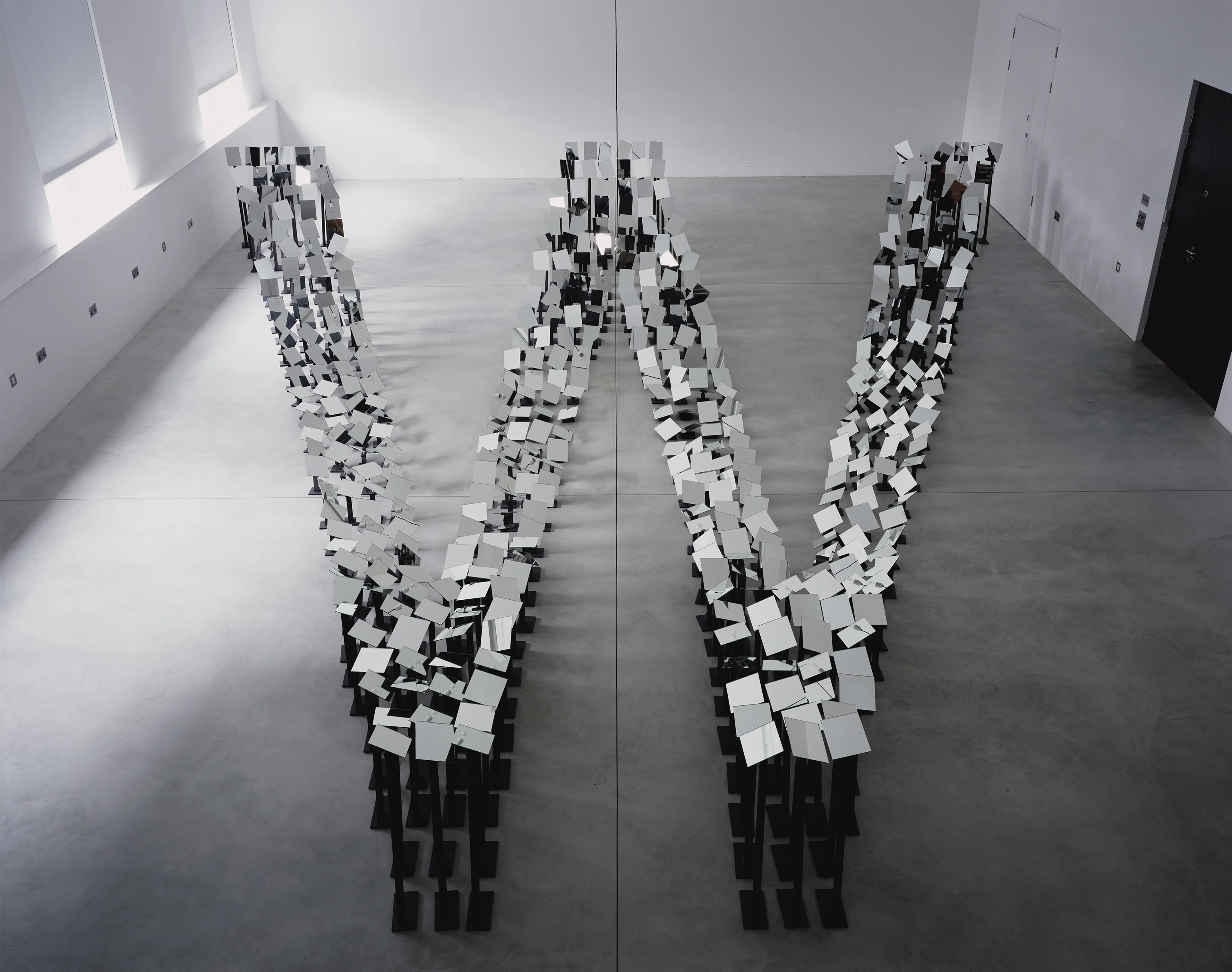
The wave function describes the probability of a particles state in an isolated quantum system. Light and other particles can behave both as a classical wave and as a classical particle. This was demonstrated in one of the most famous experiments in the history of science, the double slit experiment, first made in the 1927, where light is observed as a wave until there is some kind of measurement which then collapses that wave function into one state and it behaves a particle.
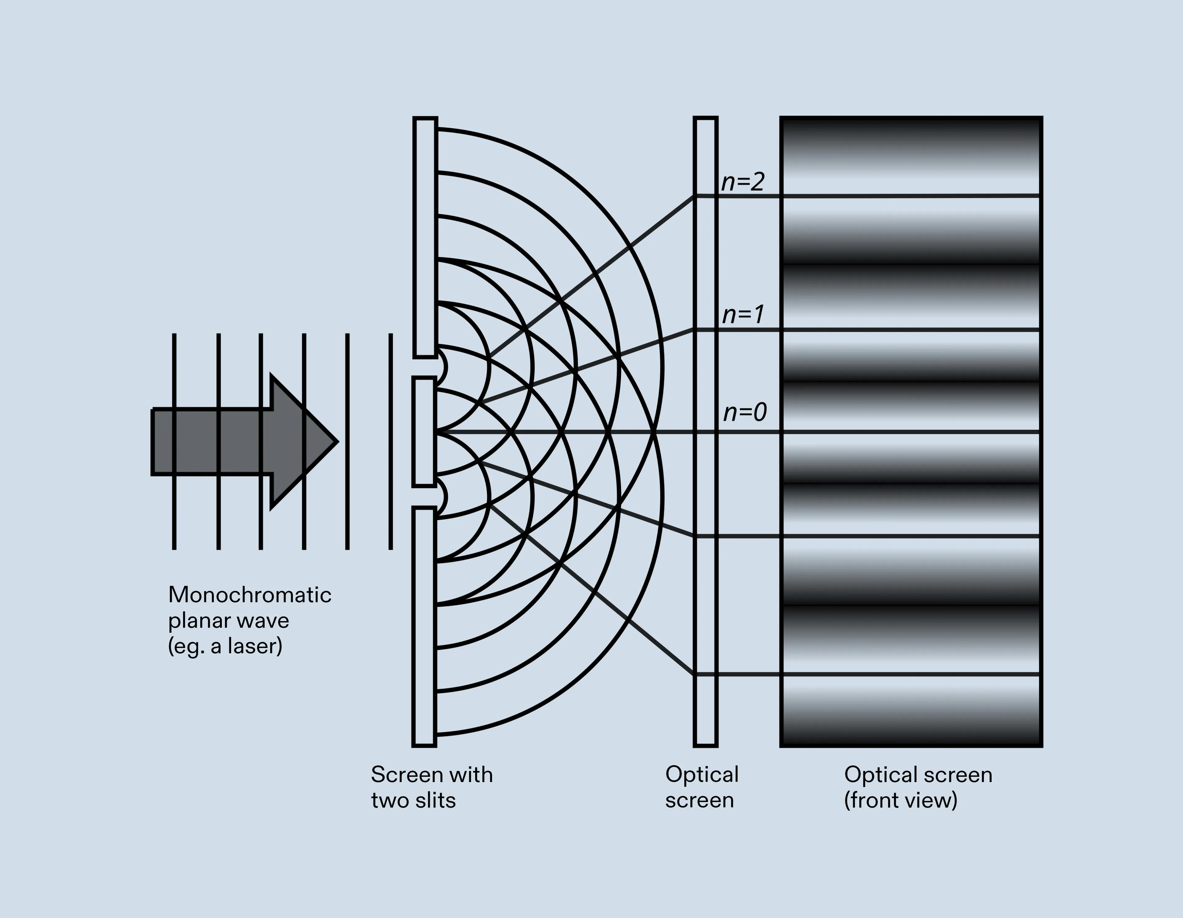
The Double Slit Experiment
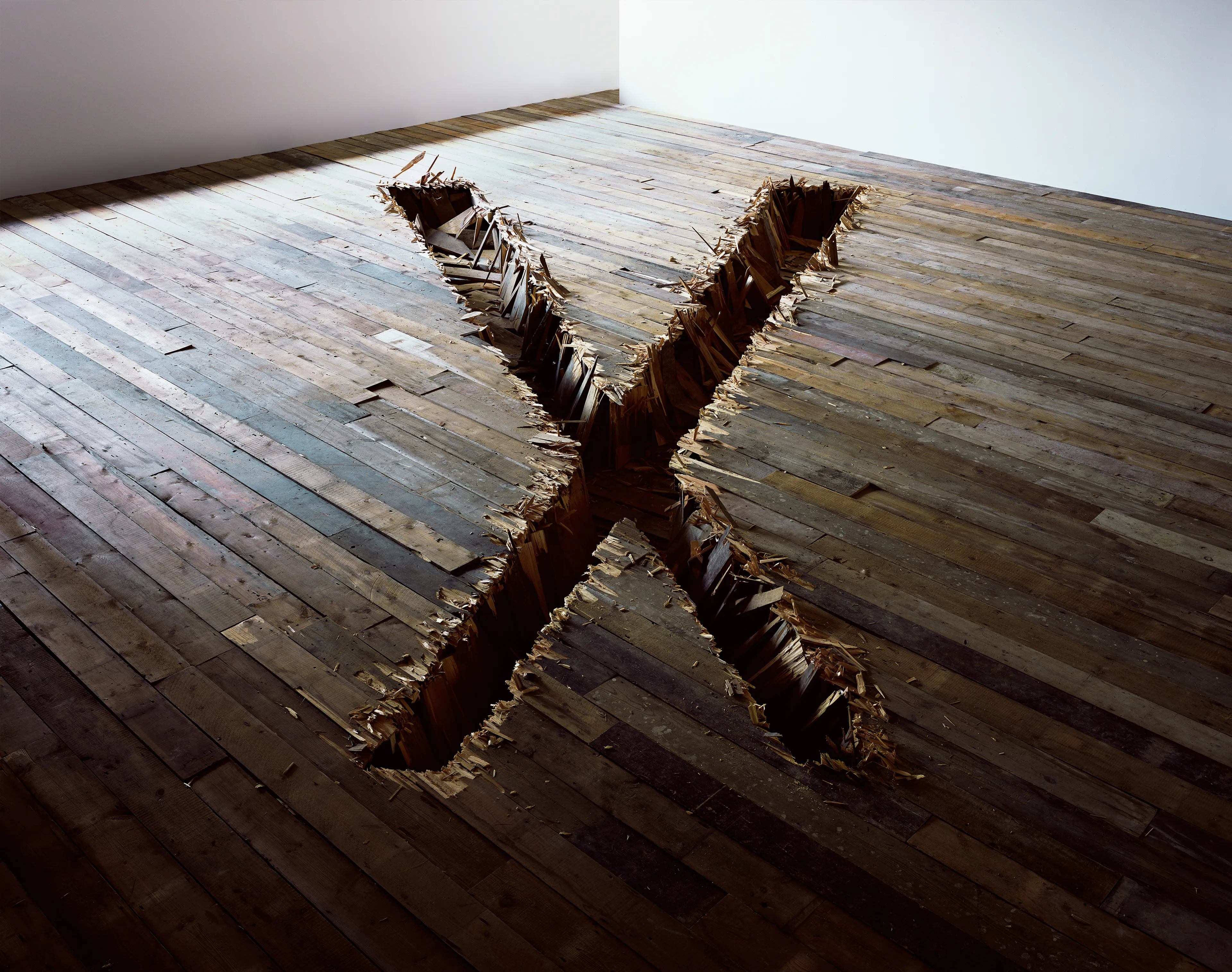
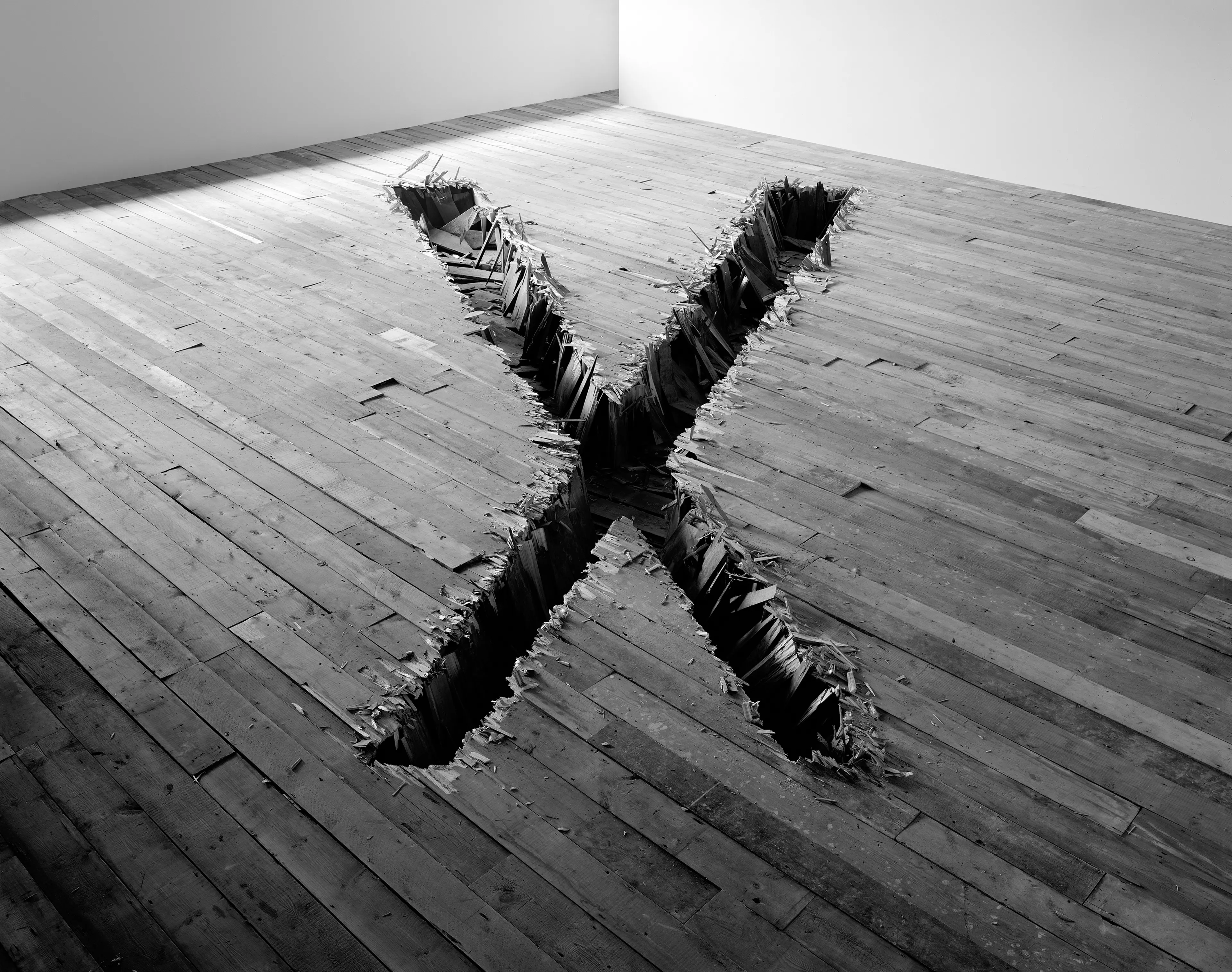
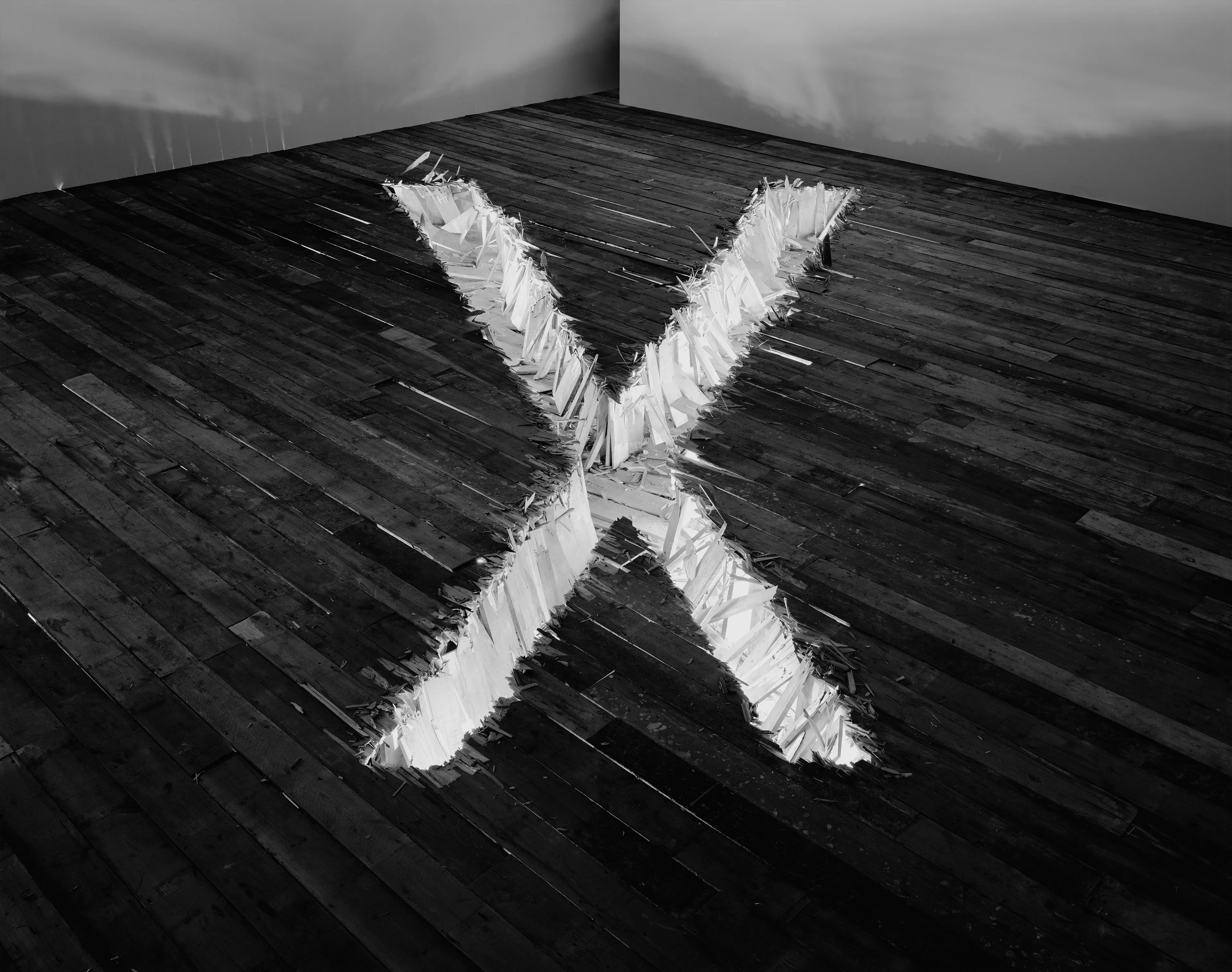
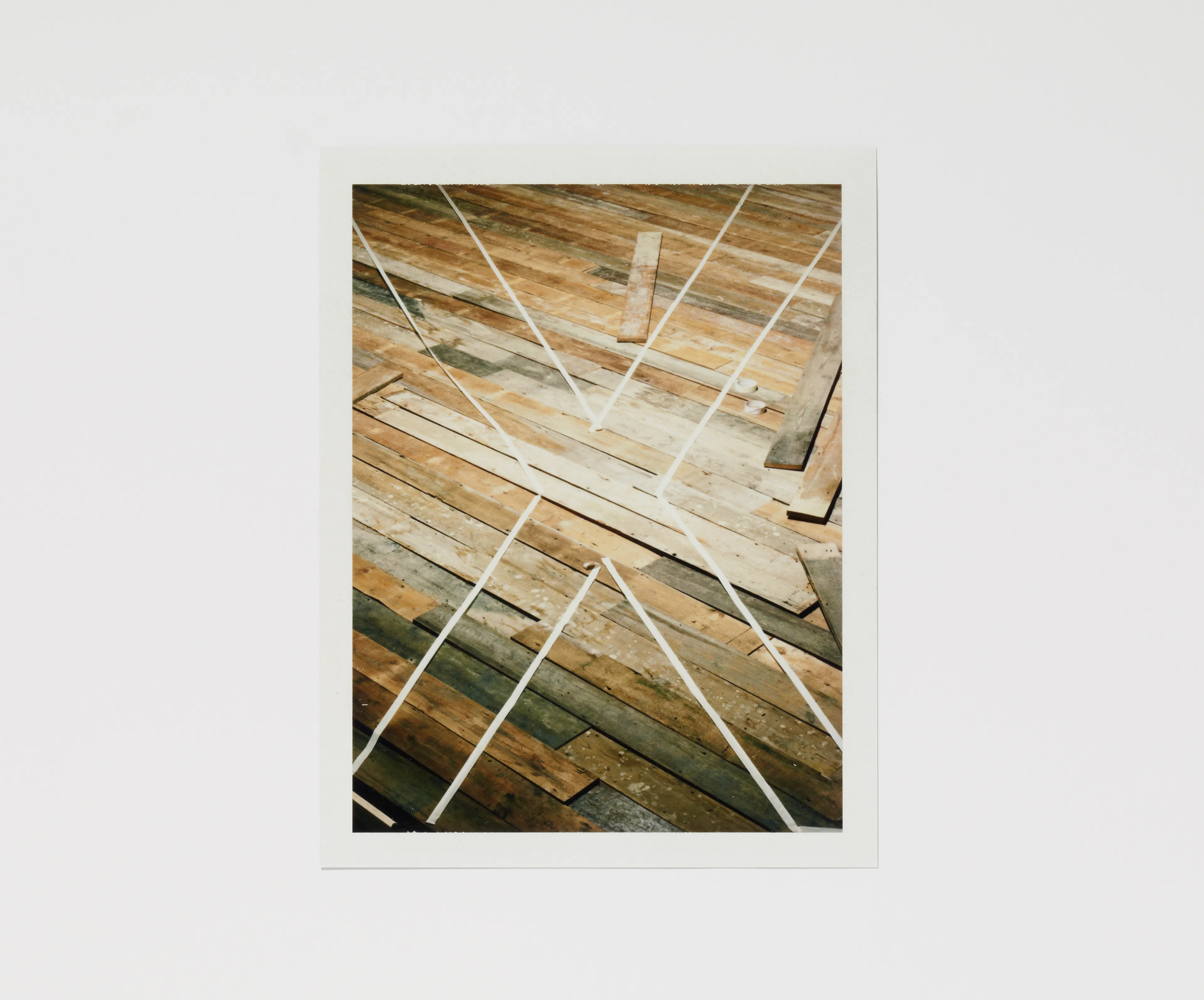
Letter X
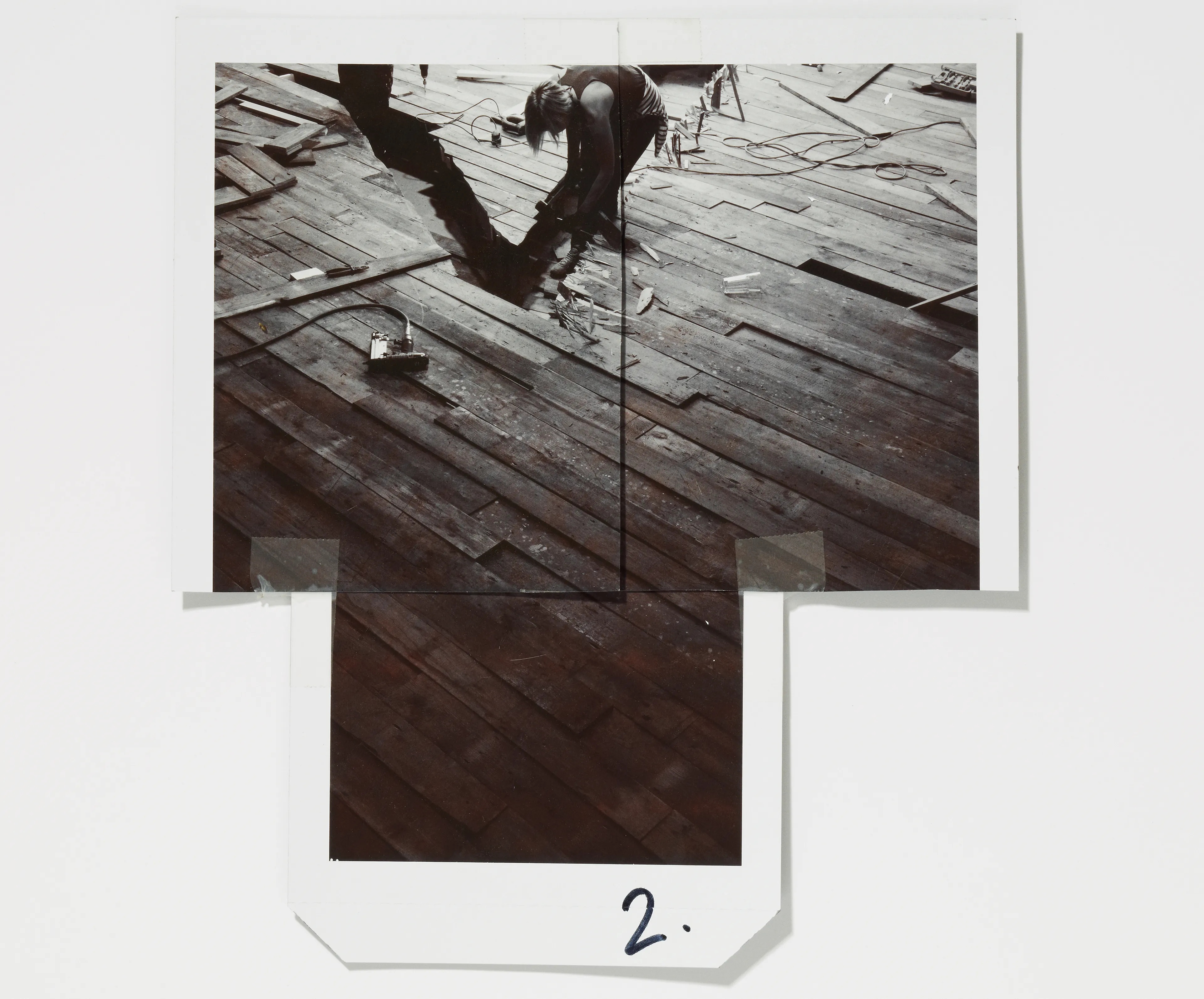
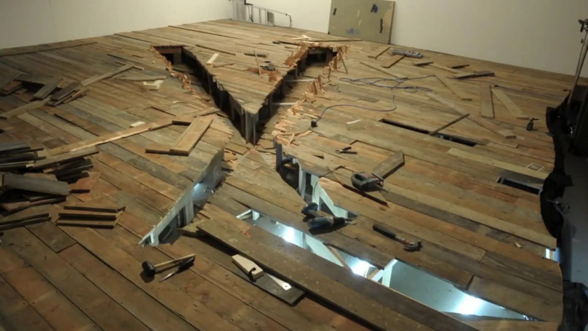
X Marks the Spot, wood, 2019
Lorem Ipsum is simply dummy text of the printing and typesetting industry. Lorem Ipsum has been the industry’s standard dummy text ever since 1966, when designers at Letraset and James Mosley, the librarian at St Bride Printing Library in London, took a 1914 Cicero translation and scrambled it to make dummy text for Letraset’s Body Type sheets. It has survived not only many decades, but also the leap into electronic typesetting, remaining essentially unchanged. It was popularised thanks to these sheets and more recently with desktop publishing software like Aldus PageMaker and Microsoft Word including versions of Lorem Ipsum.
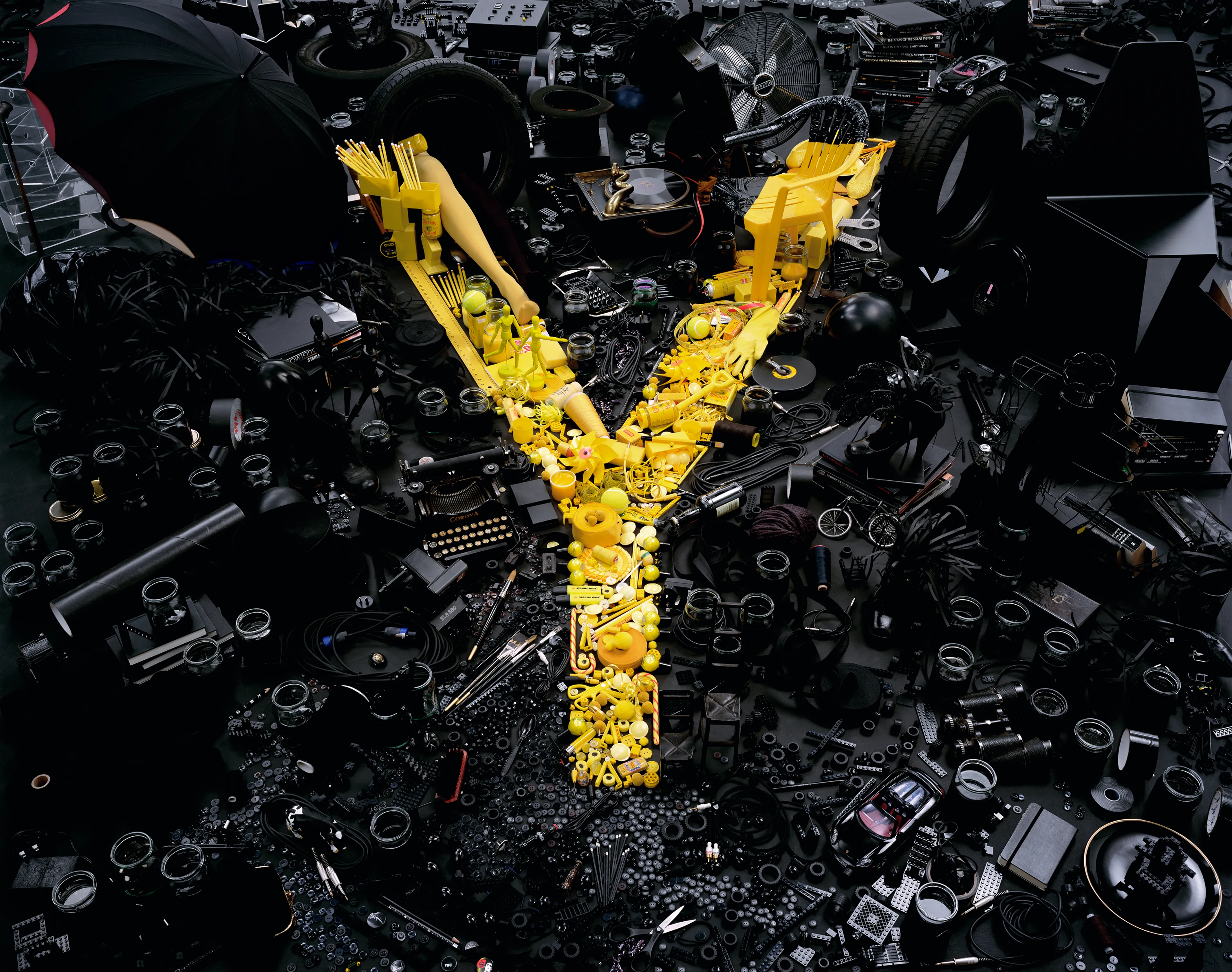
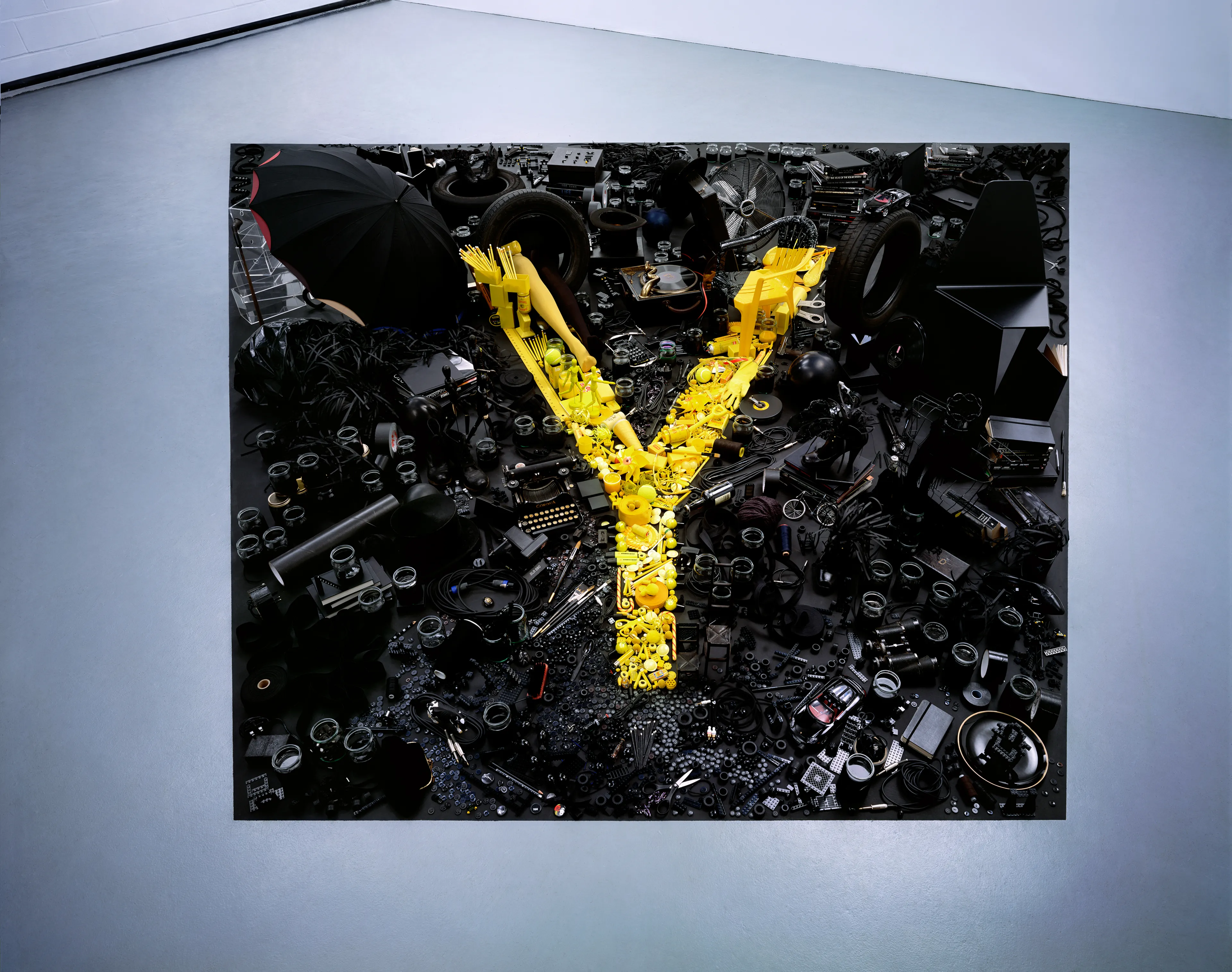
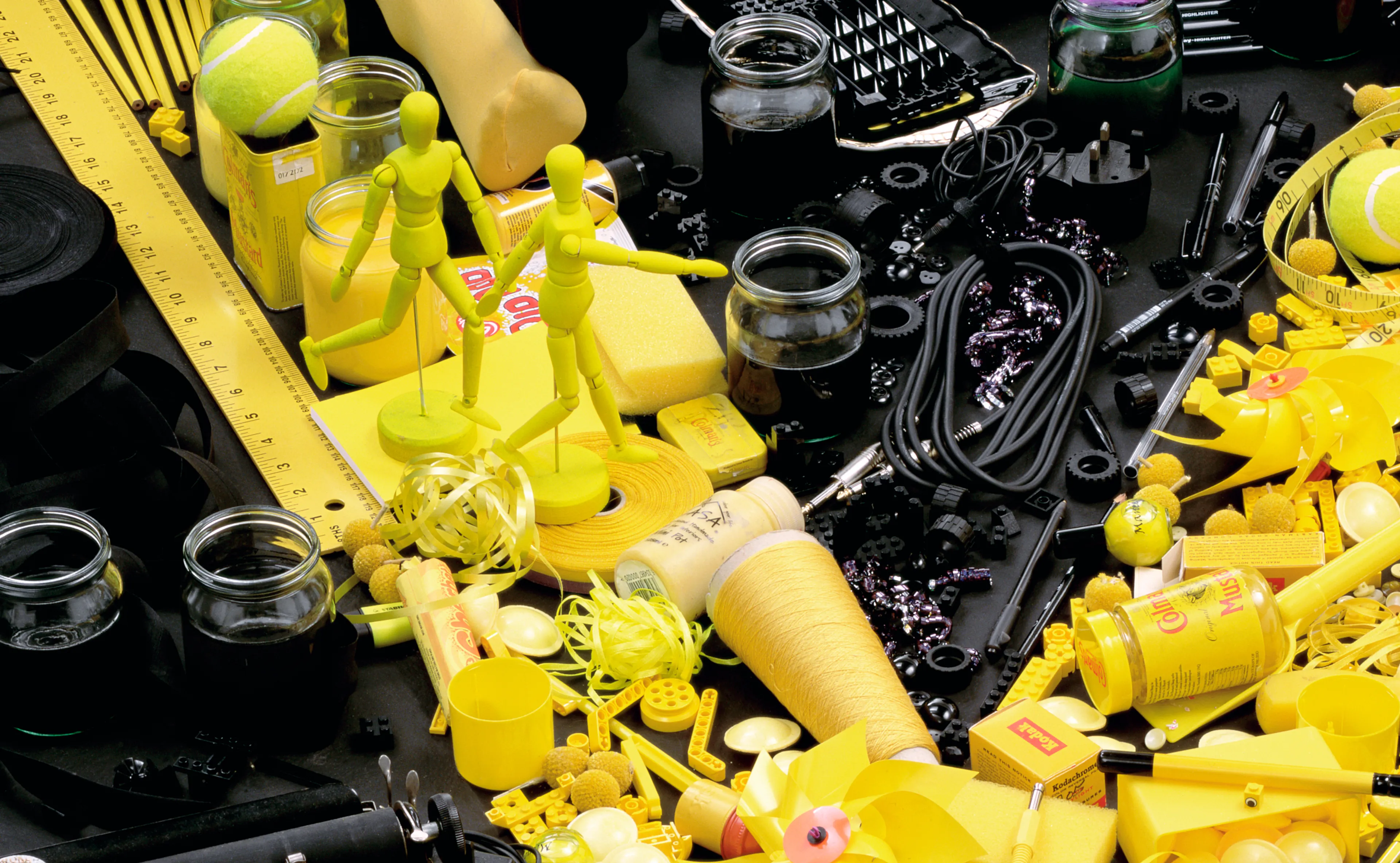
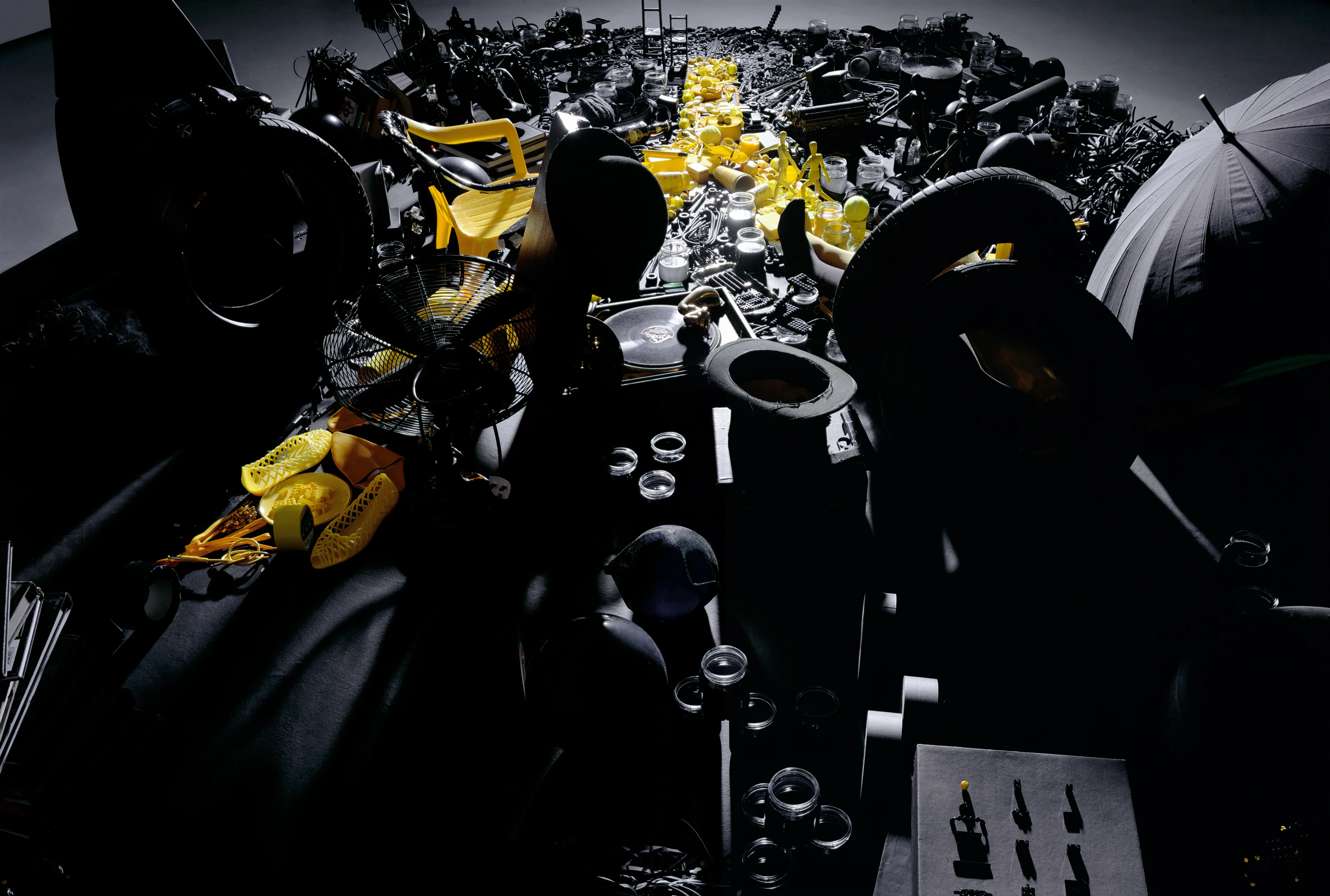
LETTER Y
Yellow
lorem ipsum dolor sit amet consectetur adipiscing elit labore sed ut est qui velit aliqua est ut nulla laboris animi imperdiet consectetur vel dolor temporibus esse et mollit dolorem sint dolor placeat vel quo in esse molestias culpa qui velit id distinctio quod enim voluptas dolore mollit culpa ex vero